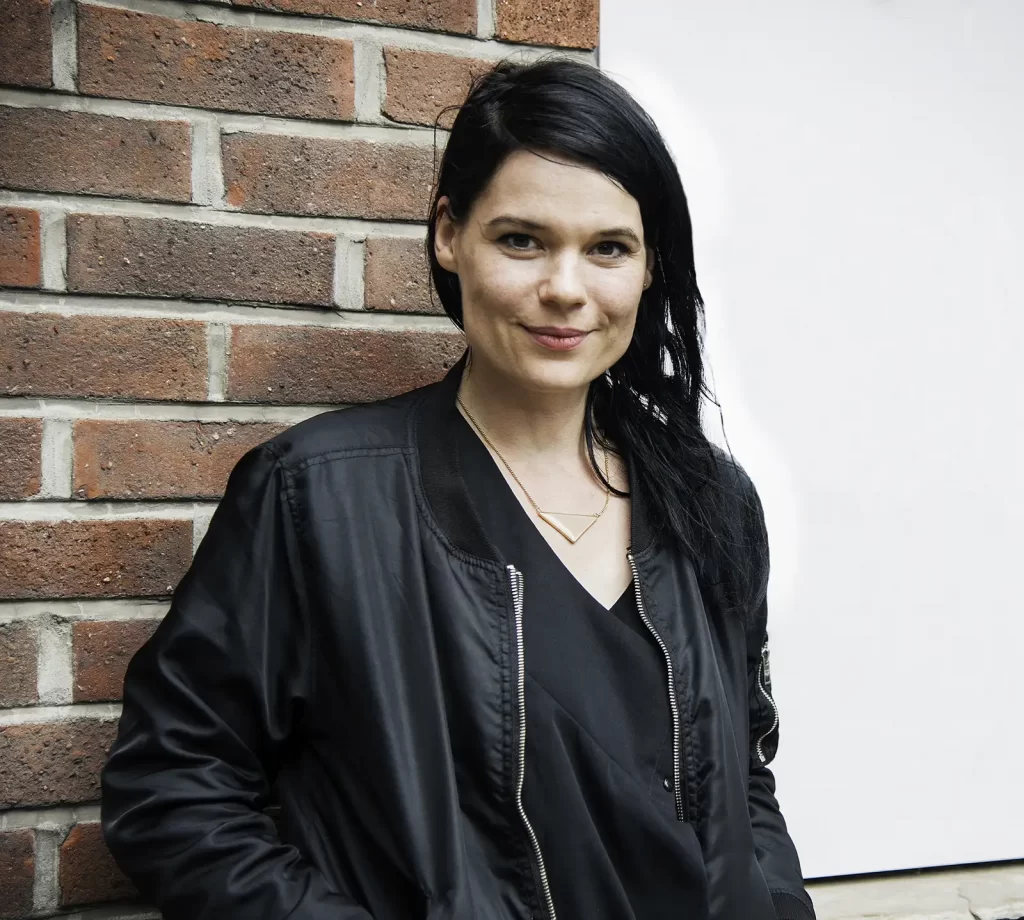
Whether it was her own creative family, her training at the Berlin Weißensee School of Art or her internship with Stefan Sagmeister in New York, Ariane Spanier cannot say today who or what influenced her most professionally. What she does know for sure, however, is that personal initiative is extremely important, the drive to want to achieve certain things and the confidence to follow your own impulses. In other words, you can do what you want as long as you do it well.
How did you get into graphic design, what attracted you to this profession?
I came into contact with design quite early on through my parents. My father worked as a product designer and designed watches, among other things, but later turned to graphic design. This gave me my first idea of what graphic design is. My mother worked as an art historian and my uncle is a graphic designer and sculptor. All of this influenced me as a child. I did a lot of drawing, painting, crafting and photography myself and watched my father build models. Later on, I had a certain aversion to the idea of going in this "family" direction. I then wanted to do something "in film", a camera perhaps, but mainly something a bit different. But during an internship at a TV production company, I quickly realized that I had more fun designing the presenters' business cards. So I gave up and applied to a few art colleges for graphic design. It just seemed to cover most of my interests.
You studied at the Kunsthochschule Berlin Weißensee, how did your education there influence you?
That's not so easy to answer. In hindsight, I was kind of impatient when it came to training. I often did a few graphic design jobs on the side that came up through contacts at university. Student projects that only appeared to be for clients but remained fictional didn't appeal to me that much. I wanted it to be real, for my design to be used and published - not that I was megalomaniac - I just wanted to experience my work in use, which is probably part of my fascination and motivation for this profession.
The great thing about the relatively small art college was the interdisciplinary contacts that arose in the first Bauhaus-like foundation year with students from other departments. We all had nude drawing, color theory classes, sculpture and even anatomical drawing - there was even a cabinet of horrors with skeletons to draw. Together with a friend from the liberal arts and a few other colleagues, we built the first exhibition stands for publications designed by students at book fairs. We did the whole thing ourselves, using hundreds of pallets - before it became a popular trend. Such experiences are important. It all depends on how you use the time. In my experience, teachers and professors can only do a certain amount, the rest comes from personal initiative, fellow students, motivation and a certain drive to want to achieve certain things. Finding out what these are can sometimes take a while. I also drew a lot during my studies, we had a professor for free drawing and illustration - Nanne Meyer. That was very inspiring and I even ended up doing a diploma with just drawings - only to stop afterwards and really turn to graphic design.
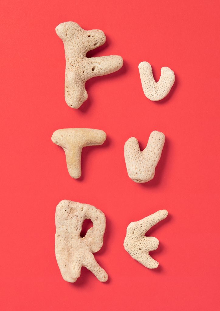
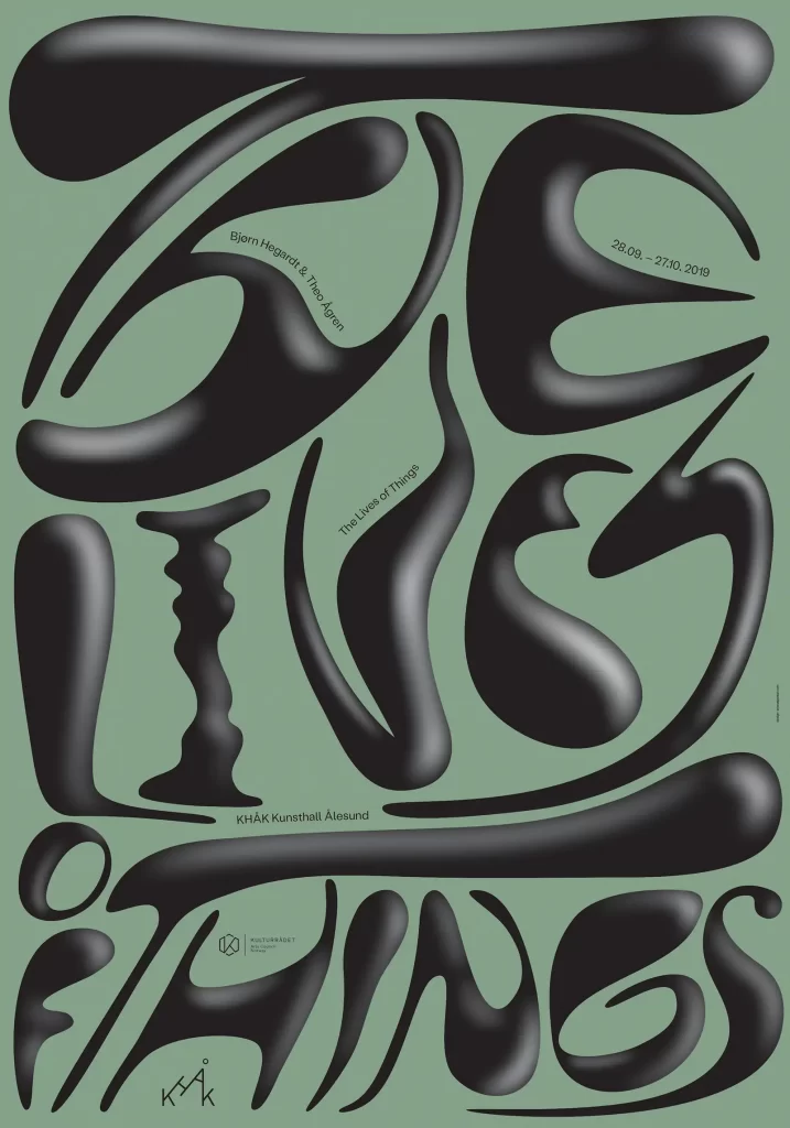
You also worked in New York, for example with Stefan Sagmeister, what did you take away from this time for your work?
I flew to New York right after I graduated, 3 days later to be exact. I was lucky that I stumbled straight into his studio. Stefan Sagmeister's studio was small back then, there were only three of us. Everyone was asked to develop ideas for every new project. But the most important thing for me as a newcomer was that it was about serious graphic design, but you couldn't necessarily tell that it was serious. It was different to anything I had seen or done myself before. At the same time, something "clicked". As if I had stumbled upon something that I had been blindly groping around for. Perhaps a way of approaching things, a tone that I thought shouldn't be used in design and suddenly it worked. I had chosen his studio because I probably suspected it without being fully aware of it.
There was a project that I designed in the studio at the time, one of his diary quotes that are summarized in his book "Things I have learned in my life so far" - a fashion mailer for which I built type from the collection that was announced. I spilled plaster all over an expensive coat to suggest bird poop, I formed sweat stains under my armpits into letters in a shirt or built words on clotheslines on the opposite rooftop. That was certainly a trigger for me to use writing more freely. I realized that you can do what you want if you do it well, if it makes sense. You can have fun doing it and you can also break things for design.
I wish everyone such a kick-start, it can be triggered by anything, usually several factors come together and suddenly the time and place and the moment you are at in your career are right. It can happen through a teacher at a university, through a project, through collaborations with others or perhaps a lecture that you hear in the right mood. It can't be planned, but I think our subconscious usually guides us in the right direction. It's as if the search is already underway while you're still tying your shoelaces. You should definitely follow your impulses.
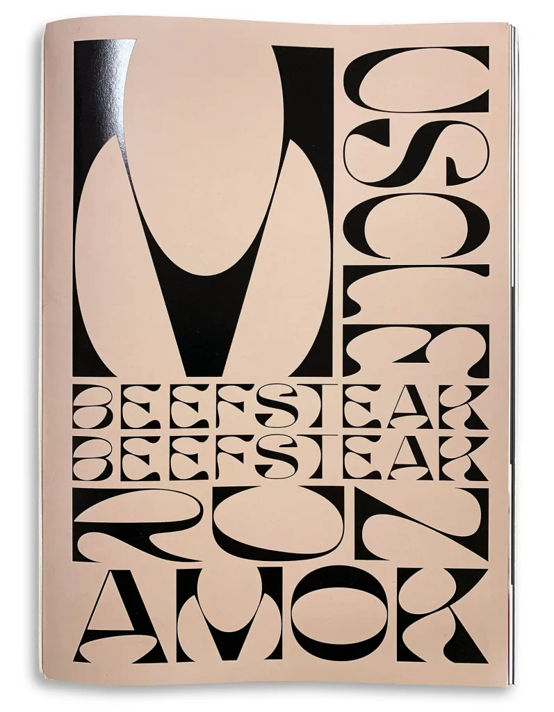
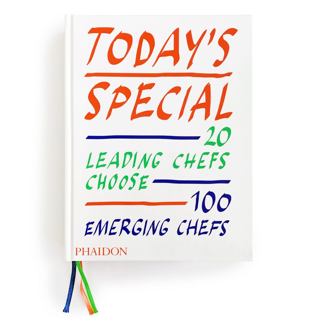
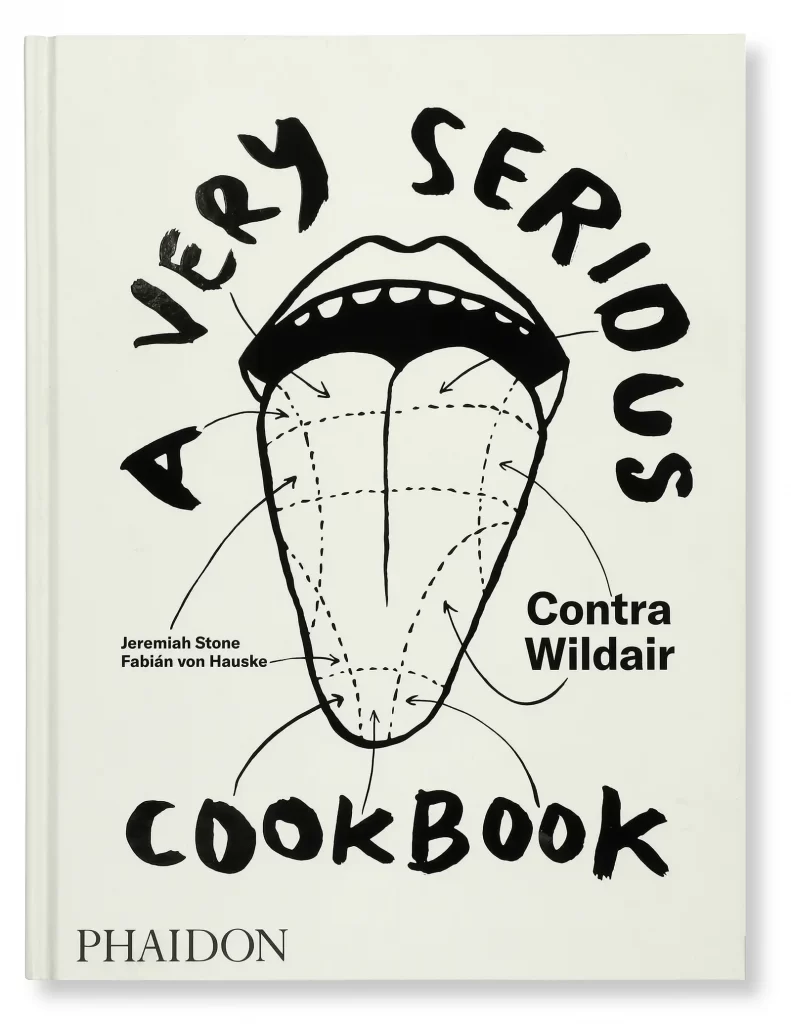
Typography plays a major role in your designs, what fascinates you about it?
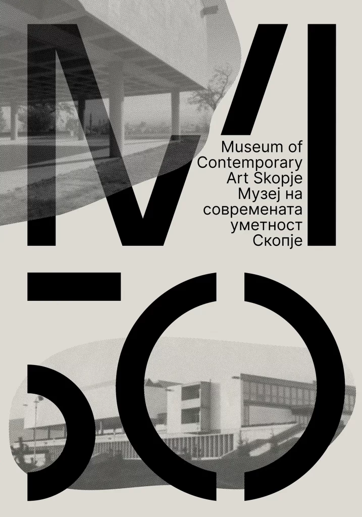
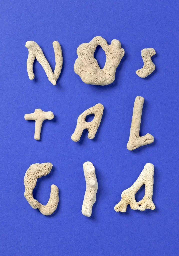
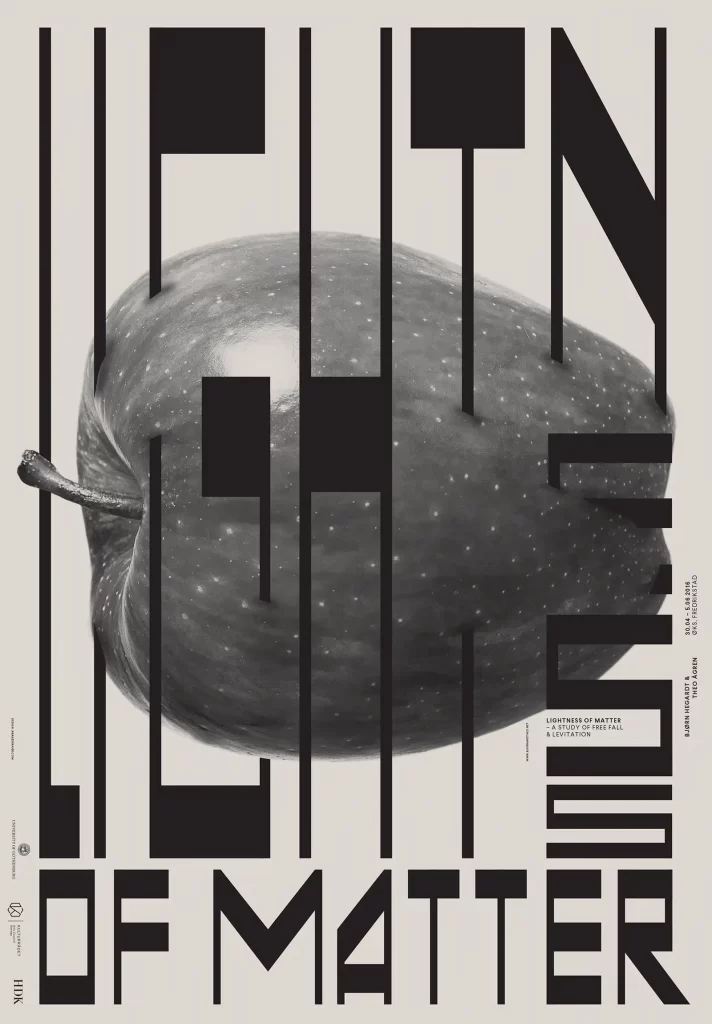
What interests me about typography is that you can kill at least two birds with one stone. On the one hand, you communicate through language, with the help of what is written. And at the same time, the expression of the font can be charged, whether through form, a material or its behavior, and can thus add further levels of meaning and expression that support or counteract the words, what is being said.
This is certainly a very visual approach to writing. My interest in drawing also flows into this. Drawing and writing are very close to each other. The graphic quality of writing, of a letter, can be viewed like a picture. But when I design something without writing or when writing only plays a subordinate role, I often have the feeling that something is missing. Or rather, something would be missing if I did that exclusively and didn't do the other more typographic work. Because I also design a lot of books, for example, where the main work consists of rhythm and image sequences. This is work that I also enjoy doing, but it's about something else. It's more like a kind of puzzle game for me; you're given a mountain of individual pieces that, when put together correctly, can tell a story. Pictures are powerful and omnipresent, but although it is always said that "a picture is worth a thousand words", I am more fascinated by a few of these thousand words for my work. A picture always leaves the viewer with a certain openness of interpretation. This has the advantage that you can sometimes create many interpretations with one image or sequence of images. But with language and through typography I can hear someone saying something, a kind of "graphic voice" is created. I think that plays a big role for me, the immediate response that typography evokes.
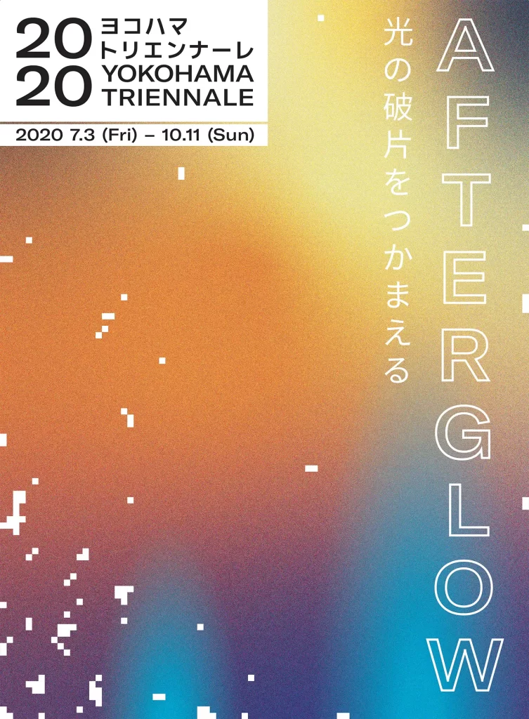
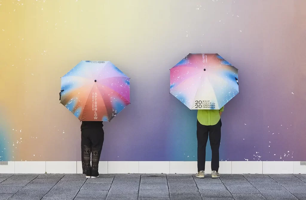
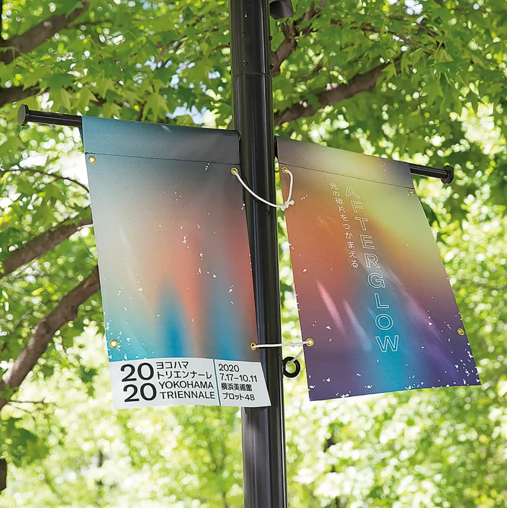
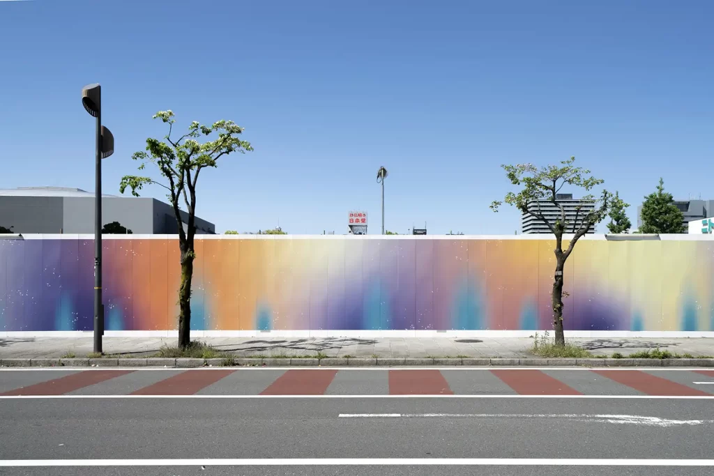
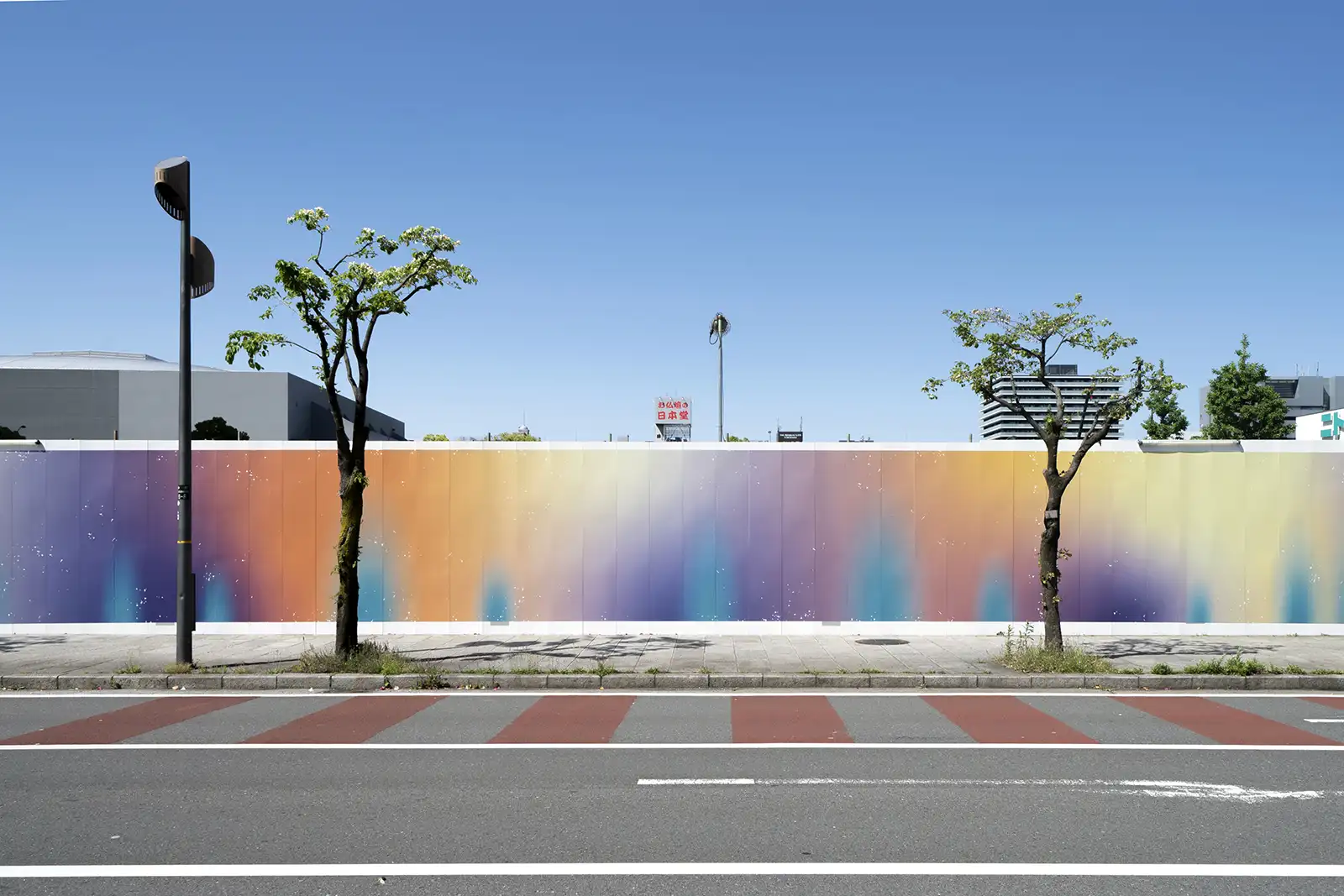
But as always, there are exceptions, such as the appearance of the Yokohama Triennale 2020 for contemporary art - one of the few exhibitions that actually took place last year. Here, my design concept consisted exclusively of color, gradients - underlaid with noise, blue, toxic radioactive-looking "glows" and error pixels, as if cosmic radiation had damaged the film (as happens to astronauts, for example, when they take pictures on the space station). Typography was of secondary importance here. It was about an atmosphere, the "afterglow", the title of the Triennial: the afterglow in the sky after a sunset or even after a nuclear catastrophe, but also about the self-generated, self-sufficient glow of plankton, the glowing feeling of connection, friendship and taking care of something. These were content themes that I felt a hard, cool, typographic concept couldn't match - the feeling I wanted to create with the design would have fallen short if I had put type or form at the center of this project.
But in general, my initial fear of doing something to type has fortunately subsided. Of course, many other designers before me are responsible for this, but as with some things in life, you have to find the right time to do something, you have to catch the moment when the door is open. That way, you can later enjoy putting recipes in a cookbook again. Or doing almost entirely without typography. It all seems to be a question of timing.
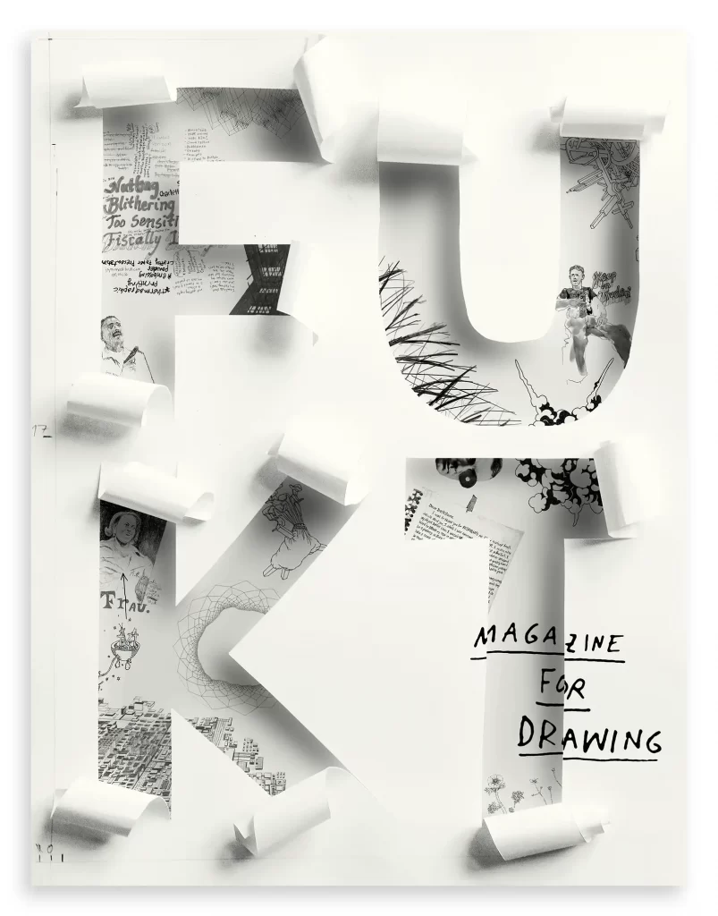
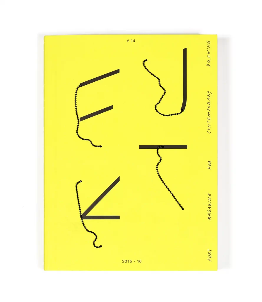
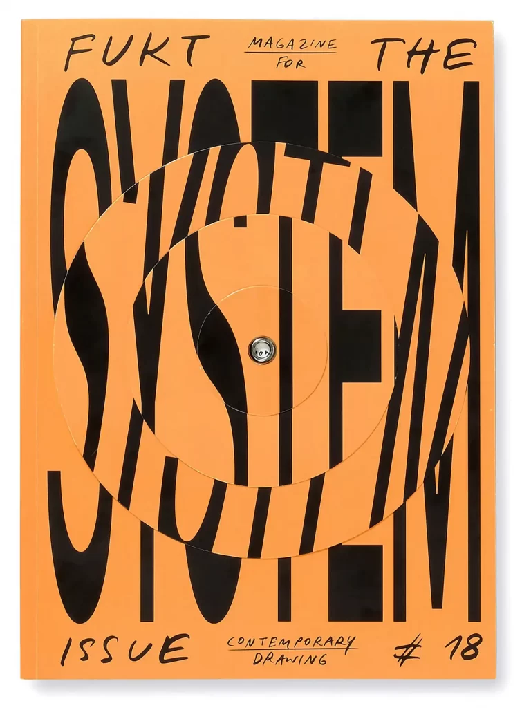
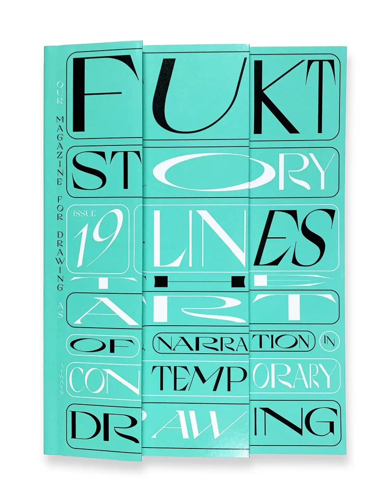
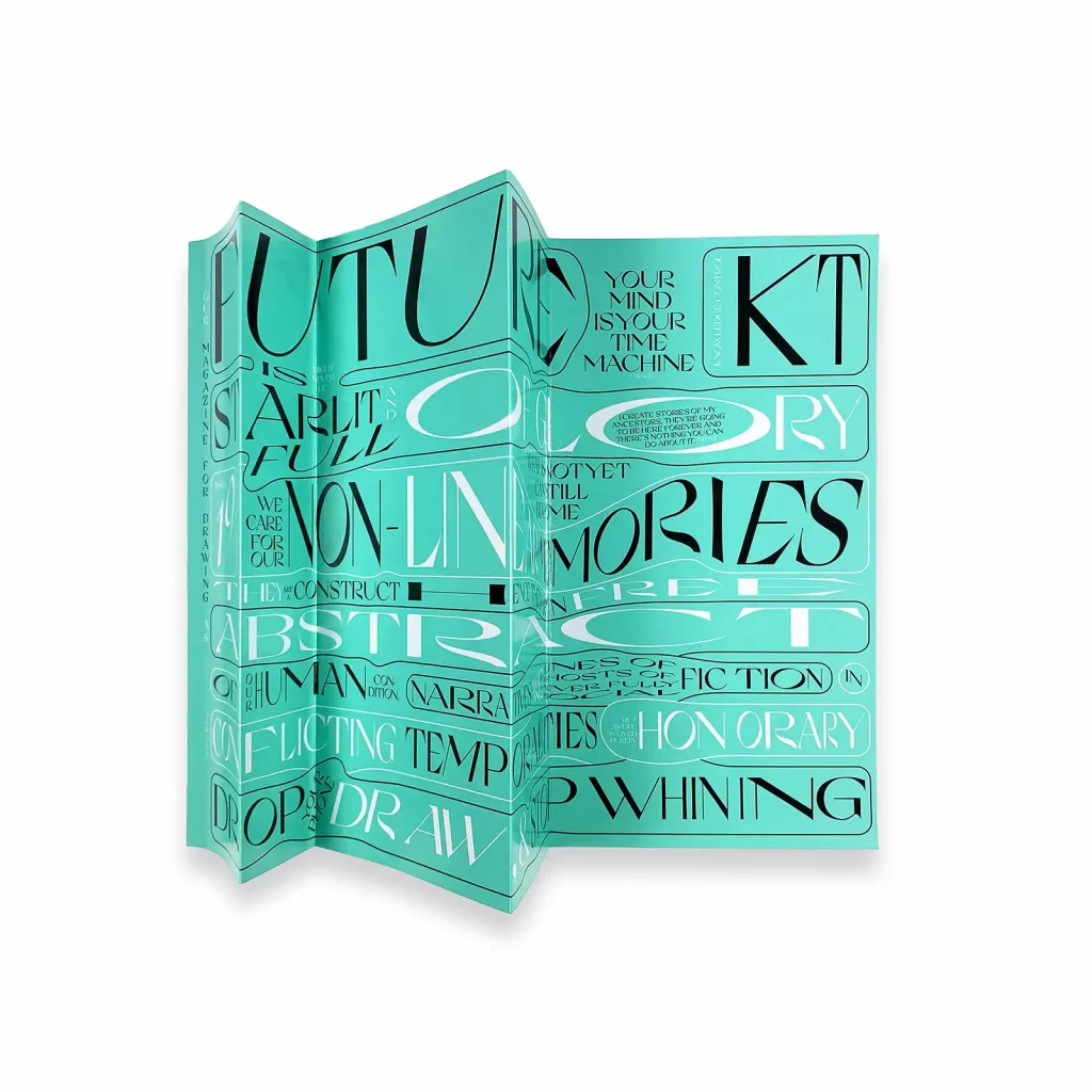
For around 15 years, you have also been designing the magazine Fukt, which focuses on contemporary drawing. Here, too, you experiment a lot with typography, but the covers often also contain interactive elements, such as a turntable or a fanfold, as in the current issue. What makes the project still exciting for you after such a long time, what can you try out or live out here that might not be possible elsewhere?
I have been designing this magazine for many years now and have gone different ways to achieve this. For some issues I have spent 3 weeks working on a set-up for a cover shoot, while others have been created in a few days. It always reflects what I'm interested in or what I want to try at that moment and as it changes, it can't really get boring. Whether that's hairy letters or live mice running through letters that were made of ink. For some issues I wanted to create a playful and interactive experience for the reader to find out if it works, how to do it and because it's just fun.
At one point we had chains attached to the cover that moved and changed the shape of the typography, or cardboard disks that could be rotated and dissected the title letters. Typography is clearly a toy here and for me the relationship between type and drawing is the perfect breeding ground for the design of Fukt. The covers themselves don't have to show drawings. Drawing tools can provide inspiration or objects reminiscent of lines or dots or movement created by drawing.
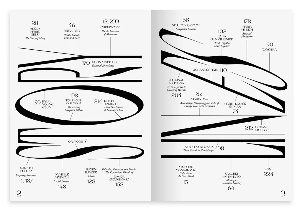
In terms of subject matter, it remained generally drawing for many years. In other words, the task was always the same. In a way, that's good - I could simply continue the series of free concepts for the magazine and pursue my interests undisturbed. But through the long period of getting a fairly broad view of contemporary drawing, we started to see focal points in the themes that artists were dealing with. This is one of the reasons why we have been highlighting one aspect of the medium with thematic issues for a few years now, for example "written drawings" in our text issue, erotic drawings, or systems used by artists in contemporary drawing as well as storylines - narrative drawings in our last issue.
Of course, this also determines the design. As Fukt Magazine is an independent project - my friend founded it - there is no control, criticism or input from outside. It is created without any specifications, wishes or pressure from customers. Easy and difficult at the same time, because customers often provide impulses that form a starting point. As everything is possible every time, it remains exciting. I am in no way suggesting that what we do at Fukt is unthinkable for customers. But in the event of failure, we are not accountable to anyone but ourselves, which is quite liberating and also makes it so special for me. Continuity and freedom are the perfect experimental set-up.
Many creative people have used the corona period for their own projects, was that also the case for you or is freelance work also part of it for you?
Those who had more time during the pandemic don't have school-age children in elementary school. I think the creative population has been divided into those with and without children during this time, with completely different perceptions of the last year and a half. A paradox emerged: while everything seemed to slow down and we supposedly gained more time through lockdowns and restrictions, the opposite happened at the same time. Between home schooling, jobs, family and trying to understand corona, there was no time to get into a creative flow. It seemed more like driving along an empty country road in 1st gear, you weren't allowed to shift up a gear or stop and get out.
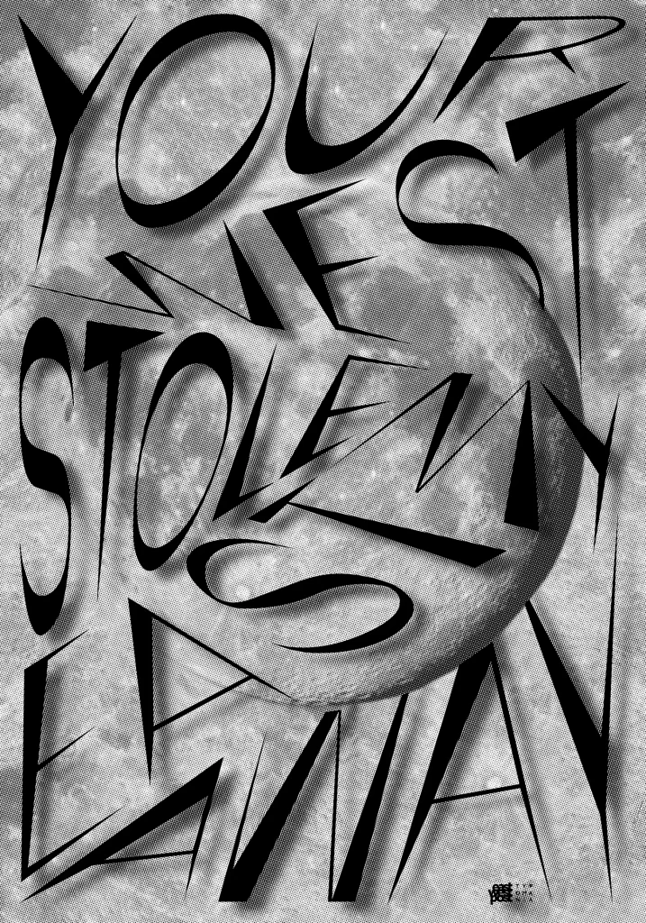
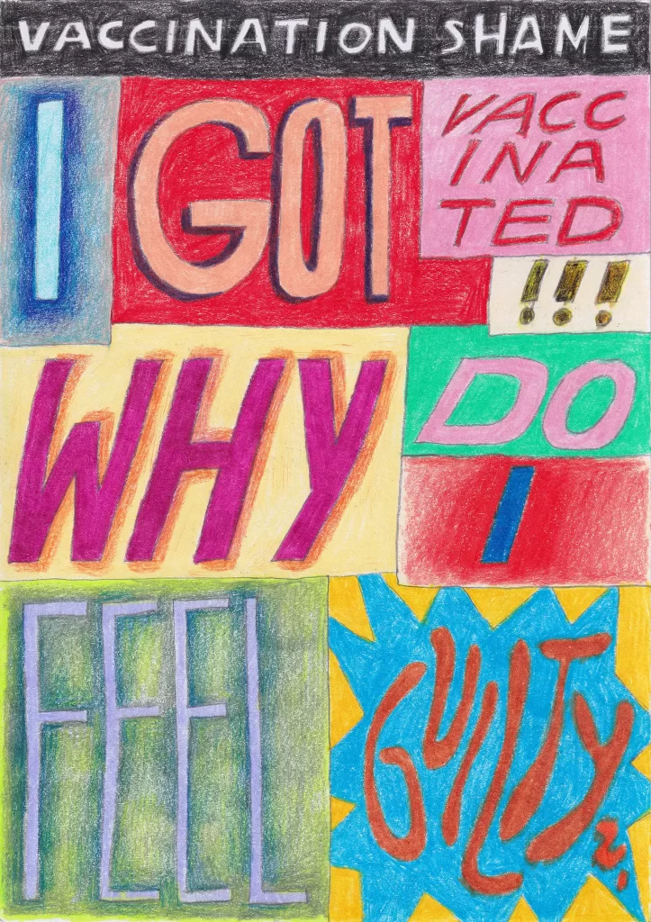
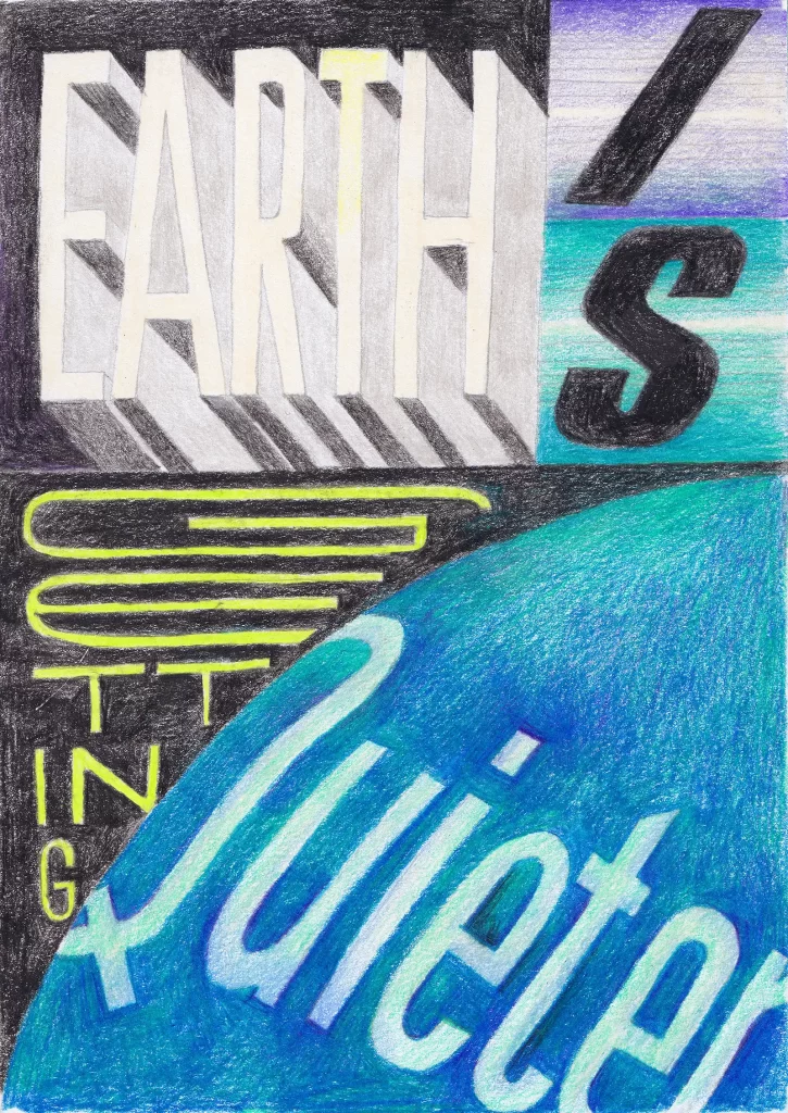
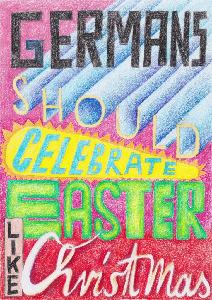
In addition to the ongoing client work, apart from the 19th issue of Fukt magazine last year, I "only" managed to complete a small, as yet unfinished series of typographic drawings: I collected absurd-sounding pandemic news items and turned them into typographic colored pencil drawings. These are messages that have become normal for us during this time, but which we will hopefully raise our eyebrows at some point because they sound like they come from a dystopian future, one that we could not have imagined. This series will probably only become more relevant once we've moved on and these messages are a thing of the past.
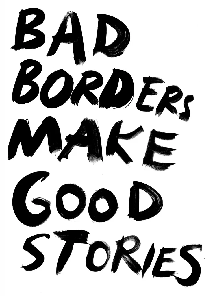
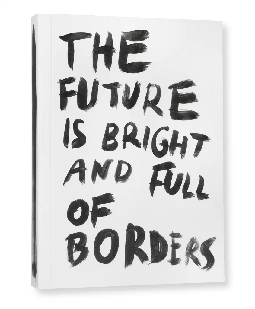
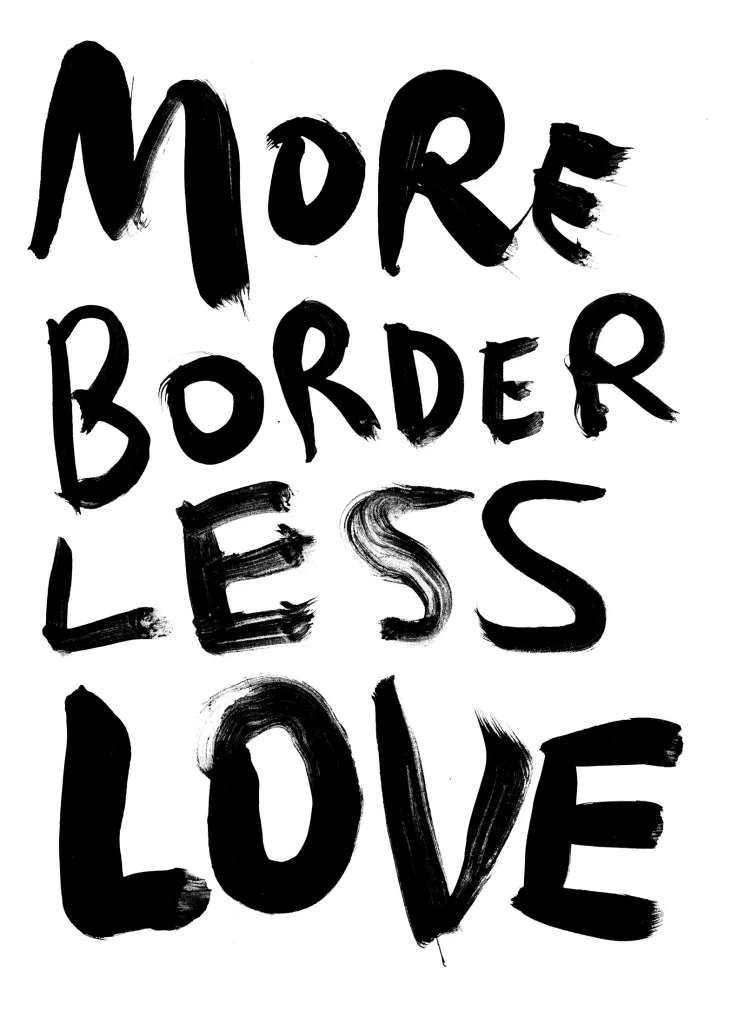
Unfortunately, I also have relatively little time for freelance work in my normal day-to-day design work, but every now and then I create something like my book of border quotes - rewritten well-known quotes on the subject of borders. At the same time, these free works are incredibly important. For a long time I didn't quite want to accept this, as I really enjoy working for clients and their various topics and thought "that's enough". But it's the only thing that can take you further if you do something without a client reference from time to time. It shows you your inner design compass most clearly, it's honest and direct, you have full control over it. Unexpectedly, this often leads to new assignments that are perhaps even better suited to you than the 25th assignment that relates to the previous 24. It's like a re-calibration, because continuous contract work can easily lead to you relying too much on familiar processes and previous designs, only doing the same thing and eventually becoming dissatisfied.
When life gets back to normal, what are you looking forward to the most, both professionally and privately?
I'm looking forward to being able to focus on other topics again as the situation eases. I find it incredible how one topic could dominate every conversation, both private and professional, for so long. Privately, of course, there is a noticeable relief, you can meet up with friends again without having to count on your fingers every time how many people from how many households are there. Museums, theaters, cinemas - we've had to do without all these things for too long. I can hardly wait to travel again, even though I can hardly imagine what it was like before the pandemic. A change of scenery and new things are essential to clear your head. Fortunately, I can't complain about the order situation professionally, and little has changed during the pandemic, as I keep in touch with my customers online a lot anyway, as they are spread out in different countries around the world.
But I hope that we can all plan more confidently soon, because planning also means imagining the future, fantasizing and asking ourselves "what if" questions. For all our love of 'living in the now', this is an essential process for creative work - and one that has been unexpectedly difficult to maintain recently.
The accompanying article on Ariane Spanier's work appeared in Grafikmagazin 04.21, in which we focus on "Typography" on 20. You can find lots of interesting and inspiring information about typography here ...
If you are interested in poster design, read an in-depth interview with poster designers Stephan Bundi and Fons Hickmann.

