According to Masihne Rasuli's experience, no subject polarizes as much as mathematics. During the research for her master's thesis, with which she completed her degree in Visual Communication at the Bauhaus University Weimar, she met many people who had always hated the subject at school. This is precisely why her project "Man störe mir meine Kreise nicht" is so refreshingly different. The now award-winning work can be read as a love letter to the humor and curiosity, the clarity and logic, the complexity and abstraction of mathematics.

In search of solutions
Why do we count? Why do we learn to count? What significance does this cultural technique have for humanity - and therefore not least for the world of design? Masihne Rasuli wanted to get to the bottom of these and other questions. Although she wouldn't describe herself as a math crack, she still took the subject in her advanced course. "I've always found science fascinating in the way it deals with questions and the creative thought processes it sets in motion in the search for solutions," says Rasuli. "Of course, the topic appealed to me in terms of design because there has been little visual language in relation to mathematics up to now, even though it has often been dealt with in popular science. In terms of content, I find it exciting how polarizing mathematics is, and that's exactly where I wanted to start - to arouse interest and even break down aversion with the help of visual communication."

Math in a creative context
She sees this translation and processing of complicated content as the task of communication design. From this perspective, it is almost incomprehensible that she chose a topic for her master's thesis that has so far received little attention from the design side, as many rules and processes in design practice can be traced back to mathematical principles. "In a design context, mathematics plays a role in very practical applications, for example in the design of a type area, certain rules of aesthetics, programming or when you simply have to calculate how much paper is needed for a book," says the communication designer, who now works as an artistic assistant at the "Image-Text-Conception" professorship in Weimar.
Experimenting and failing
"In a broader sense, I would say that mathematical and creative solution processes are also more related than you might think at first. In mathematics, there is a lot of trial and error, experimentation and failure. You have to be able to think in many directions and act creatively - for example, by ultimately solving a number theory problem geometrically rather than arithmetically. The same is often true in design - with the distinction that in mathematics there is ultimately a clear right or wrong and in design there is room for interpretation." The ability to think abstractly and thus simplify content or make it more manageable is also required. A certain tenacity is also what connects good designers and mathematicians in their search for an optimal solution.
"Hard nuts"
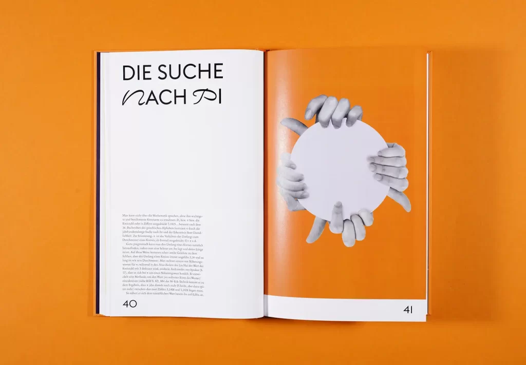
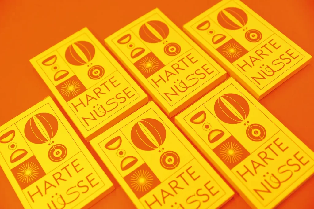
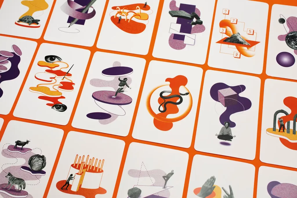
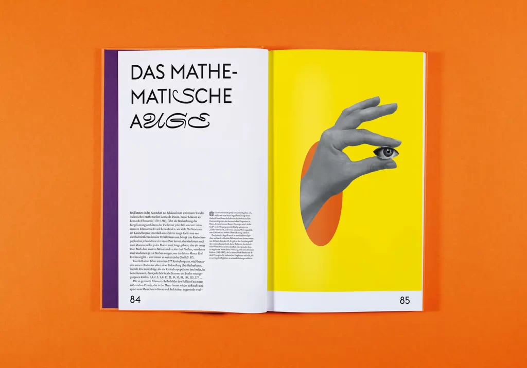
"You don't have to understand mathematics down to the last detail to succumb to its fascination," says Masihne Rasuli. The approach of her master's thesis was therefore to present the history of mathematical science in a completely new light. The central narrative is a publication that marks important milestones in mathematics. Its surprising narrative form makes it accessible and brings to life the absolutely curious geniuses behind the respective achievements; she wrote all the texts herself. Collaged illustrations make reading easier, and mathematical graphics also serve to better convey the history. The illustrated card set "Harte Nüsse" (Hard Nuts), which brings together 23 well-known mathematical paradoxes, amusing puzzles and absurd phenomena, was created as an additional interactive element.
Design details
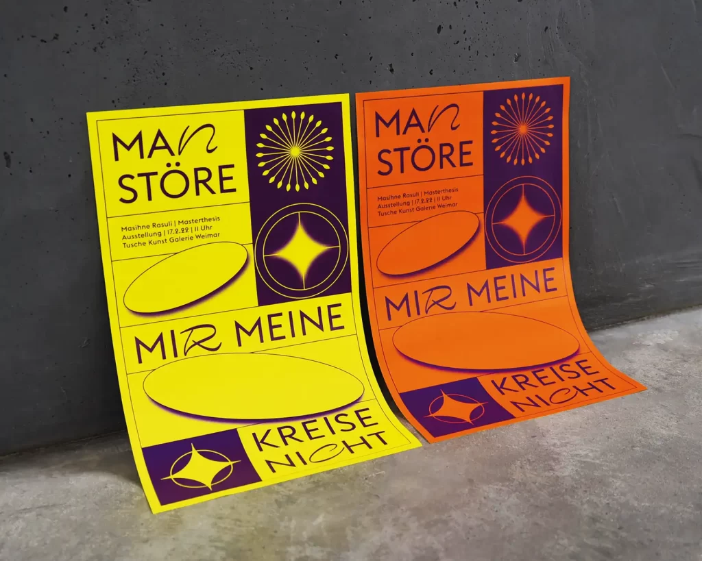
"In terms of design, I wanted to take a path that contrasts with the existing popular scientific literature on mathematics," says Rasuli. She opted for a concise, bright color scheme and illustrative elements that sometimes appear humorous, sometimes surreal. When choosing the typeface, she opted for fonts that reflect the rational, straightforward and fantastically creative characteristics of mathematics. With Euclid Flex, a beautifully geometric font by Emmanuel Rey, and the curved, extra-wide monospace font Nostra Stream by Lucas Destroix, she achieved this desired typographic interplay fabulously.
These design details are particularly accentuated by the screen printing process on high-quality paper from the Gmund Color series, which she used for the individual components and the packaging. "I wanted to avoid a childish appearance at all costs, because the story is primarily aimed at an adult audience who may have lost touch with mathematics since school or have always felt aversion to it," she explains.

The origin of the title
Incidentally, the saying "Don't disturb my circles!", which became the title of her work, is attributed to the Greek inventor, mathematician and physicist Archimedes. He was the first to give the number pi a mathematical name; it is needed to calculate the area of a circle. He was presumably approached by the Romans, who conquered Syracuse, a coastal town on what is now Sicily, in 212 BC. Archimedes, soon to be an old man, was busy drawing geometric figures in the sand when they tried to capture him. The rest is history.
Click here for Masihne Rasuli's Instagram account


