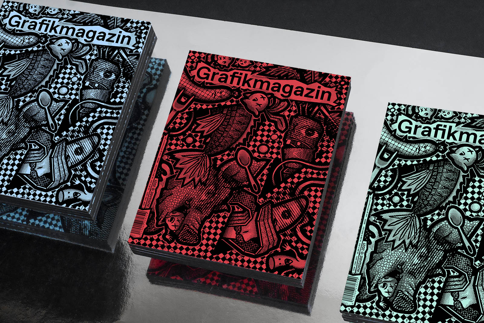
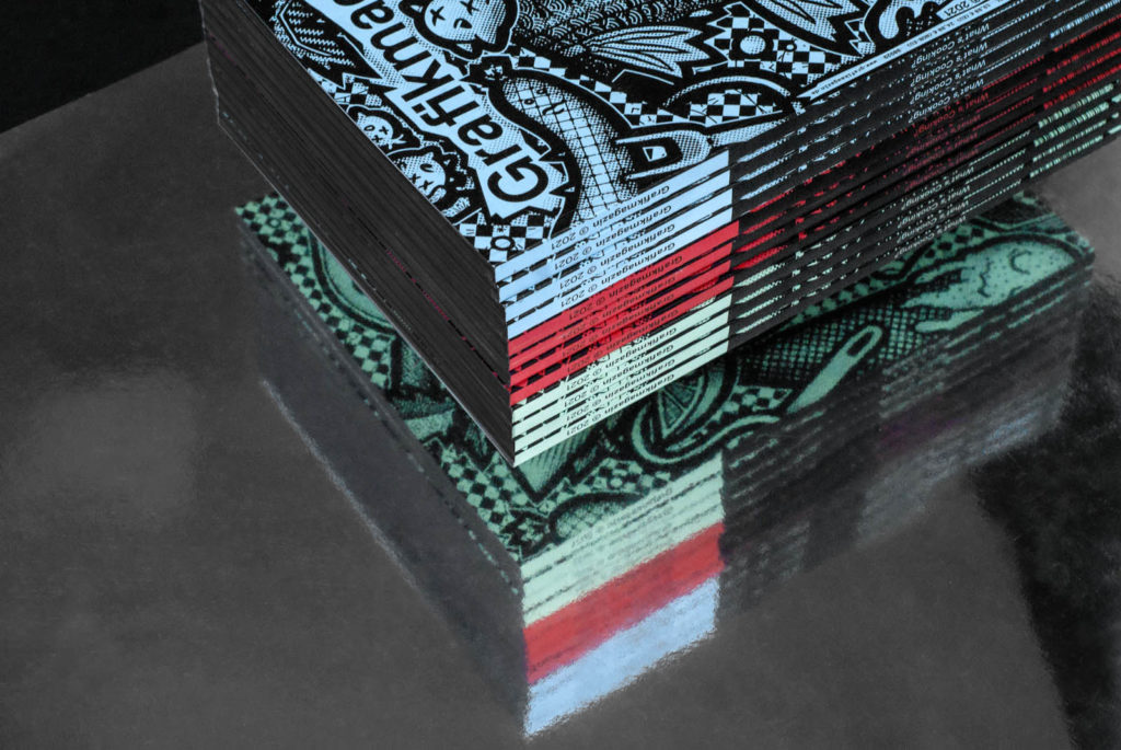
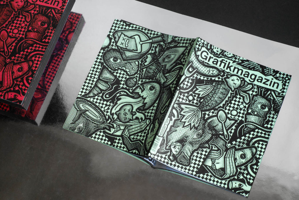
Between punk and wooden spoon - "What's cooking?" is the motto of the third graphic magazine, and the cover alone shows that this issue is a real party. Dutch street art duo SOGO have skillfully staged the food theme with humour and a sharp pen, while three paper colors and a black color cut provide the finishing touches. In Grafik+ you can look forward to unusual restaurant concepts, bold visuals, food design and gastronomic publications. Grafikmagazin 03.21 is a visual feast for the palate from the first to the last page.
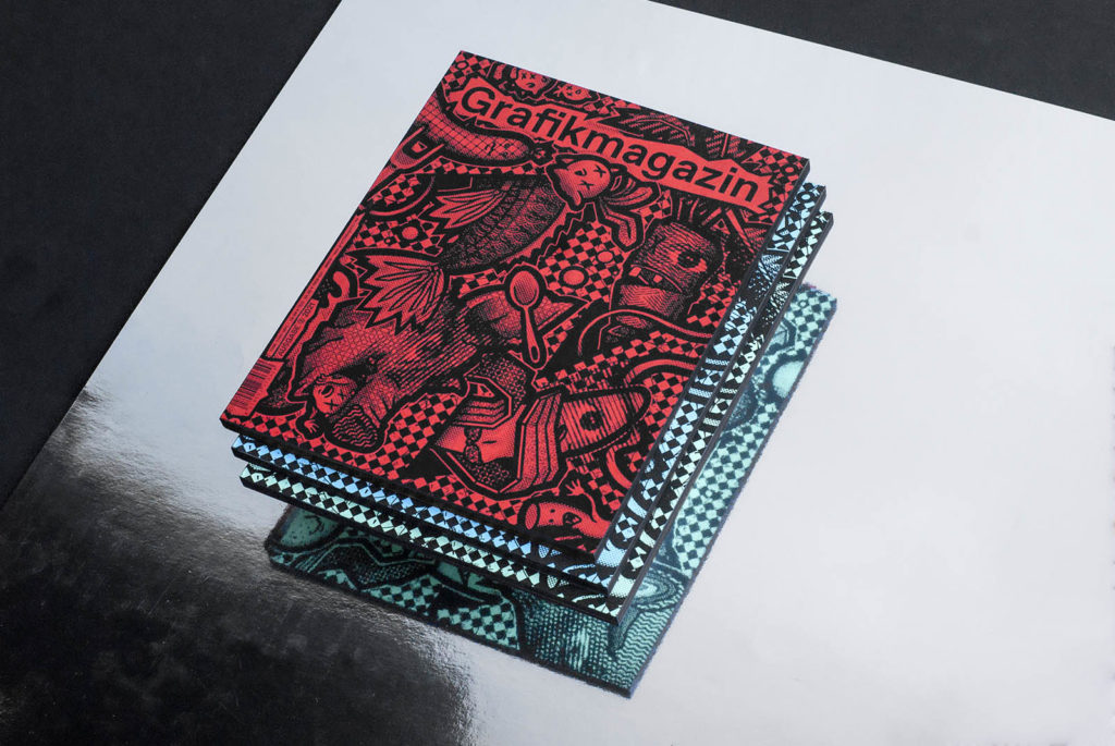
It is not only the cover of this issue that is colorful and diverse, the topics in the magazine also cover a wide range. From young Chinese photography to the craft of typefounding, from eye-catching posters and outstanding type design to a remarkable appearance for the waste collection service - the Grafikmagazin shows creativity and inventiveness at their best.
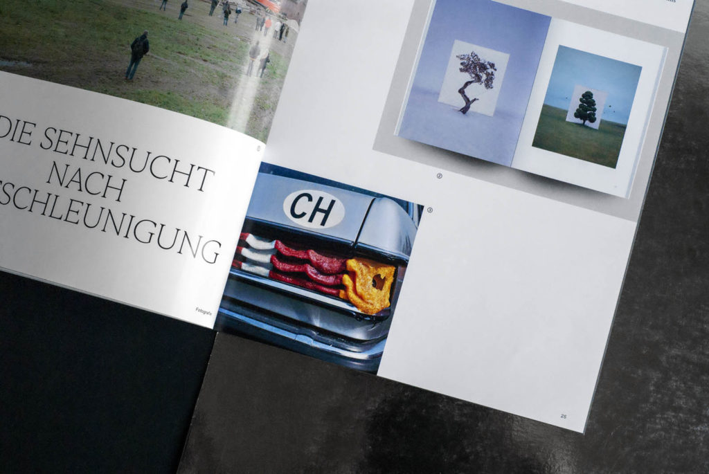
The content
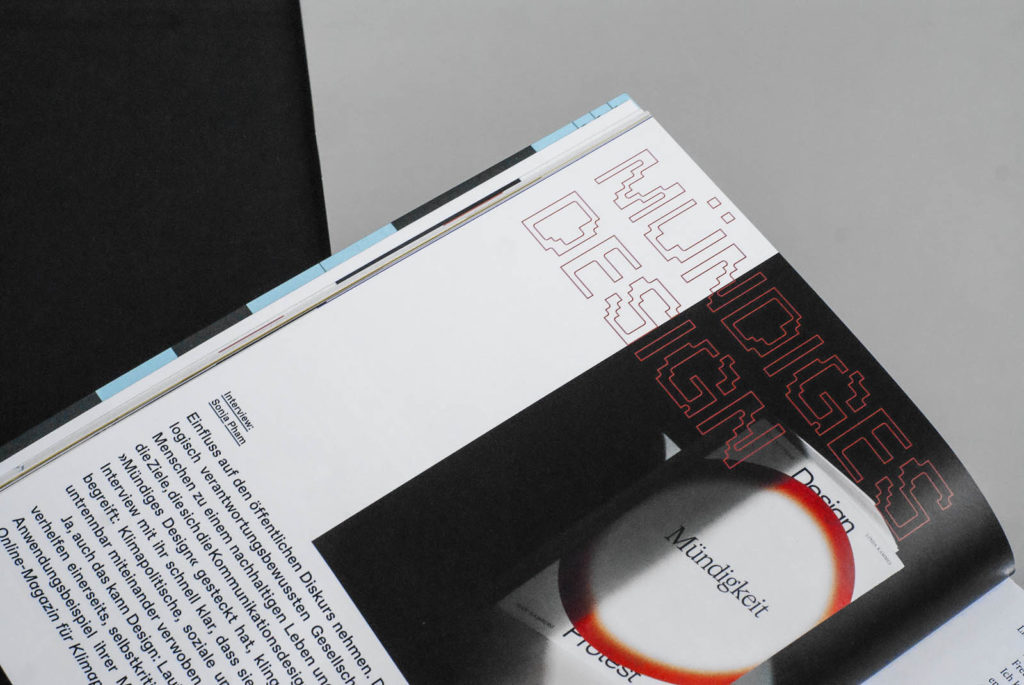
Happiness Machine - sounds funny, but the name actually refers to a graduation project that puts our consumer behavior to the test in a way that is as bizarre as it is intelligent. Our "Design & Research" section is also about responsible design, participation and how to present sustainable packaging. Sylvia Lerch is dedicated to the last type foundry and we asked the Missy Magazine design team what feminist graphic design actually is.
In Grafikmagazin 03.21, we focus on the topic of "New Work". We took a look behind the scenes at our colleagues at Neue Narrative magazine to find out what appreciative and non-hierarchical working can look like. At Studio MAD, a personal stroke of fate led to a new course being set in terms of work. Sebastian Waters' touching story shows how difficult it is to get rid of old habits, but how beneficial change can be for everyone.
"What's cooking?"
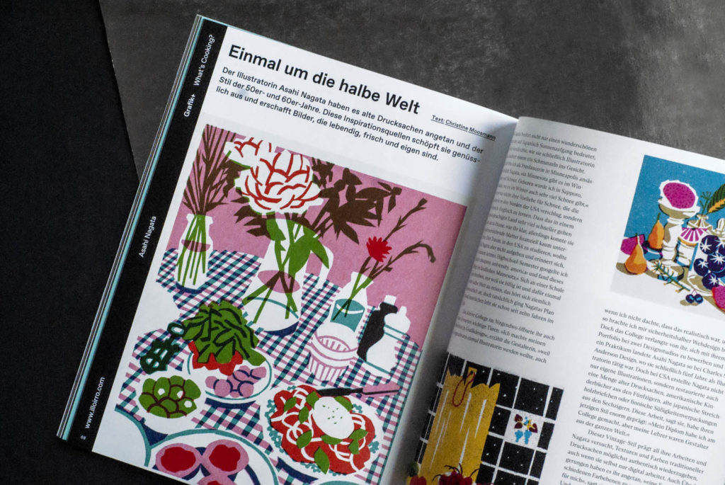
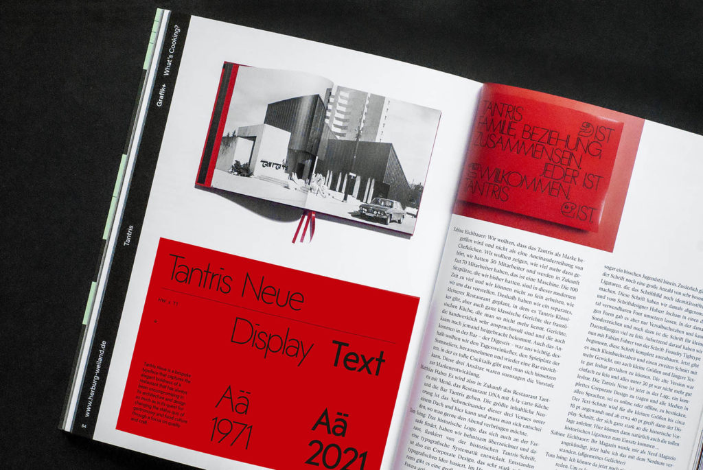
This issue of Grafik+ is all about food and gastronomy. Not only has a new concept been developed for Tantris, the legendary Michelin-starred restaurant in Munich, but a corporate typeface has also been designed. We spoke to owner Sabine Eichbauer, Executive Chef Matthias Hahn and designer Tom Ising about the new Tantris. The Austrian restaurant Mraz & Sohn also knows its way around fine dining, but the new look takes a completely different and very unconventional approach. Food illustrations that invite you to feel good are created by Asahi Nagata from the USA, sweet pieces of jewelry are created by Pars Pralinen and crazy chicken burgers are best enjoyed in Saudi Arabia.
You can find all this and many more visual delicacies in our "What's cooking?" feature
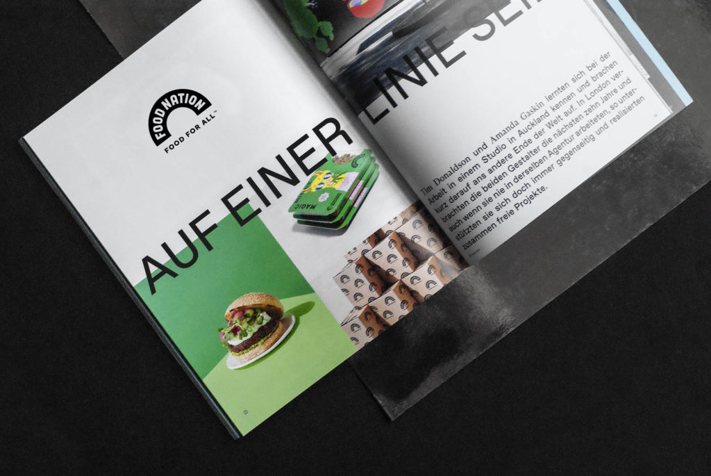
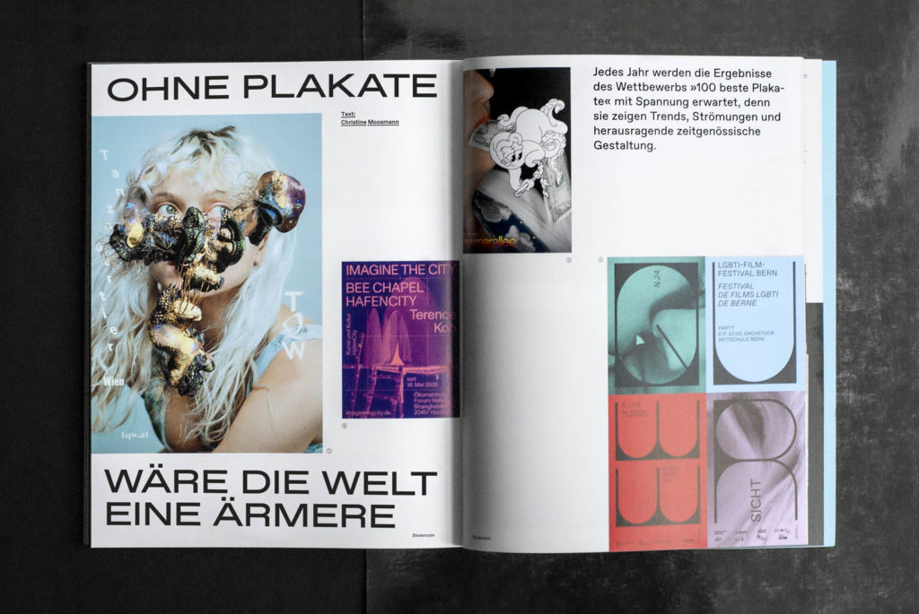
Showroom
In the showroom of Grafikmagazin 03.21, we introduce Swiss designer Dennis Moya Razafimandimby, who can't quite decide what he loves more: books or typography. In Auckland, on the other hand, we discovered the small studio Seachange, which likes to be colorful and unconventional, but always gets it right - whether its clients are restaurants, a composting plant or the local waste collection service.
The 100 Best Posters are once again impressive. We present the award-winning works from Germany, Austria and Switzerland and congratulate the dedicated team on the 20th anniversary of the competition. Last but not least, the trip goes to the Netherlands. Behind SOGO is a creative duo with roots in illustration and photography. Sophia den Breems and Gordon Meuleman not only create impressive murals but are also able to make excellent use of the small format of a cover.
Cover, paper and production
The work of Sophia den Breems and Gordon Meuleman is mostly character-based, so it was obvious to both of them that the characters for this issue had to be things that are eaten. No sooner said than done, and so the cover of graphic magazine 03.21 is now adorned with turnips, fish, sausages and pig's heads.
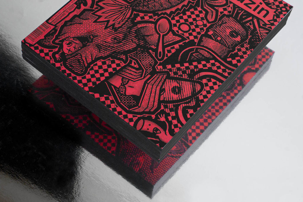
The highlight is that the creative minds were able to use the front and back and the motifs complement each other. As if there were slits in the paper, the turnip head appears on the cover, while its end protrudes on the reverse. There is also an interesting effect for which SOGO is known: if you look at the motif from close up, you can see the finest details; from a distance, a 3D effect is created.
The black color cut also contributes to the charm of this issue. It corresponds with the cover illustration and makes the booklet look like a single piece. It was masterfully realized by the Mayer bookbindery.
Finally, the paper is the proverbial icing on the cake. In this issue, we used Pergraphica from Mondi (distributed by Igepa) in the evocative colors Hopeful Green, Calming Blue and Charismatic Red. So, which type are you?

Have we aroused your curiosity? Then go to the store quickly and look forward to receiving your own copy of Grafikmagazin 03.21 in just a few days
And if you missed the first issues of Grafikmagazin, it's worth taking a look here too !

