(Advertisement) What makes the iF Awards so extraordinary is their versatility. In addition to all the exciting categories, there is also a category that is particularly close to our hearts as proven print aficionados: book productions with a love of detail, realized with dedication.
Application Book Capital of Culture
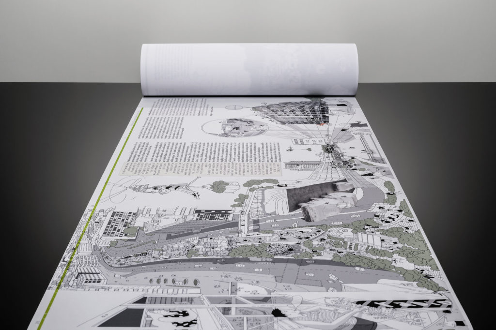
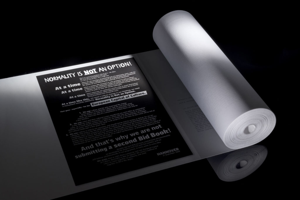
Although Chemnitz was ultimately chosen, Hanover had a good chance of becoming the Capital of Culture 2025. To win the coveted award, the city would have had to prevail against seven other applicant cities at national level. In such an evaluation, it is crucial that it is about a city's visions and plans for the future. It is not what a city already has that is decisive for the jury, but how it can develop with the help of culture as a tool.
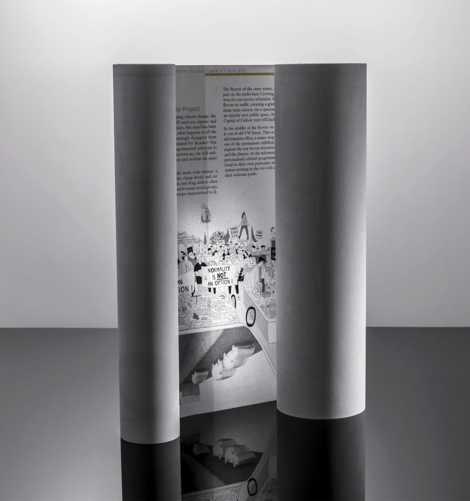
Well, with this book, which was quite rightly honored with the iF Award, Hanover took a couple of capable steps towards the future: How would one look at the present in the future? The design process of the agency peetz & le peetz design began with a question: "Why and since when has mankind been writing - what were the first books?"
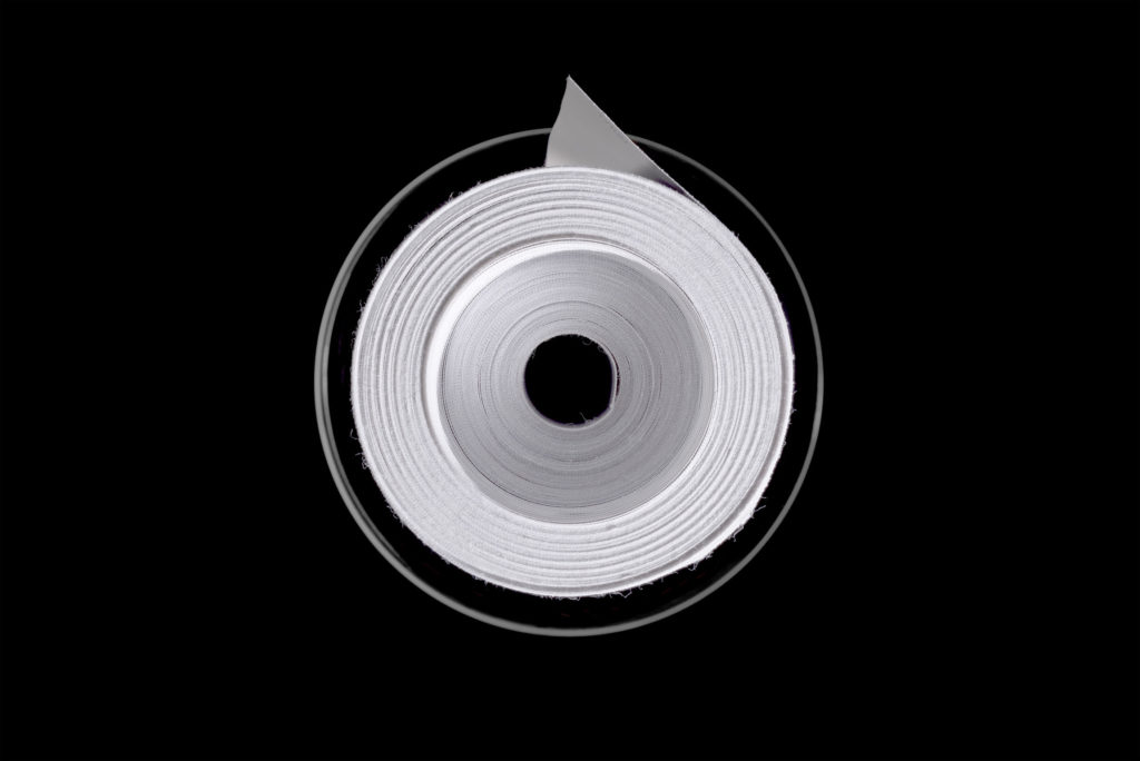

The paper should be strictly 100 pages in A4 with 10pt font. So why not link everything? Art director Sebastian Peetz wove text, various commentary boxes from the future, graphics and illustrations into a book artwork no less than 21 meters long. Layout boundaries were constantly questioned and redefined. The scientific time capsule with landing code was protected during the long journey in a pneumatic tube. Even if it didn't make it to the Capital of Culture: The agency will be mighty proud of this result in the future too...
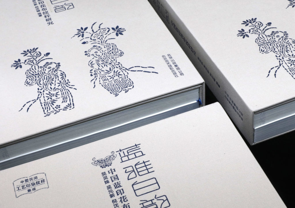
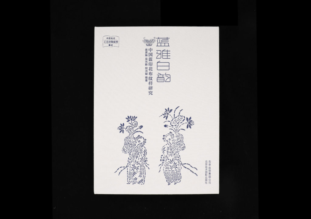
Lan Ya Bai Yun
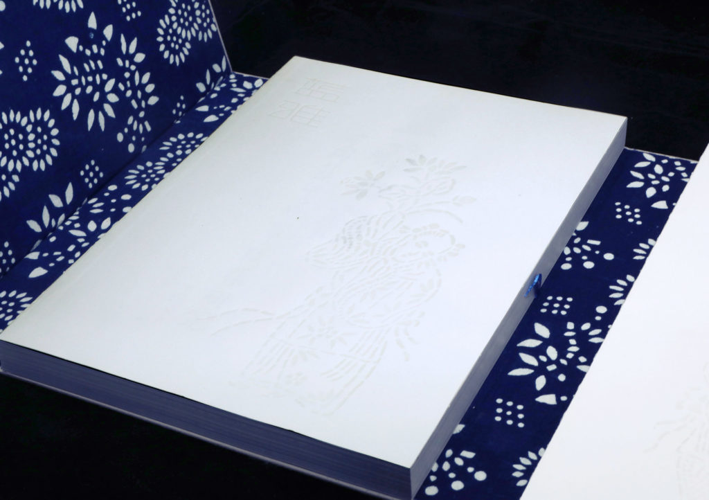
Blue Calico is a centuries-old craft. Mastering it requires discipline, talent and incredible patience. That is why this book can be regarded as Wu Yuanxin's masterpiece: The master craftsman and and national inheritor of the Blue Calico technique spent five years in 21 provinces, cities and autonomous regions. There he collected research results going back many years and researched for this book series. It integrates printing and dyeing patterns of sophisticated Chinese handicrafts.
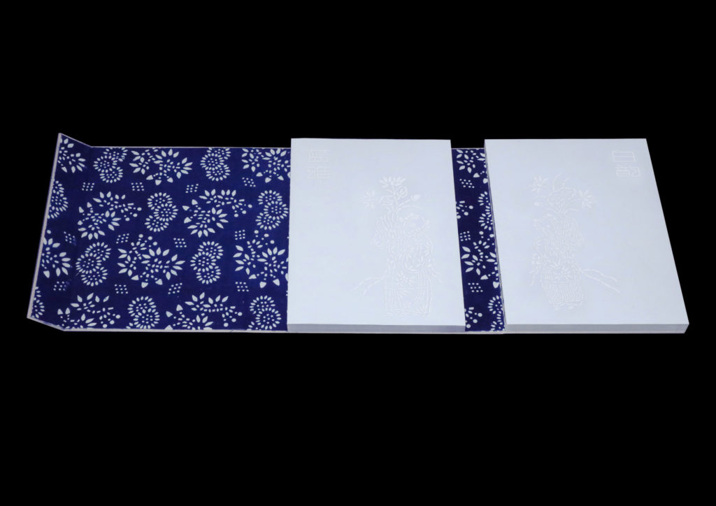
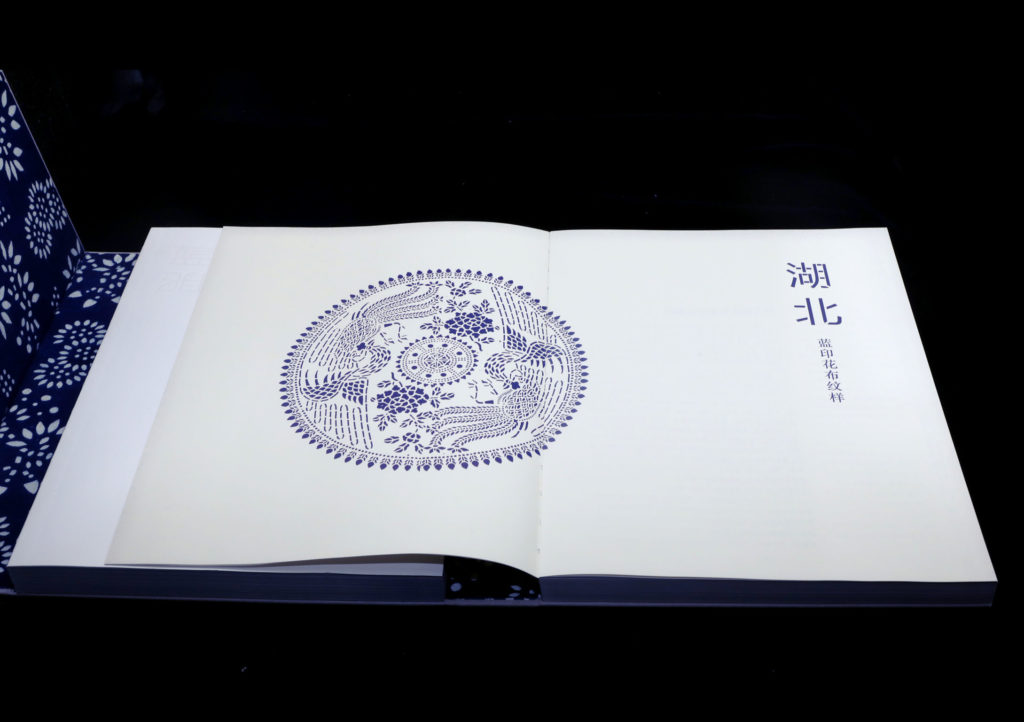
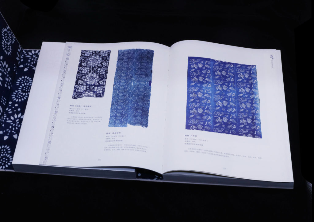
The books, which were produced by the Sun Design agency in Beijing, document and explore - one could even say restore - the technique with which Blue Calico was used. The images and text demonstrate the mystery and charm that surrounds the Chinese blue dye. In the history of art, Blue Calico stands for wisdom and artistic aesthetics. The craft itself has been passed down through generations for thousands of years.
GreenLeader notebook
Zhejiang University of
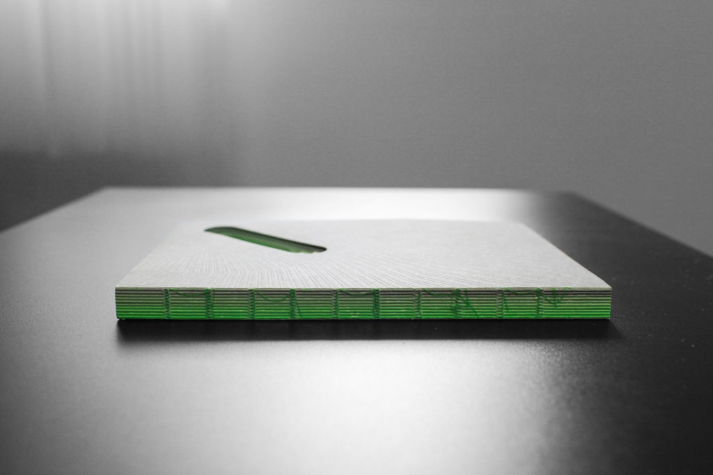
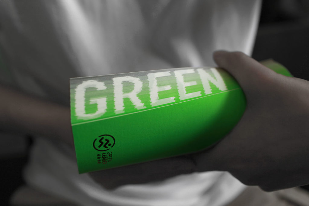
Finance & Economics made a special wish come true with the "Green Leader Program" notebook. The certification body for China's green furnishing brands, Red Star Macalline, wanted a conference gift that reflected its mission. They wanted to convey the concept of an environmentally friendly home to their guests. For this reason, the responsible design director Jianhua Dong developed the idea of gradients as the core concept.
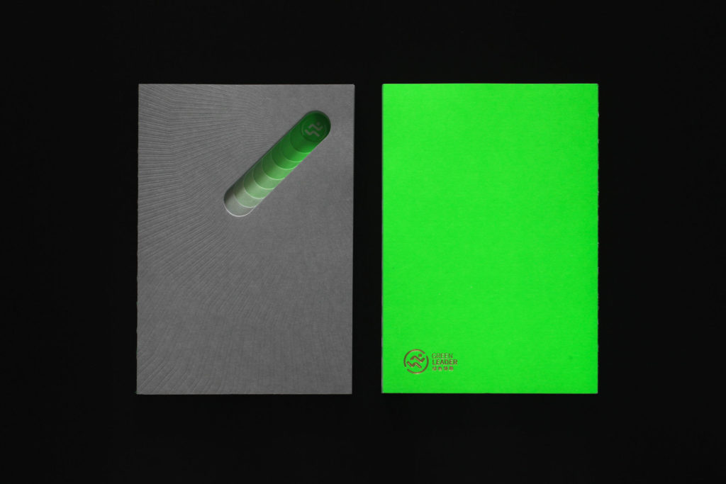
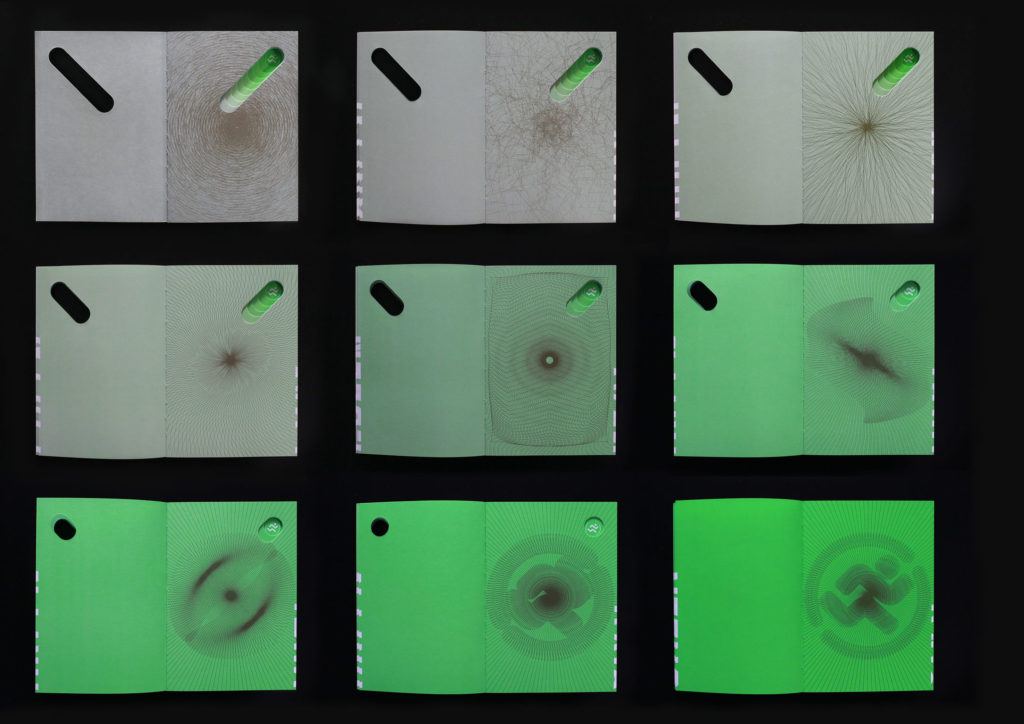
The colors run from green to grey. The reverse side can be seen through its own stepped structures. The designer says: "Using the perspectives of graphic gradient, color gradient, spatial gradient and structural gradient, we explain the gradual transition from chaos to order." As the world becomes ever greener and more environmentally friendly, order is gradually being brought to chaos - a beautiful thought!
Traditional Tile Patterns in Taiwan
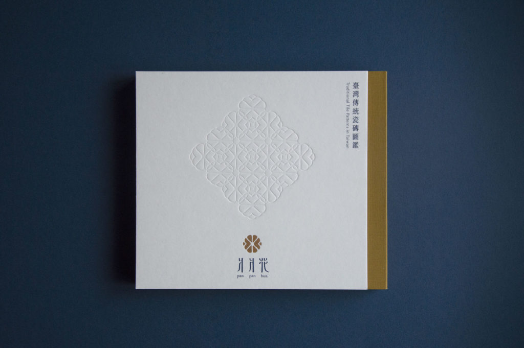
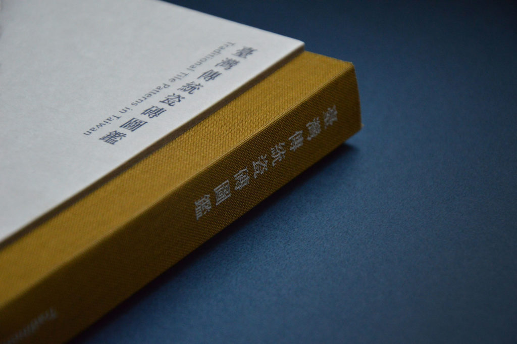
Taiwanese tiles: Without this distinction from the iF Awards, we in the editorial team would probably never have googled it. And yet they have a long tradition in the island state to the east of China. Artistic tiles are still used in interiors, developed in collaboration with Taiwanese ceramic artists. They are inspired by traditional designs, which are often made in floral shapes and create a large, coherent pattern. In many buildings, they flow around entire wall surfaces, including all the curves and curves. This book introduces four types of traditional Taiwanese tiles from the 1920s to the 1980s, recording and cataloging them according to their shapes and patterns. The first part of the book contains the relevant history of the tiles with photographs taken by the authors throughout Taiwan.
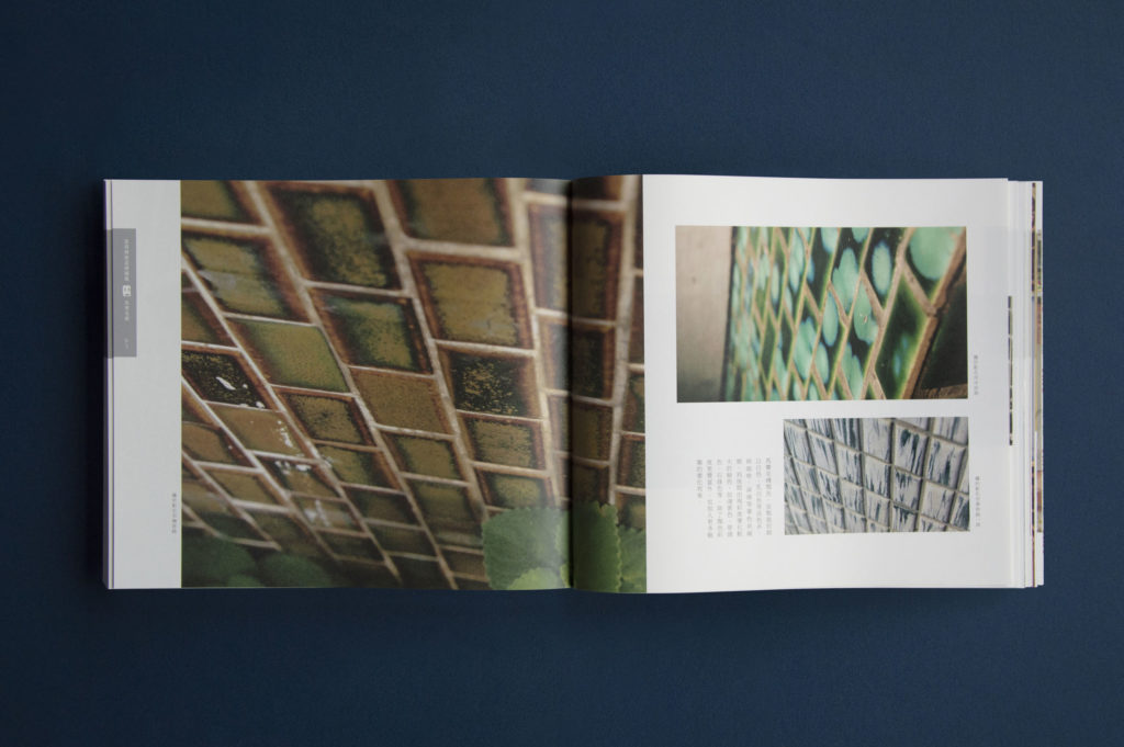
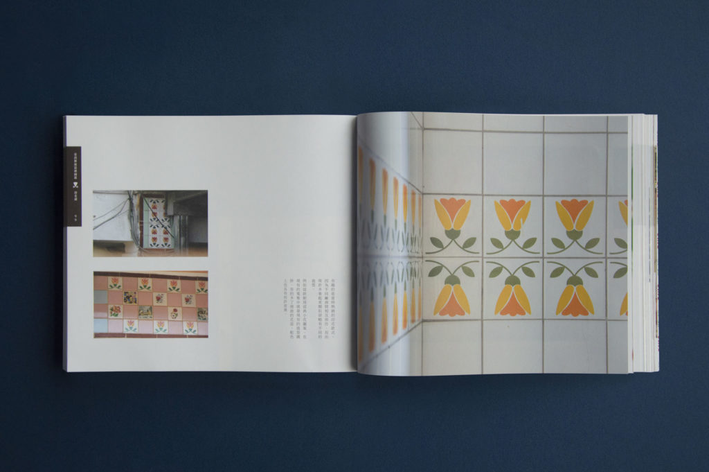
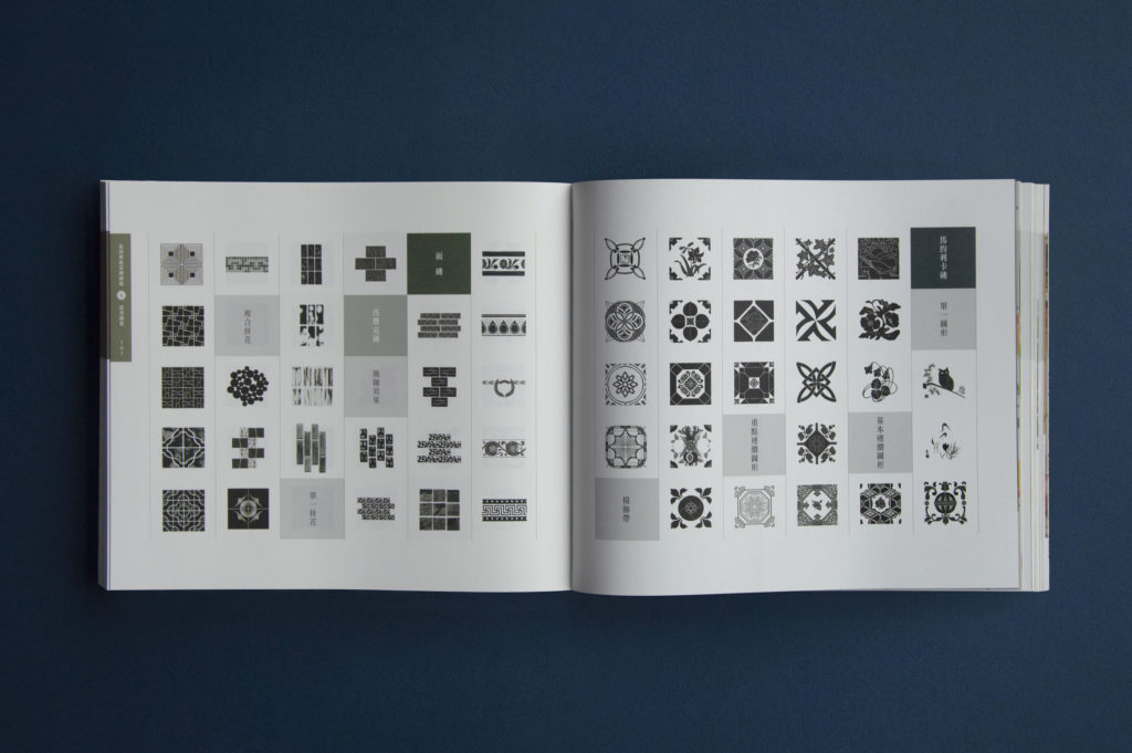
The second part offers 100 featured tile patterns that have been redrawn by the authors and provided with a Pantone color guide. So these fantastic tile patterns can be used for personal or commercial purposes. The aim of the book is to preserve the spirit and appreciation of traditional tiles through their reinterpretation and reproduction.
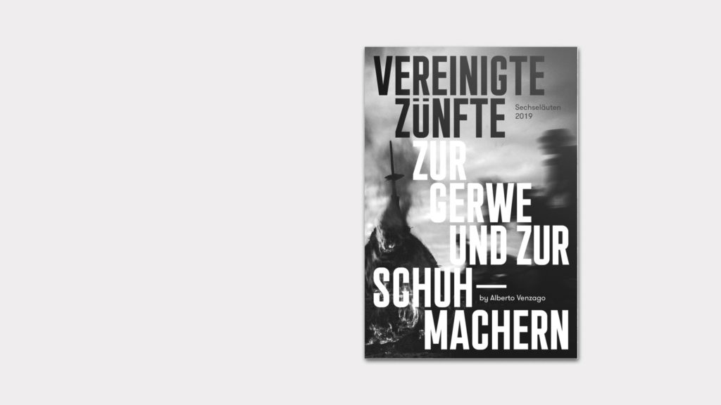
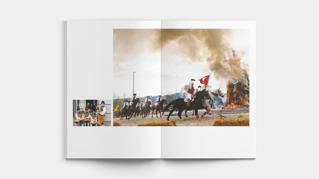
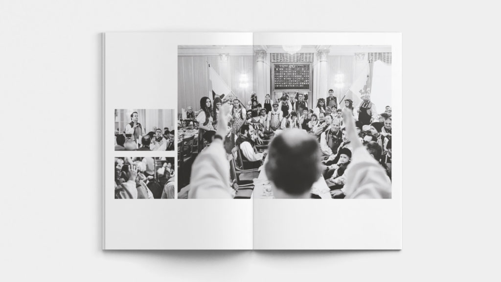
Sechseläuten 2019 by Alberto Venzago
Sechseläuten is a traditional Zurich event from the early 20th century. It combines traditional elements of carnival and spring festivals with the parades of the guilds. The absolute highlight of the festival after the guild parade is the burning of winter in the form of the Böögg, a snowman figure prepared with explosives.
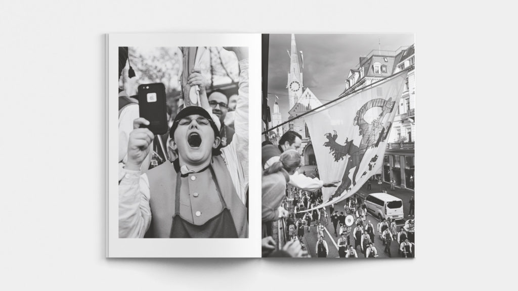
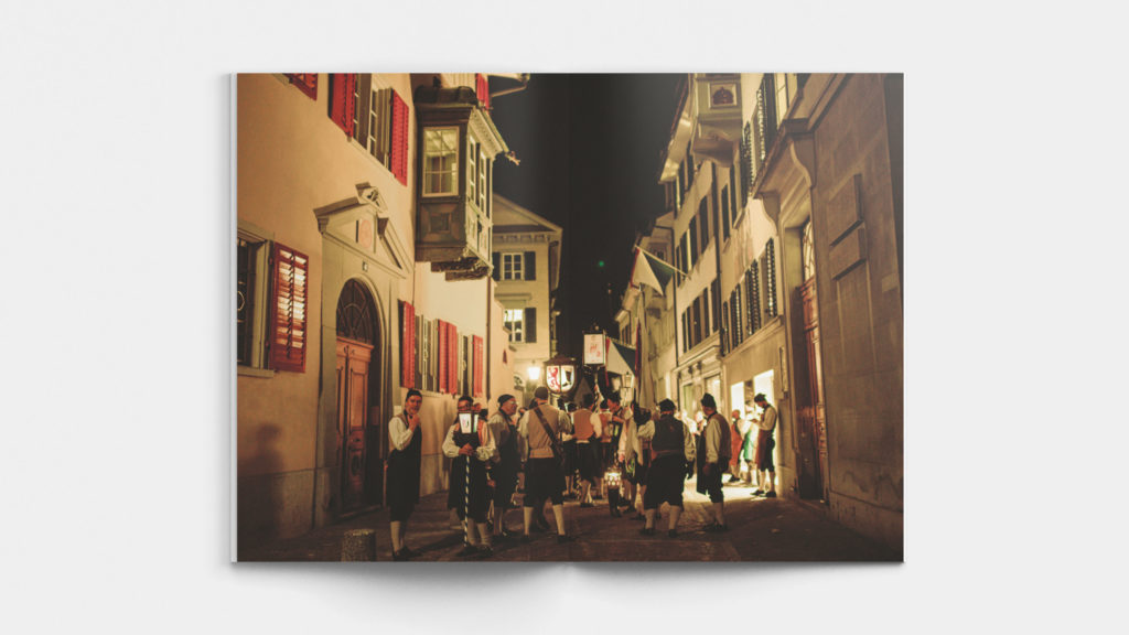
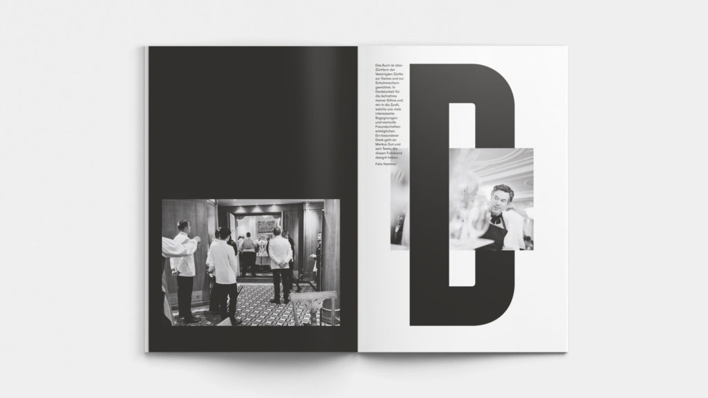
This year, the "Vereinigte Zünfte zur Gerwe und Schuhmachern", one of the participating guilds, commissioned the well-known Swiss photojournalist Alberto Venzago to produce a visual history of the event. Venzago's photo reportages have gained international recognition, covering topics ranging from organized crime in Japan to the revolution in Iran. However, he also saw an appeal in Sechseläuten, resulting in impressive images that were compiled in a high-quality book and lavishly produced by the Farner Consulting agency from Zurich. Although the 2020 event was unfortunately unable to take place due to COVID-19, it was all the better that the book was published on time for Sechseläuten in the same year.
Click here for all categories and winners of the iF Design Awards.


