(Advertisement) Branding and communication campaigns from China: these iF Award-winning projects prove how enriching it can be to look beyond the horizon, beyond the European design canon.
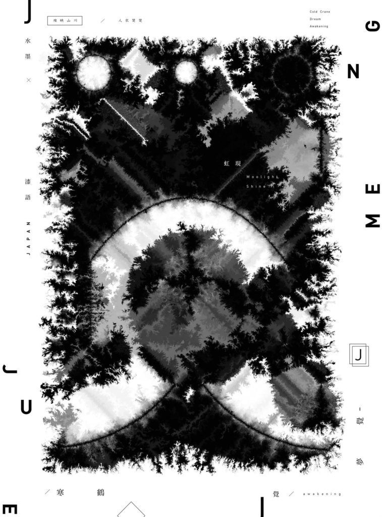
Hanhe Mengjue
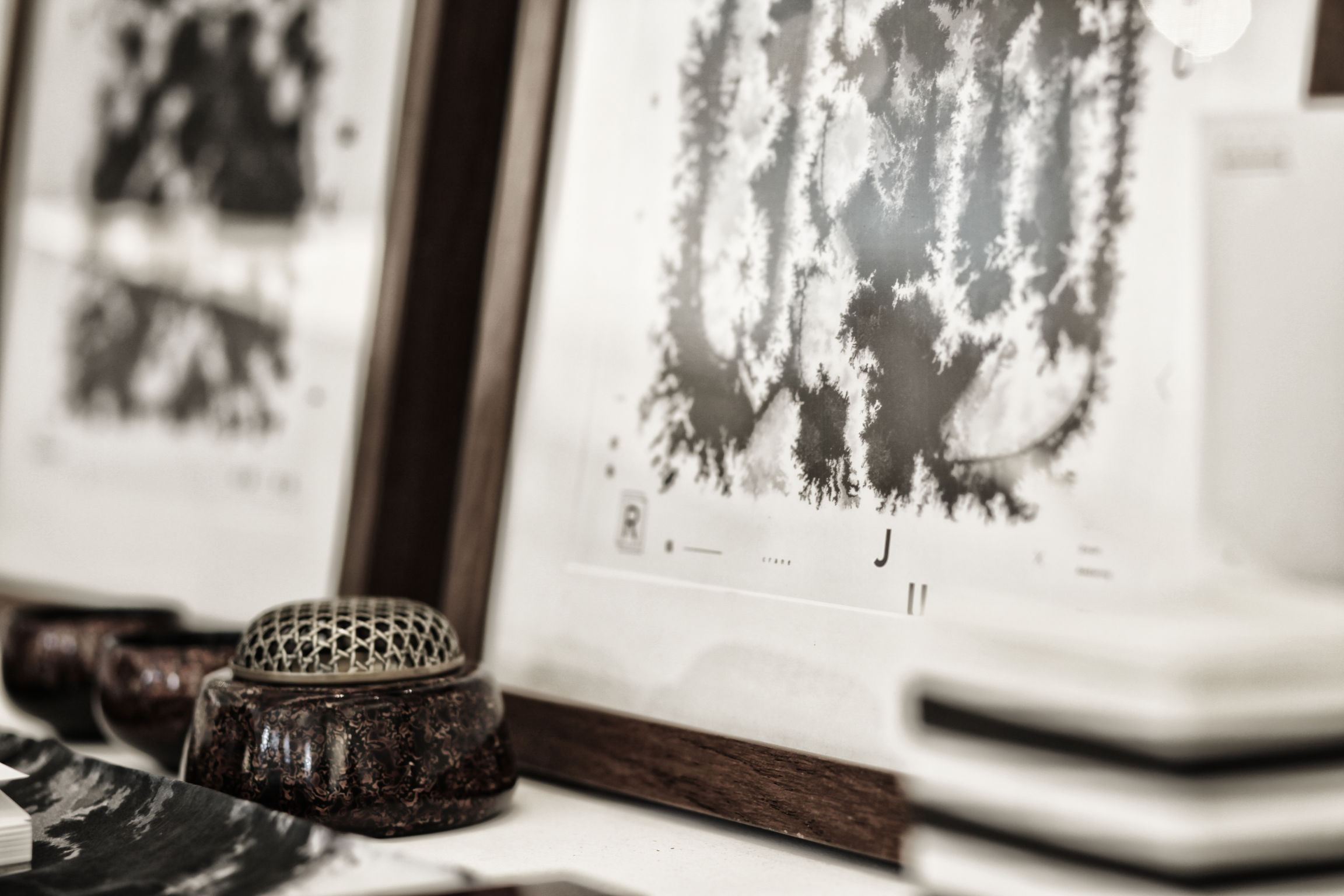
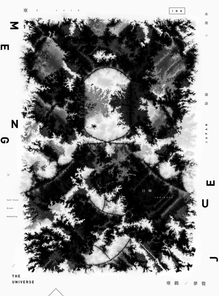
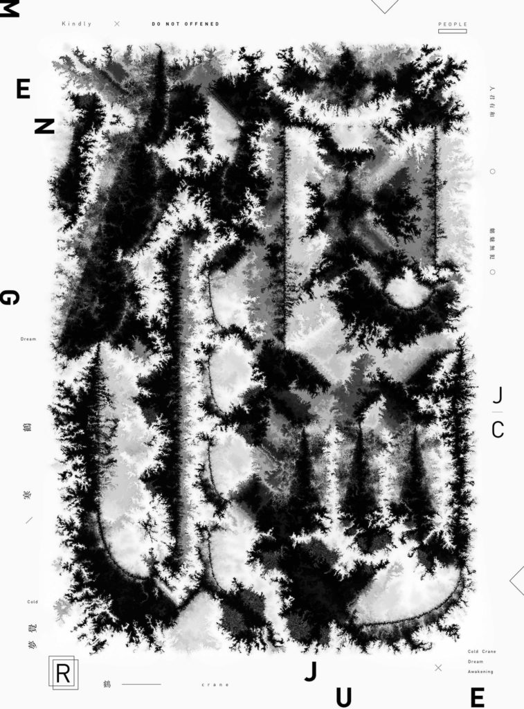
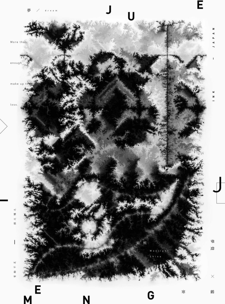
It is well known that the use of ink and ink has a long tradition in Chinese history. Calligraphy is considered an art form and is closely related to painting. The so-called "Four Treasures of the Scholar's Room" are used for both: the writing brush, bar ink, a rubbing stone and paper. The visual image design "Hanhe Mengjue" combines traditional Chinese ink painting with Japanese lacquer art and creates a visual language that is also intended to express a transformation in design.
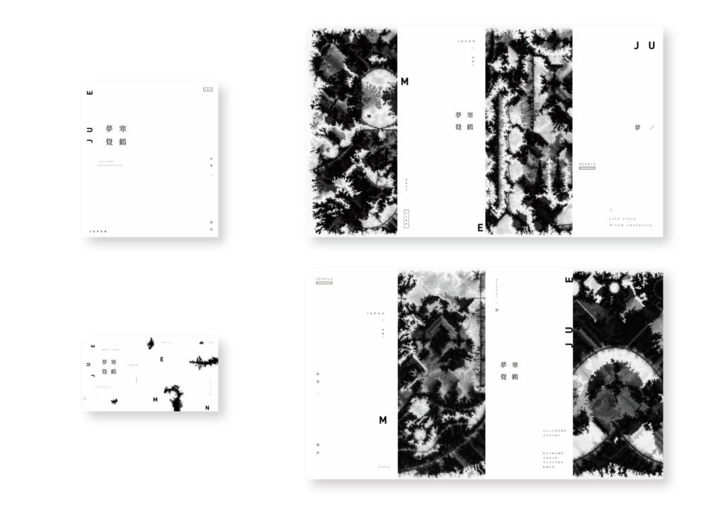
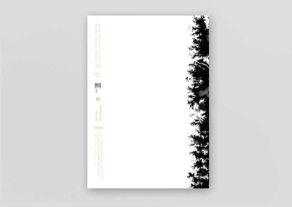
On a symbolic level, "Hanhe" refers to the older generation of society, whereas "Mengjue" refers to the spirit of contemporary awakening. This metaphorical integration of the traditional ink painting language with modern lacquer art represents a fusion of time-honored culture and contemporary visual design.
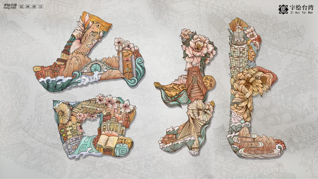
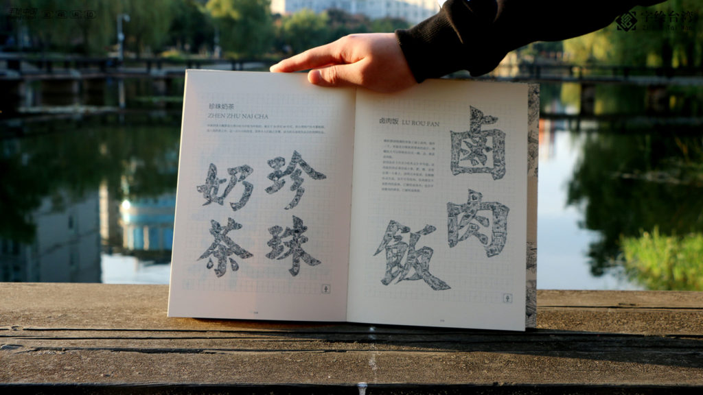
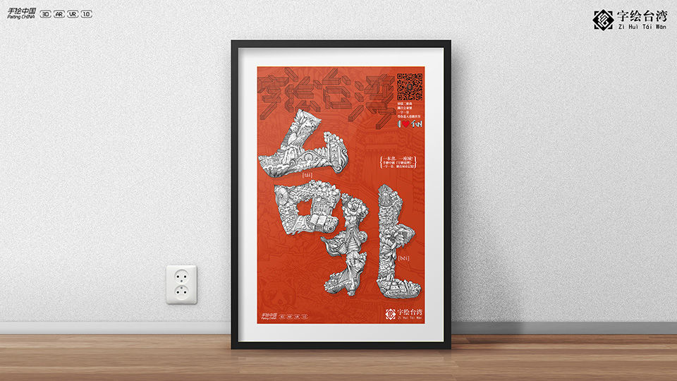
Hand-Drawn China series: Taiwan in Chinese Characters
Responsible for "Hand-Drawn China: Taiwan in Chinese Characters" are the designers Xu Zhengbing and Shen Juan from the agency Wuhan Guan Shanjue Culture Media, who produced the work for the art publisher Hubei Fine Arts Publishing House. The series brings together the creativity of art talents from both sides of the Taiwan Strait between the Chinese province of Fujian in the west and the island of Taiwan in the east, which connects the East China Sea and the South China Sea.
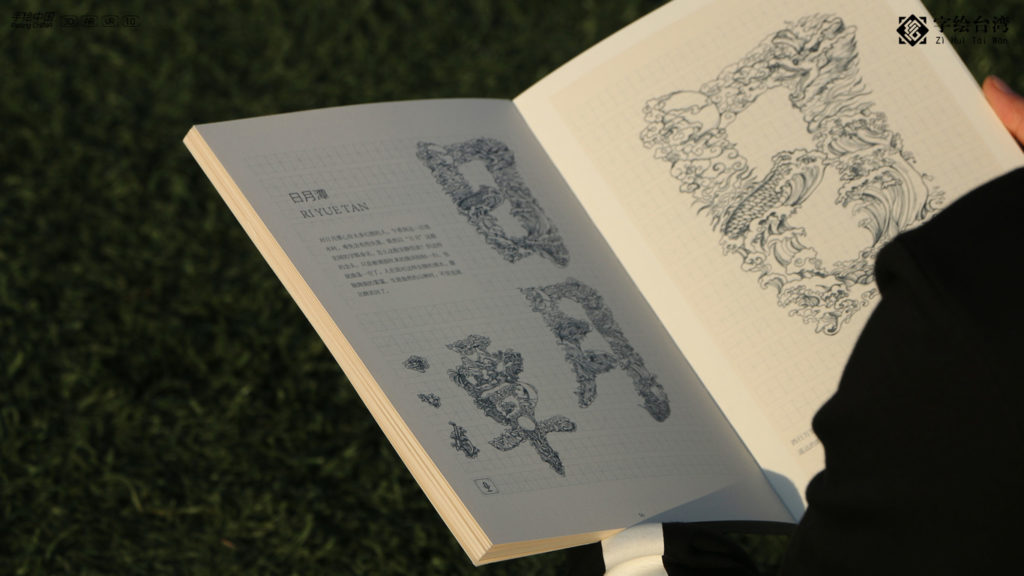
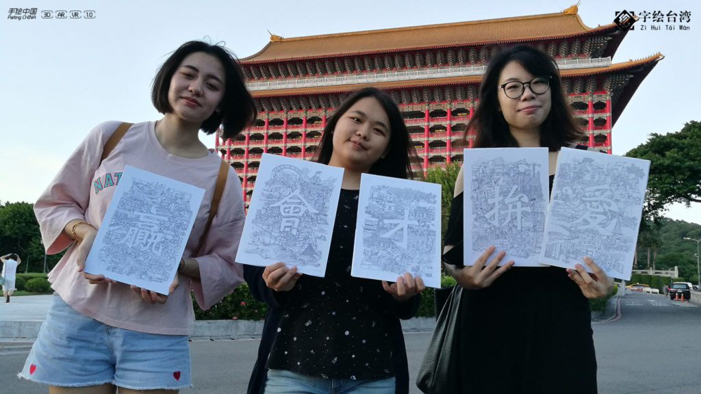
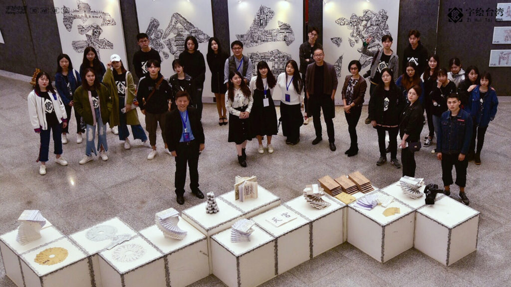
The book uses Chinese characters as a medium to present the beautiful island appropriately. The work is divided into four chapters: places, scenic spots, food and dialects. Based on Taiwan's urban culture, landmarks, representative foods and elements of rich cultural heritage were selected and illustrated. The drawings were then embedded in Chinese characters to form unique urban and cultural symbols.
Fragments of Time
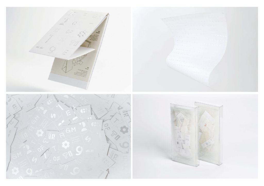
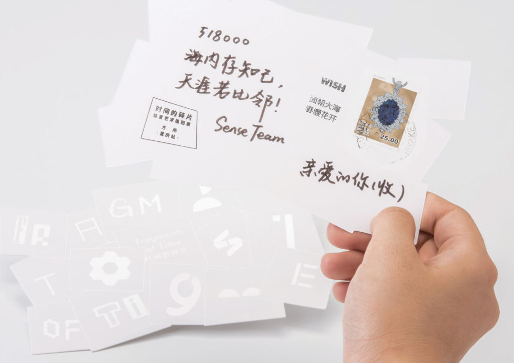
Kandeli Antalis is the world's leading art paper brand with a 250-year history, defying the challenges of the paper industry. Its specialty papers are a constant in the market and is deeply rooted in the Chinese industry. Always driven to interpret art and print with high-quality products, Kandeli Antalis wants to give the traditional medium of paper a promising future.
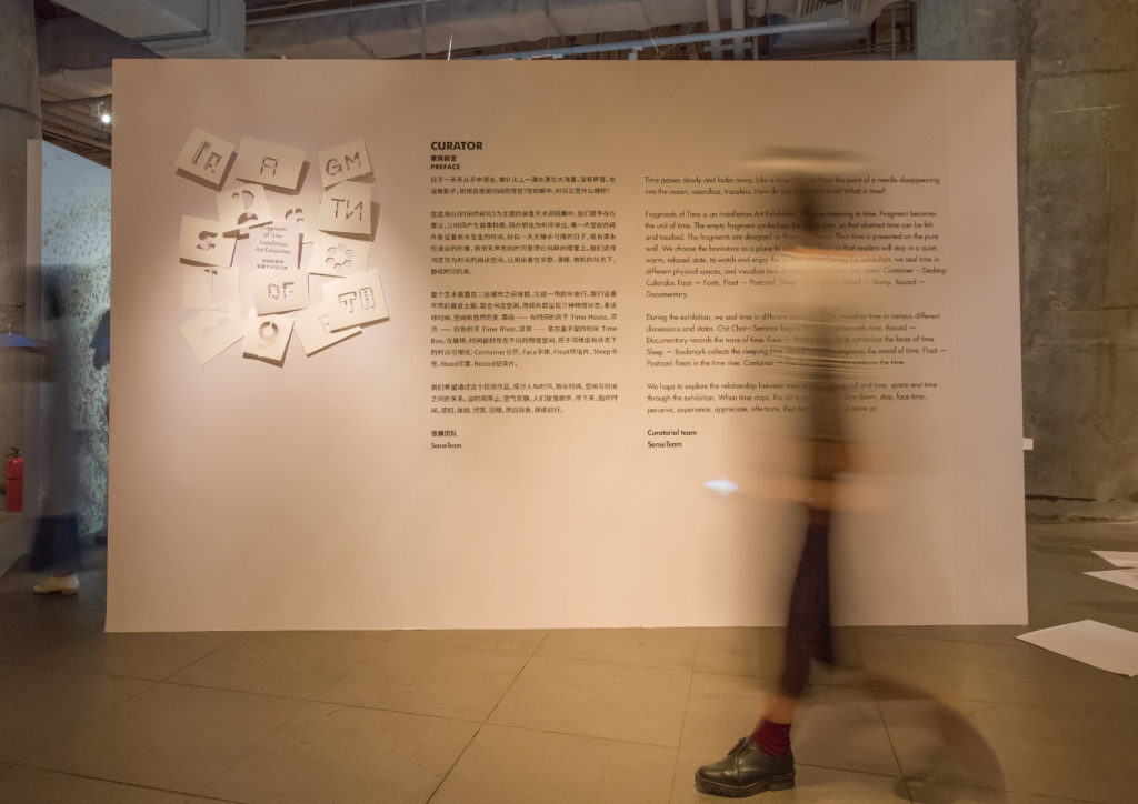
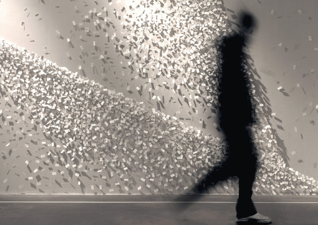
The "Fragments of Time" communication strategy , which won the iF Award, plays an important role here. It positions the brand in the context of digital communication in China. In this way, the centuries-old industrial group wants to encourage consumers to continue to rely on paper. The staging of the Chinese Antalis subsidiary stands for the consistency of the brand and aims to create trust through communication. The campaign was implemented by SenseTeam from Shenzhen.
Shanghai in Chinese Characters
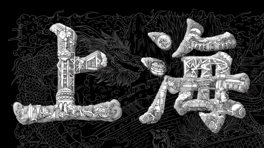
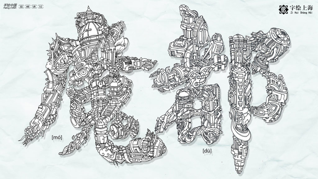
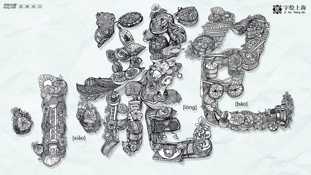
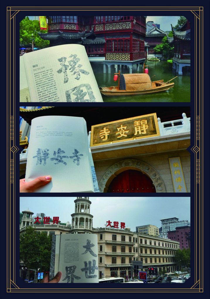
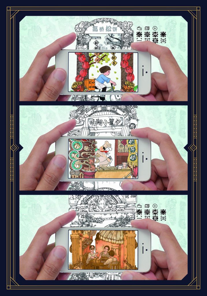
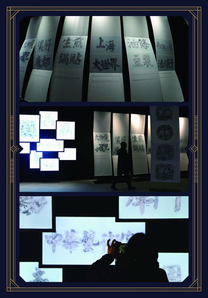
The expressive Chinese characters were also filled with content in this campaign. Here too, designers Xu Zhengbing and Shen Juan from the Wuhan Guan Shanjue Culture Media agency were responsible. They once again developed a visualization of Shanghai's diverse cultural history. To capture the essence of the city's landmarks, they started with tourist attractions. They combined them with some recognizable lifestyle forms to create a kind of "super symbol". In this way, they wanted to increase brand identification. The concept behind it is simple: one image per character, filled with hand-drawn memories of cities.
Click here for all categories and winners of the iF Design Awards.


