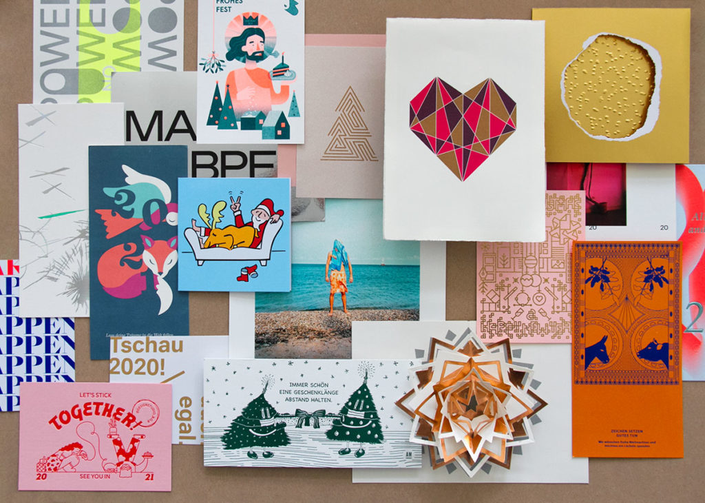
In the run-up to Christmas, the hustle and bustle usually means that there is hardly any time to appreciate them, which is why we have now taken a leisurely look at all the beautiful Christmas and New Year cards once again. And as always, we are amazed at the many ways in which the theme can be interpreted and implemented and the love of detail and craftsmanship with which our readers design their cards. In any case, the cards and greetings are far too good to be seen by just a few, so curtain up ...
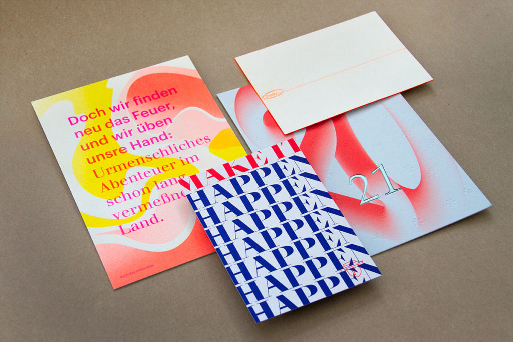
Sometimes a simple thank you is enough to make an impression, especially when it's printed in letterpress and has a bright neo-orange color edge (j. x. Albrecht office). Thick uncoated paper, hot foil and delicate blind embossing, effektiv Druck + Veredelung wants everything to be different in 2021 - but the beautiful cards are welcome to stay. "Make it happen" is the wish of Berlin studio Formdusche. Aye, aye, will be implemented immediately. Zeichen & Wunder has been in business for twenty years and is still passionate about what it does - a risographic color explosion that does you good.
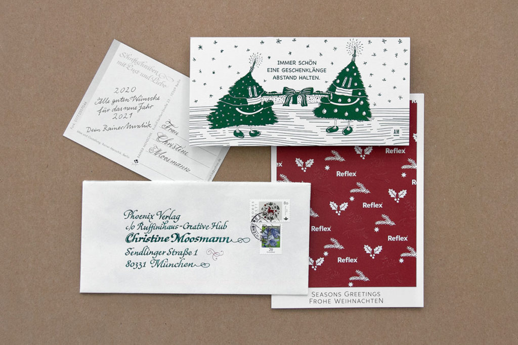
A beautiful paper, a simple motif and blind embossing - good wishes can be sent without much fanfare (Reflex Paper). But you can make a big impression on us if you have mastered the art of calligraphy. Who can write so beautifully? Always a pleasure, dear Rainer Menschick. The letterpress card by Anika Meyborg is also very impressive. I'll probably still be able to laugh about "Always keep your distance ..." and the masked Christmas tree figures in ten years' time.
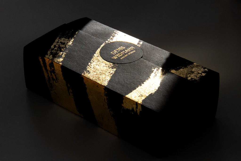
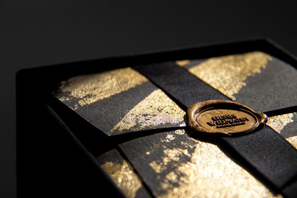
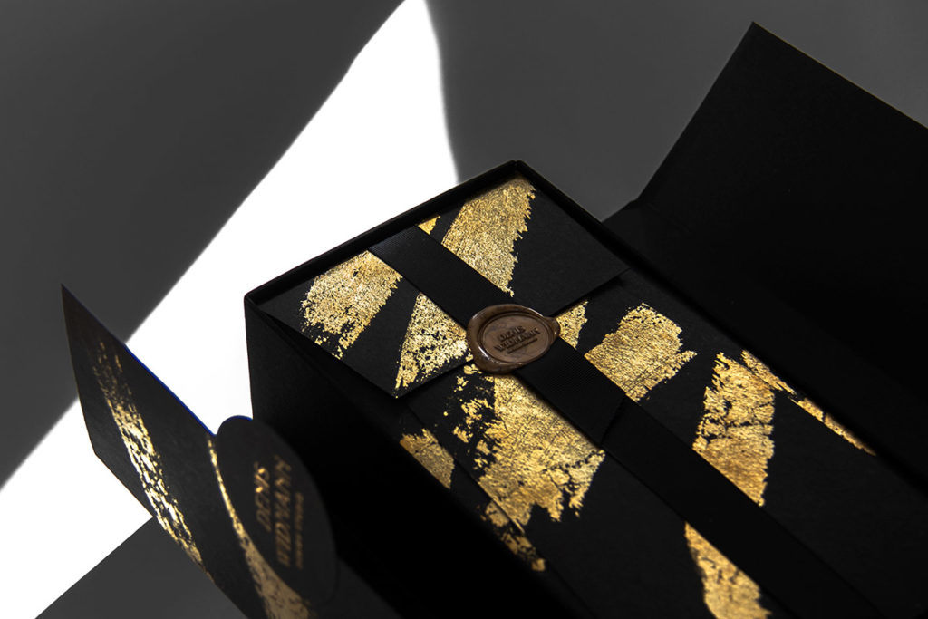
Speaking of gifts. Even if it didn't have the pandemic-technically sensible length of 1.5 meters, the gift from Denis Widmann Design Studio didn't miss its mark. Thick black cardboard, gold leaf, magnetic closure and seal - with packaging like this, the contents are almost secondary, although they weren't bad either.
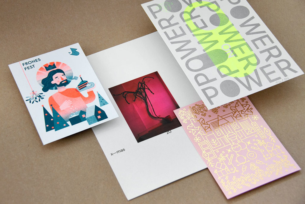
Joseph & Sebastian greet you with the Birthday Boy in risograph print, as does Formdusche with a numbered motif. Making opportunities out of the crisis, that's what nodesign wants and yes, sometimes it just has to be gold, lots of gold (brandbook / 707krea.com).
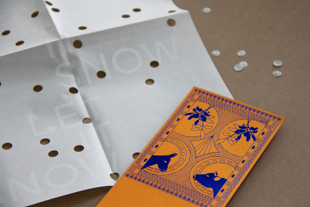
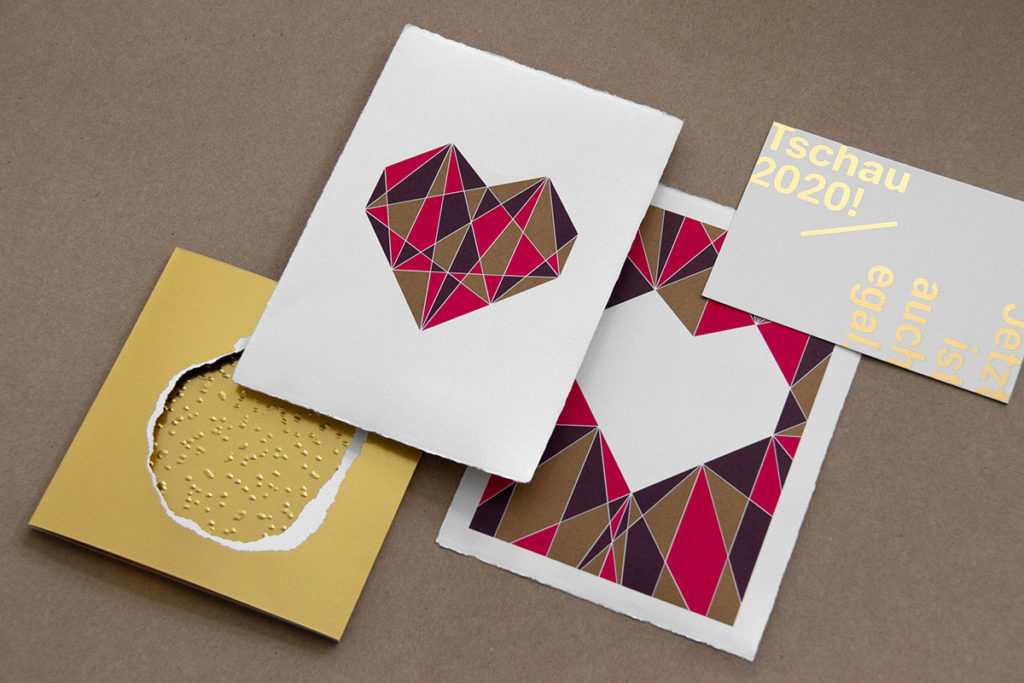
Not gold, but red-gold iridescent and therefore even more spectacular, the paper of the milk+honey card, plus a blue hot foil, wonderful. London-based Studio Bob Design uses a thin transparent paper with cut-outs and white screen printing - a nice foretaste of the super cute video that goes with it. The Christmas card from Kurz is a play on shapes and structures, which seems to say: if you're going to use gold, do it properly. Waldmann/Post focuses more on haptics and surprises with prints on velvety handmade paper. KD1 takes its hat off to all its clients and partners and invites you to simply wash away the old year and look forward to good things in the New Year.
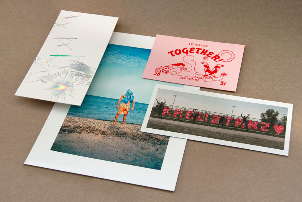
But of course it can't always just be about contemplation, when looking ahead to the new year you can also wish yourself and others a zest for life (again). The hot foil fireworks by Ulrike Zeizel Grafik Design glow in all the colors of the rainbow and the design studio B.O.B. wishes "Let's stick together". The fact that even closed borders (here between Kreuzlingen, CH and Konstanz, D) are always what you make of them is shown by the "Kreuztanz" campaign, documented by Homebase. And last, but not least, the prospect of sun, beach and sea is optimistic, even in these strange times.
We would like to thank everyone who thought of us again this year. Every kind greeting and every creative idea was a special pleasure for us. Here's to a happy new year ...
