(Advertisement) In our current issue with the graphic+ "What's cooking?", we present many culinary design highlights, innovative food concepts and restaurant designs. The communication of gastronomic projects also plays a major role in renowned design prizes such as the iF Awards. Here we present three award-winning, future-oriented brandings.
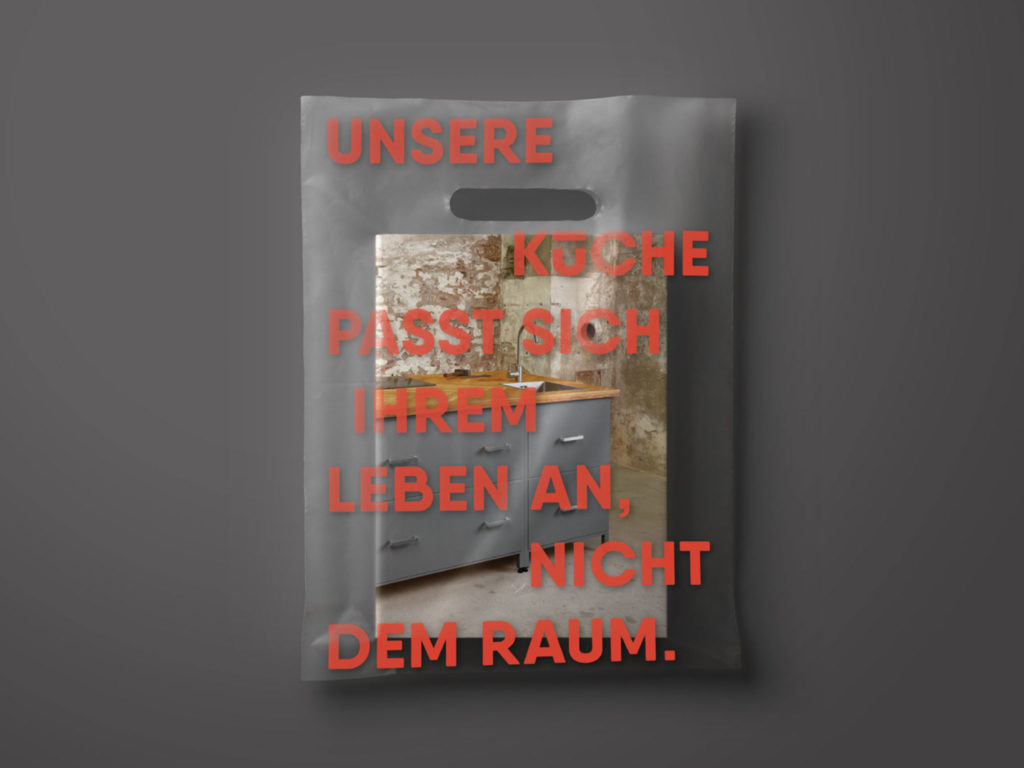
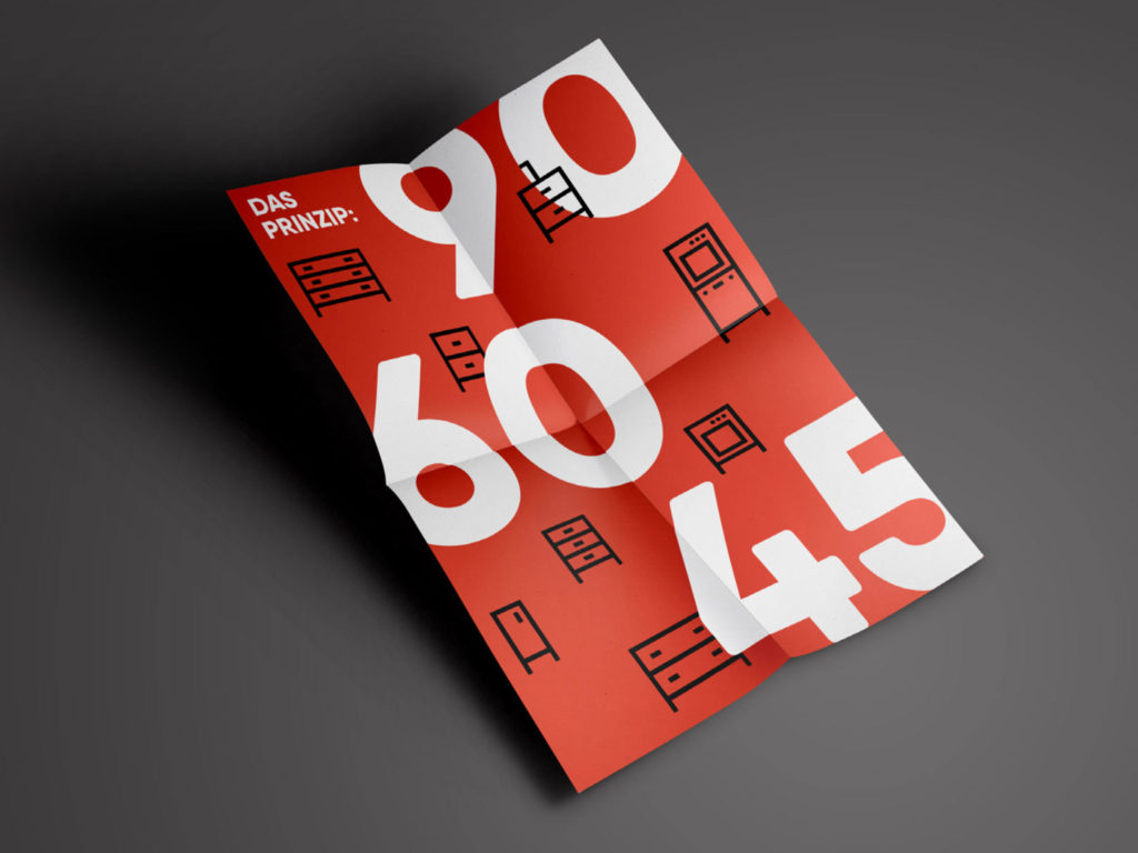
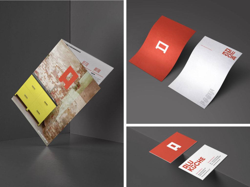
The kitchen furniture manufacturer from Duisburg is a family-run business. When developing the corporate design, it was therefore all the more important for the team to make it look just as down-to-earth and elegant as the creation of their kitchens. All kitchen modules are handmade and welded in their workshop. This principle needed to be communicated clearly.
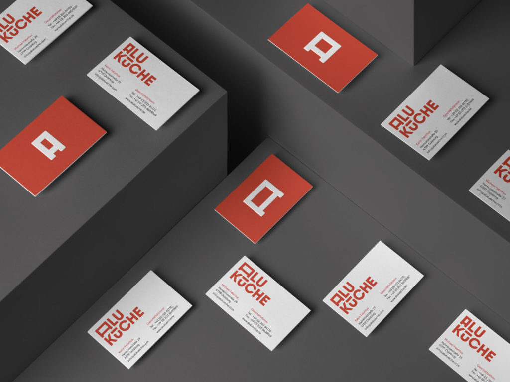
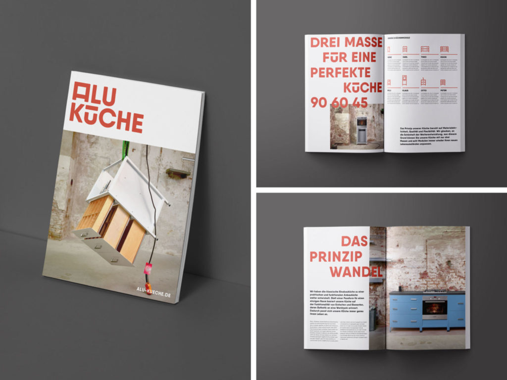
The strong and unique brand image therefore includes the actual everyday working environment: the Alu Küchen cabinet is both the central motif of communication and the open workbench in a kitchen. It is not covered with strips or panels, as Alu Küchen's aim was to reduce the number of customizations. The designers from Oppa Franz Brand Design were commissioned to create the new look.
Click here for the award-winning design in the Communication category.
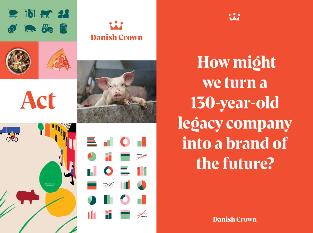
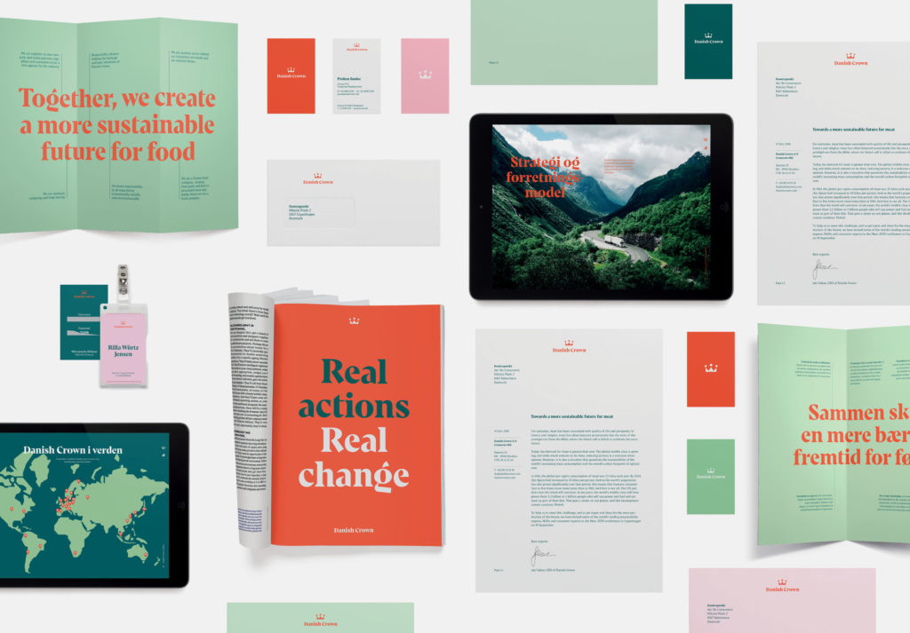
Danish Crown - Towards a more sustainable future
As a global group of companies in the meat industry, Danish Crown faced the challenge of addressing the sustainability of its food distribution. The company, headquartered in Randers, Denmark, decided to make its meat processing more responsible and adopt a more sustainable approach. This new positioning of its identity as a market leader was also to be passed on to consumers - in the form of a new brand image.
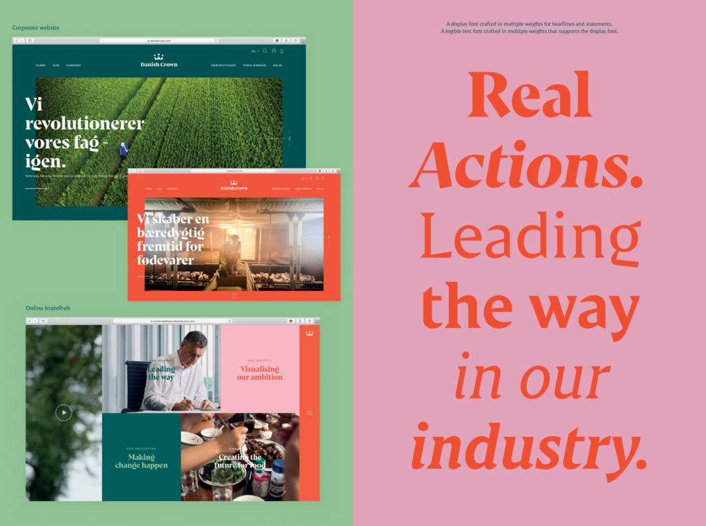
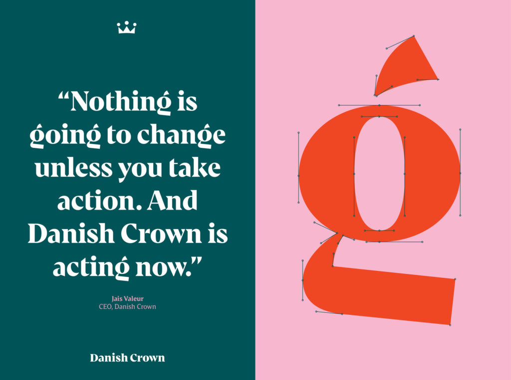
The new corporate identity is based on a holistic approach to the project: everything was redesigned from the ground up. From the visual identity to the UX design and corporate website through to the corporate report, everything was to reflect the new values. The Copenhagen-based studio Kontrapunkt was commissioned for the 360° project.
More about the relaunch of Danish Crown.
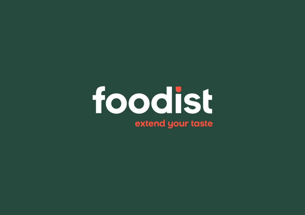
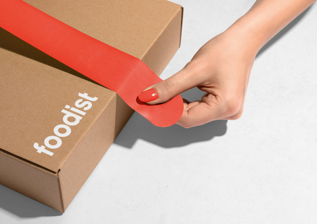
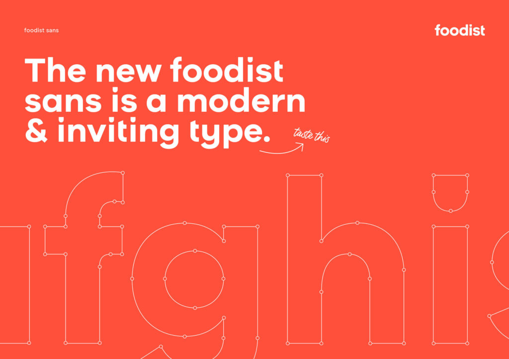
The Foodist company presents exceptional, high-quality delicacies from manufacturers all over Europe in its portfolio. It offers monthly delivery boxes: from gourmet boxes for connoisseurs to healthy boxes for the nutrition-conscious, there is something for everyone... In order to meet the requirements of the dynamic changes in the food industry, Foodist decided on a new look. With the new Foodist logo, a claim and brand visuals, the company hopes to gain an edge over its competitors.
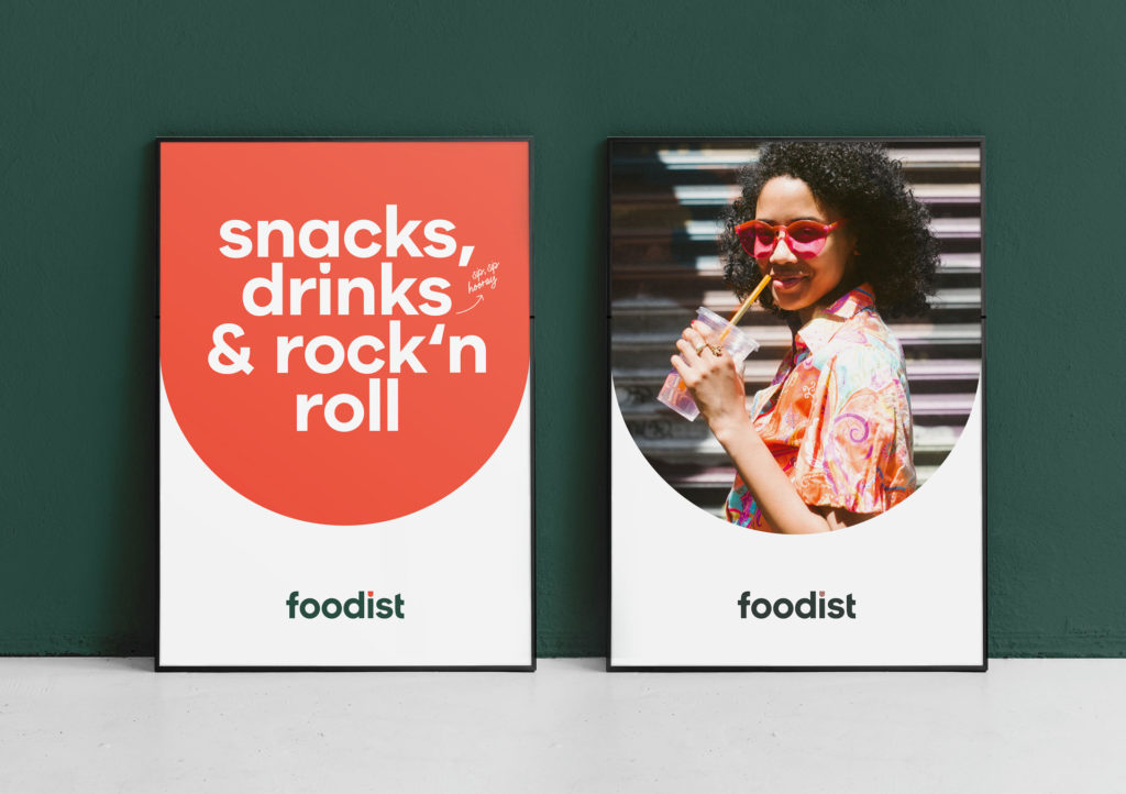
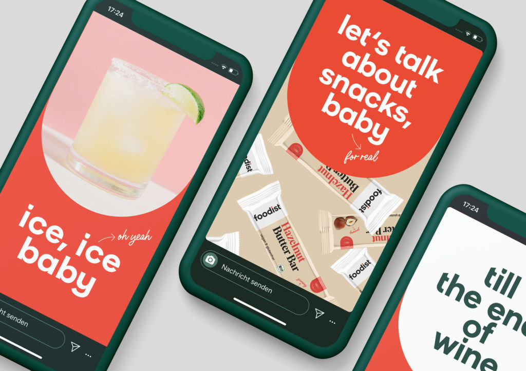
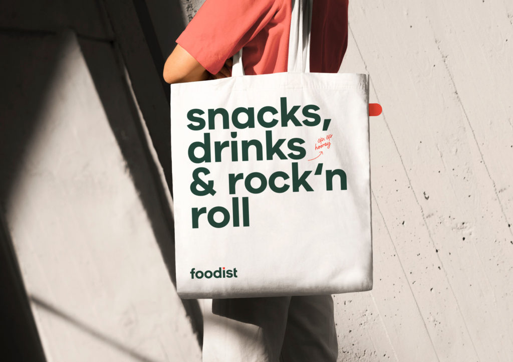
The claim "Extend your taste" and the colored area in the shape of a tongue are the key visuals in Foodist's new branding. The target group is addressed with a friendly and accessible brand presence. The logo design also communicates at all touchpoints and is flexible in every application. The creative team from The Studios in Hamburg did a great job here.
Read more about Foodist's new branding.
