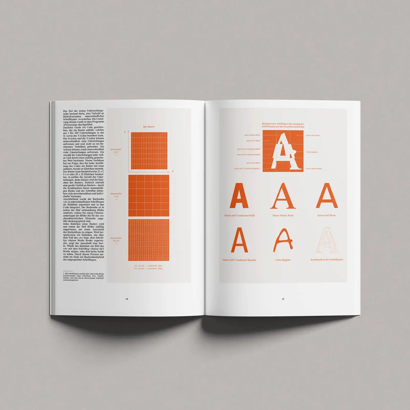
The invention of writing was an incredible cultural achievement; finds from the Danube region indicate that the first written characters were used here as early as 5300 BC. Without writing, our world would not be what it is today. But you also have to be able to interpret the signs. It was the discovery of the Rosetta Stone that made it possible to read the hieroglyphs, and even today's characters must remain relatively stable in their form so that they can be identified. Robin Kiesel wanted to find out more in his final thesis and investigated what makes letters legible and at what point disturbances literally destroy their function.
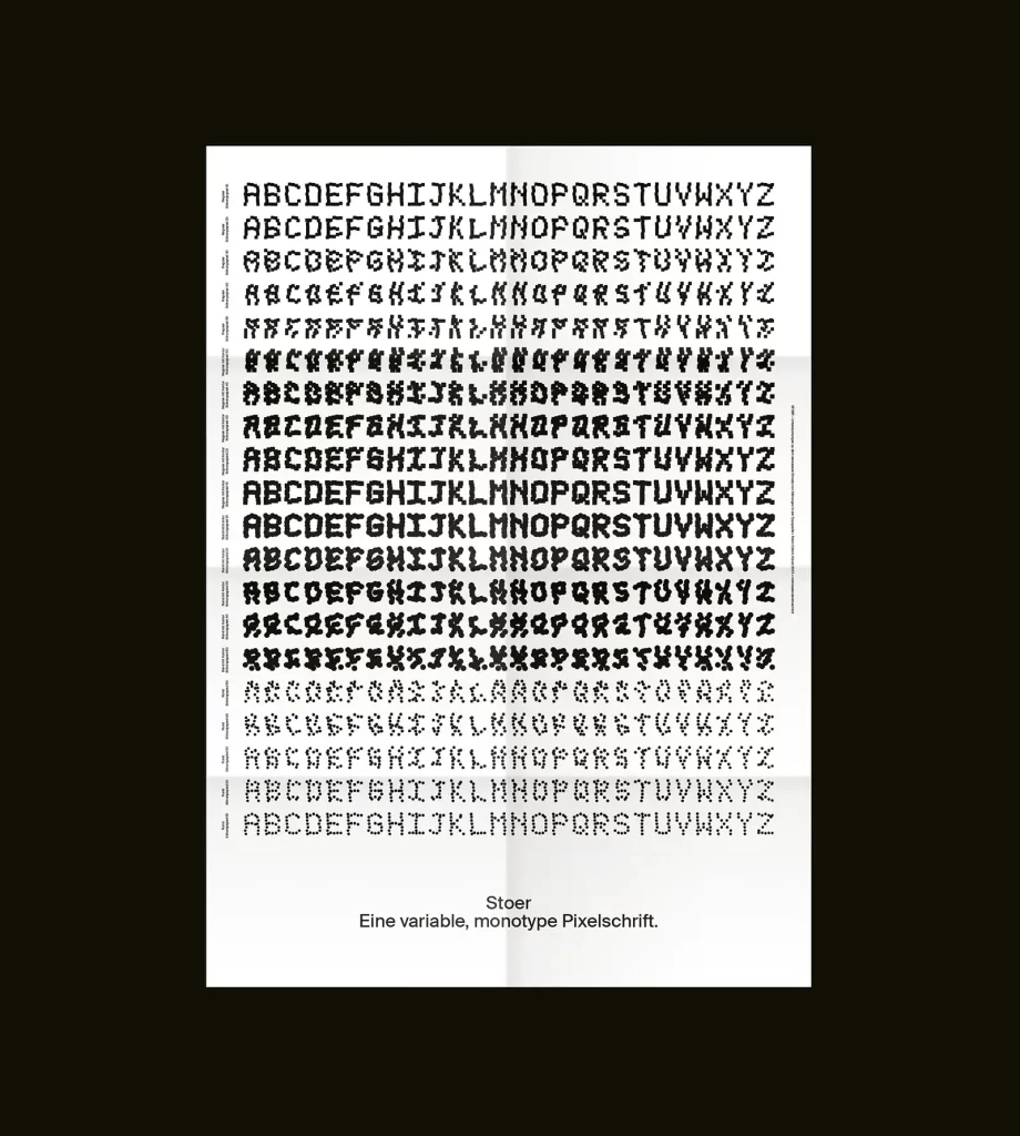
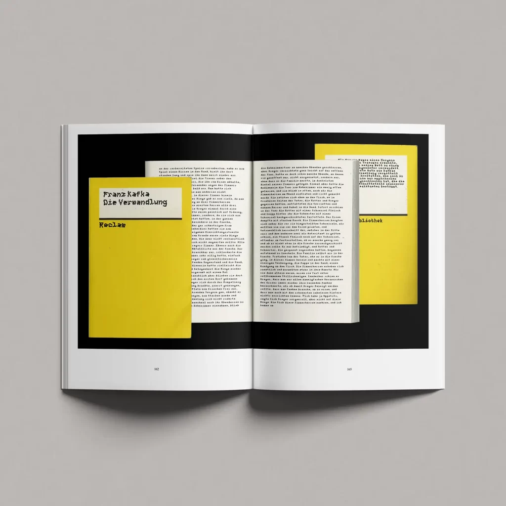
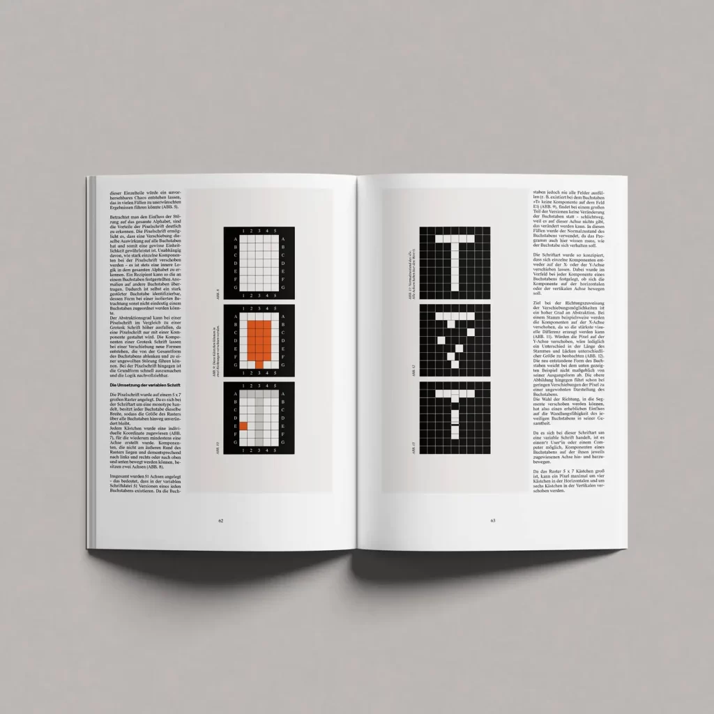
After training as a graphic designer in Stuttgart, Robin Kiesel began a further course of study at KISD in Cologne, where he immersed himself even further in typography. "In my final thesis, I fully lived out my passion for typography and spent 170 pages intensively examining disruptions in typography," he explains. The title of his work is "STOER - Investigations into the conscious use of disruptions in typography" and Kiesel's aim was to explore various design-relevant issues with the help of generative typography. "The aim," explains the designer, "was to illustrate what a disruption in typography can look like, when it occurs and at what point it is perceived as a pure obstacle. I showed how a consciously applied disruption differs from an unconsciously created one and where the limits of the plannability of disruptions lie. To illustrate this, I carried out various series of investigations, such as the random combination of different font styles in a grid, the division of letters into their characteristic segments and the effect of their displacement, as well as the creation of a variable monotype pixel font, which I influenced by means of code."
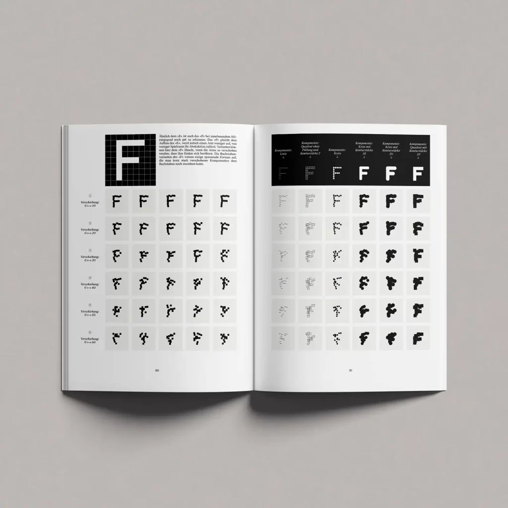
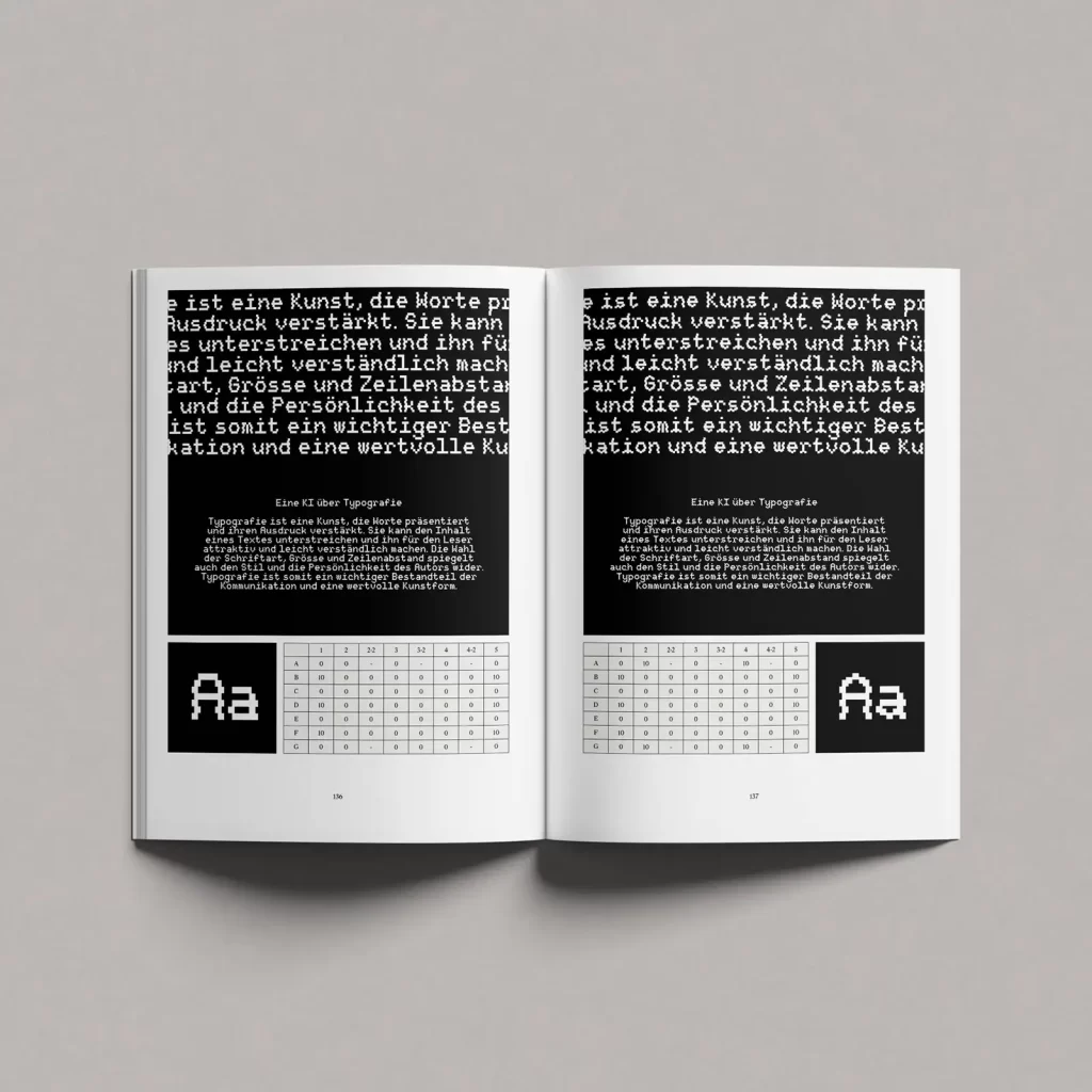
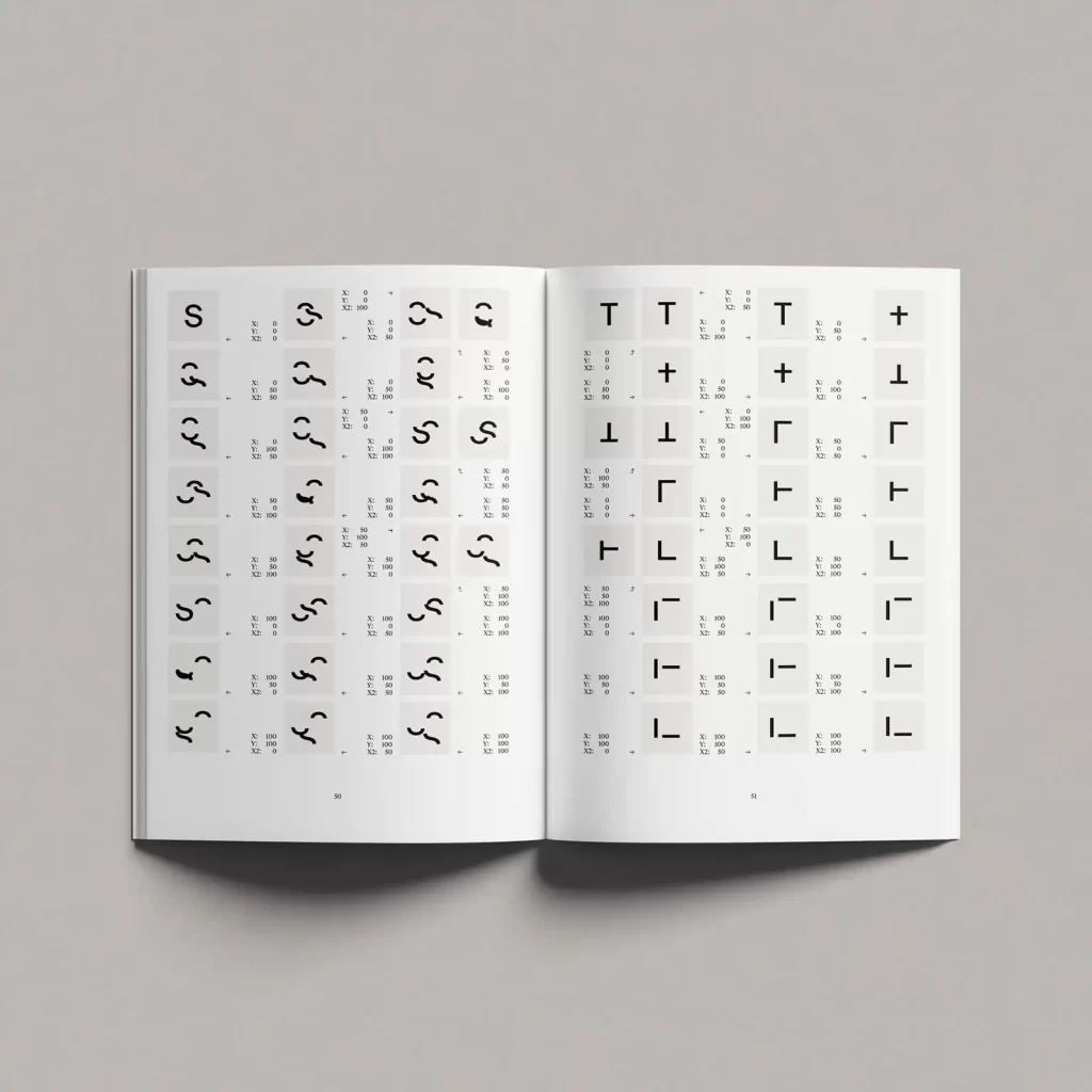
To make his investigations comprehensible, Kiesel has created an editor with which users can distort fonts themselves and thus develop a feeling for when a letter can still be recognized as such. When do I still see P and at what point does the curve slip so low that it becomes a D? Experimentation leads to insights that can be used in type design. Accidental distortions can give designers new ideas for shapes and inspire them, but working with the editor also encourages them to think about why letters are recognized and which elements are specifically responsible for this recognition. "These new forms," says Kiesel, "can be the starting point for thoughts on how letters can still be designed in an unconventional way. In any case, STOER is a very appealing invitation to think playfully about form and content.
If you would like to find out more about Robin Kiesel's work, please visit his website. You can also find even more exciting articles from the world of typefaces in our typography section.

