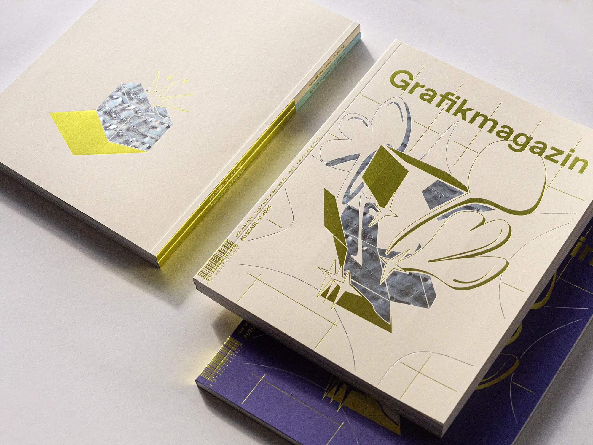
Packaging waste is rightly seen as one of the great evils of our consumer society, but a great deal is happening in the industry. In this issue, we present projects that are breaking new ground in packaging design. Sustainability and aesthetics are not mutually exclusive; they make design more challenging, but also much more exciting. You can discover this and more in the Grafikmagazin 01.24 with a focus on "Packaging Design".
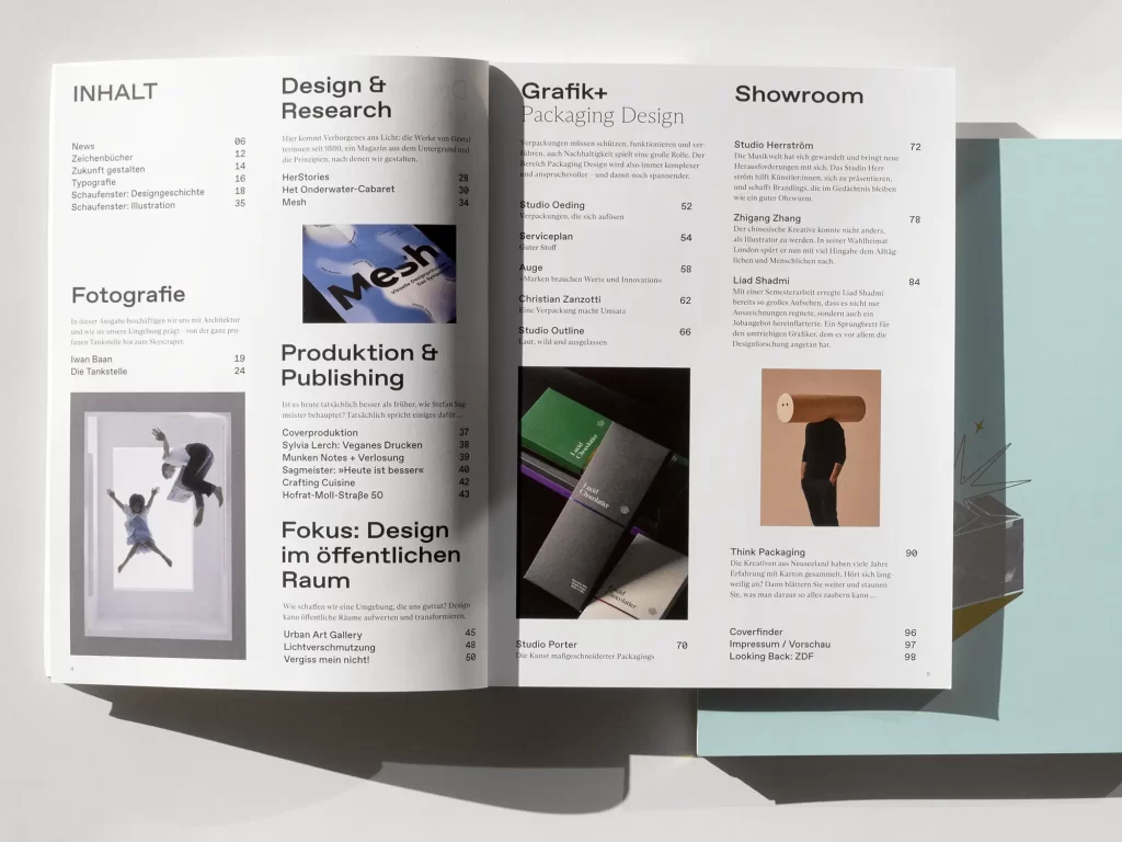
This time we can present a real treasure in our "Design & Research" section. Curt Bloch had to flee from the Nazis and survived the war in hiding in Holland. There he produced Het Onderwater-Cabaret with the little he had. After the 96 issues of the small magazine lay on the shelf of his family in New York for decades, they are now accessible to the public for the first time. A remarkable find and a moving testimony to the times, because Curt Bloch's words from back then are frighteningly relevant again today.
In this issue, we also start a new focus topic and show what communication design can do for public spaces. It is usually architects and urban planners who design public spaces, but graphic designers can also enhance and transform our surroundings and make them more usable for all of us. In Constance, for example, a dreary and unpleasant underpass has been transformed into an urban open-air gallery, a final project draws attention to light pollution and an app guides you through the city and combines personal stories with historical knowledge.
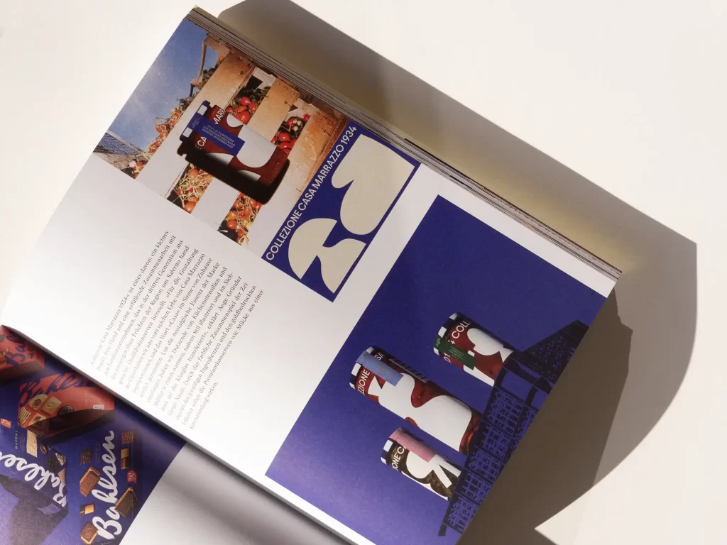
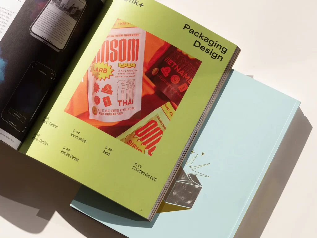
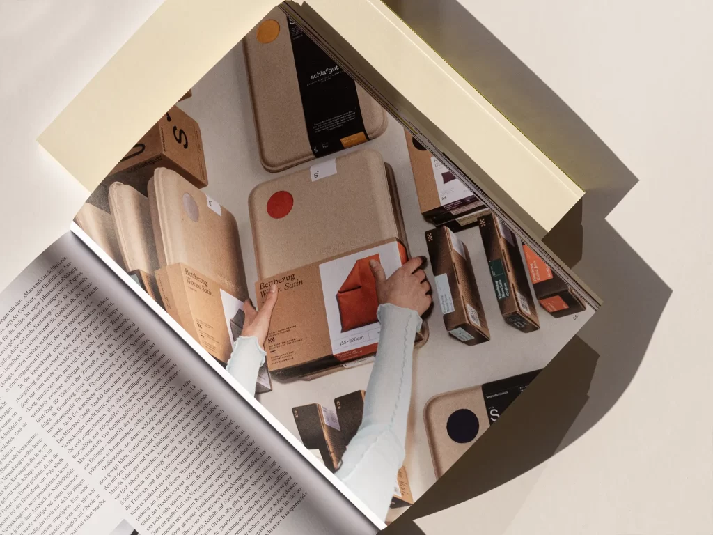
Graphics+ "Packaging Design"
Packaging must protect, function and entice, and sustainability is also becoming increasingly important. If you want to reconcile all these aspects, you need staying power and the will to experiment, tinker and think outside the box. In our Grafik+, we present 20 pages of projects and studios that are breaking new ground in packaging design.
The American studio Outline, for example, shows how to brand packaging with style. Auge in Italy manages to make a wide variety of customers look good, regardless of whether they produce cookies or sex toys. At Serviceplan, a great deal of work went into the ingenious packaging of an innovative cosmetic product and the family-run company Schlafgut spared neither effort nor expense in developing sustainable packaging for its range. The new packaging design brought so much movement to the company that the entire brand image was redesigned and the products have more radiance, which also pays off financially.
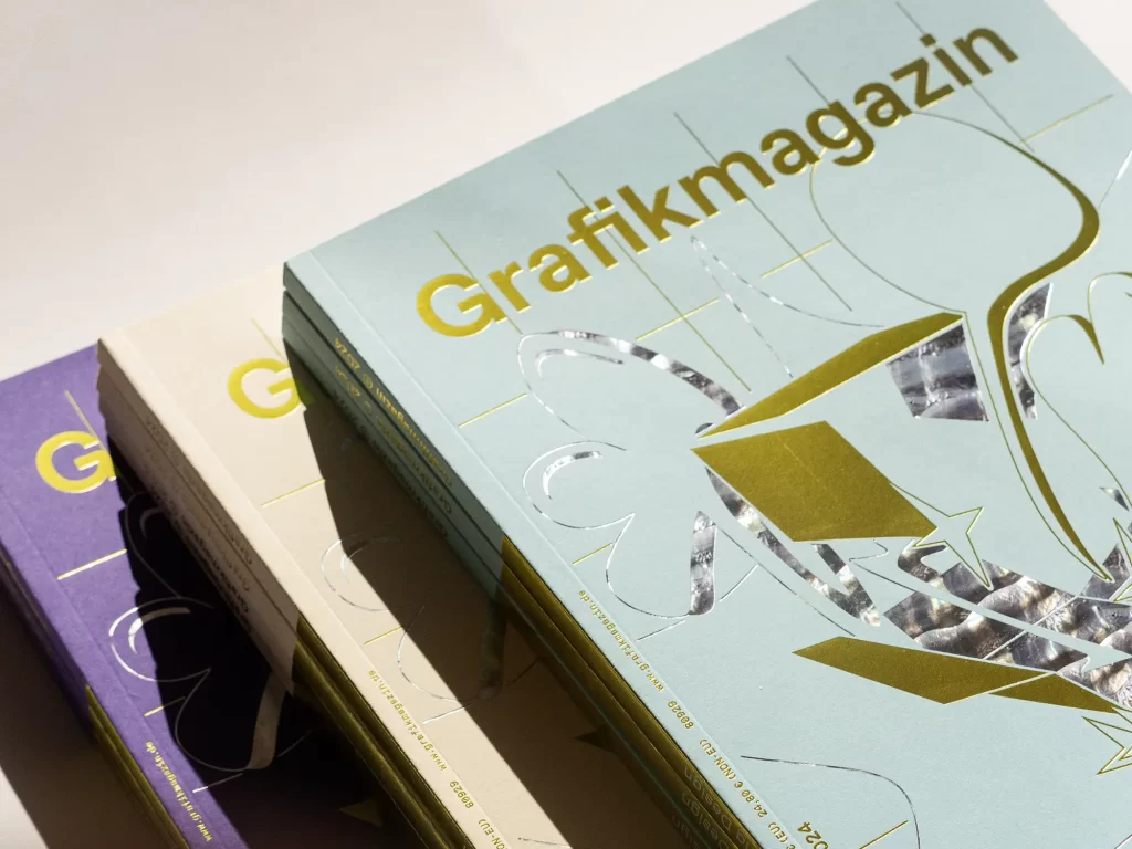
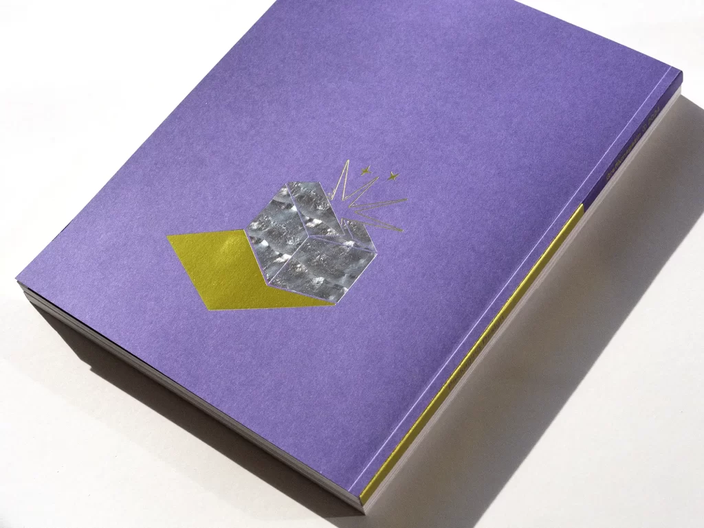

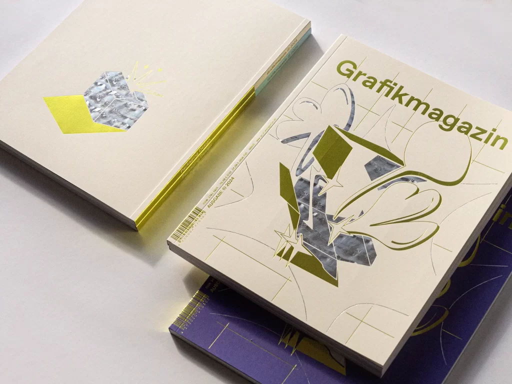
The cover
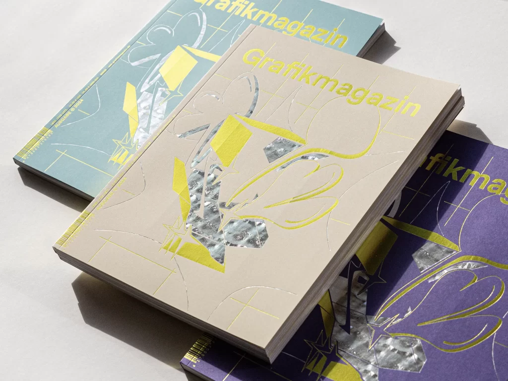
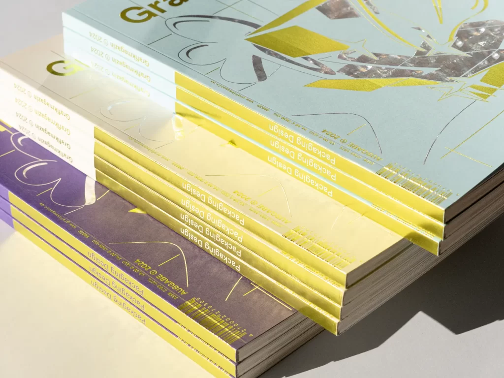
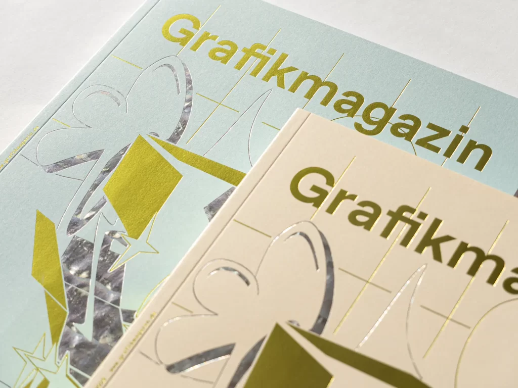
The cover of this issue is presented in three attractive colors. The Pergraphica paper from Igepa is not only ideal for luxury packaging, it also lends the Grafikmagazin a certain sophistication. We used the colors Precious Purple, Shining Pearl and Calming Blue and realized the motif using the hot stamping process. Forum Druckveredelung contributed its expertise here, with the precise embossing tools coming from Hinderer+ Mühlich and the embossing material from Kurz. The new trend color Emerging Yellow attracts attention, while SB Abalone Select sets accents with its diffraction effect. The motif itself captures the emotional moment of "unboxing". What could be better than opening a package with anticipation! The design was created by young designer Johanna Schmees, who approached the subject of print and finishing with a fresh eye.
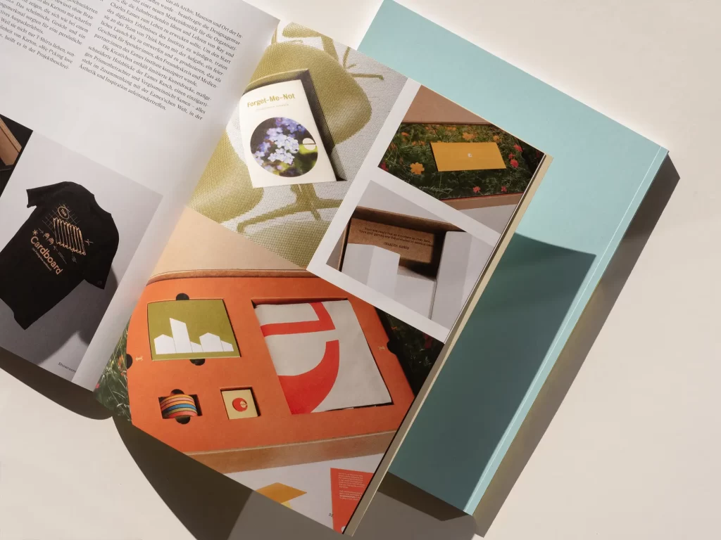
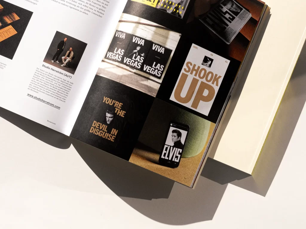
The showroom
In the showrooms, we draw your attention to four great portfolios: Isralian, Hamburg-based typographer and graphic designer Liad Shadmi, with his fantastic eye for detail; Vienna-based studio Herrström, which is passionate about the music industry; Chinese, London-based illustrator Zhigang Zhang, who bathes everyday moments in a special light; and packaging agency Think from Auckland, New Zealand, whose team describes itself as the "Daft Punk of packaging" - you'll immediately understand why when you open the magazine.
Order now!
You can download the Grafikmagazin 01.24 with the focus on "Packaging Design" here free of shipping costs (within the EU).
You can also find out more about packaging design in our blog ...

