
Type design is an art, but so is the correct use of type. Typographic skill often determines whether a design is good or excellent. In this issue, we therefore focus on "Typography" and present trends and type designs, as well as projects that make life easier through type design.
In this issue, we have once again put together a broad mix of inspiring projects and informative articles for you. The photo section takes us into a colorful, somewhat fairytale-like world that Wes Anderson couldn't have invented any better. With "Ciné-Passion" we stay with film and present great movie posters. The final project "Turning the corner" shows how we can still do something about climate change - including a charmingly illustrated raised index finger. In "Growing up in Alphabet City", we follow type designer and lettering artist Michael Doret, who found his inspiration in the flashy rides at Coney Island and the dazzling billboards in Times Square.
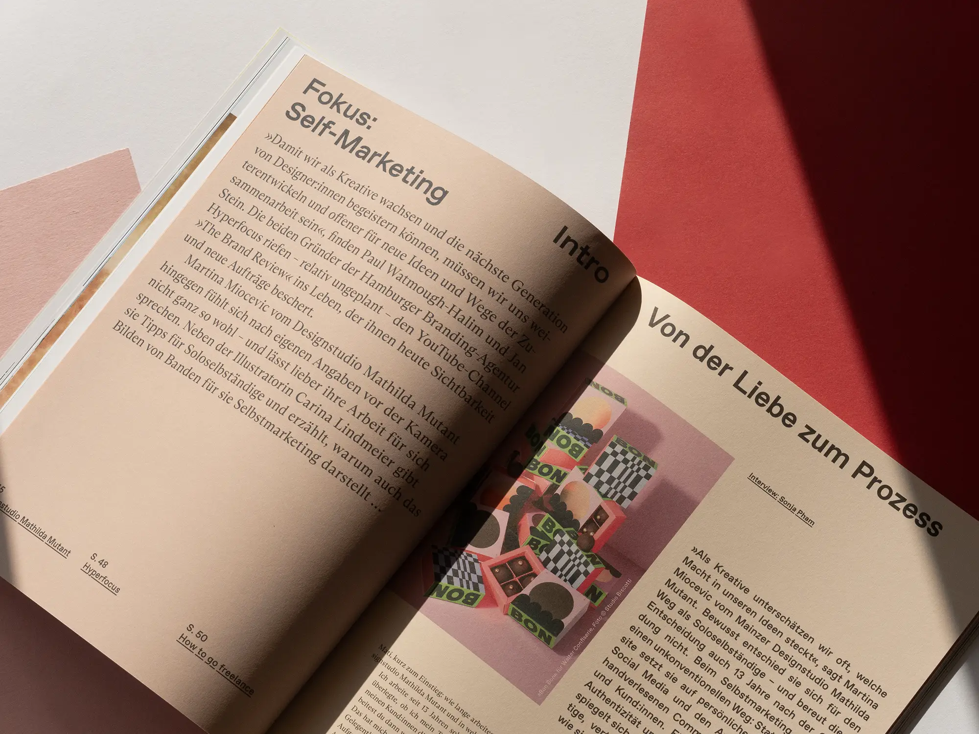
Of course, the informative side is not neglected either. In our design history showcase, we look back at the year 1925 and Jan Tschichold, who steered typography in a completely new direction. Little loved, but nevertheless necessary: We explain what e-invoices are all about and when they will become mandatory for designers. Our production expert Sylvia Lerch explains how you can use folding to turn print projects into something really special and you can find out how to ensure more visibility for your own work in our "Focus on self-marketing".
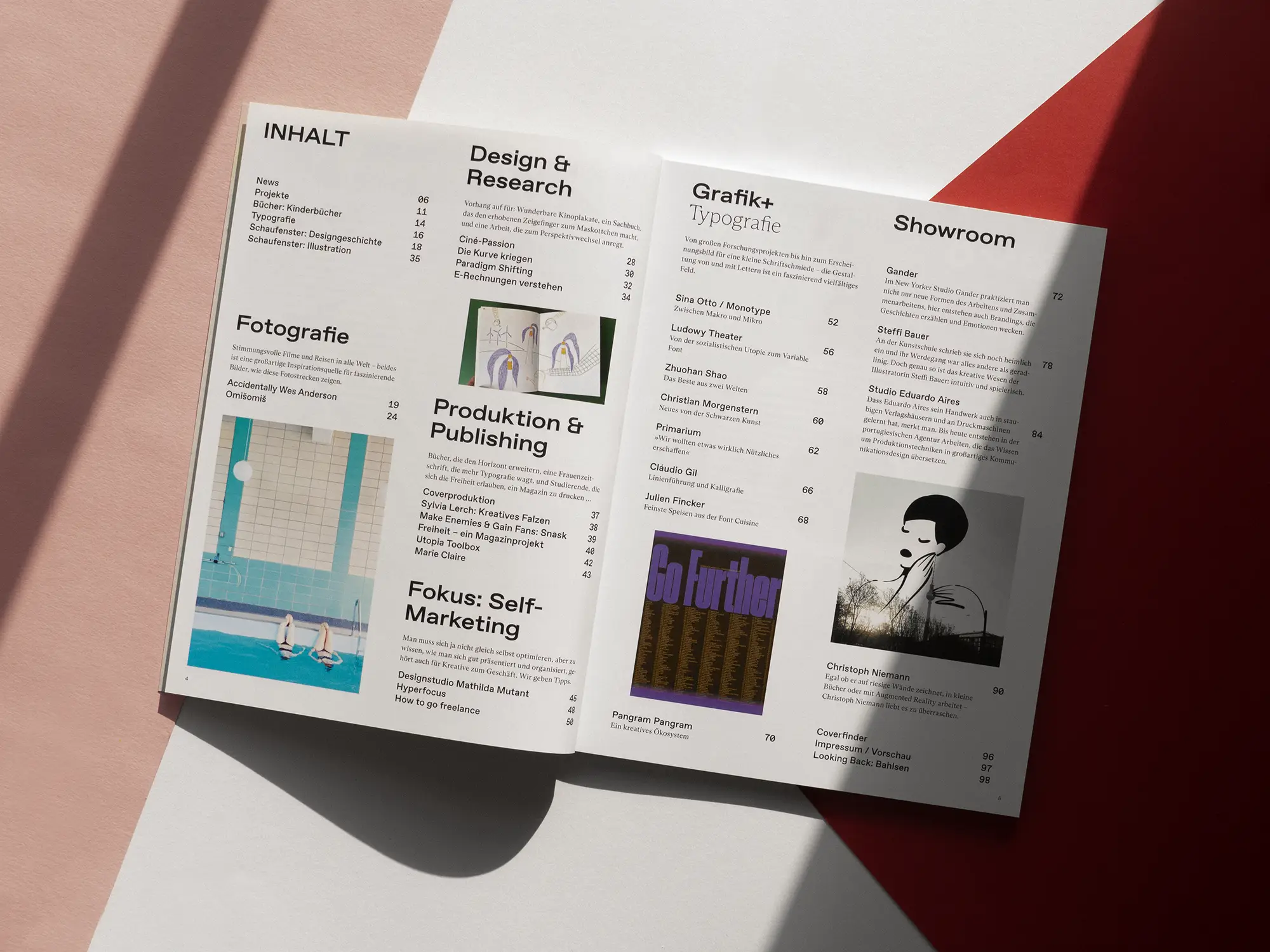
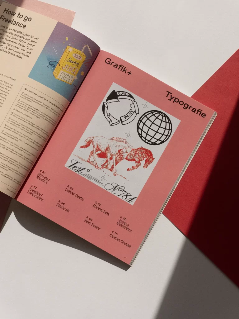
Graphics+ "Typography"
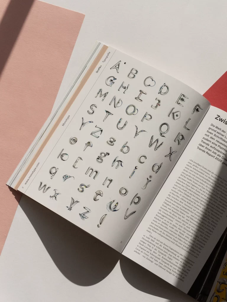
Grafikmagazin 01.25 is all about "typography" and this topic is always a particular pleasure for us. We love the almost nerdy meticulousness, care and passion with which typefaces are designed and we are always fascinated by how much typography can lend character to a project or a brand. We've put together 20 pages of great type design: typographic experiments from China, hand lettering from Brazil, a global research project on school fonts, good old lead typesetting and, of course, font trends for the year 2025. So there's plenty for typography fans to discover in this issue of Grafik+.
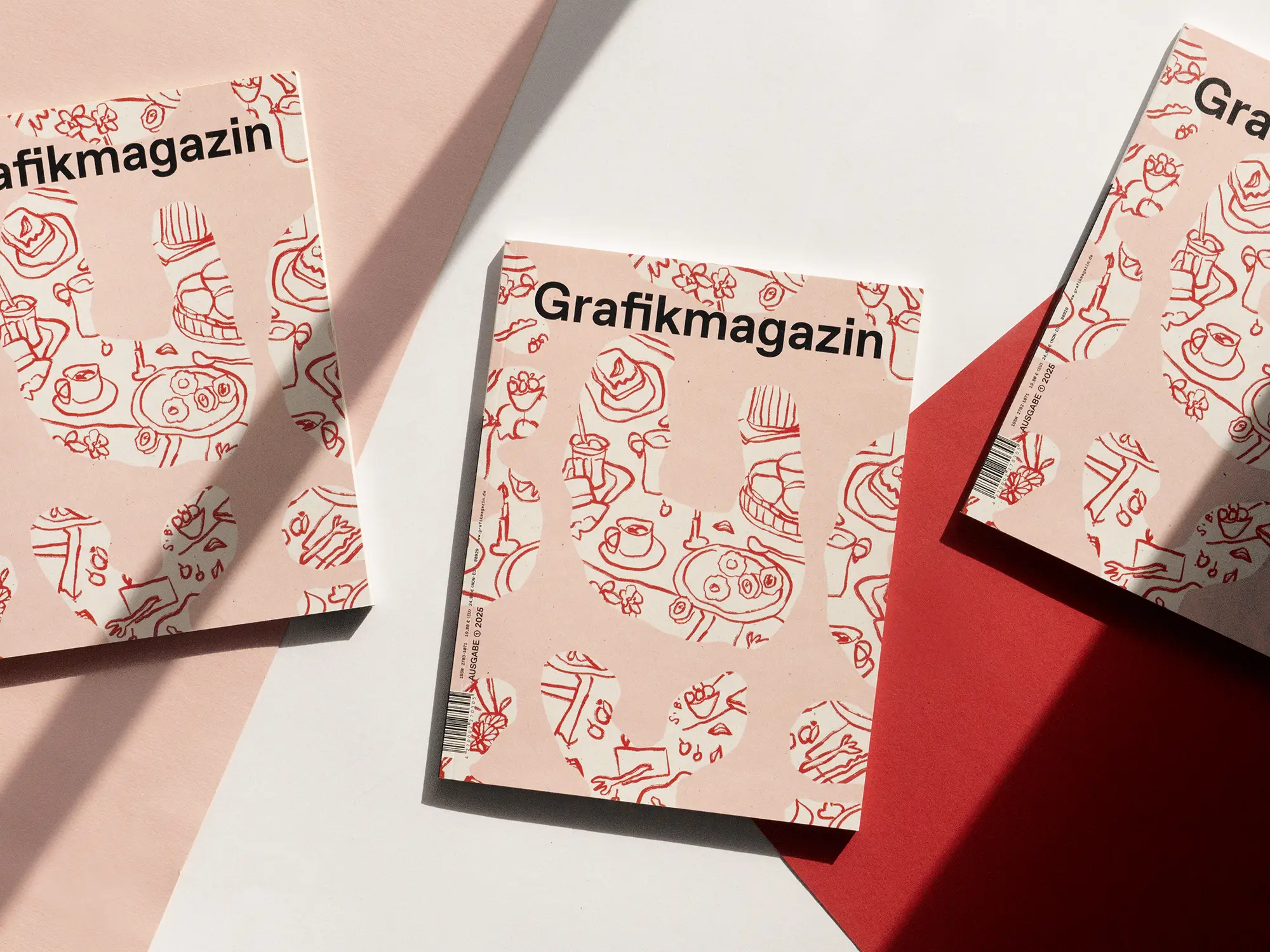
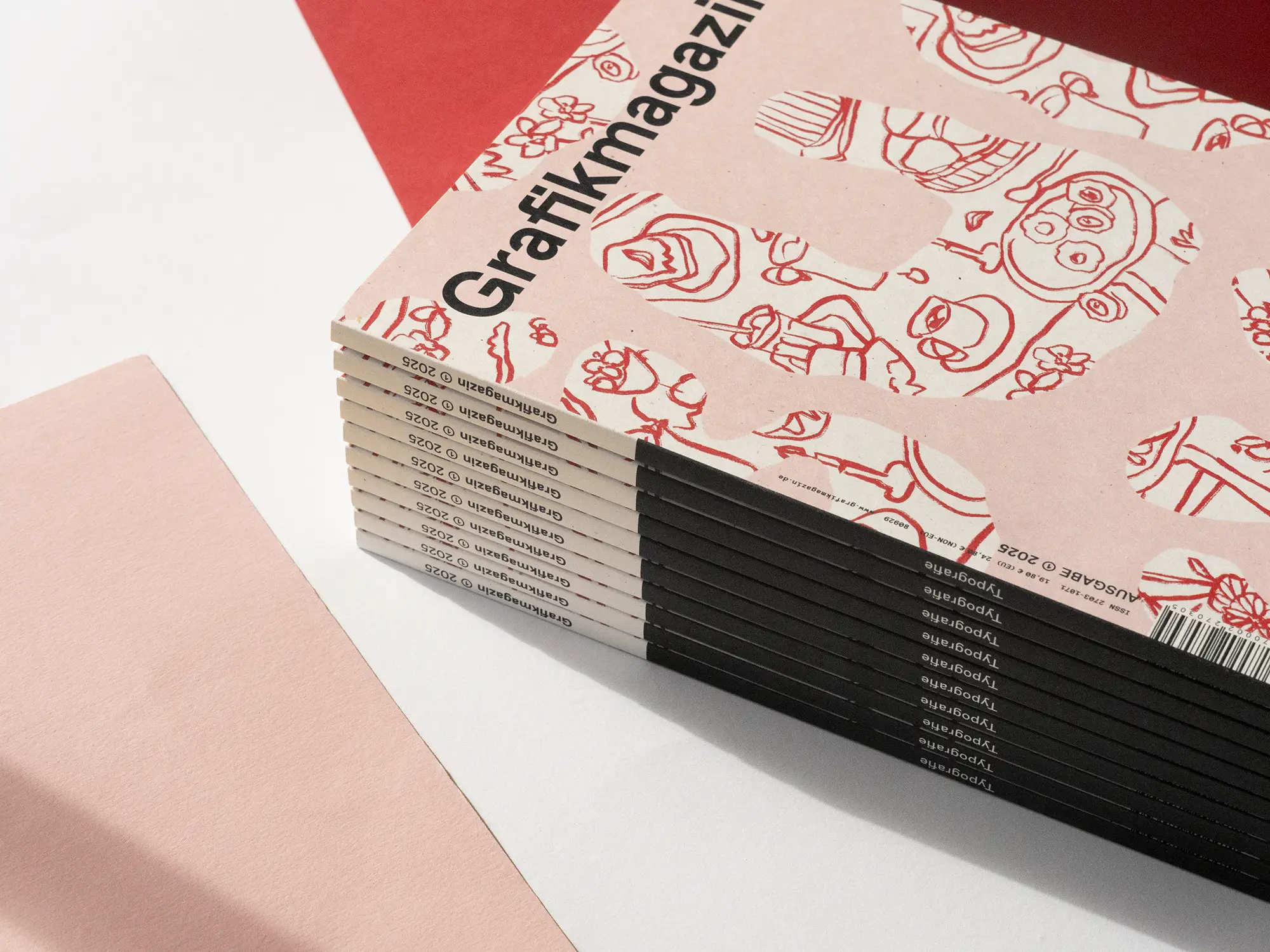
The cover
This edition feels different in the hand, somehow smoother. This is because we have used a material with "only" 240 g/sqm for the cover this time, but also because of the paper itself. Icon Nature is a recycled paper made from 100 percent secondary fibers and has a special, somewhat rough feel. The paper from Igepa is also visually striking, as the "sprinkled" version we used has small inclusions of tree bark. At first glance, they look like printing errors, but at second glance they are fascinating and create more visual tension.
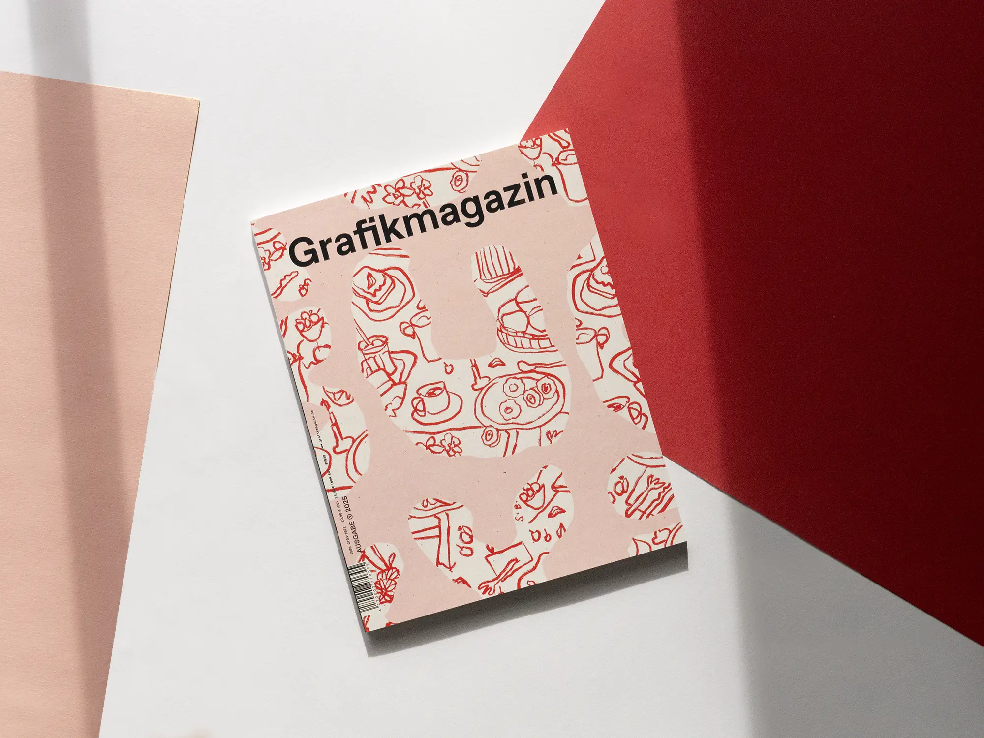
The cover design was created by Steffi Bauer, who took up the main theme of "typography" and combined it with her very own illustrative style. The cover was printed in offset by F&W Medien.
The showroom
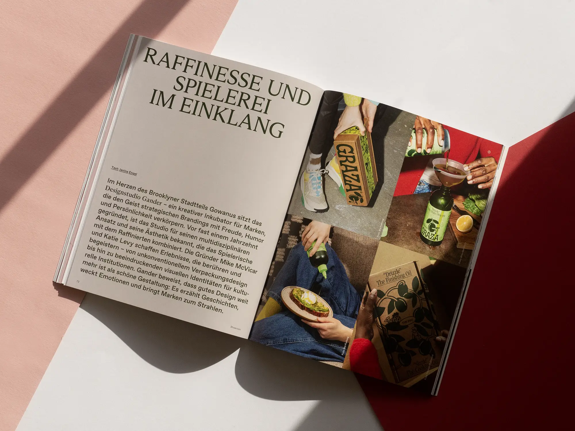
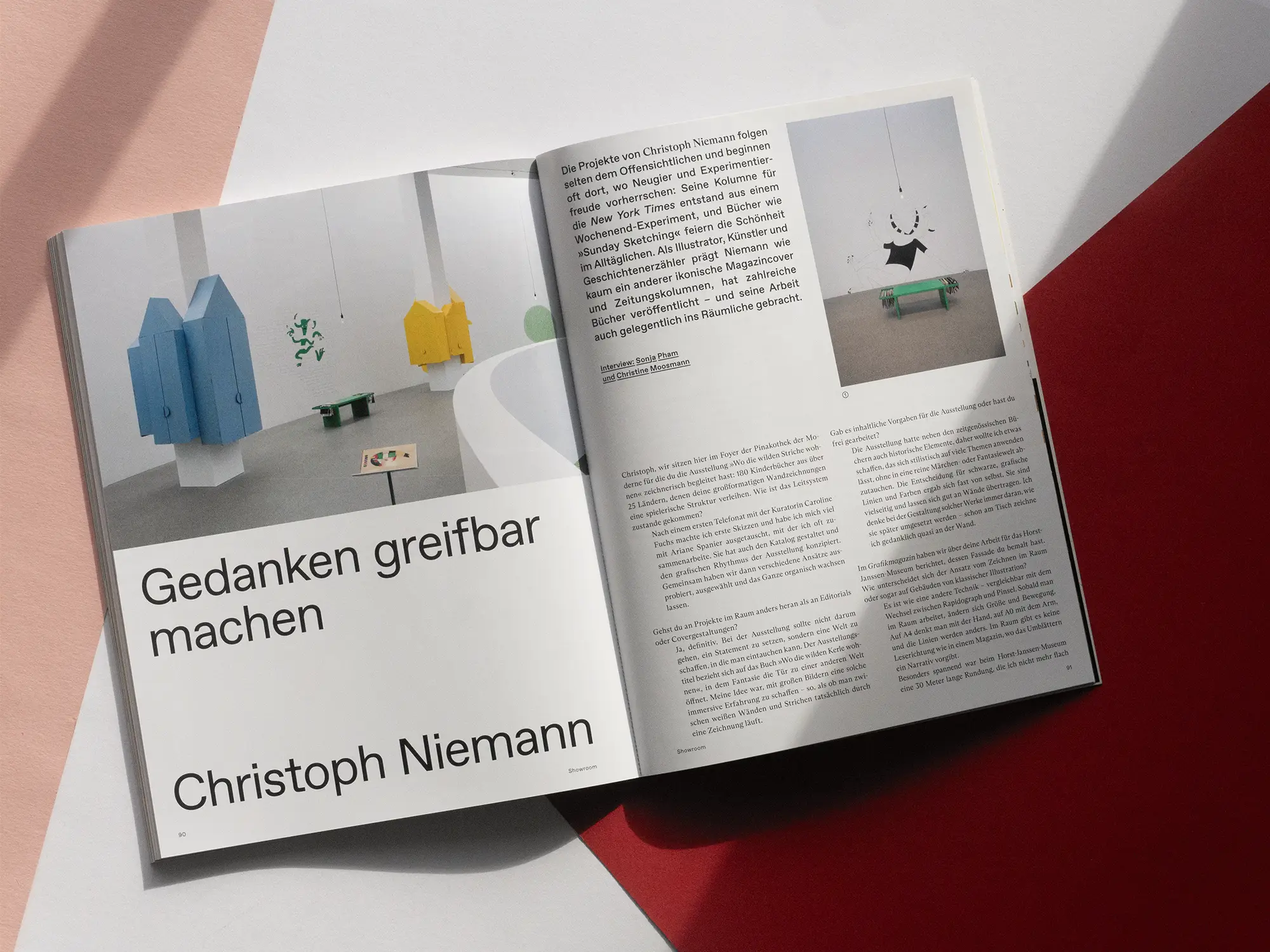
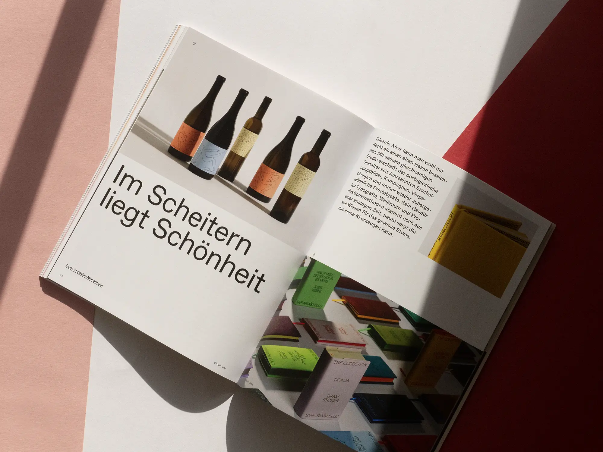
In the showroom, we travel from Bavaria to Berlin and from Porto to New York. In the Big Apple, Studio Gander creates brandings that resemble fireworks, and in Portugal, Eduardo Aires shows what a leap in quality design work can make when you have a comprehensive knowledge of materials and production methods. Steffi Bauer couldn't make up her mind and now successfully combines both: illustration and textile design. Last but not least, we were able to conduct an interview with Christoph Niemann at the Pinakothek der Moderne in Munich. The illustrator became known for his cover designs for The New Yorker and the New York Times Magazine, but now also works a lot in the space. He told us how he prefers to work and what makes a successful work of art for him.
Order now!
Grafikmagazin 01.25 shows how important typographic skills are for branding projects, what type can achieve and what trends are emerging. This issue also offers many practical tips for your work.
You can order Grafikmagazin 01.25 with a focus on "Typography" here, free of shipping costs (within the EU).
You can find out more about typography here ...

