How is communication design changing the education sector, how can design help to convey content better and make learning easier and more fun? In Grafikmagazin 02.24, our focus is on the topic of "Education" and shows exciting projects at the interface between education and design.
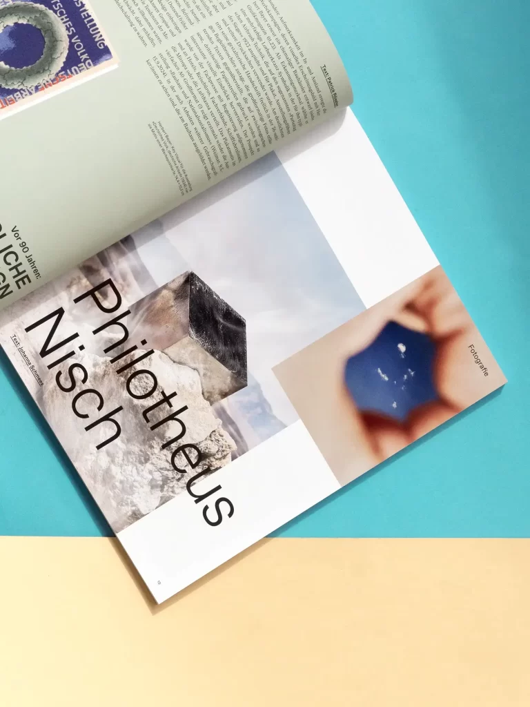
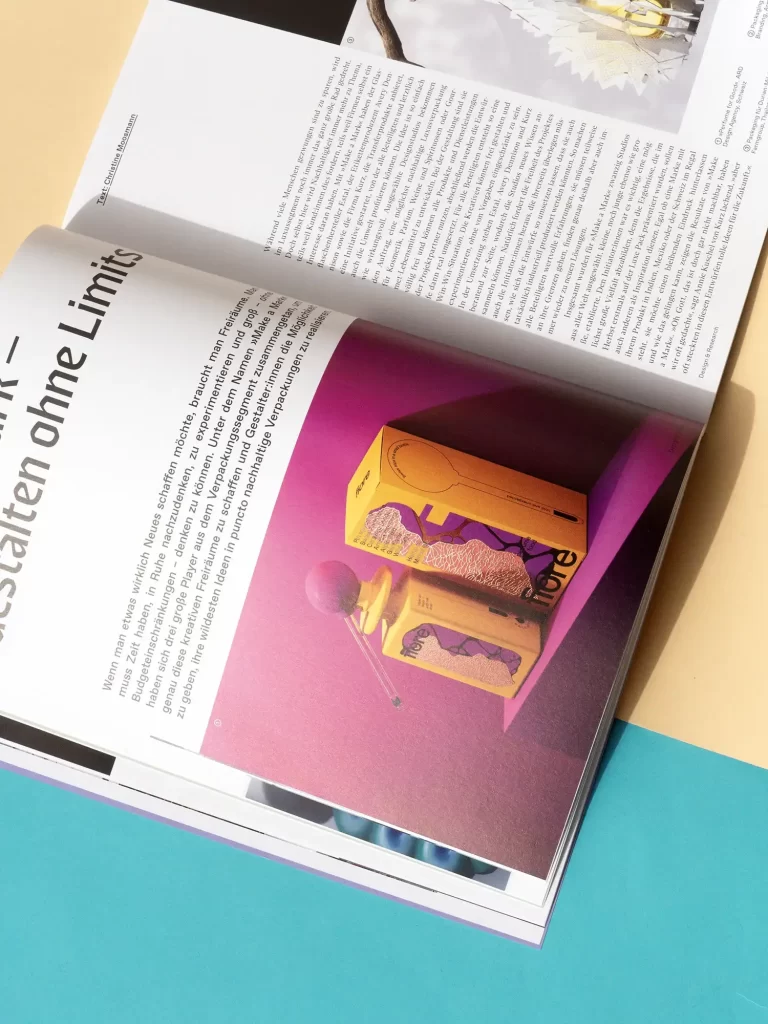
What would it be like if you could just do whatever you wanted? Sometimes this dream comes true for designers. For example, packaging designers from all over the world were allowed to design packaging as part of "Make a Mark", where everything was allowed and experimentation was encouraged. We show what happens when you have unlimited freedom. A dream has also come true for Studio Dumbar, as the creative minds from Holland have succeeded in transforming the country's digital advertising spaces into public galleries. We explain what the festival for motion design is all about in our focus on "Design in public space".
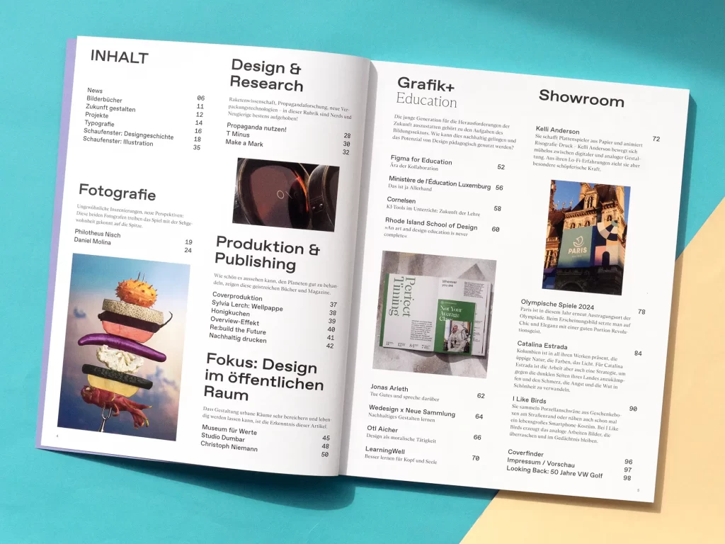
There are also plenty of beautiful print projects to discover in Grafikmagazin 02.24. Sonja Pham presents her favorite children's books, Kat Menschik has illustrated a volume of short stories by Haruki Murakami and Sylvia Lerch shows the creative potential of corrugated cardboard. Finally, we present "Sustainable printing", a guide that finally provides a comprehensive, well-founded and unbiased explanation of how to design and plan print products sustainably.
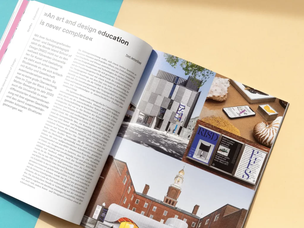
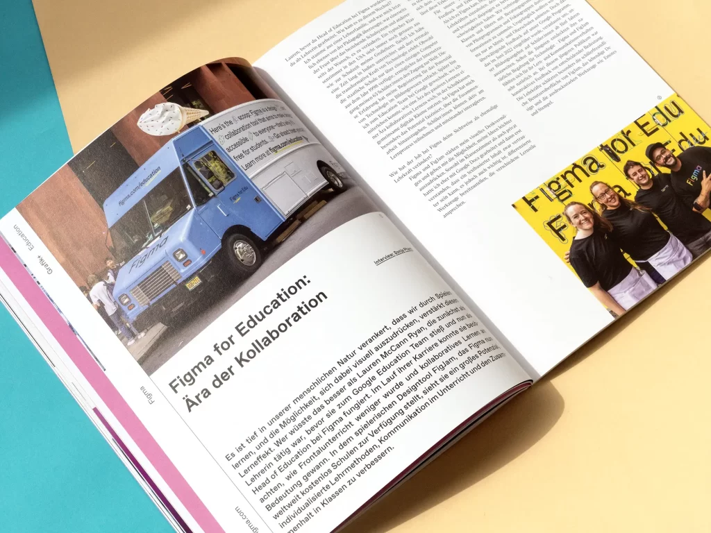
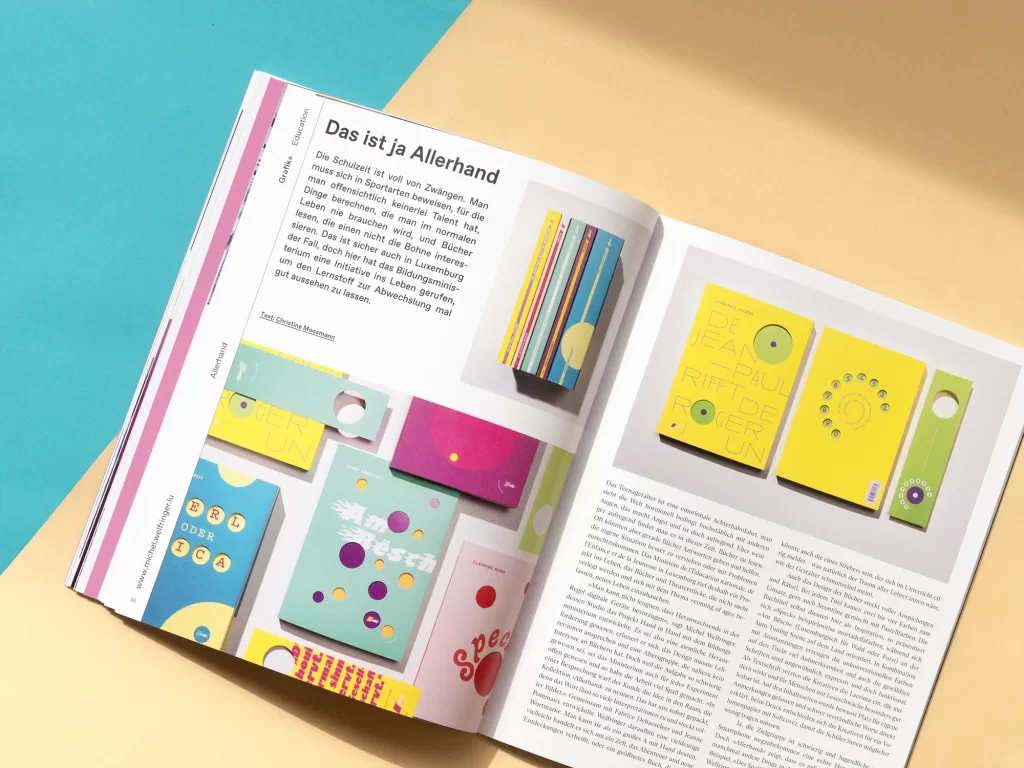
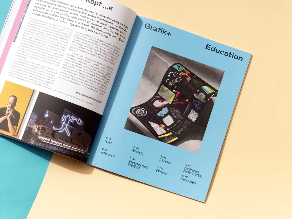
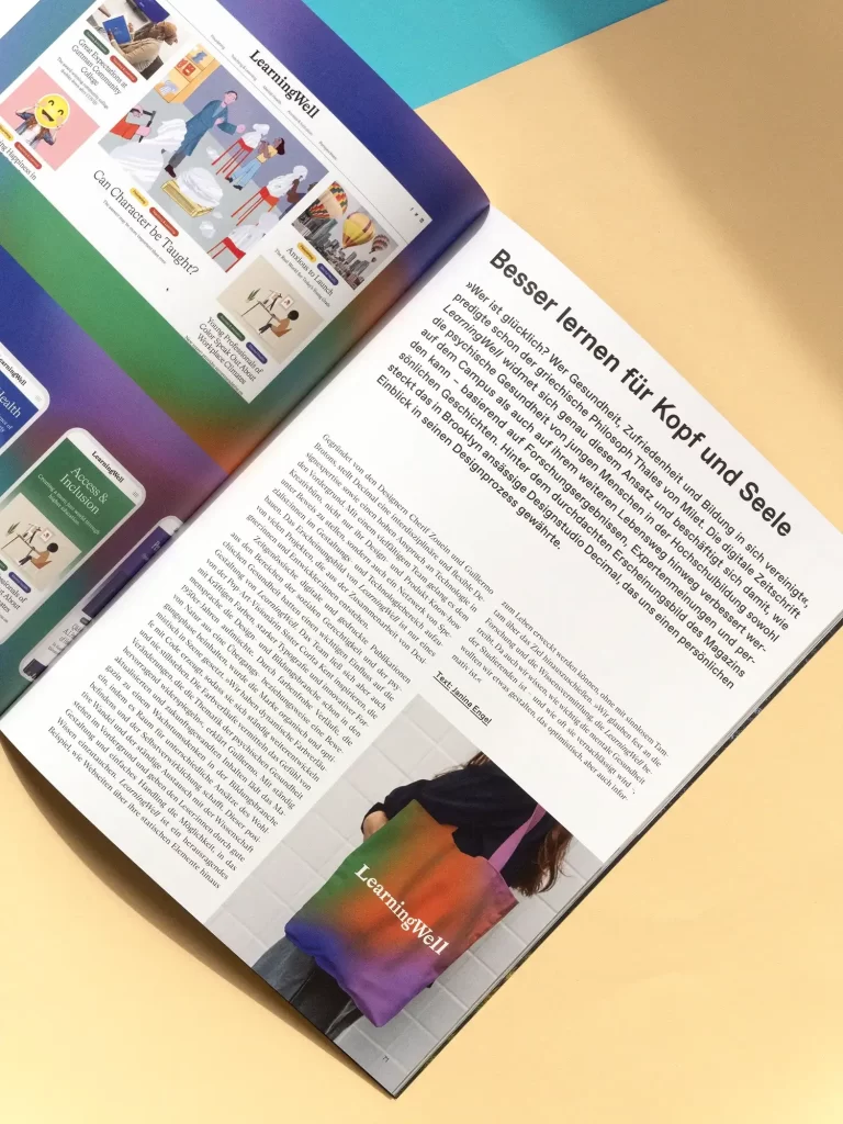
Graphics+ "Education"
In Grafikmagazin 02.24, we focus on the topic of "Education". In the education sector, too, design does much more than just make things look pretty. Thanks to new technologies, teaching and learning themselves are often changing. Textbook publisher Cornelsen, for example, has developed new AI tools that provide teachers with targeted and individual support, while Figma, a manufacturer of design software, has created an environment in which learning can take place in a playful way with its FigJam tool. Of course, books are still an important part of education. To ensure that young people still want to read them, the Luxembourg Ministry of Education has enlisted the help of creative minds - the initiative is aptly named Allerhand.
You can discover this and much more in Grafik+ on the topic of "Education".

The cover
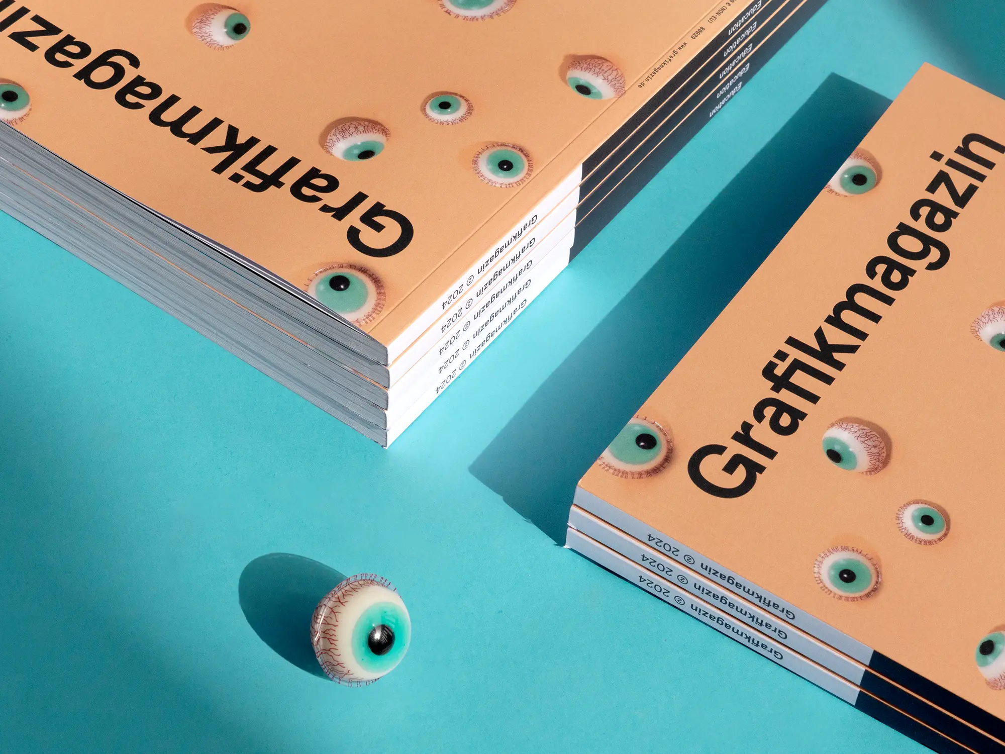
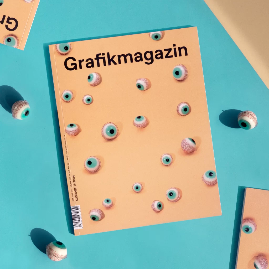
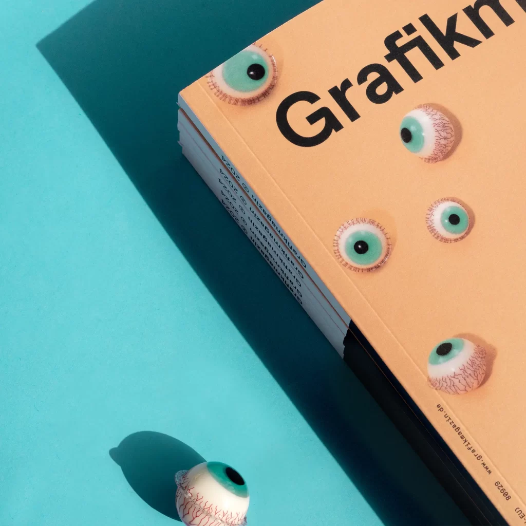
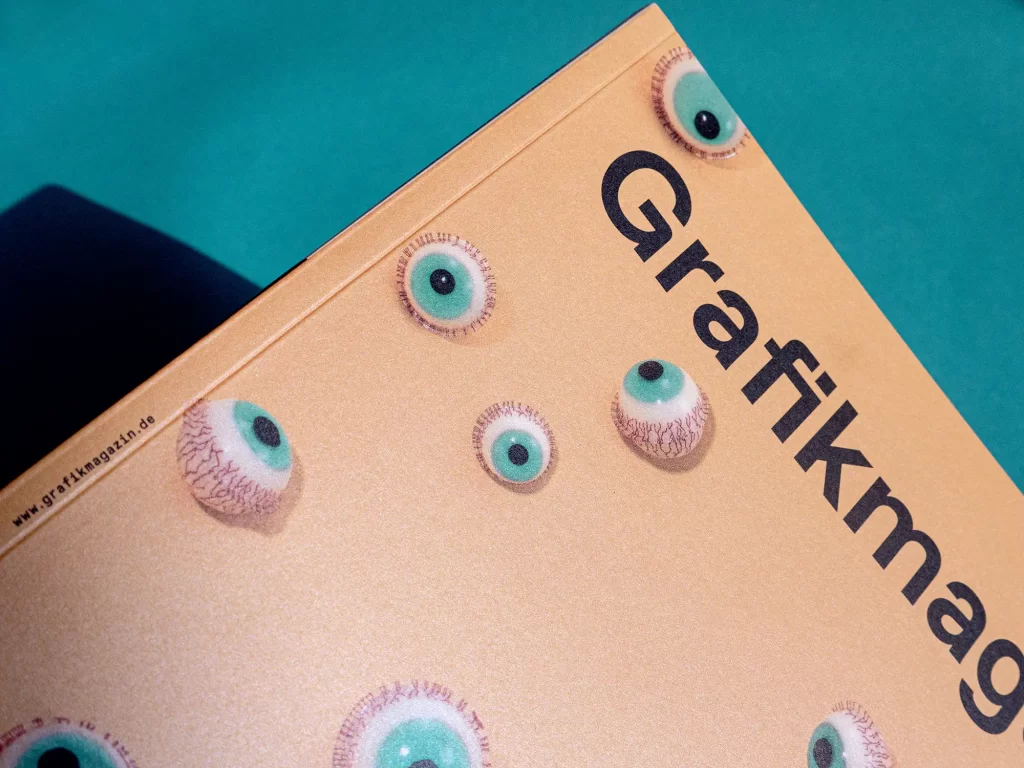
Look here, take a closer look at me, this gives you a deep insight, we have a clear view - the cover motif of this issue evokes many associations. It was created by the creative minds at I Like Birds, a Hamburg-based studio that uses a wide variety of props to create analog image worlds that have charm and look very different from many things created on a computer.
A shimmering metallic paper adds to the appeal of the cover and creates a sophisticated contrast to the trendy motif with its elegant appearance. The cover was printed in offset by F&W Medien.
The showroom
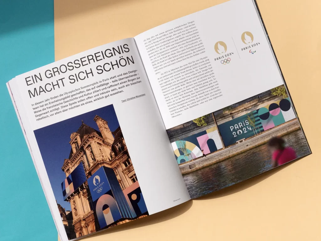
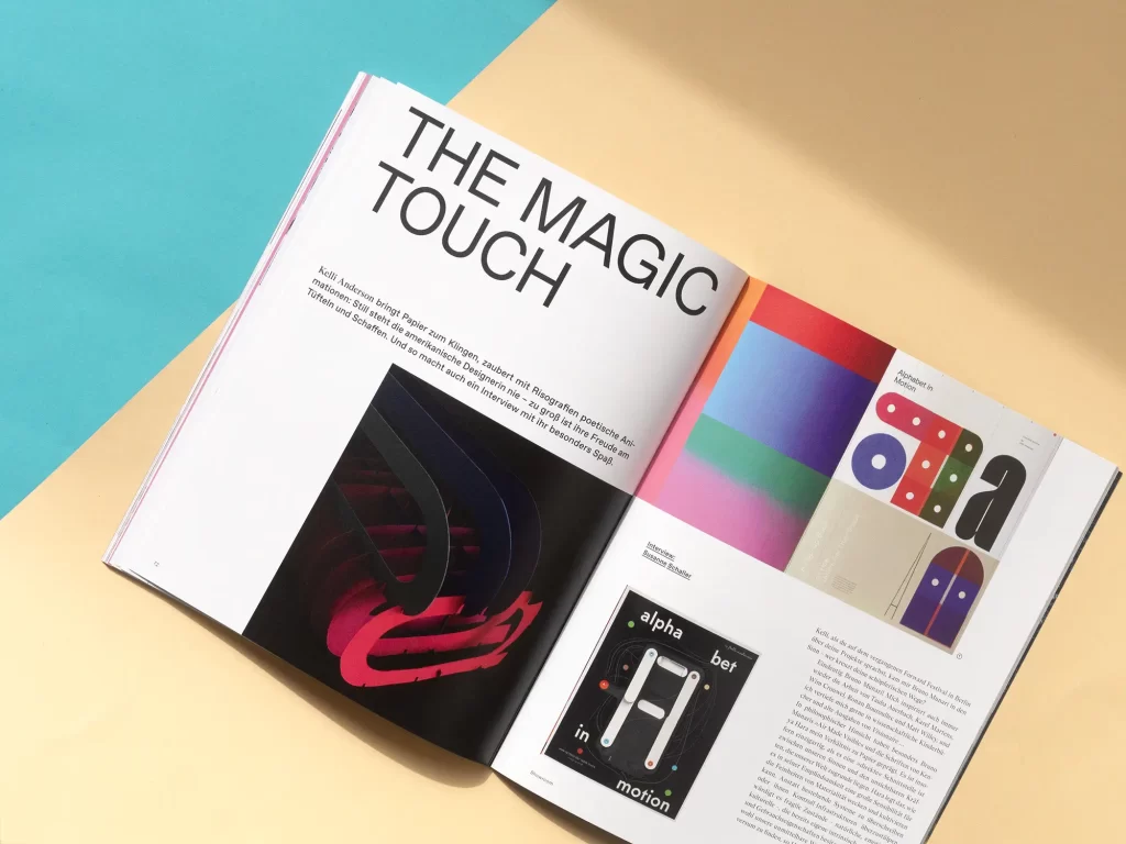
In the showrooms, we once again take you on a journey across the world: the experimental designer Kelli Anderson, who you may remember from our Risographie issue 05.23 "Creative Printing", lives in New York City, our cover artist duo from I Like Birds lives in Hamburg and the Colombian textile designer and artist Catalina Estrada now works in Barcelona. And for an exclusive look behind the scenes of the new look for the Summer Olympics, we take you to Paris. Have fun discovering!

Order now!
You can order the Grafikmagazin 02.24 with a focus on "Education" here, free of shipping costs (within the EU):
If you are interested in the topic of education and training, you can find more articles here...
