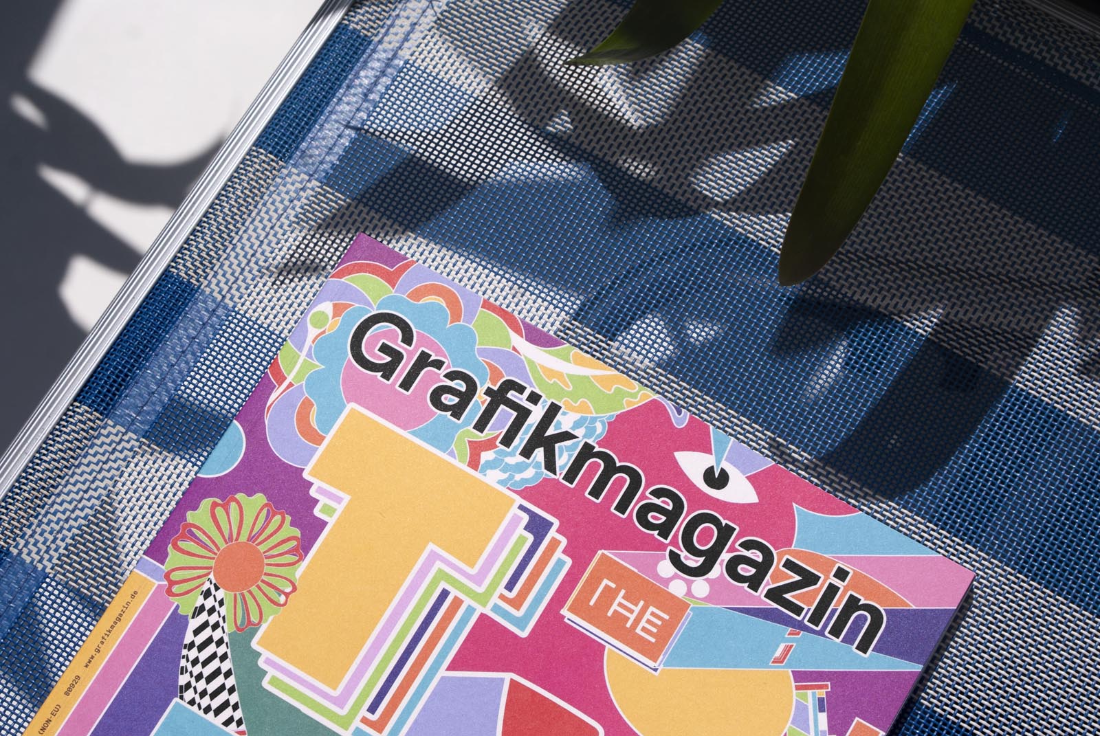
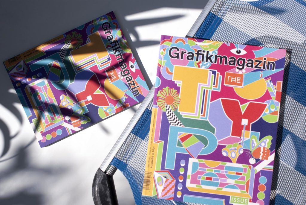
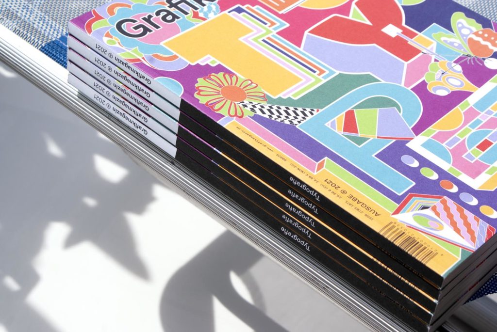
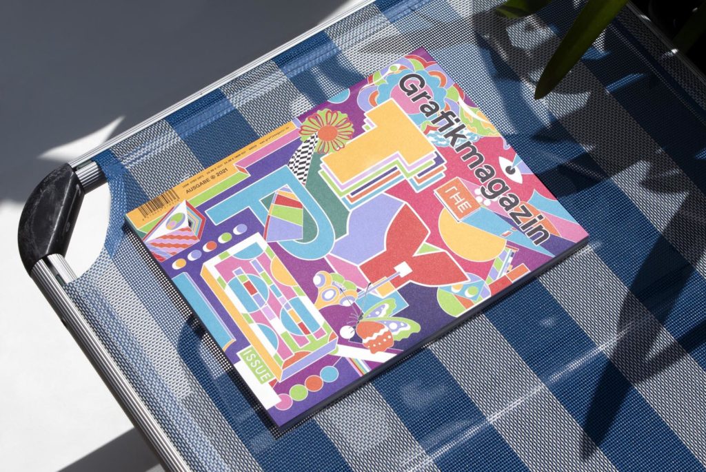
Sometimes you have to experiment - that's what British-Sri Lankan illustrator Murugiah says. He left his comfort zone for us and designed the cover of this issue. His interpretation of the theme of typography is unconventional, but for this very reason it is appealing and full of energy. After this riot of color, we dive into the world of typography and present classic type design as well as typographic experiments and lots of interesting facts about typography. We also introduce a "hidden champion": Joe Caroff himself is only known to a few, but his work is known to millions - such as the 007 logo.
So there is also a lot to discover in the 04.21 Grafikmagazin with a focus on typography ...
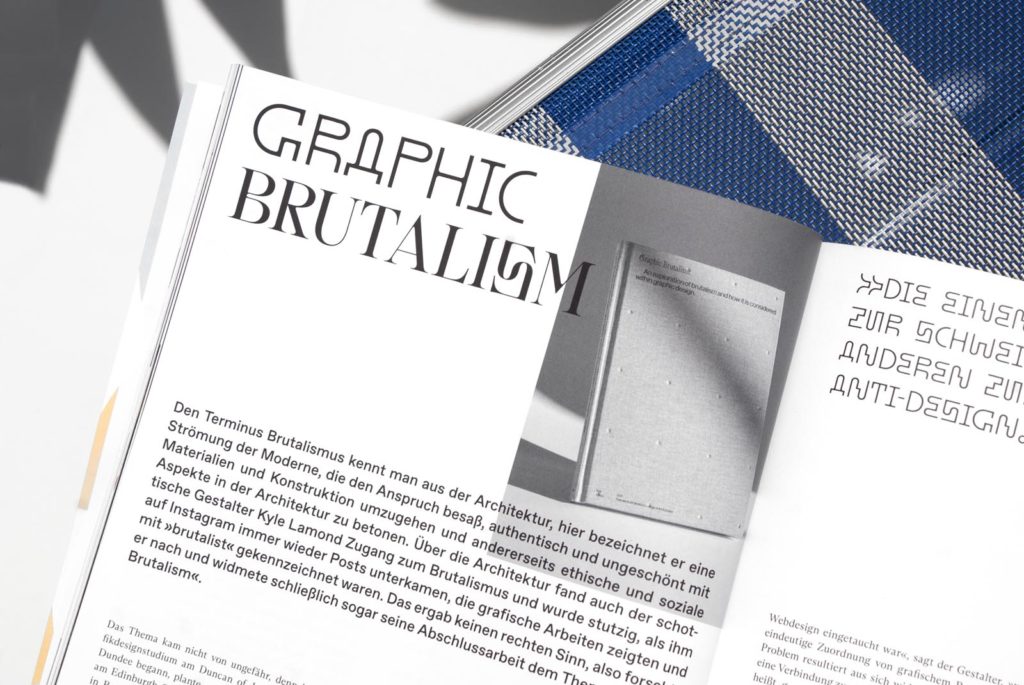
The great Kurt Schwitters once defined the aim of typography as creating relationships. We agree with him, because without it, graphic design would be bland, meaningless and often without purpose. In this issue of Grafik+, we explore the many facets of type design: white spaces and digital poetry, inclusion and wild experiments, proportions and processes, but we don't just focus on practical, applied typography and its illustrious facets. Abstract ideas and scientific reflections on the future of design also find their place, as do insightful discussions on necessary changes in the creative industry: once again, we talked to experts on the topic of New Work.
The content
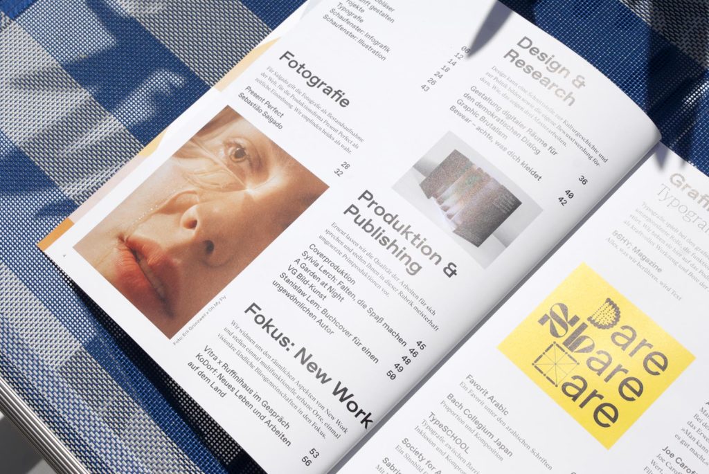
How can design promote awareness? Why is it important that it also interfaces with politics and cultural history? How do graphic designers contribute to democratic dialog? In the "Design & Research" section, we present three pioneering Master's theses that attempt to provide answers to these questions.
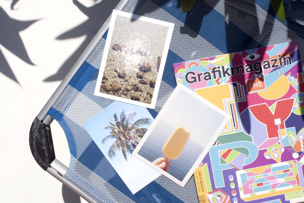
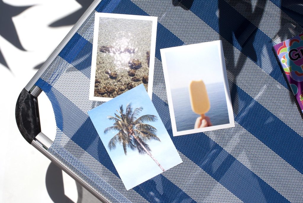
In the photography section, you will come across the unique black and white photographs of the legendary Sebastião Ribeiro Salgado Júnior, the war journalist turned environmental activist, who fulfilled both activities with greatness. We also introduce you to the Austrian photo production company Present Perfect, headed by Elli Schindler. Three of her wonderful photographers also agreed to provide us with motifs for the postcards enclosed with the magazine. So you can send a photographic greeting card out into the wide world - or brighten up your workplace with a little vacation spirit.
Because we think that, in addition to the last New Work special, the spatial aspects are also of the utmost importance when we talk about the future of work, we are devoting a little more space to this topic. To highlight the differences, we asked various players to talk to us: We spoke with workplace developer Philipp Becker from Vitra and Ruffinihaus Creative Hub project manager Christina Schepper-Bonnet about multifunctional urban spaces, and with the green people from KoDorf about visionary rural living and office communities.
Graphic+
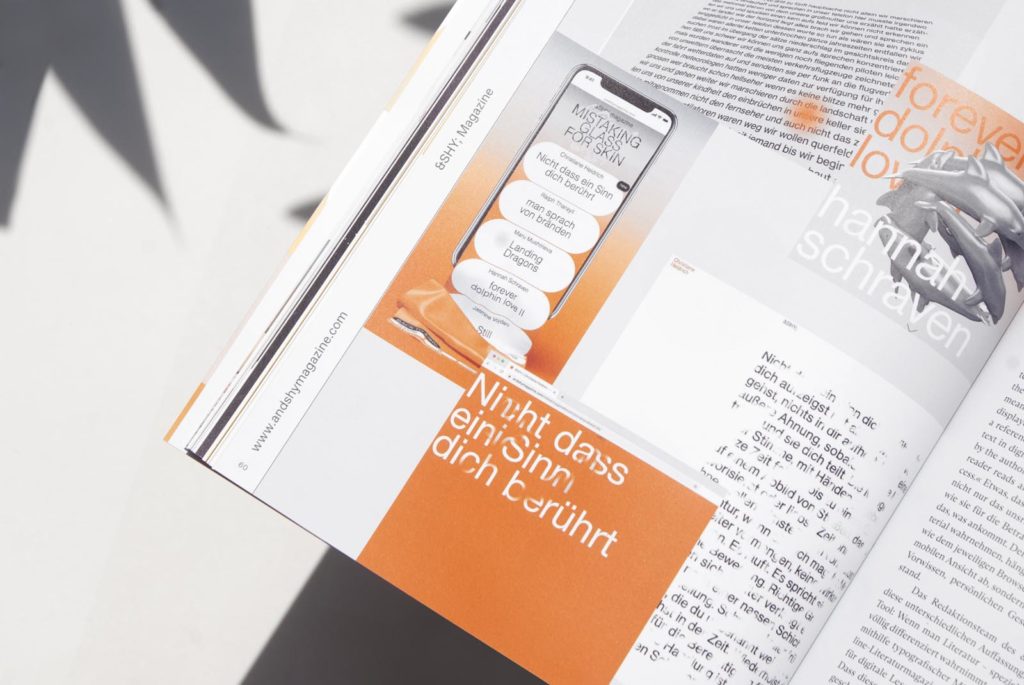
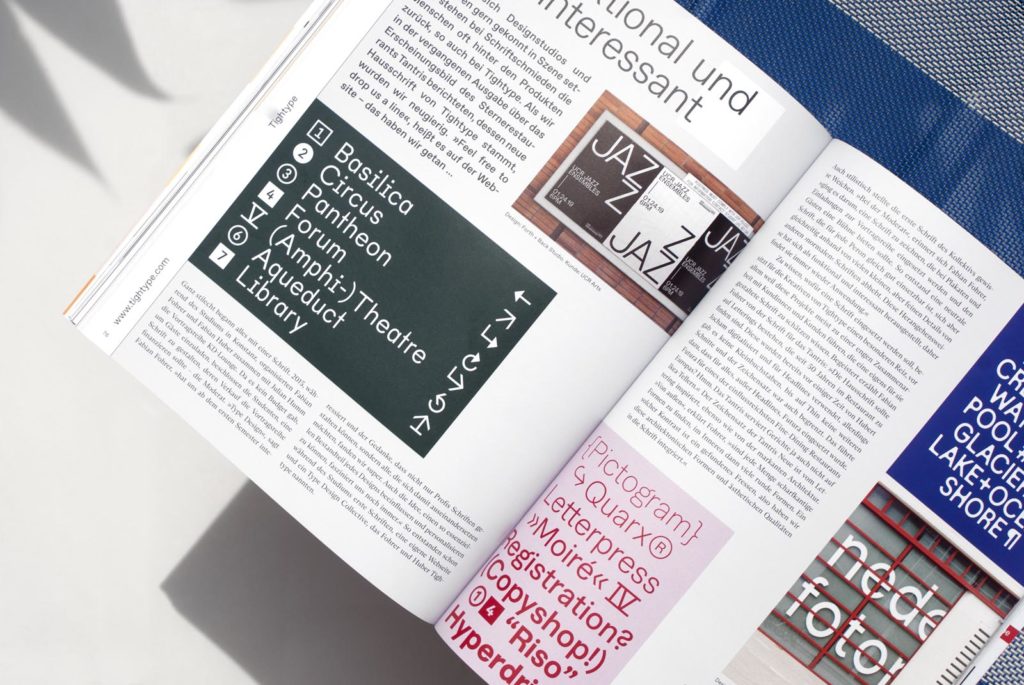
Grafik+ profiles type designers and their projects, such as the type foundry Tightype, communication designer and author Sabrina Öttl and Uwe Steinacker's workshops on inclusive typography. It focuses on interactive typographic experiments, such as those carried out by the digital literary magazine ­, but also on how type can be designed to be barrier-free and more international.

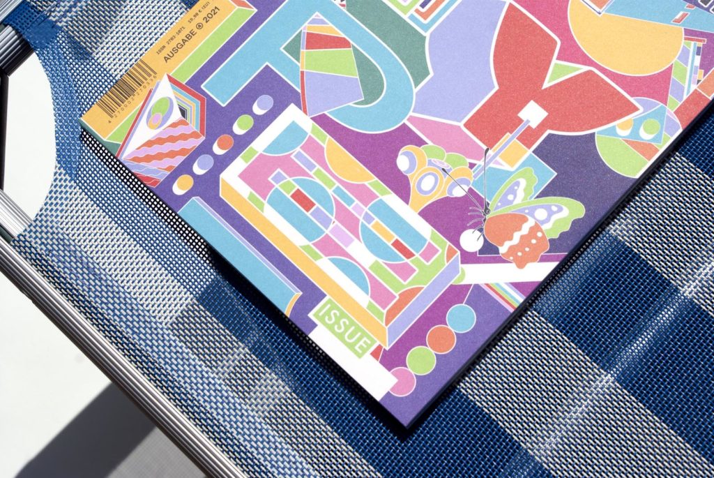
Cover, paper & production
For the cover of this issue of Design Magazine, we chose Rebecca Design Original paper with a weight of 300 gsm from Clairefontaine. Thanks to the surface treatment, the material has excellent machinability and an even print result, the best prerequisites for large-scale color compositions such as those Murugiah created especially for our cover. It was printed by F&W Medien in offset in 4c.
Murugiah has gone off the beaten track with this radiant design, as he is known for small-scale compositions and quirky characters, "but when I got the great opportunity to design the Typo issue for Grafikmagazin , I wanted to embark on a typographic experiment. As any creative knows, it's important to force yourself to step out of your comfort zone every now and then to better understand yourself and your work."
With this open-minded mindset, he fits perfectly into this issue. Thank you very much for the splendid summer colors!
Special thanks to our readers
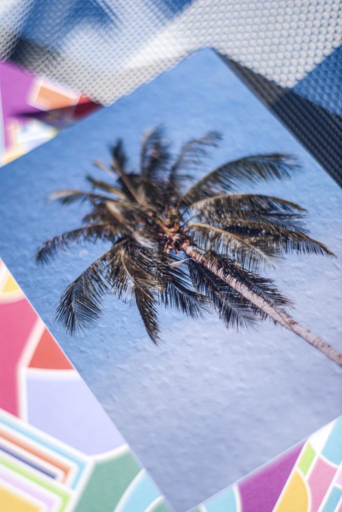
In this issue you will also find a set consisting of three postcards, each staged on three different papers. The cards feature summery motifs by Present Perfect Productions photographers and were produced by Onlineprinters.
Use the cards to send a personal greeting to friends, family and nice people or simply to create a little vacation atmosphere at work.
Yours sincerely
Your Grafikmagazin
The Grafikmagazin 04.21 with the focus on typography and the postcards can be purchased here ...

