Editorial design is quite specialized and there are a lot of rules, but it is also an area of design that is particularly enriching. "It's so nice," a book cover designer told us, "because you're so close to people and everyone can immediately relate to it and have an opinion." So this issue is all about the design of books, covers and magazines and about the passion for a cultural object that has been constantly reinventing itself for centuries.

The question of why
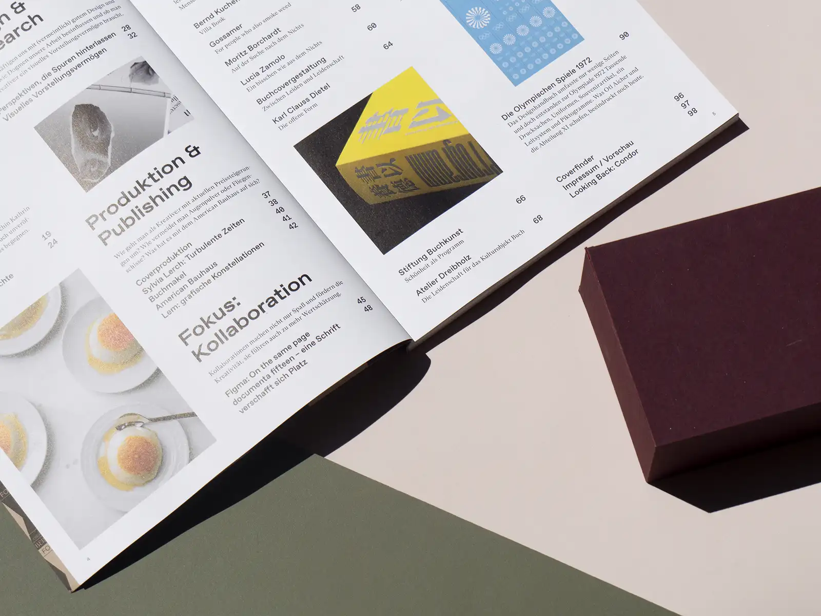
In this issue of our Design & Research section, we get to the bottom of the question with Mara Recklies as to who is actually allowed to define what good design is - and why it often can't be with prominent design principles such as those of Dieter Rams. The design philosopher teaches design theory subjects at numerous universities and has already set many a thought process in motion - not least among us. For her master's thesis, Melanie Scheer investigated what it means for the creative process that people have very different imaginations.
Together you are less alone
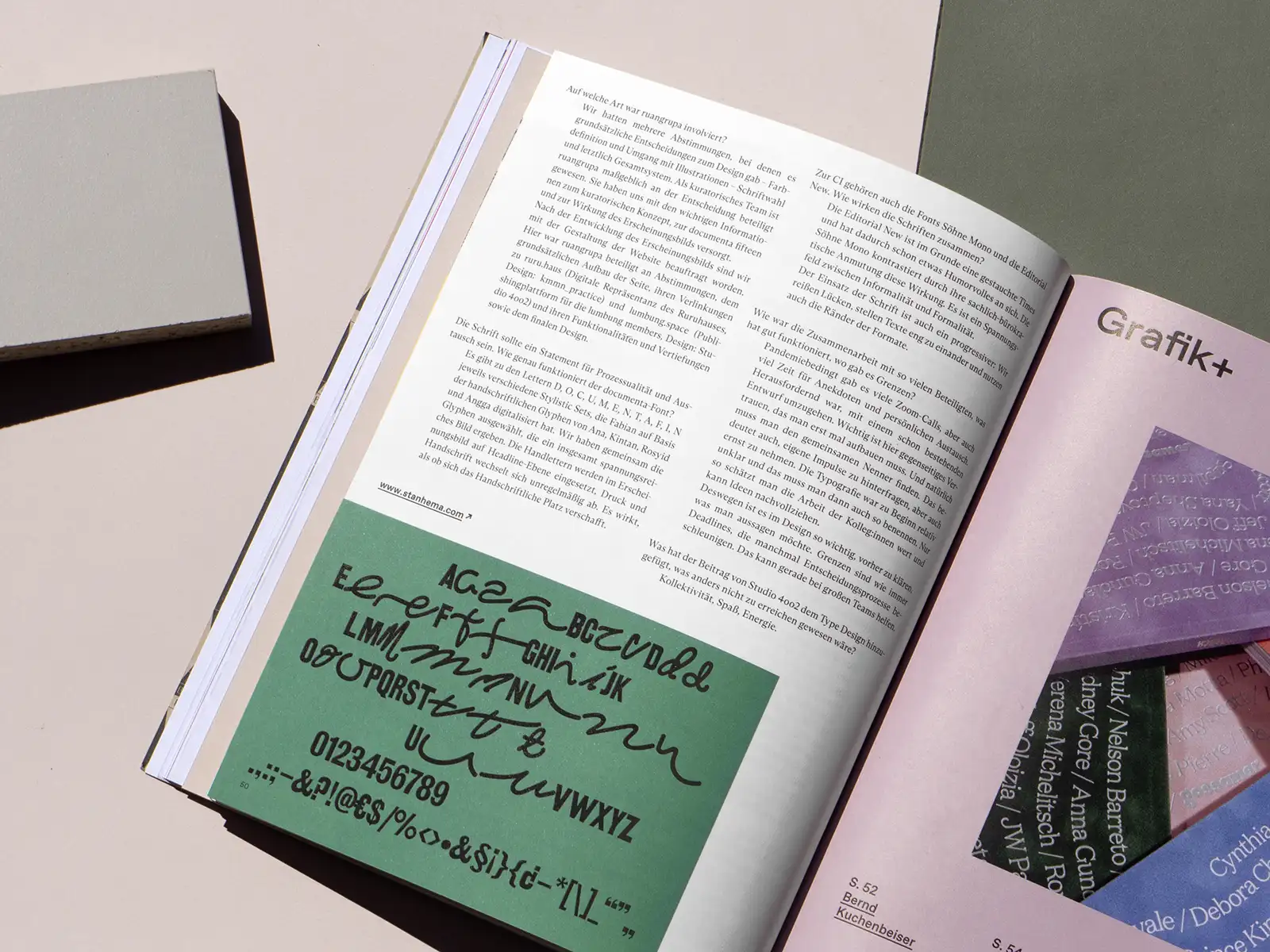
This issue also focuses on the topic of collaboration. We spoke to the CEO of the collaborative design software Figma, Dylan Field, about his vision for the democratization of the creative process. Collaboration was also used for the appearance of documenta fifteen, right down to the font design. This unusual process led to a very complex result, which we discussed with designer André van Rueth from Stan Hema. He advocates mutual trust and listening to one's own impulses - even if they should often be questioned during the collaboration.
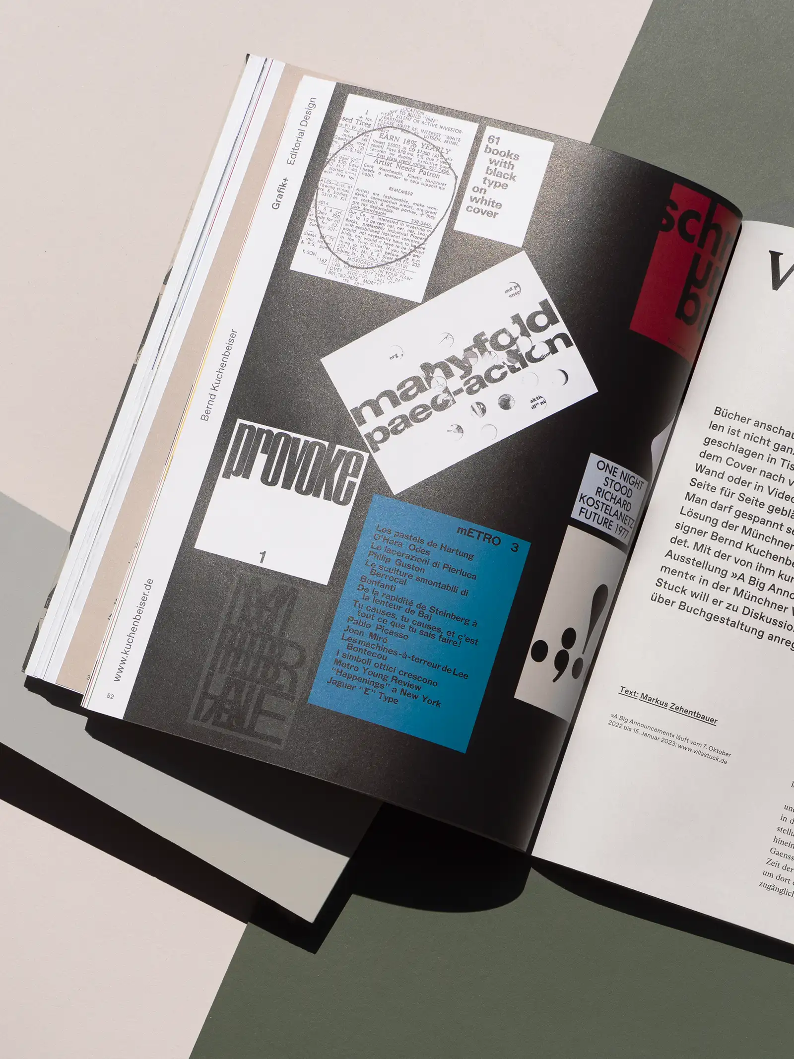
Graphics+ Editorial Design
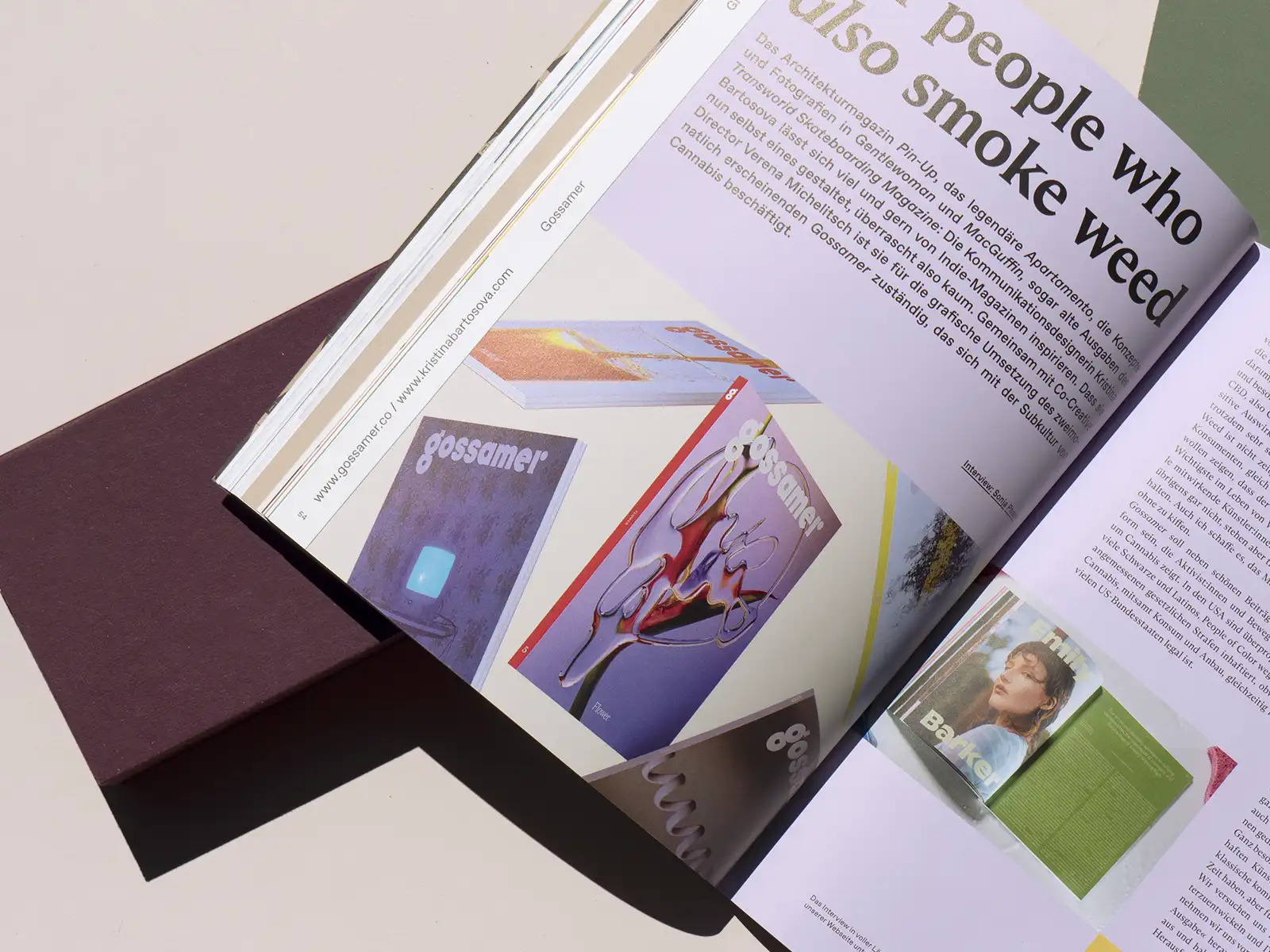
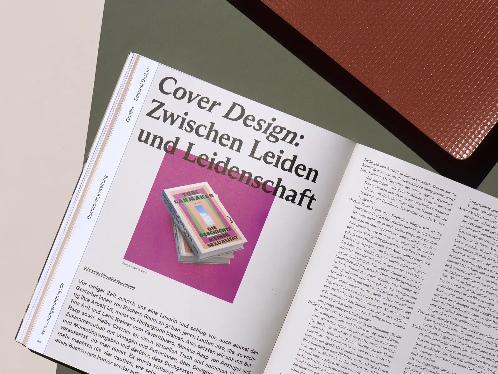
Good editorial design immediately catches the eye and touches you in a special way, but how are these great books, covers and magazines actually created? In our Grafik+, we took a look behind the scenes and spoke to exceptional book designers such as Bernd Kuchenbeiser and Paulus M. Dreibholz or with Kristina Bartosova, Creative Director of Gossamer Magazine, Lucia Zamolo told us more about illustrative design and Moritz Borchardt created a book about nothingness. We also wanted to know why many book covers look the way they do on the store counter and had a lively discussion with four book cover designers about designing between suffering and passion.
The cover
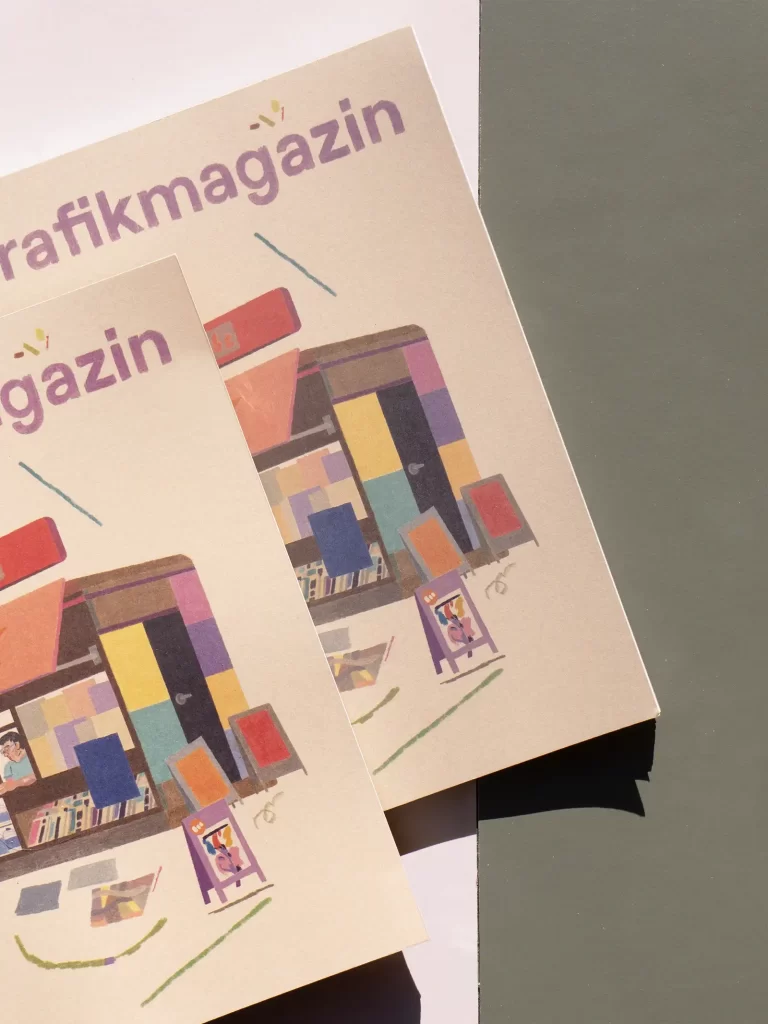
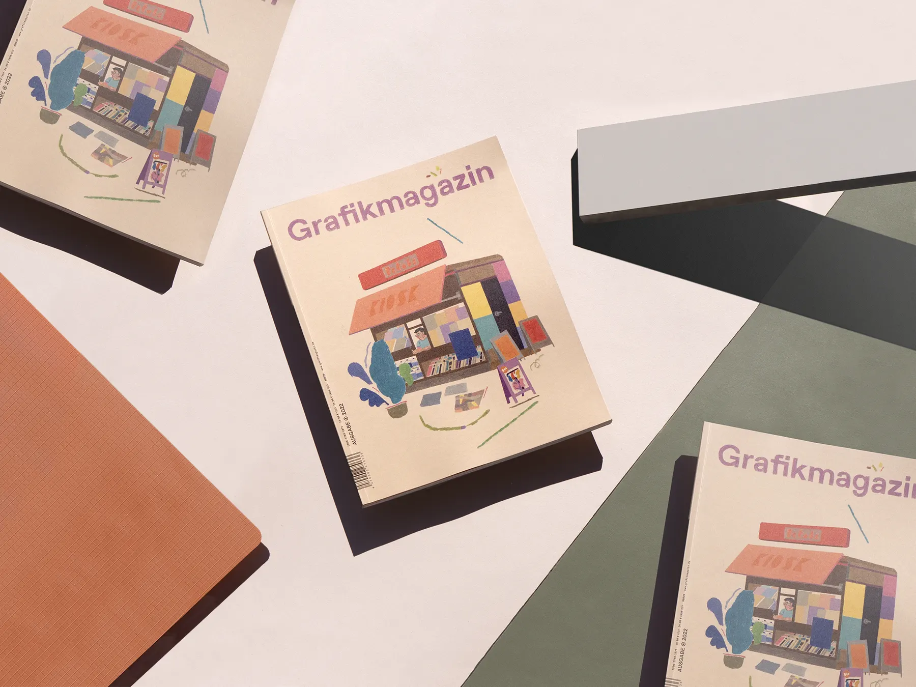
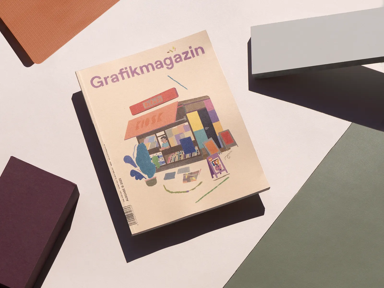
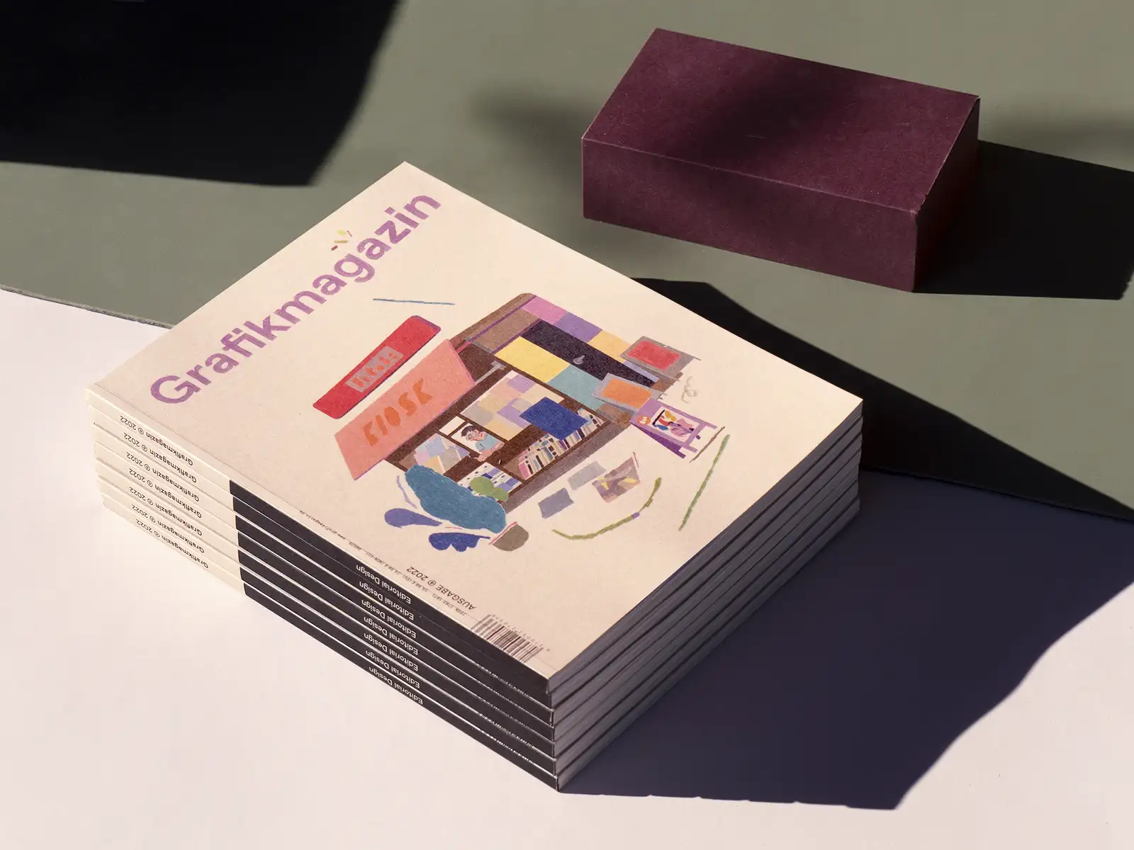
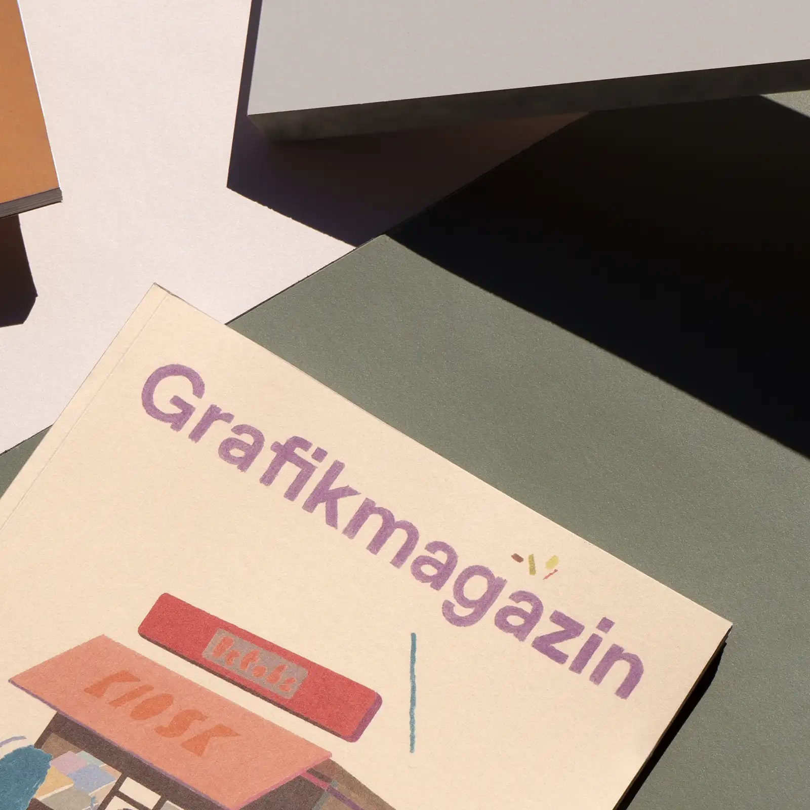
Illustrator Christina Gransow, whose work we also present in the Showroom, designed the cover of this issue. When she thought of editorial design, she immediately thought of a kiosk, she told us, where so much of it comes together. "But also because I personally really like it as a motif: a mostly inconspicuous little box in the city where a person spends their life day in, day out, surrounded by sweets, drinks, newspapers and magazines."
For this issue, we used the FSC-certified Olin Origins from Antalis in 320 gsm and the color Cereal for the cover. It was printed in offset, but it is thanks to F&W's expertise that the result is so bright.
And there's something else special about this cover, have you noticed? Not only the motif is illustrated, but also the masthead!

The showroom
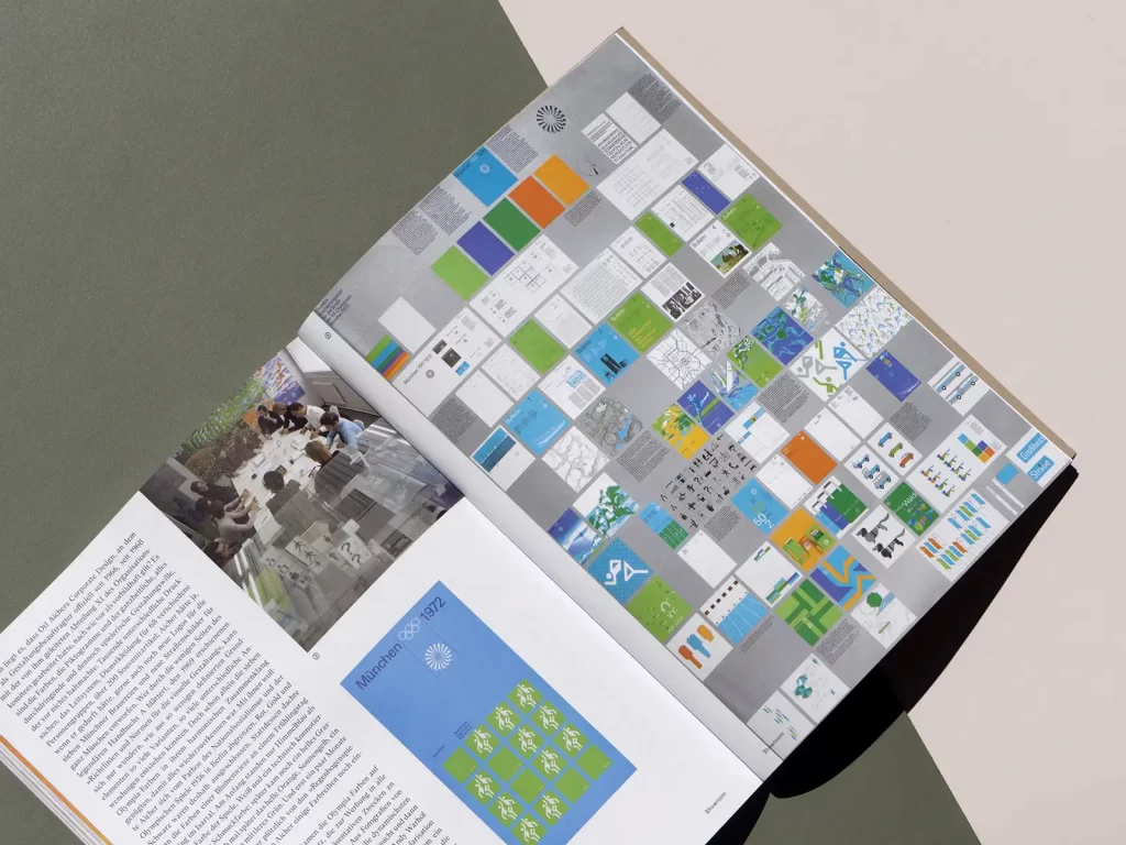
In the showroom, we present - alongside Christina Gransow - some of the results of the European Design Awards, whose jury includes our editor-in-chief Christine Moosmann, whose strong stance she particularly admired this year. Our author Markus Zehentbauer reports in detail on the appearance of the 1972 Olympic Games and Patrick Rössler writes about Jan Tschichold as a tireless propagandist of the "New Typography" movement in the 1930s.
So there really is a lot to discover in this issue. The Grafikmagazin 04.22 with a focus on "Editorial Design" is now available in our store.
There you will also find further issues of Grafikmagazin and various subscriptions.
