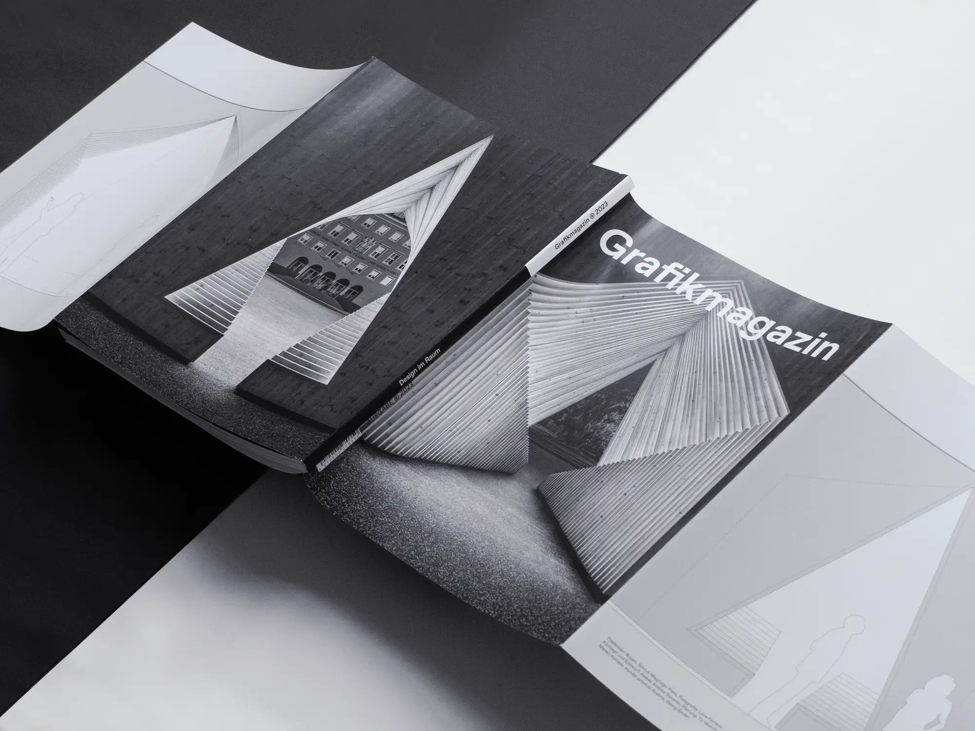
In the digital world, the user experience has long been an important criterion in design, but when it comes to real spaces, there is still plenty of room for improvement. In our focus area "Design in space", we show successful projects that create orientation and well-being - from children's homes and museums to trade fair stands, office spaces and public spaces.
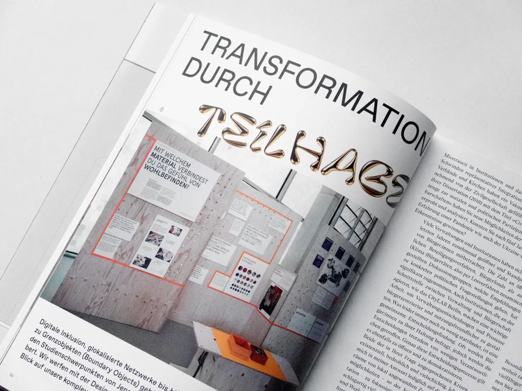
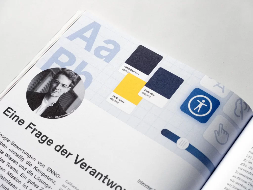
Orientation is also the subject of another section in our new issue. In our "Focus on ethics" section, Nina Reisinger and Guillaume Vaslin show how ethical standards can be integrated into everyday design. Design researcher Jennifer Schubert creates spaces for exchange between administration, politics and citizens. This creates change through participation. Good local journalism can also advance and strengthen society, as Karla from Constance shows.
In the photography section, this time the Grafikmagazin is exploring the world's major cities. With Fotografiska, Berlin has gained an exhibition space that offers a stage for contemporary, critical and queer-feminist positions. Alan Schaller, on the other hand, makes the city itself the protagonist and shows people in urban spaces in atmospheric black and white photographs.
Graphics+ "Design in space"
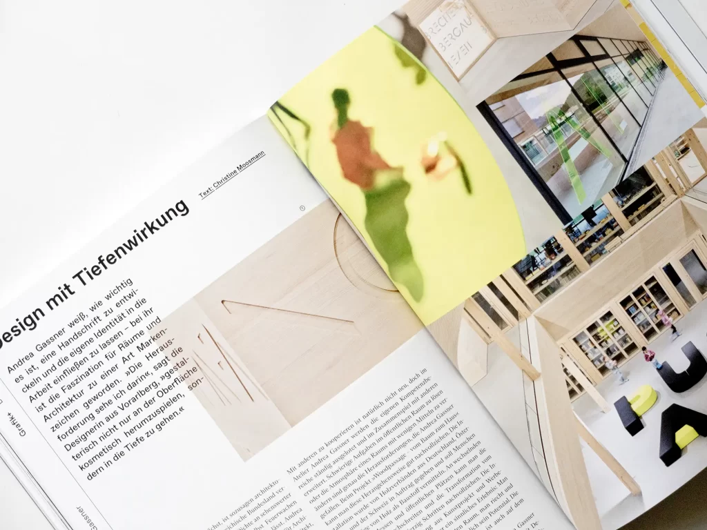
Designing for spaces means designing for all the senses - it's challenging, but also very exciting. In our focus section, we showcase a trade fair concept that combines immersive, digital experiences with real spaces, orientation systems that demonstrate posture, small tactile changes that make many things easier for senior citizens and a children's home in which almost nothing is broken anymore.
The examples we present make it clear that design in space is much more than just hanging up signs. Creatives need a deep understanding of spaces, their use and their impact. But if you take the trouble to take a closer look, you can make a huge difference to users and improve their lives.
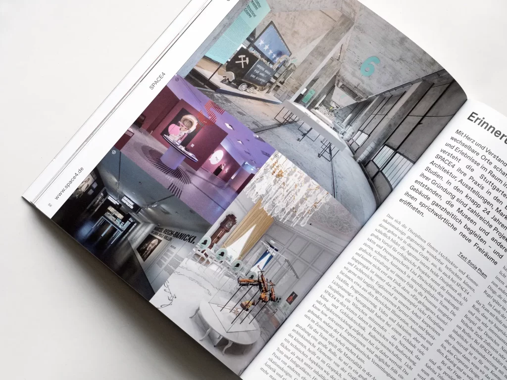
The cover
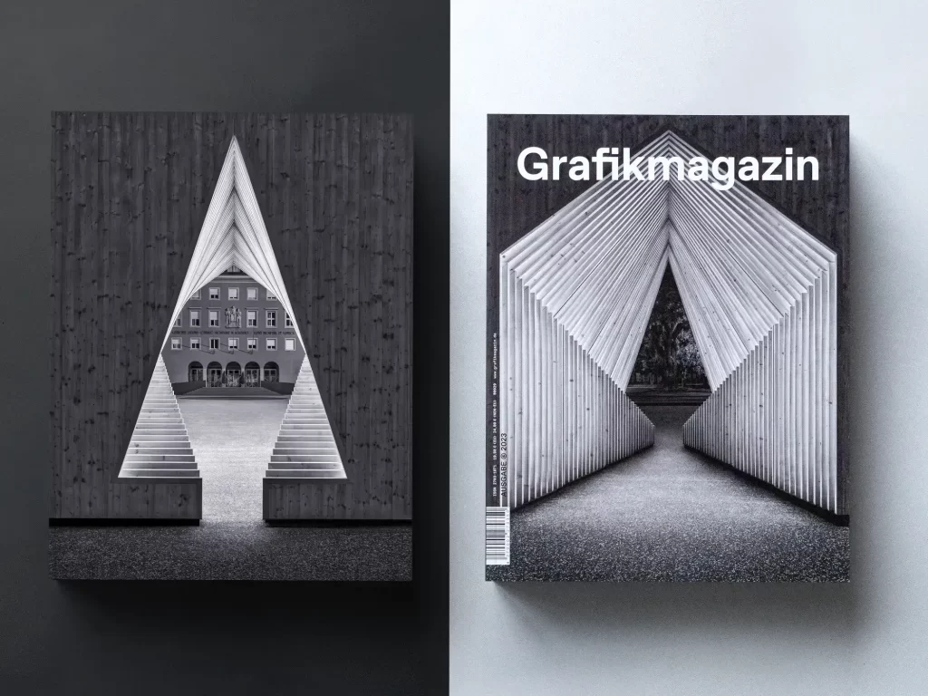
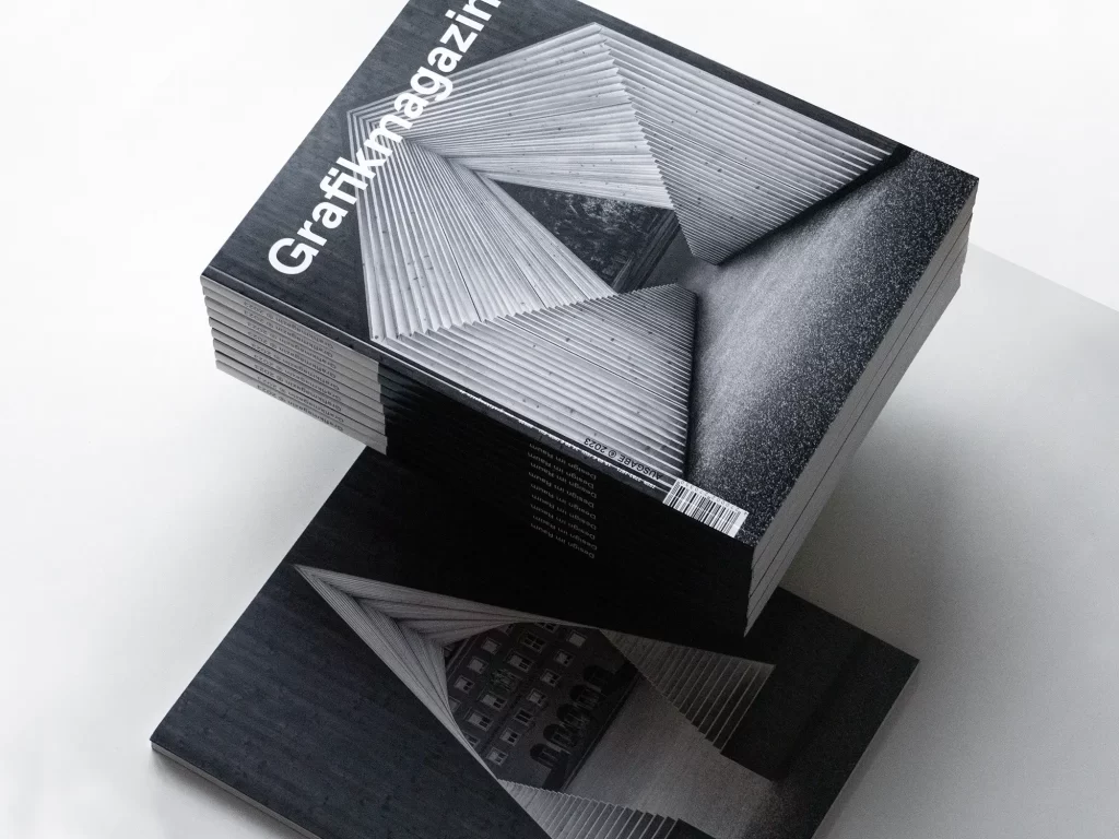
This issue is all about "design in space", which is why we not only show a charming spatial sculpture on the cover, we have also transformed the cover itself into an exhibition space. The flaps on the front and back of the cover create an extra area that we have used like a gallery. If you wish, you can also set up the Grafikmagazin like a cube and switch between an outside perspective and an inside view. The design comes from the Andrea Gassner studio and the photo motif from Luca Ferrario.
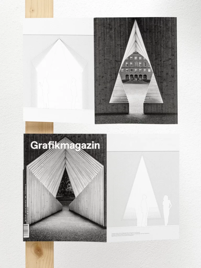
The cover was printed by F&W Medien in black and white, with the black tones being overprinted several times to achieve a rich color effect. For the cover, we chose GardaGloss Art from Berberich, a paper that is characterized by its high print gloss and was ideally suited for this motif.
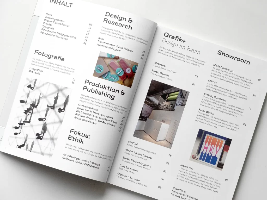
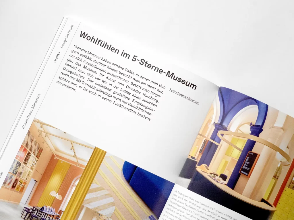
The showroom
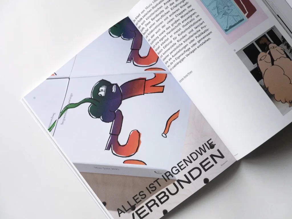
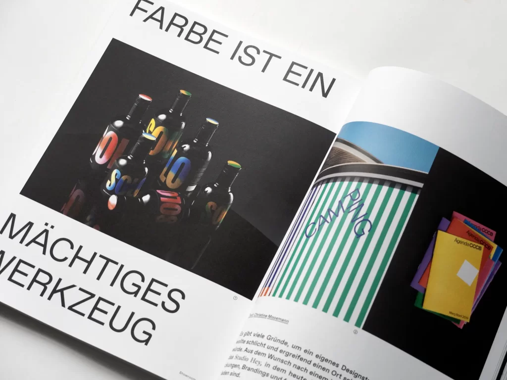
"Learning from the most beautiful" is the motto of the Stiftung Buchkunst, whose valuable work we present in detail in this issue, and it could apply to all the portraits in the Showroom section: Verònica Fuerte from Studio Hey approaches projects playfully and with the courage to use color, Moriz Oberberger works at the interface between illustration, typography and art, Kieler Woche presents itself not only as a major sailing event, but also as a major graphic event and an excerpt from Andreas Loop's new book "DDR CI" delves into a piece of design history from the former GDR.
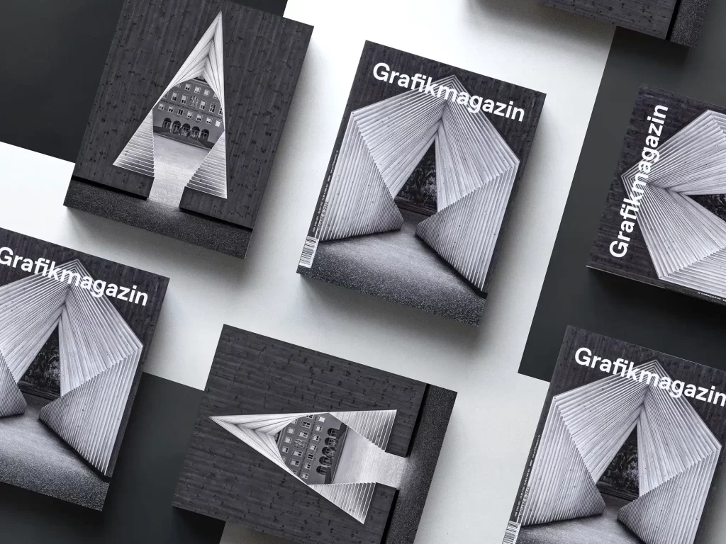
You can order the Grafikmagazin 06.23 with a focus on "Design in space" here free of shipping costs (within the EU).

