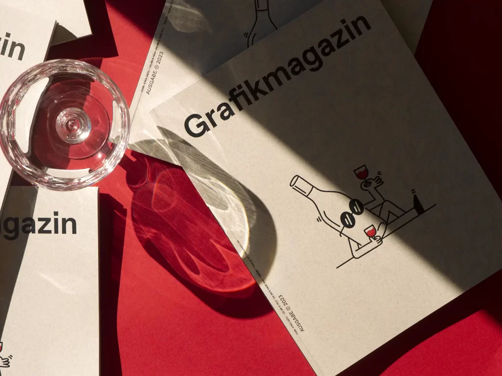
We haven't had this much fun preparing a new magazine for a long time. This issue focuses on "Bars & Drinks" and we were really impressed by the great design solutions we discovered around the world. There is also a great letterpress cover. The Grafikmagazin 01.23 is a real treat - even from a sober point of view.
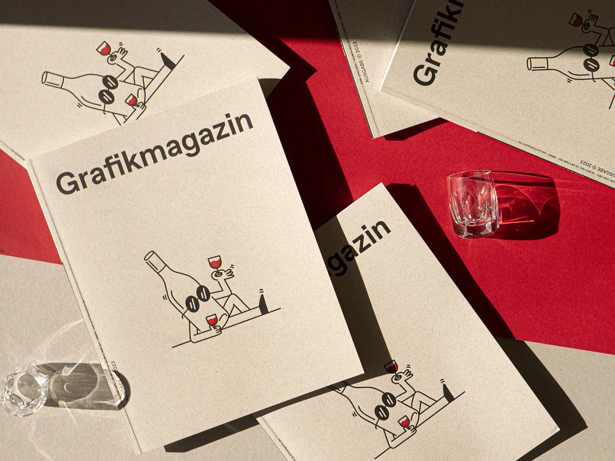
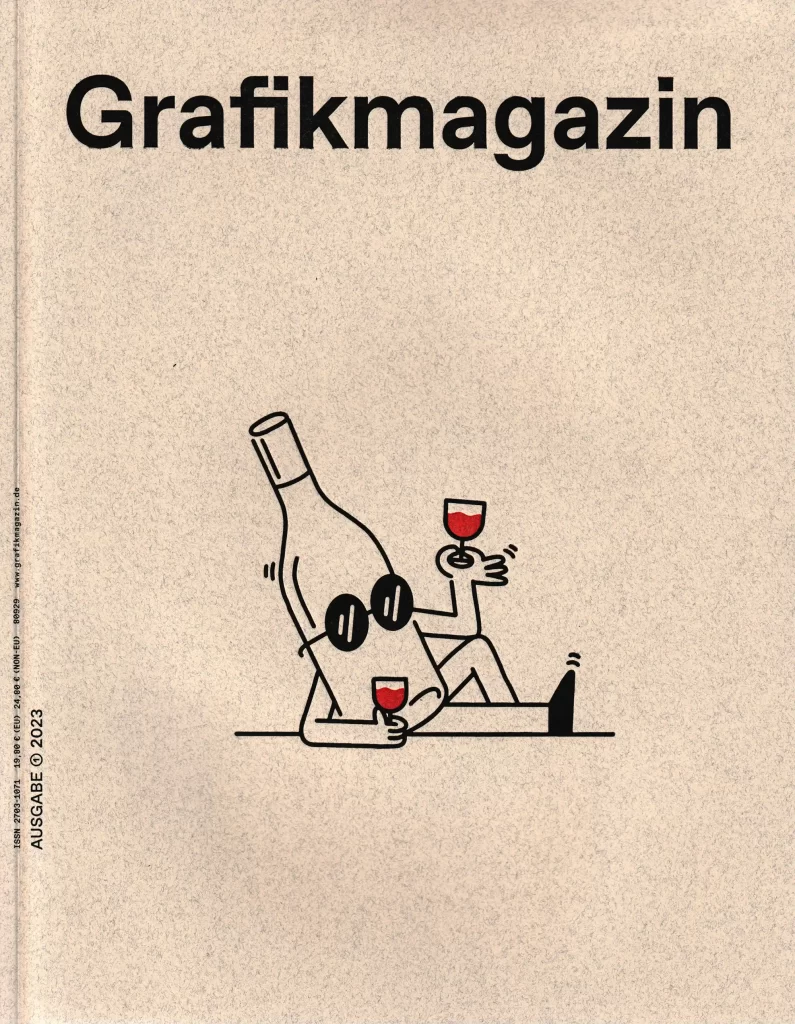
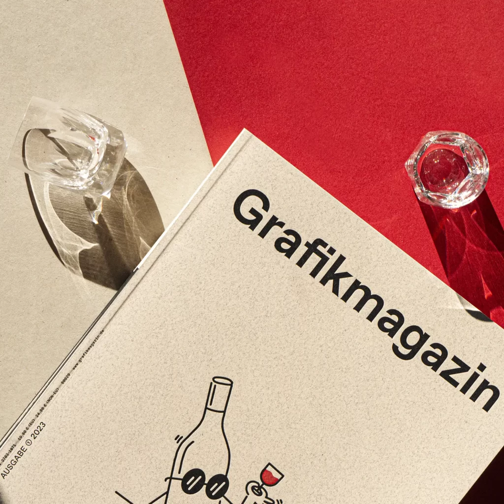
Does she look cool or grumpy, the bottle on the cover? That's up to you, but the design of our new issue is very cool. A velvety-soft paper with a high cotton content and letterpress transform this cover into a real gem. Absolute visual reduction meets the highest quality paper and printing - the Grafikmagazin 01.23 with its focus on "Bars & Drinks" is pure understatement.
In this issue, we invite you to several remarkable exhibitions and our author Patrick Marc Sommer has taken a look at the grassroots movement Creatives for Futures. Herbert Lechner remembers the typographer Georg Salden, whose typeface Polo is 50 years old. Communication scientist Patrick Rössler looks back even further, presenting a remarkable graphic find from the past century in every issue from now on, starting in 1923. We are also launching a new focus in Grafikmagazin 01.23, in this and the following issue we will be looking at the topic of "Design Education". Where does design education stand today, what deficits are there and what could a better education look like?
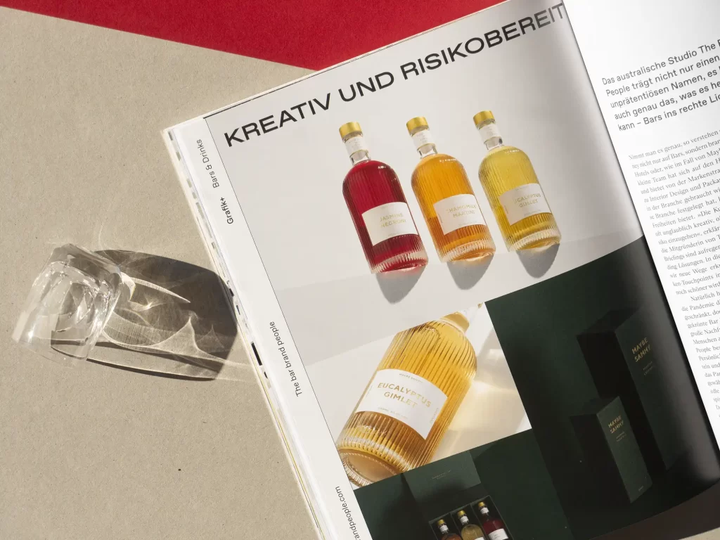

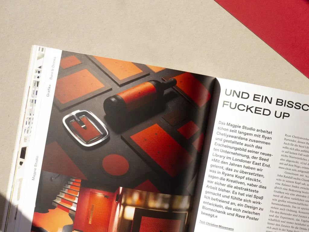
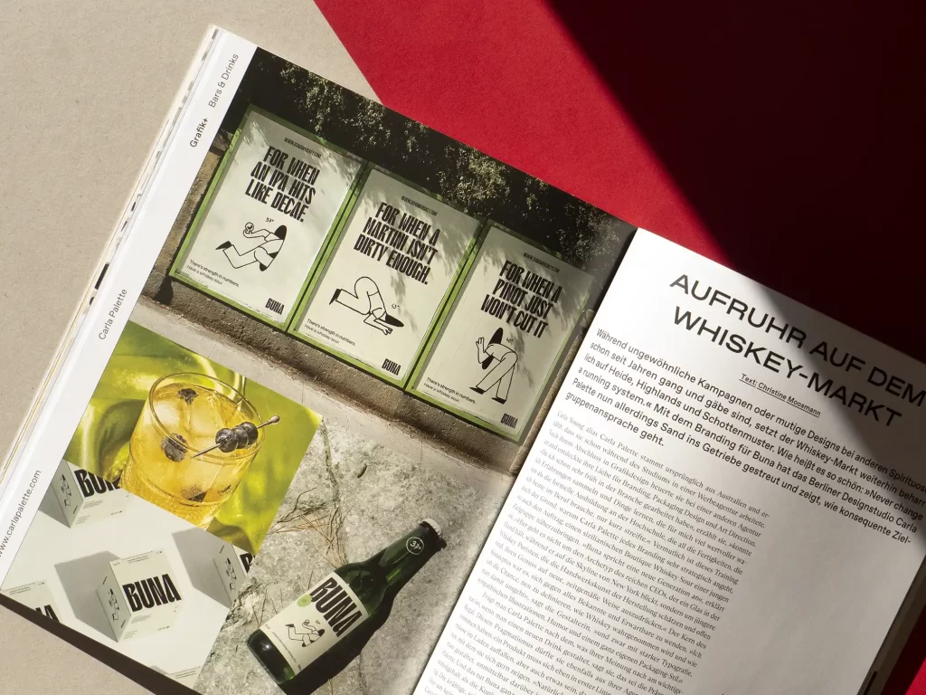
Focus on bars & drinks
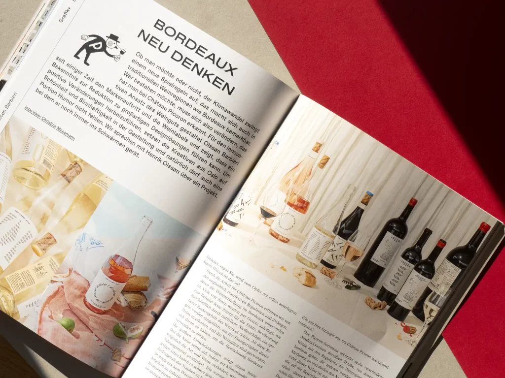
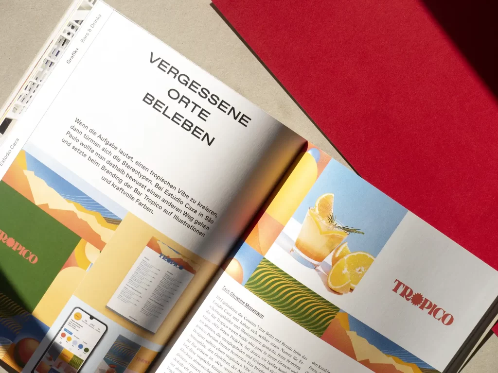
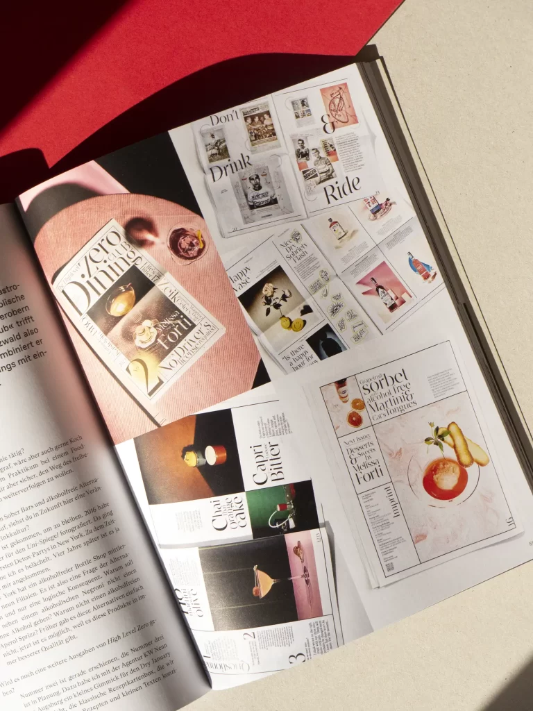
In Grafik+, we travel the world's bars. From Bordeaux to Taipei, we have tracked down great branding and interior designs and found illustrations and editorial design for bars and drinks that have really inspired us. Whether a little fucked-up in London, elegant in Sydney or healthy in Vienna, these design solutions are a feast for the eyes.
The Grafikmagazin 01.23 with its focus on "Bars & Drinks" shows how enormously diverse communication design can be when experienced designers meet courageous clients.
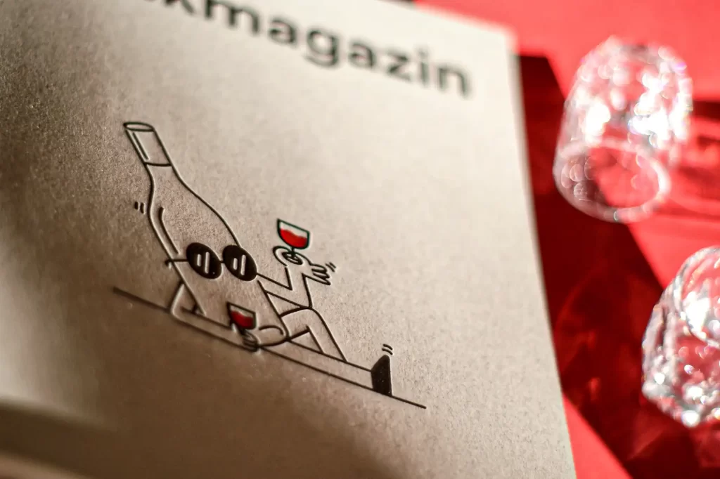

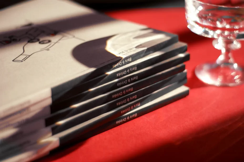
The cover
This cover is pure understatement and only reveals its elegance on closer inspection. Australian illustrator Steve Gavan works a lot for the bar and restaurant scene and knows how important it is to win over customers with fresh ideas. He also found the right mix of message and humor for our cover.
The paper we used for this issue also sends an extremely appealing message. Refit Cotton Pearl from Antalis is made from 40% recycled post-consumer waste and 15% by-products from spinning and weaving. The threads not only form attractive inclusions in the paper, but also make the material feel velvety soft in the hand.
Papers with a high cotton content are particularly suitable for embossing of all kinds, so we decided to use letterpress printing for the cover. The letterpress specialists at Infinitive Factory in Graz printed the motif using old Heidelberg platens and cylinders, which means you can now not only see it, but also feel it.
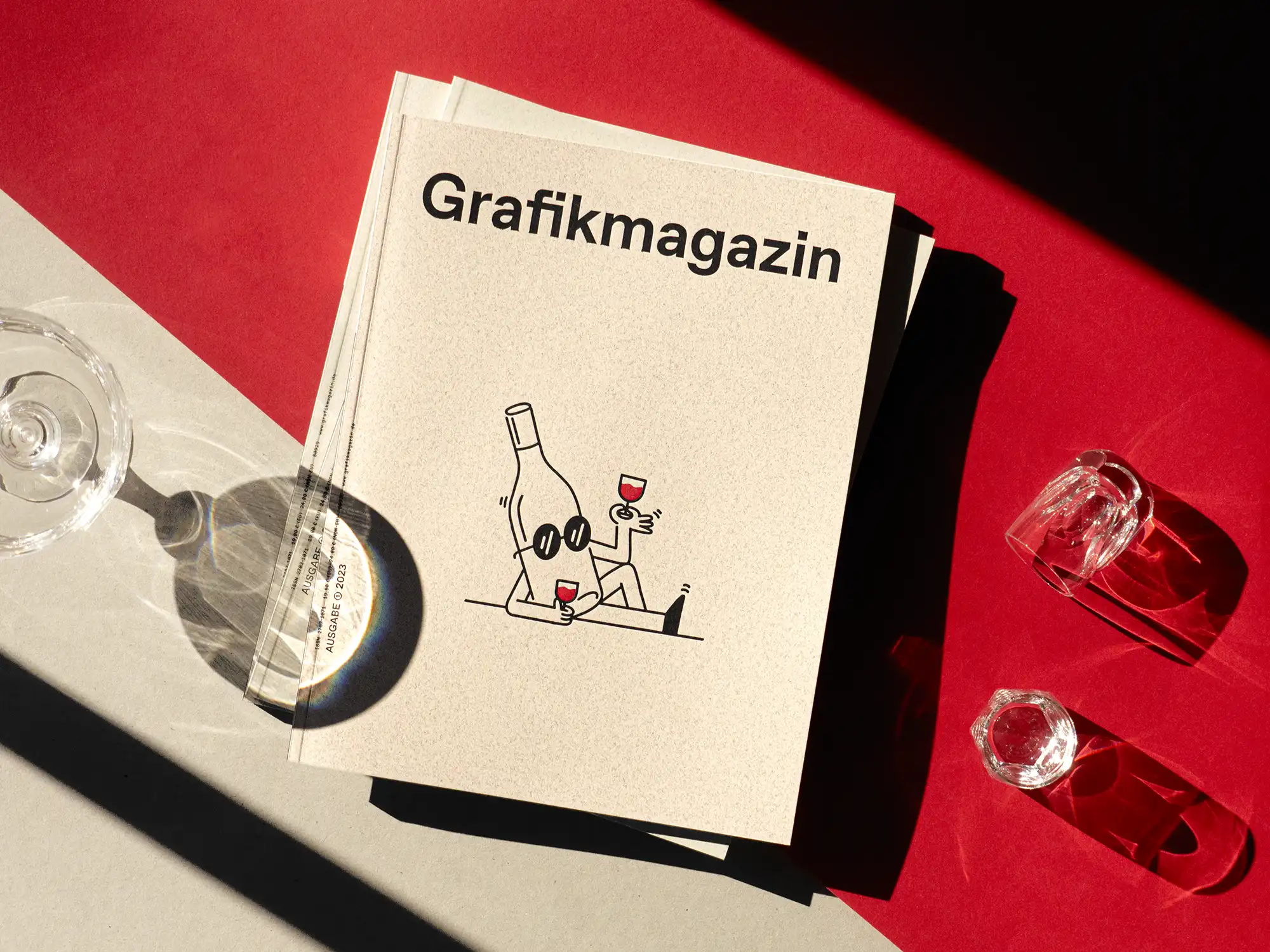
Showroom
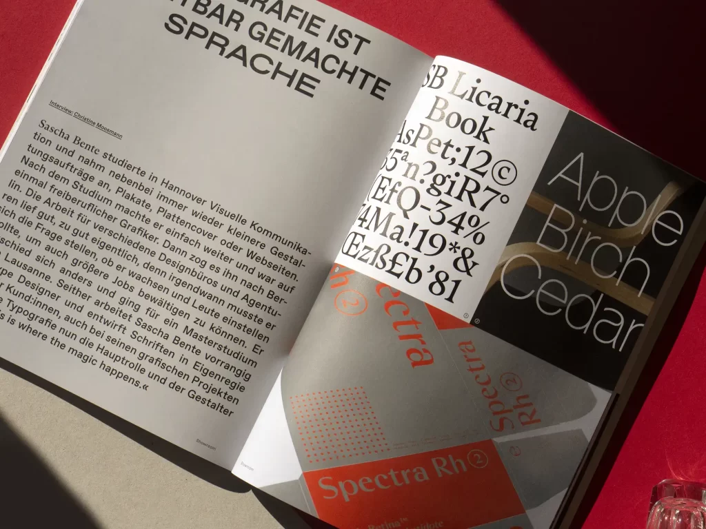
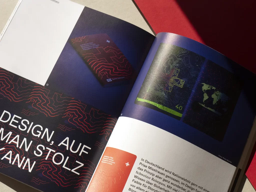
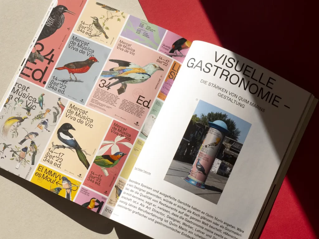
In the showroom of Grafikmagazin 01.23 we visit the Spanish graphic designer Quim Marin, who consciously seeks change in order to find new inspiration. Sascha Bente talks about his great love, typography, and Rafal Kwiczor creates retro worlds in his illustrations that move between nostalgia and computer games. Last but not least, we take a closer look at the newly designed Swiss passport. Here, functionality, security aspects and the highest graphic quality come together perfectly.
You can order the Grafikmagazin 01.23 with the focus on "Bars & Drink" free of shipping costs (within the EU) here.
