Double the number of characters, new features and more compatibility with languages from all over the world: the well-known Neo-Grotesk Case from Typefoundry Fontwerk is getting an extensive update with Case 2.0. A font full of expertise and little surprises with a so-called "no-nonsense personality" proves why it is perfect for any brand project.

Text: Paula Schneewind
The Case font, designed by renowned type designers Ralph du Carrois, Anja Meiners and Erik Spiekermann, was in need of a polish in their opinion. This was completed in spring 2023 and proudly published by the Berlin type foundry Fontwerk.
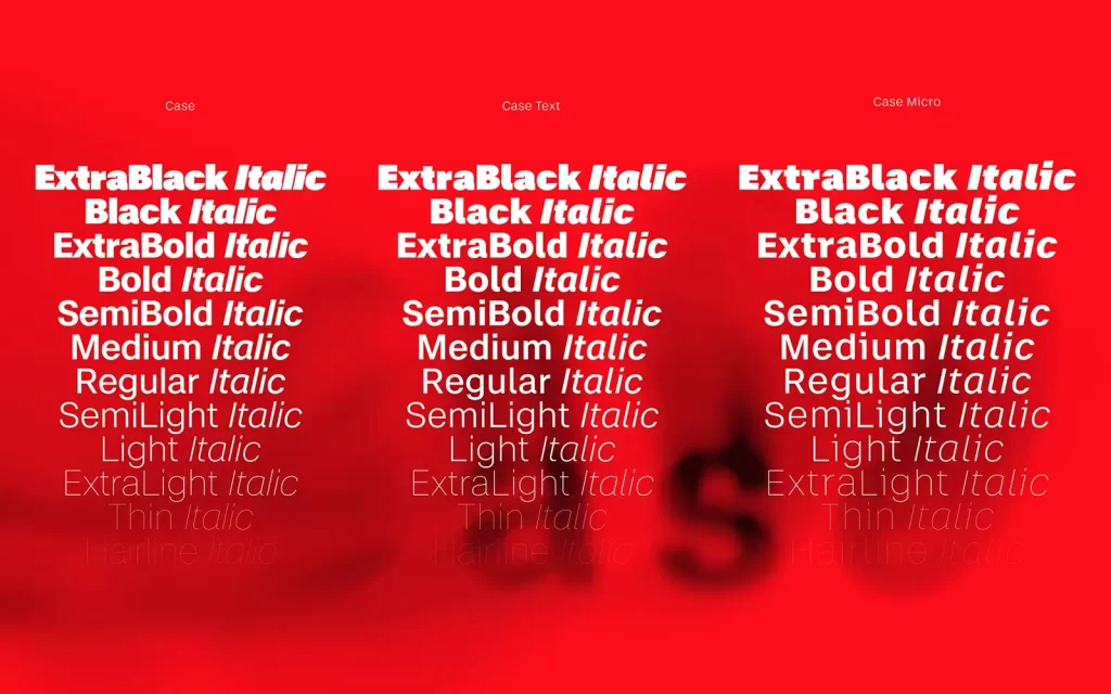
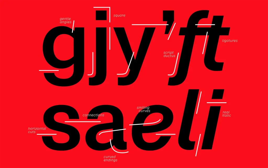
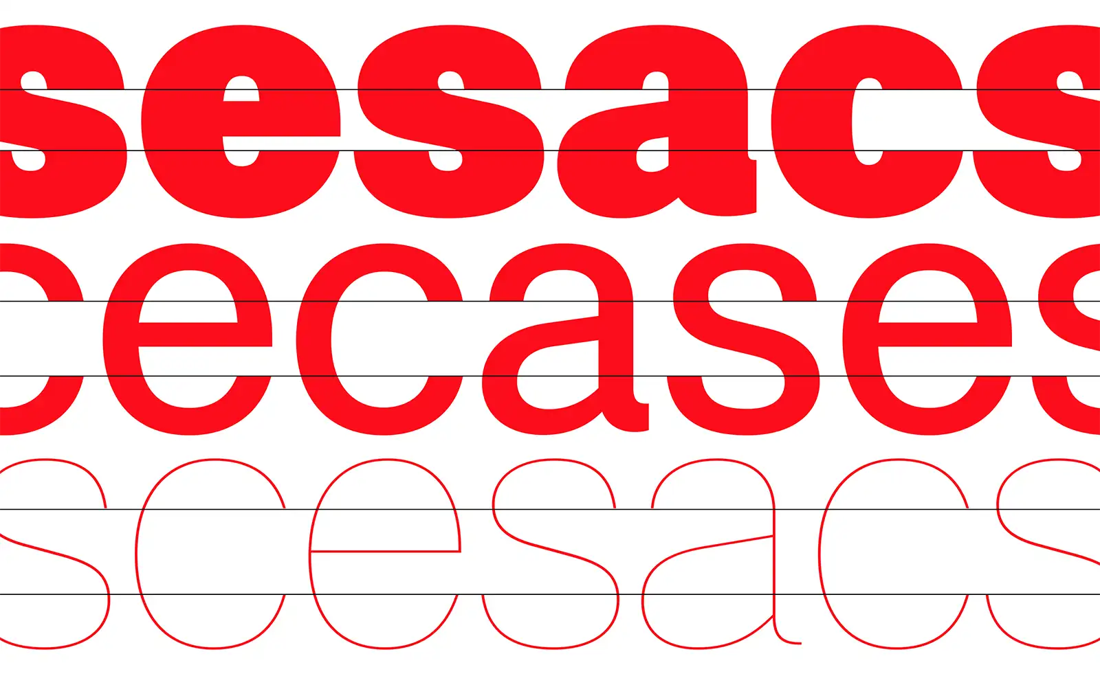
The Case family was born out of numerous customer requests for a unique and exclusive sans serif for their brand identity. In other words, the actual demand was for their own version of popular neo-grotesque fonts such as Helvetica or Akzidenz Grotesk. Thanks to the type designers' many years of experience with the development of ubiquitous neo-grotesques, they were able to combine their knowledge in the development of the Case family and thus create a font with a new and modern vibrancy. Particularly characteristic are the emphasis on the horizontal, the outstanding legibility of the three family members (Case, Case Text and Case Mikro) and the so-called "real italics", the uniquely and precisely designed italic weights.

Case 2.0 is a completely reworked version of this neutral and confident font and has been expanded in every respect. The characters and stylesets have doubled, a Unicase feature has been added and characters from other language systems are now also included. From now on, Case can also be used for languages with Cyrillic, Greek, Vietnamese and Latin-African characters. The font styles have also been expanded with SemiLight, SemiBold and ExtraBold and, in addition to the extensive variable font function, open up further options for using the font individually.

This makes Case 2.0 a font that is suitable for projects of all kinds and strikes the right note with its versatility in use and its familiar and reassuring neutrality. With that certain extra something in the details, it skillfully stands out from its current competitors and brings freshness to the world of sans serifs.
If you missed this article, please read another one on the subject of typography. How about "Working with the invisible"


