It is always said that good design is timeless. Logos show just how true this is, as many major brands still use designs that were created over 100 years ago. The volume "Logo Beginnings" traces over 6,000 trademarks and shows how the design of logos and corporate identities has evolved over time.

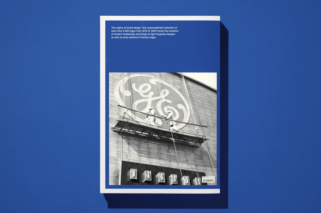
"You know what you've got!" - Brands accompany us in all areas of life, we know them and know how to read these signals. After all, most of these images have been familiar for generations, and many have already reached an astonishing age. Often carefully modified and modernized, they have retained their characteristic features since the beginning, as the thick volume "Logo Beginnings" (Taschen Verlag, 2022, Euro 60,-) impressively demonstrates.



Jens Müller has collected around 6,000 of these logos from the early days and sorted them according to formal criteria, from strictly geometric to playfully decorative, figurative or abstract, with letters or animal depictions, to name just a few of the groups. Famous pieces and long-forgotten ones are included. In any case, there were no limits to the ingenuity (and occasional plagiarism). The collection is supplemented by a reprint of the important essay "Über die künstlerische Gestaltung von Warenzeichen" (1921) by Fritz Helmuth Ehmcke, who is known to have created numerous stamps with the Steglitz workshop and later as a lecturer himself.
The compilation is rounded off with examples of packaging and the transformations of some classic logos such as Shell, 3M and Singer. We would like to see more of this, perhaps the subject of Jens Müller's next publication?
Text: Herbert Lechner
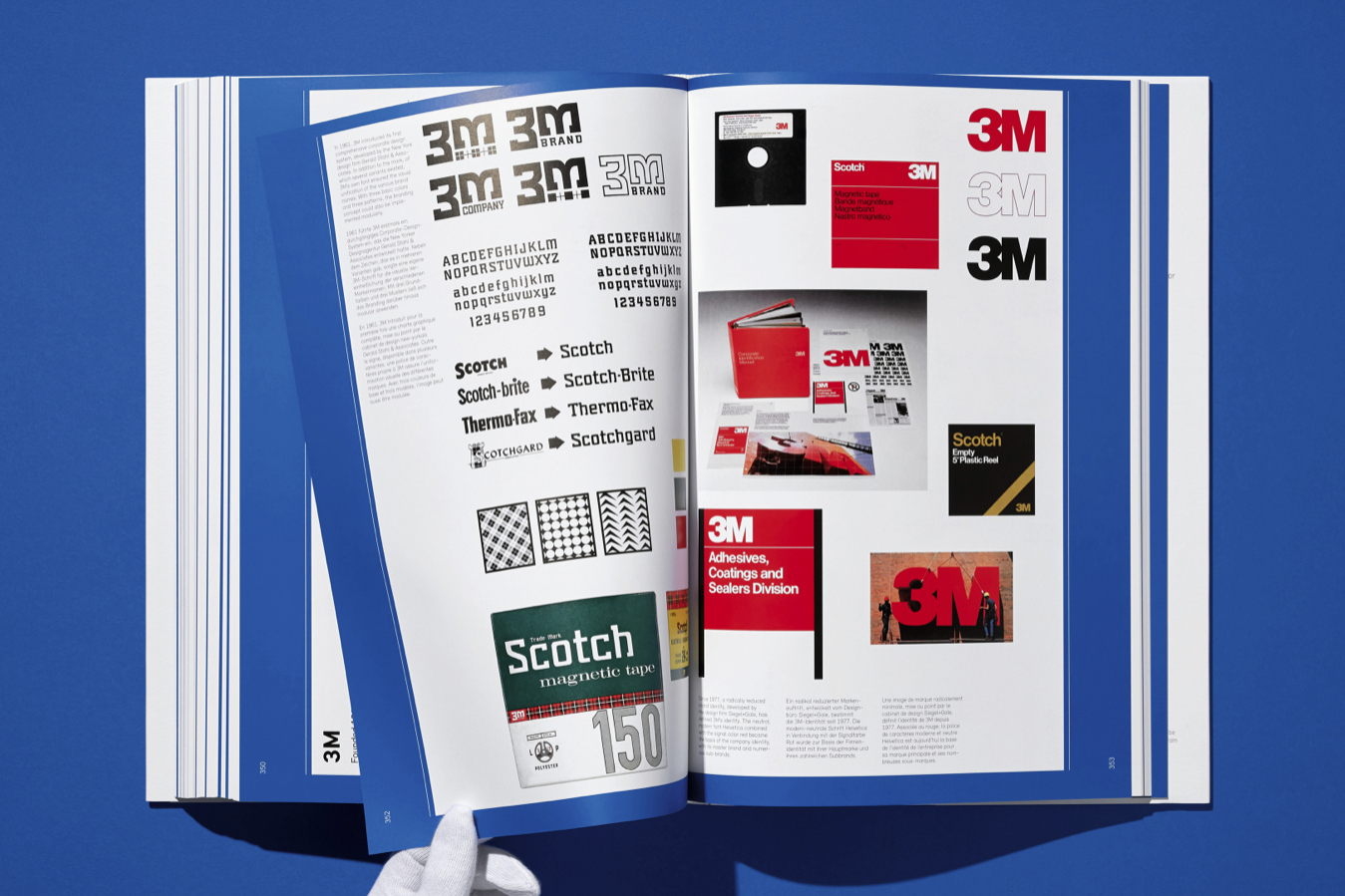

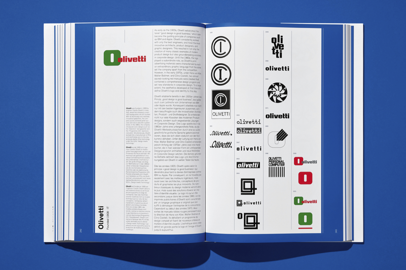
Jens Müller, Taschen Verlag
Hardcover, 432 pages, text in English, French and German
60,- Euro
You can find out more about "Corporate Communication" in Grafikmagazin 02.21.


