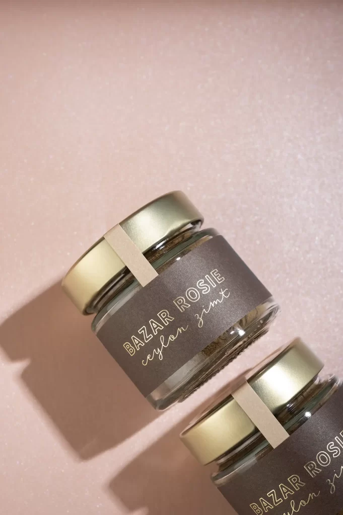
As you read this, Martina Miocevic may be strolling through a supermarket in New York City. The Mainz-based designer, who has been running the Mathilda Mutant design studio for almost ten years, is taking some time out and combining the pleasant with the useful: Nowhere else can she come up with such good ideas for packaging. She brings home tons of little bags, boxes and cases from her travels and draws inspiration for her subsequent commissions from everything she comes across. A conversation about her favorite subject: packaging.
Mati and her packaging, a very special love. Where does that come from? And what do you look forward to most when you go to the supermarket in New York?
Supermarkets are my hobby! Haha! I discovered my love for packaging on my first trip to New York! I visited a Whole Foods store in Williamsburg and felt like I was photographing every shelf and marveling at every single product because I was so fascinated: How great does the beer label look? How mega is this soap, please? I only came back out after two hours, my boyfriend was already completely annoyed. (laughs) Whether it was water bottles, Mac'n Cheese bags or the vegetable shelf - I was extremely fascinated by the aesthetics. When you visit supermarkets in Germany, on the other hand, everything looks down-to-earth and standard. In the USA, I realized for the first time that you can break away from this standard and that brands have the courage to break new ground and try out the unusual. When I'm traveling, a supermarket feels like a visit to a museum - I'm really looking forward to it.
So you also see your travels as field research?
Yes, I collect a lot of things that I like. With design, as with music, it's often said that design is a remix. Sometimes you see a color that you like, sometimes it's a special finish, sometimes a pattern on the tiled floor or a beautiful tactile paper. I try to incorporate everything I come across that inspires me and is unusual into new projects (if it suits the project).
That's why traveling is so important to me, because I don't get inspired where I work, but when I leave my familiar surroundings. On every vacation since then, I go to supermarkets, museums and different places and gather inspiration. Back in Mainz, I draw on these impressions.
Sometimes I still keep packaging from umpteen years ago that I don't want to know what kind of life has developed in the meantime. (Laughs) From the colors to the typography to the feel - I value them so much.
In Germany, there are many regulations, for example, certain foods may only be wrapped in aluminum foil or plastic. I was recently in Iceland, where chocolate was wrapped in parchment paper - much more environmentally friendly. Unfortunately, there are stricter rules in Germany when it comes to food.
Just as you reflect your experiences with experimental packaging on German down-to-earthness, would you say that food is celebrated differently in other countries, because fantastic packaging also has to do with appreciation of a product?
I can subscribe to that 100%. I tell my customers: "What you embody on the inside, you have to reflect on the outside! The moment you stand behind the product and say: "This is me! This is my product", it automatically sells better. You can't just look at the target group, you also have to look at your own needs. In a few respects, of course, but if you don't stand behind the product, people won't buy it.
How does a design process work for you? Do customers come to you and tell you about their idea, want you to be involved as a packaging specialist and give you a completely free hand? Or do they come with their own suggestions and directions they want to take?
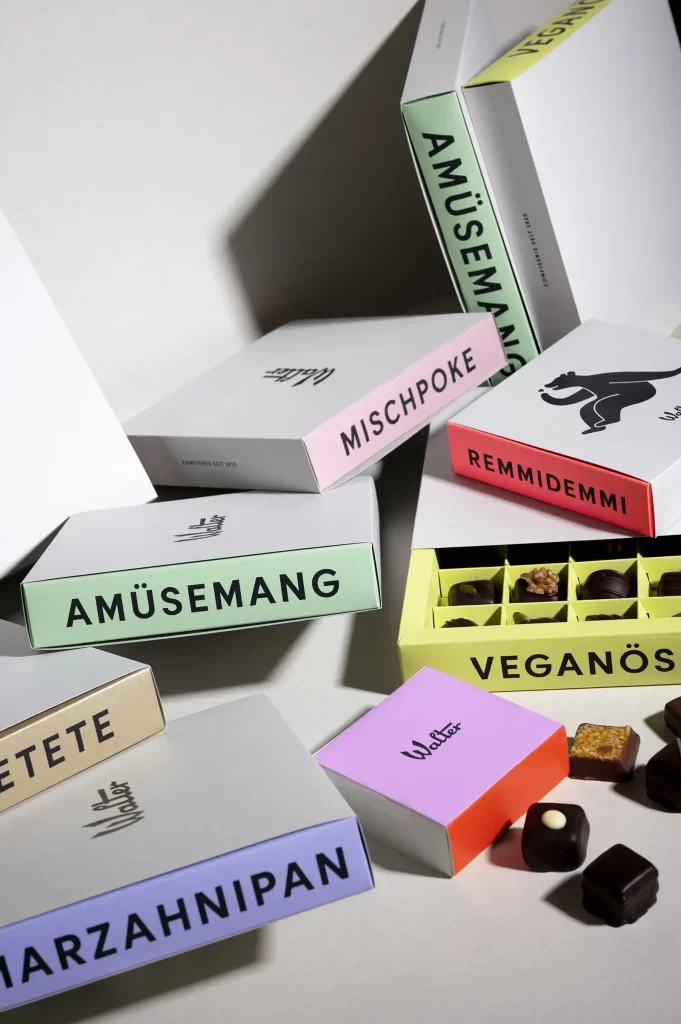
Very different, preferably of course with a completely free hand. After an initial meeting and before the first presentation, a mood board forms the basis for everything that follows. This is where everything on the respective topic is researched, collected and visually compiled. But things that are out-of-the-box but could fit in well are also included here. This gives me a good picture of what customers want from the future design. We look at the mood board together and I have developed a questionnaire for this: Which colors appeal to you? Which typography stands out for you, and so on. In this way, I want to find out the language that the customer wants to speak, completely independently of the product. I usually get an annotated document back: I like this, I don't like that. This way I understand, aha, the customer doesn't like orange and serif fonts don't work at all. This is also an important moment for customers: they are understood and taken on board. They have the feeling that they can have a say. This is how the design process begins for me and there are many details to consider, especially when it comes to packaging: How big is a product, how does it have to work on the shelf, when is it perfectly legible? On my assignment for Confiserie Walter, for example, I was taken into the factory to understand the production process and to rummage through old cupboards for possible old design elements. There we found an old sticker with a bear logo that had been removed during a redesign. We really wanted to bring it back with its special emotional character. Finally, I went to the stores and took a look at the entire complex to really visualize the complete branding.
At what point would you talk to your customers about sustainable packaging?
From the very beginning, the values of the company must be addressed first and foremost. I am convinced that, as a designer, I have a responsibility to do educational work. Especially when a client wants to radiate this topic to the outside world. It is important to me to show options that are possible through look and feel and that sustainability does not have to be green. There are other ways to communicate this. That's what the initial discussions are all about. It's important to optimize processes and produce less packaging waste.
Are customers happy to let you talk to them? Or does it sometimes backfire and make them feel patronized?
As a designer, you often suggest papers or printing techniques, so I try not to suggest anything that doesn't go in a sustainable direction. Except for hot foil, which is still such a critical point: I love it because finishes can enhance so many things, but I wonder what solution can be found that is more environmentally friendly.
But the most important thing is to get started. I often tell customers: many small steps go a long way in the end. Small things that get you started in the right direction instead of standing still.
Looking back, do you have a favorite packaging in your projects?
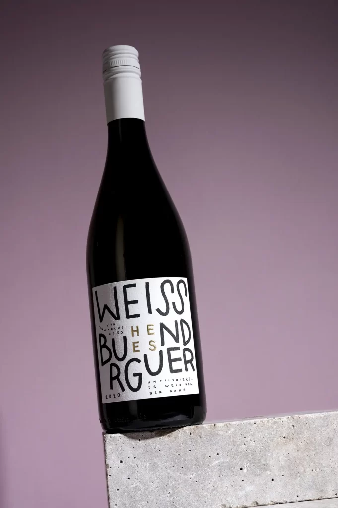
I love the handwritten bottle labels I did for the Hees-Auen-Nahe winery. I had previously developed a basic line for the winegrowers and they wanted to try something new for their series of unfiltered wines. That's how these "five-minute labels", as we call them, came about by chance: Riesling, Pinot Blanc, Petnat, scribbled quick and dirty over the base to break through the classic, graphic label. I really like to look at that and think: the foundation was laid and then we could go crazy! (laughs)
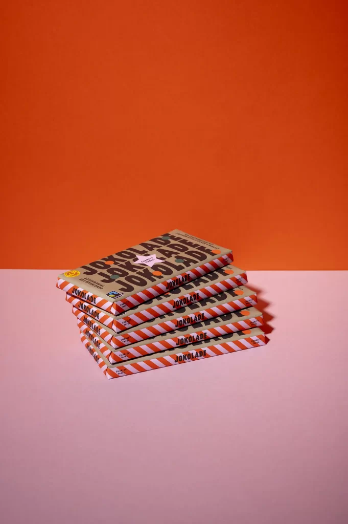
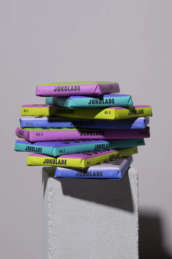
The "JOKOLADE" was also a very special project from the heart. It is the chocolate of presenter Joko Winterscheidt with a special and great mission: to break through modern slavery and illegal child labor and establish slave-free chocolate. But what I also love here is that this visual basis on the shelf has been broken. JOKOLADE stands out next to the other chocolates and consumers are happy about it, reaching for the shelf, even if the product costs a little more than the masses, which is 80 cents. That makes people happy. This project is constantly evolving: special varieties and new varieties are added, where we also make use of the inside of the packaging to introduce artists, print themed hidden object pictures or include special information. This brand is really alive and gives me as a designer the opportunity to explode creatively.
For Walter Confiserie, I wasn't just allowed to design packaging, but a complex system that works as a whole. The owner, Caroline Thiedig, gave me complete freedom to approach everything in a new way. At some point in the meeting, we came up with the idea of working with Berlin words and made a collection: why don't we call the family mix "Mischpoke"? And the classic schnapps pralines "Etepetete"? The nougat pralines are now called "Amüsemang", there's "Remmidemmi", "Veganös" and "Marzahnipan". She was very open to many new ideas, which makes you happy as a designer, you are much more motivated because you are part of the development.
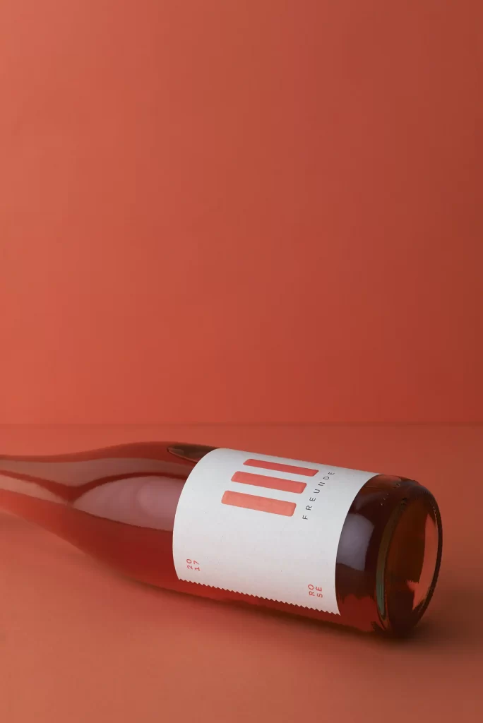
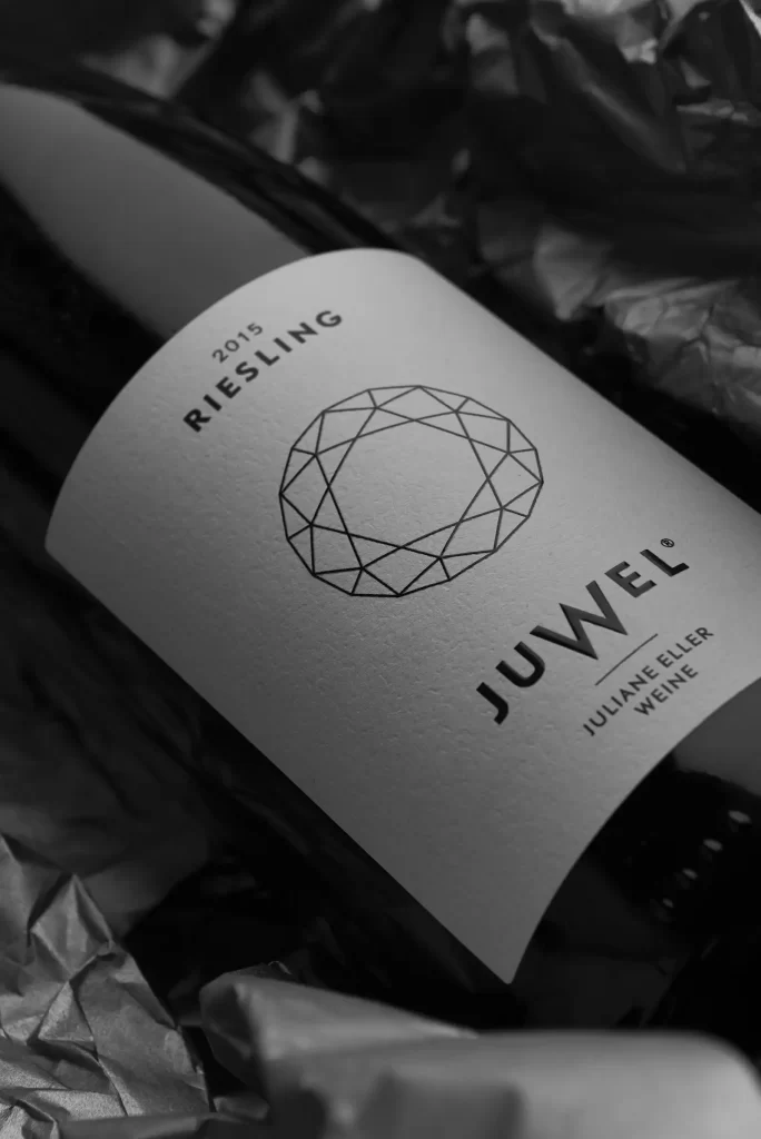
Of course, I also think of the winemaker Juliane Eller, who was my first customer. When I see the product I designed for her and it still works, even though it's already eight years old, it's incredibly great.
I think that's very well put. You first have to manage to realize your own taste in such a way that you even feel part of the brand.
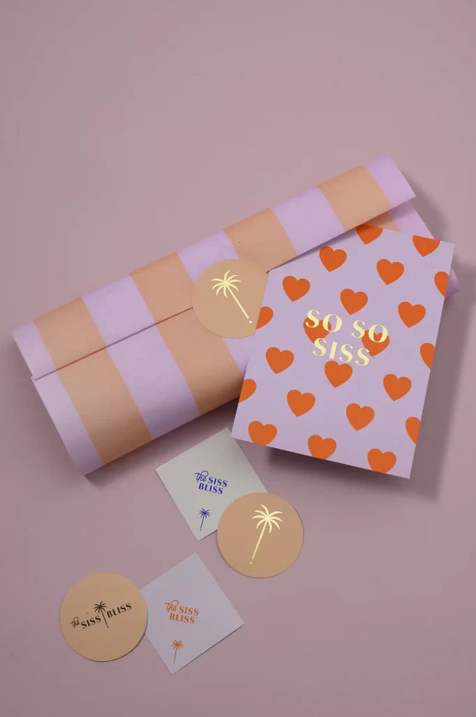
If your expertise is listened to, that's worth a lot. It's important to me that the customer sees themselves. For example, one of my clients, Franzi von Hardenberg, was drawn to my colorful side. Previously, everyone thought I was totally minimalist because of the various jobs I had beforehand. But I'm actually not minimalist at all! (laughs) Franzi gave me the opportunity for the first time to go completely crazy with color in a corporate design. Pink, orange, blue, purple, pink. At some point she also had her own Pantone fan and said: "Mati, it's your fault! Pantone is like a drug! I don't even want to print in CMYK anymore" (laughs)
Does designing packaging that presents a product to the outside world have anything to do with trust for you?
Trust is one point yes. Secondly, as an individual you didn't stand a chance against the big agencies. I think it's nice that this has changed, that the "small" designers are being seen. Especially when it comes to branding, which is something very personal. Something creative. If you have too big a team or too many designers working on something, then you can't really grasp a brand. Gradually, clients no longer care how big the agency is, they're more attracted to an attractive portfolio, even if it's from a single designer who has a heart for packaging. (Shows me a smoothed nougat foil from Iceland) Someone who picks up a lot of packaging stuff. (laughs)
