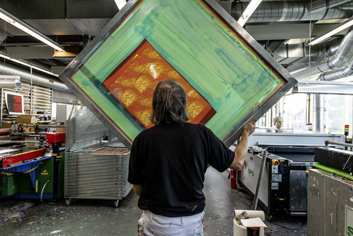
(Advertisement) Lorenz Boegli has not only won numerous awards, he has also elevated screen printing to a true art form. In his workshop in western Switzerland, he experiments with the finest screens, light printing and unusual pigments to create prints that are pure emotion. So who better to showcase the papers in the Olin Origins series?
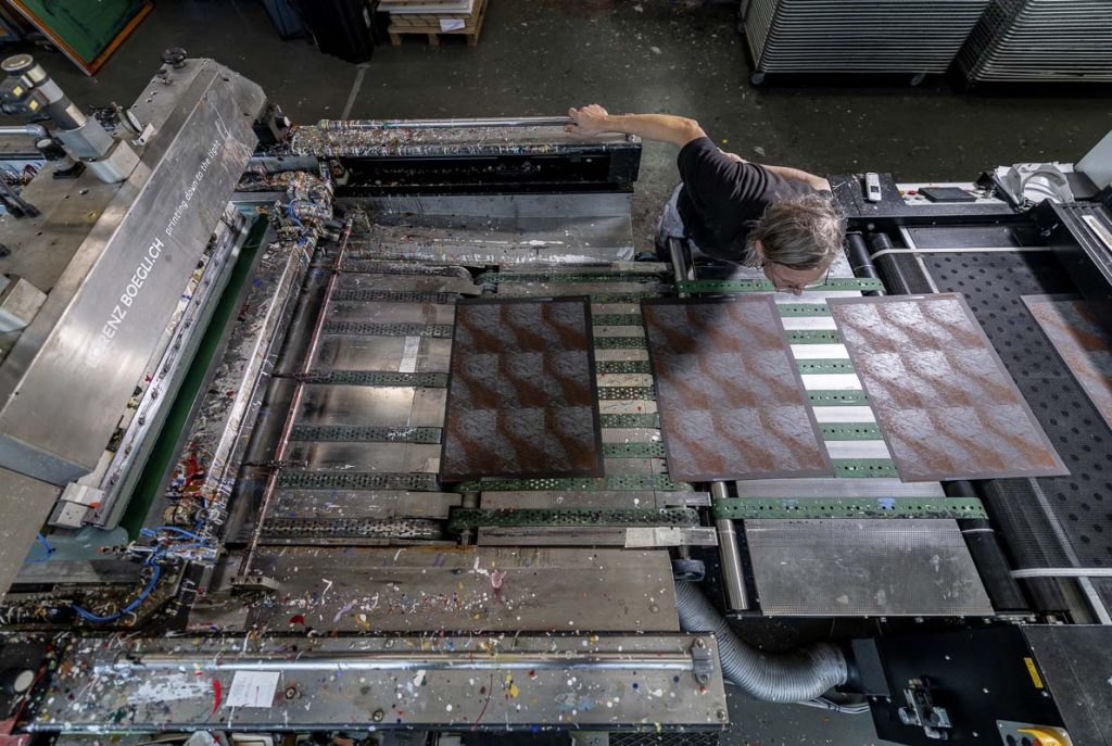
Anyone who sells beautiful papers naturally wants to present them in the best possible way. But when it came to creating advertising materials for the Olin Origins range, Lorenz Boegli was not only chosen because he is an artist and can conjure up the most unusual effects in screen printing. At Antalis, he was also chosen because ecological issues are very close to his heart. Boegli runs his workshop with energy from sustainable and regional sources and Olin Origins is part of the "1% for the Planet" initiative, which means the company donates one percent of its profits to charitable nature conservation projects and all its papers are FSC®-certified and CO2-neutral.
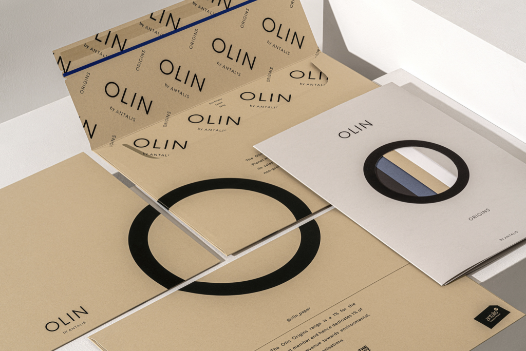
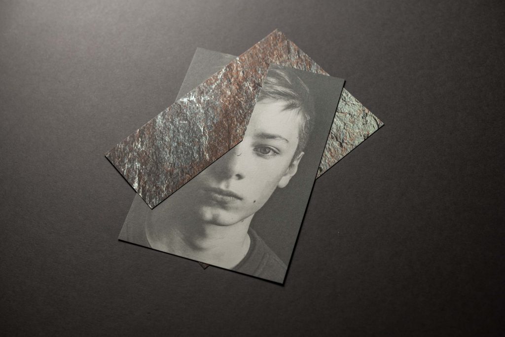
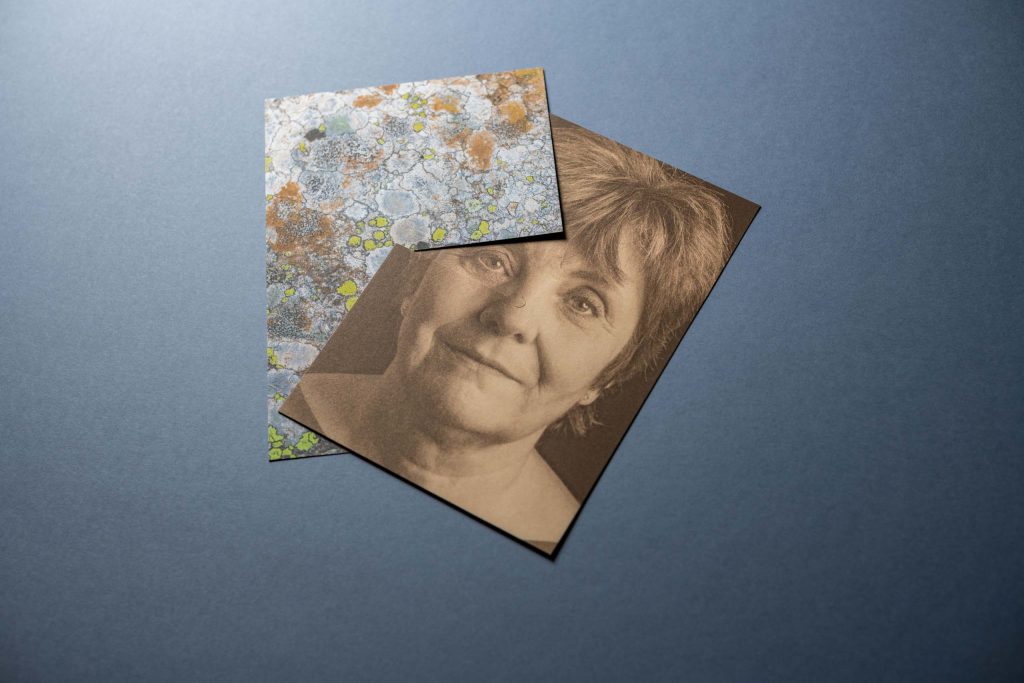
Antalis and Lorenz Boegli quickly agreed on sustainability and the screen printer was given carte blanche to experiment with printing, colors and papers to his heart's content when it came to the design of the advertising material. The result is two cards, each consisting of two motifs, printed on Olin Origins Indigo, Pebble, Cereal and Lava Stone. VIP customers receive the small works of art and they are included in design magazines throughout Europe, including Grafikmagazin. Here Lorenz Boegli reveals more about his screen printing art and the unusual Olin Origins project.
Lorenz Boegli, what do you like most about screen printing, how does this process support creativity?
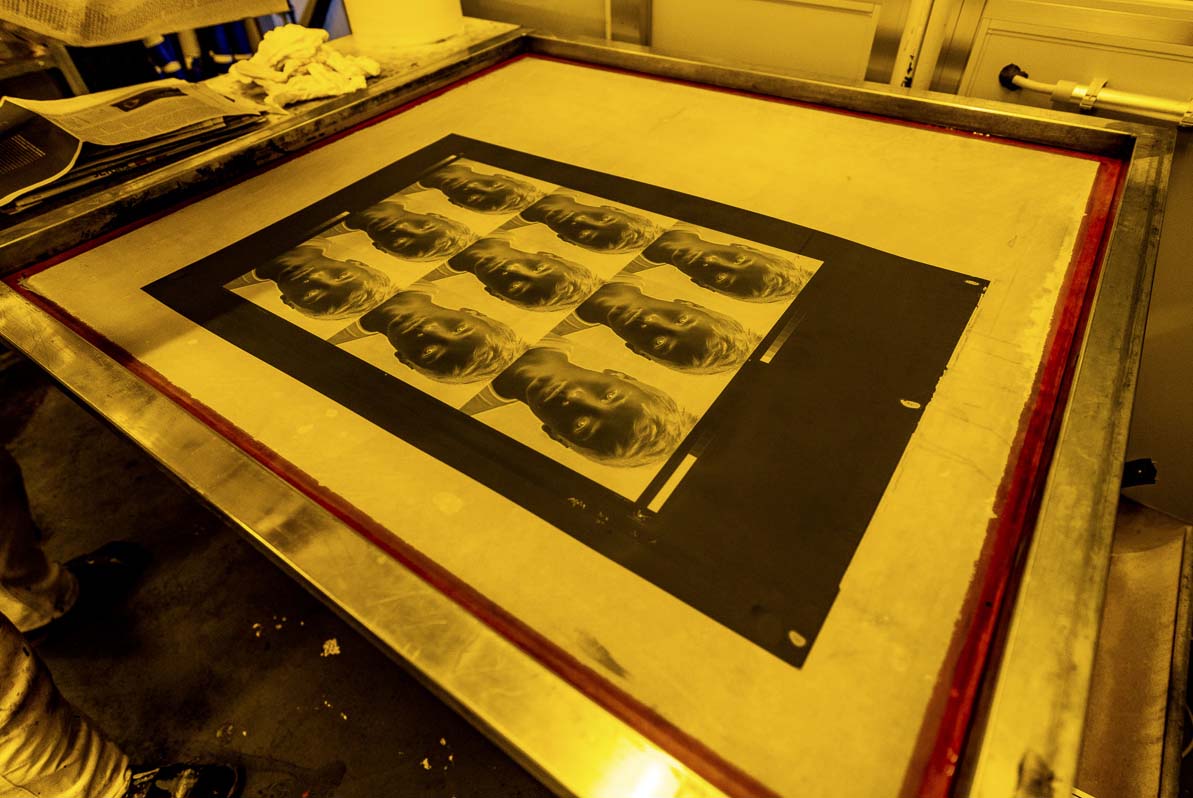
First of all, I appreciate the simplicity and directness, screen printing is perhaps the printing process that allows the most personal freedom. Thanks to its flexibility and technical range, it allows a graphic designer's creative ideas to be emphasized through the production process. The unique selling point of screen printing should also not be forgotten: It's the printing process that allows the highest ink coverage and the coarsest pigments.
The uniquely high ink coverage allows the possibilities of effects to sprout like buds in spring. Screen printing allows high opacity and transparency, special surfaces and the finest screens, printing on tissue paper or heavy cardboard, solid colors, iridescent colors or negative tones on dark papers.
Which applications do you value the most?
My current claim is: "Printing down to the Light". This means that I work with light (reflections to be precise) instead of colors. I'm also known as a black paper printer. I reduce photos to their negative forms and then print them with iridescent colors on dark paper, thus deceiving the eye.
In the late 90s I started using iridescent pigments in rasterized photographs and this eventually led to the invention of RGB printing in 2013. I printed red, green and blue on black paper and created all possible colors up to white - additive 4c printing was invented. Together with Merck, I was later able to patent this process.
What does it take to really master screen printing, what did you only learn over time?
I took my cue from the results of offset printing early on and tried to expand screen printing into previously unknown dimensions, for example by refining the grid to the extreme. It is true that elegance begins once you have learned to master the technique. I find it a great freedom that there are no process standards in screen printing. In return, I also accept failures ...
How important is the choice of paper in achieving the desired look of a work? Are there ranges that you particularly favor or does every project present a new challenge?
For me, the inspiration for a new print effect always starts with the paper. With its color, grammage, surface or technical properties, all this tells us a lot about the possibilities that arise in printing. For a paper to become a favorite for me, it has to have a very subjective color palette that can't be found anywhere else on the market, and for me this includes ArjoWiggins' Keaykolour range.
What are the most important features for you when selecting a paper for a project?
This can be a contrast of grammages, a silk paper whose processing slows down the printing process considerably or a 700 gsm cardboard that looks sculptural in comparison. Or working with transparent papers and combining them with opaque and transparent screen printing inks. Sometimes I also take the paper colors and combine them with opaque and transparent complementary colors, resulting in four color combinations.
My aim is to integrate paper into the design as more than just a carrier material. When this succeeds in a harmonious way, I like to say that 1 plus 1 equals 3, when paper and print touch the soul through the eye.
Is a certain style of photography particularly suitable for certain printing techniques and papers?
A wonderful piece that preceded our print on Olin Origins was also created in collaboration with photographer Rob Lewis and using the same type of cut-out stones, which we printed on Keaykolour paper in Medium Grey. One color layer consisted of a positive form in black, the unprinted grey paper created the three-quarter tones, and three additional print passes in negative form ranged from lighter colors to white. The integration of the paper color contributed significantly to the outstanding depth of the stone structures. I am convinced that creating a dimension that goes beyond the second, i.e. the paper, leads to print products that are highly valued and that can increase the value and lifespan of printed products many times over.
What role does sustainability play in your creative process?
The issue of renewable energy is central to a print shop and can be implemented easily and immediately. The roof of my print shop is too small to generate the necessary amount of solar energy, but we have found a partner in the Swiss Energy Cooperative who generates 100% of our energy on a farm just 10 minutes away from us by bike. The hot water we need to develop our screens comes from our roof and our waste water is purified through a separation process that filters out all solid particles.
In terms of creative work, there is now a wide range of partially or fully recycled papers available - from interior papers to wonderful colors such as Olin Origins.
Only natural pigments were used in the Olin Origins project, right?
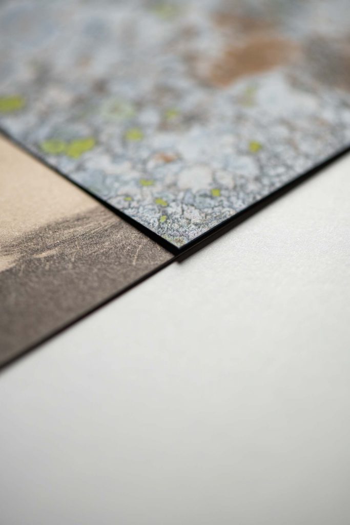
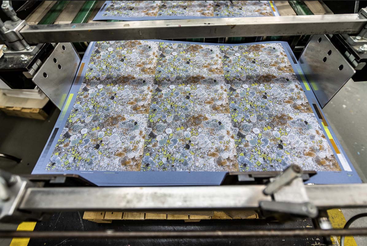
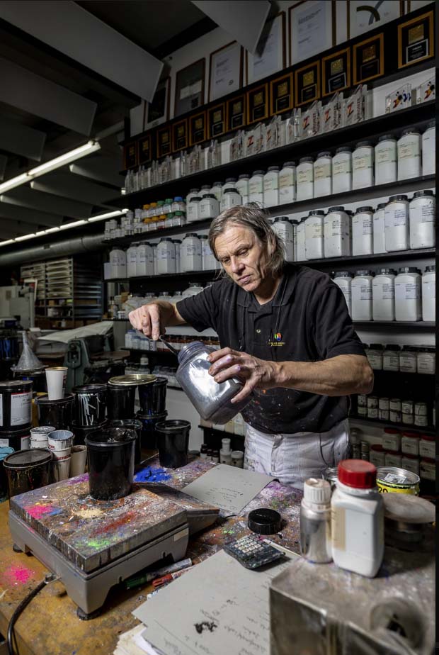
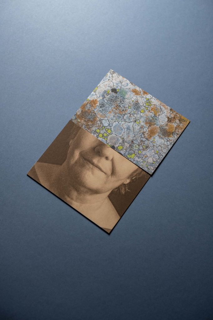
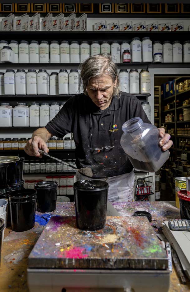
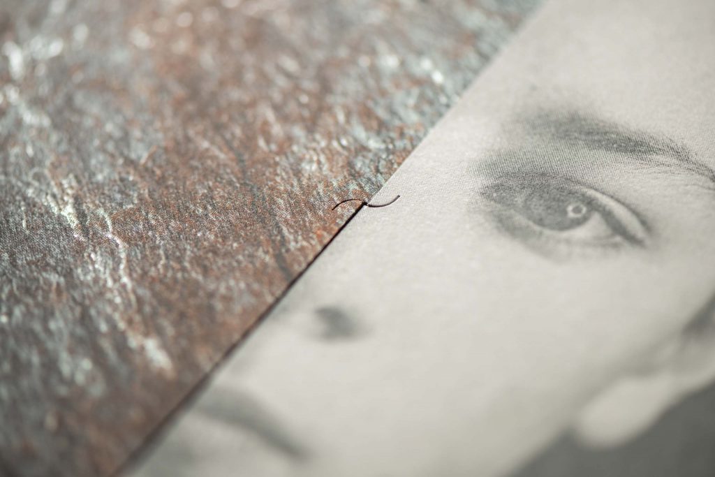
Yes, in my work for Antalis I only used natural mineral pigments for screen printing. These colorful earths are intended for artists and are not really suitable for the printing process, as the pigments are very large and irregular. However, I was particularly struck by their naturalness and harmonious colors. I used ochre from the south of France, umber from central Italy, black earths from Andalusia, some from Cyprus, green earth from Bohemia and slate gray limestone from the Alps.
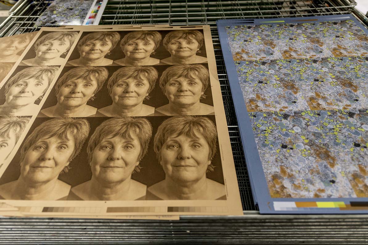
It is not easy to produce such a large edition of 30,000 cards in natural colors. But we always have the option of adjusting or reducing the production speed. We took the color tones of the colored earths into account in the separation and also used the paper color as part of the image composition. The result is an all-round harmonious print product.
How much freedom did you have with the Olin Origins project and where did your original ideas come from?
Jérôme from Antalis approached me at Luxe Pack at the end of September and only mentioned the ecological benefits as a condition. I was happy to use this freedom to implement the idea of printing with colored earth pigments. I had already worked with Rob Lewis several times before. His pictures and films document my work and I interpret his works in screen printing. For this project, Rob created great photographs with different surfaces of stones and I was able to choose two suitable motifs that went well with the Olin paper colors. As I love to challenge perception, I chose two portraits for contrast. It was only afterwards that I realized that the huge time difference of 60 years between grandmother and grandson had a counterpart in the 60,000,000 years that separate the rocks of the Swiss Alps. Then there is the lifespan of the Olin papers.


What were the advantages of Olin Origins for you in this project?
Olin Origins has this unique velvety, open surface structure that makes the paper very soft to the touch. This makes it possible to contrast this feel with a glossy foil, a relief varnish or, as in this case, with natural earth pigments. You can feel the softness and the roughness. The motto of the Antalis Creative Power Awards is: "Choosing paper is a creative act". That's true and, in my opinion, it starts right here with the creation of strong emotions.
Finally, what advice would you give to designers or artists who want to use screen printing for their next project?
Dear graphic designers, free yourself from the standardized Adobe creativity! Expand your horizons and make the most of the possibilities offered by the production process. Start with the motto "Choosing paper is a creative act", select the type of printing, for example screen printing, which knows no limitations, then decide on the production or binding types.
A colored paper that is printed with two colors and folded intelligently can convey a graphic idea perfectly or even a customer's message. Or if it needs to be a little more complex: Choose your production partners early on so that their ability to create effects can support your idea. The printing and production features should be incorporated into the design wherever possible and not just added as decoration at the end. A symbiosis of graphic concept, paper, print and equipment - these are the incomparable advantages of analog communication that appeal to and stimulate the viewer intellectually.
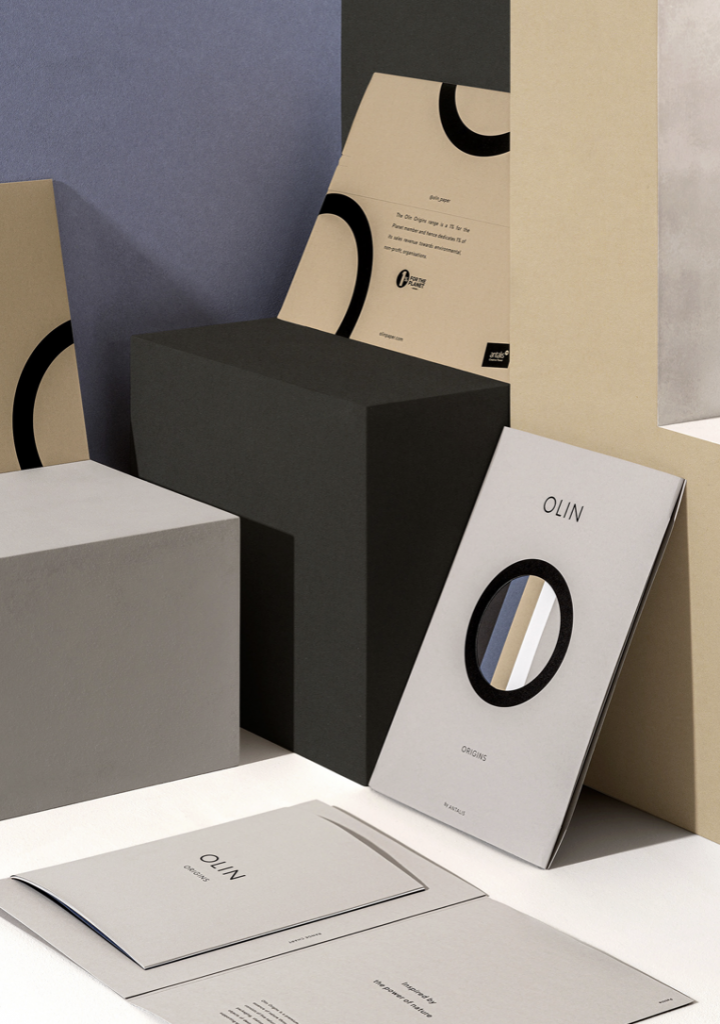
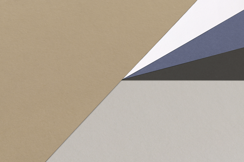
Olin Origins in 240 gsm in the colors indigo, pebble, cereal and lava stone was used for the cards printed by Lorenz Boegli using screen printing with earth pigments. The cards are included as advertising material in various European design magazines, including Grafikmagazin 02.22.


