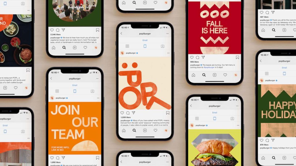
After an incredibly successful burger pop-up in their own restaurant, the team behind Copenhagen's renowned Noma has opened the burger restaurant POPL in the Christianshavn district. For the brand identity, they turned to the New York design studio Gretel - with a great result, in our opinion.
Studio Gretel didn't need to be asked for long - the New Yorkers advised the Noma team on everything from strategy and naming to visual identity. The brief was that the POPL restaurant should bring people together and create a community despite social distancing rules, especially in times like these.
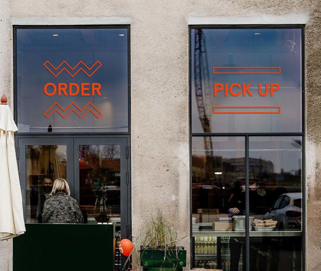
"With POPL, we wanted to create a brand that comes across as warm, playful and inclusive," says Dylan Mulvaney, Design Lead at Gretel. The design was inspired by the menu, which invites you to enjoy a familiar yet innovative moment of indulgence. The designers also had to take into account the hygiene and protection measures in connection with Covid-19. New rules are constantly being introduced for the catering industry, which is why the concept should be able to adapt flexibly to the respective changes.
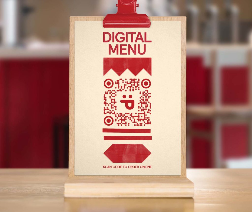
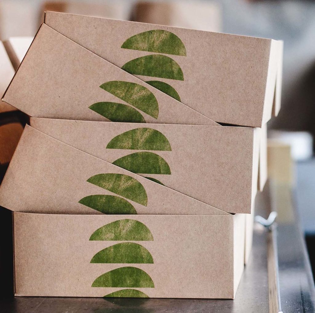
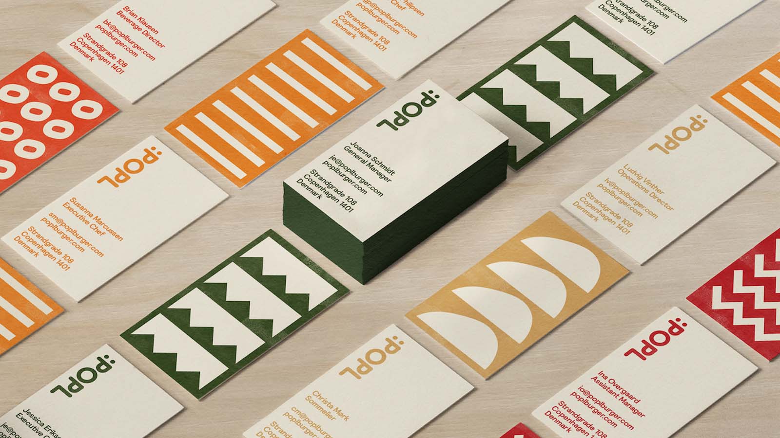
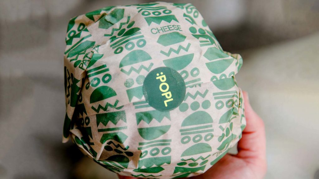
The menu is absolutely straightforward: no chichi, just simple burgers made from Danish organic beef (with vegetarian or vegan options from big brother Noma's fermentation lab), seasonal side dishes, ice cream and a few drinks. This lightness is also reflected in the visual identity: the very graphic, robust design language has taken on the side dishes and the format of the burger - a playful combination of ingredients. With this small collection of geometric figures, the designers imitate the process of topping the burgers: individual shapes, letters or entire pictures are stacked here. "The system allows for variation and expression while being consistently recognizable," says Mulvaney.
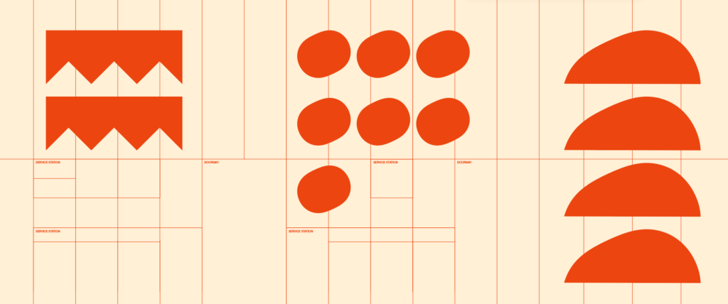
POPL's playful brand identity has already been applied to every area guests come into contact with - from the restaurant's online, mobile and social media presence to restaurant signage, printed menus, sustainable to-go packaging and staff uniforms. The logo also appears everywhere - and instead of creating a separate symbol for POPL, Gretel combined various elements into a wordmark that is stacked vertically. This conceals an abbreviation as an emoji - there couldn't be a simpler way to convey the feeling of fun, excitement and happiness...
Incidentally, the somewhat unusual name POPL comes - who paid attention in their first Latin lesson? - from the word "populus", which means "community of people", but in the manner of the venerable Noma, it also refers to the Danish word for poplar wood - an allusion to the gastronomic approach and the great respect for nature.

The Gretel brand agency has set itself the goal of creating clarity in all its assignments. The team's disciplines include strategy, copy writing, art direction and motion design. "We believe that the most interesting and memorable work happens at the intersection of opposing forces: Commerce and culture, old and new, intellect and emotion, freedom and constraint." Their previous clients include Apple, Nike, Netflix, the New York Times, MoMA and - they are particularly proud of this - Noma.
