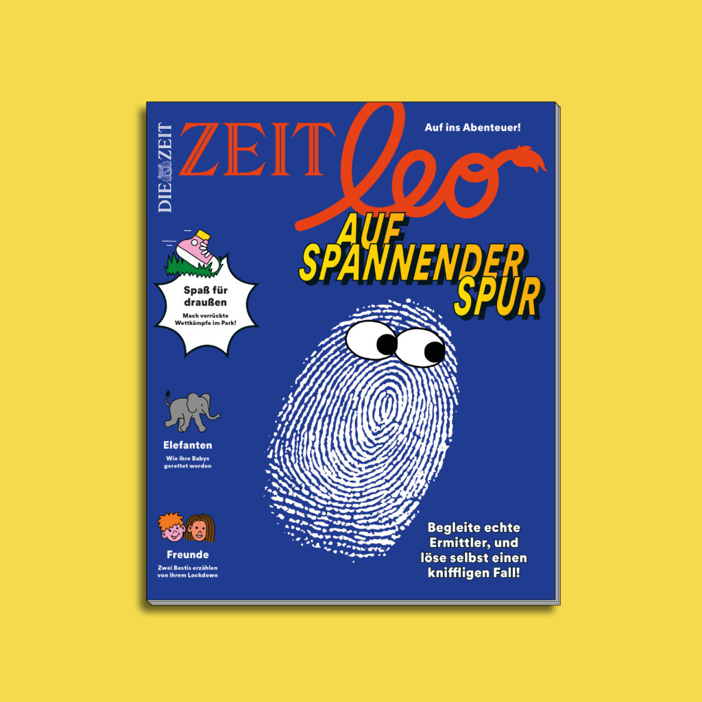
Making a magazine for children is no easy task, as the target group has an infinite number of interests and is also very demanding. In a one-year development process, the magazine Zeit Leo was completely redesigned, and this week the magazine launches in its new look. We spoke to Art Director Kai Schmitzer about the redesign, the new concept and the fact that parents don't always want it to be educational and that design for children doesn't have to be soft.
What was decisive for the redesign of Zeit Leo?
We have been working on the relaunch as a team for over a year, and the process was quite long because we still had our regular productions running at the same time. The decisive factor was that the last relaunch was in 2016 and we had the feeling that we needed to work on our magazine again.
We started by analyzing the market and our target group and then thought very broadly in all directions. We could have imagined doing away with the magazine and instead making a newspaper, an app or a podcast, a book with a focus on literature that only comes out four times a year or a craft magazine for younger children. And after a very long process, we ended up doing something similar to what we had done before. Sometimes you need a big overhaul to realize what was good before.
You initially thought in all directions during the realignment, which I find very courageous. Nevertheless, you have more or less ended up back where you started.
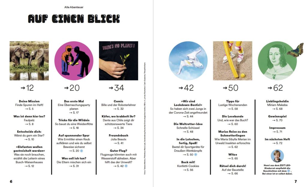
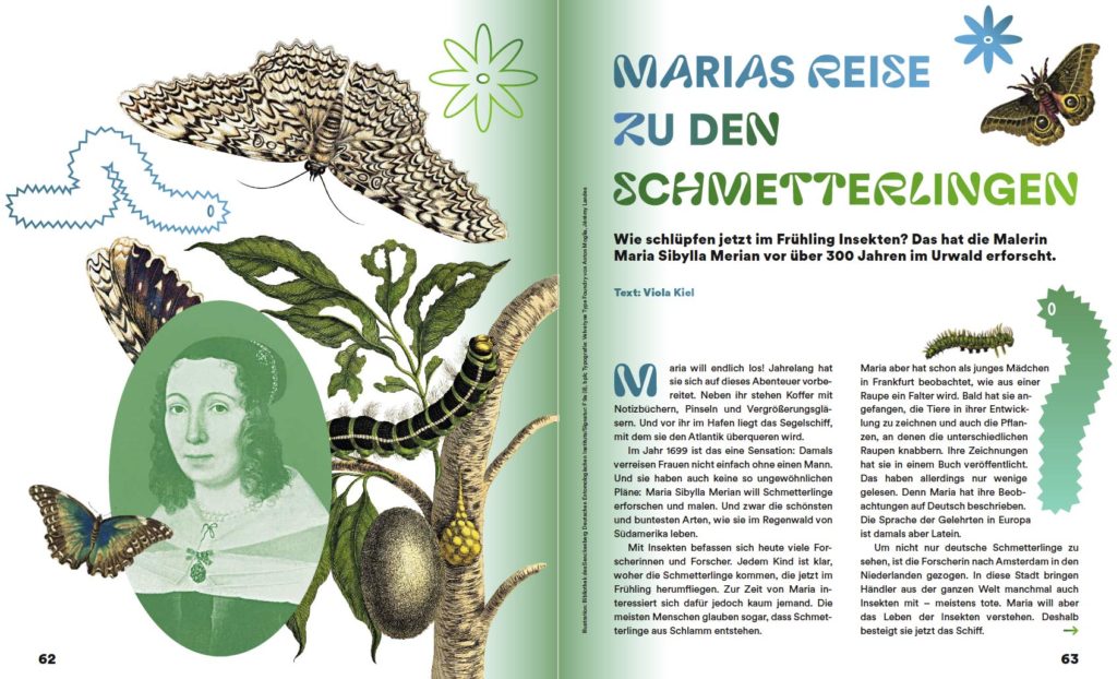
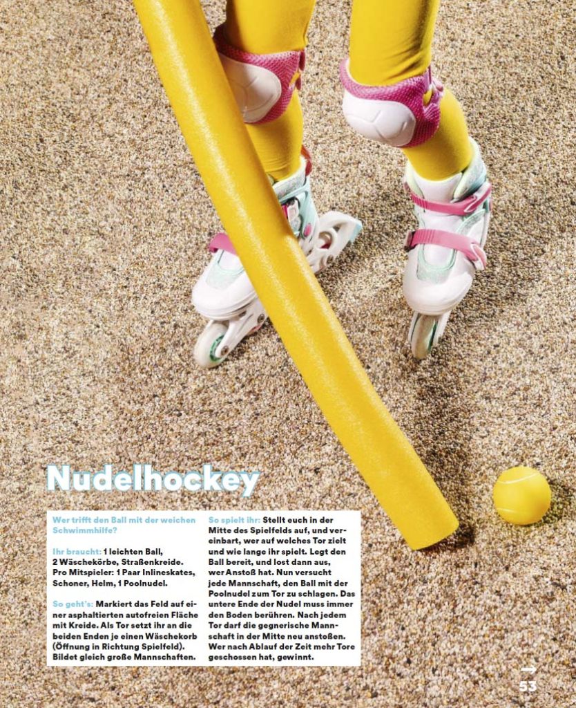
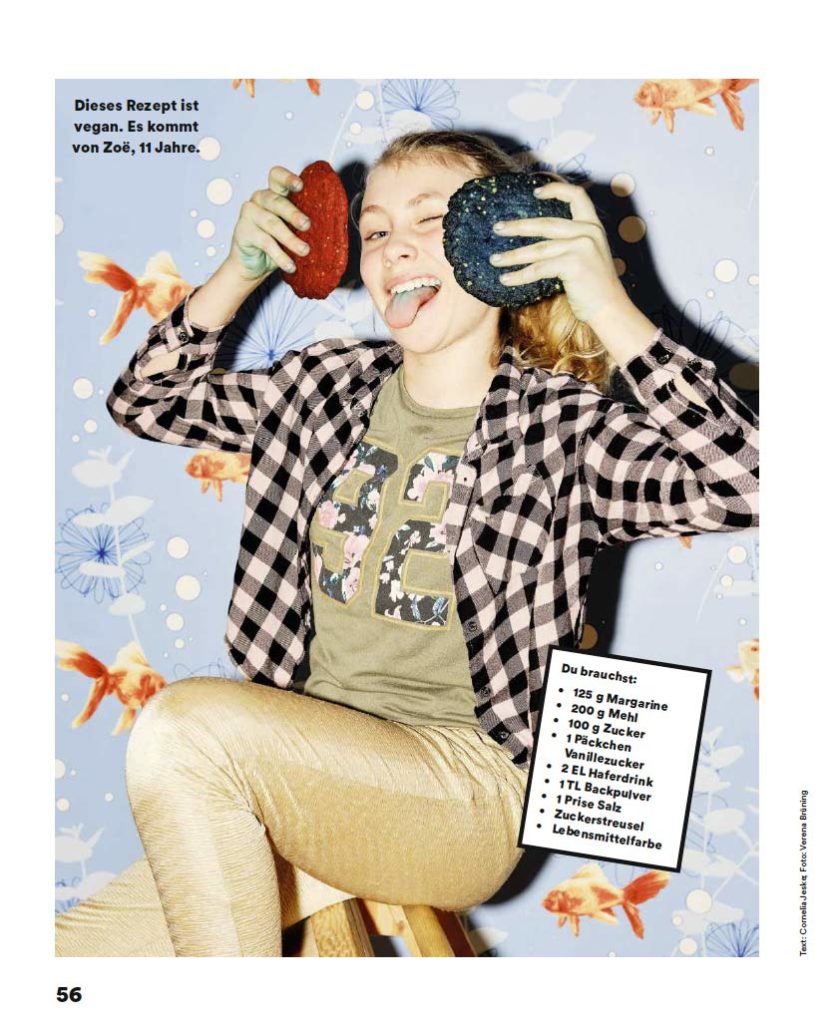
Yes, it's still a magazine, it still comes out eight times a year. Nevertheless, a lot of things are new: we used to have three chapters, but we've thrown them overboard. Now the magazine consists of a mixture of section pages that have a fairly clear design. It's also much more black and white than before, we've introduced new typography and the overall picture is much more uniform. The classified pages are repeatedly broken up by individually designed, special stories, which are also much longer and can stand out much better. Basically, we have reduced the background noise of the classified pages to a certain extent in order to emphasize the special stories more. They can now simply shine more in the magazine thanks to their unusual design and opulence.
What has also changed is the target group. It sounds a bit illogical, but we've rejuvenated it. Children are a rather difficult target group, they get older so quickly and then you lose them as readers. So it would be logical to say that we should broaden the target group in terms of age, then we will keep them for longer. We did the same thing in the previous issue and addressed both seven-year-olds and fourteen-year-olds. But that's not so easy, not only in terms of the topics, but also in terms of visual preferences, the younger ones differ greatly from the older ones. In tests, we have seen that children like very different things depending on their age; for example, the illustrations they like are very different, as are the colors.
There is a kind of breaking point and that is the smartphone. Children usually get one when they go to secondary school, when they start to cut the cord with their parents and no longer want to read the colorful booklet that their parents buy them, but want to discover content themselves. That is why we have rejuvenated and narrowed our target group and can now formulate what happens in Zeit Leo in a much sharper and more targeted way, both in terms of content and design.
As you have just mentioned, the target group of a children's magazine is of course children, but the magazines are bought by parents. So to what extent do you always help to design a children's magazine for the parents?
That's a great question, we asked ourselves that too. That's something we also changed a lot with the relaunch, in terms of content, but also in the design and on the cover. Previously, we actually often tried to take an educational approach to topics and also convey added value for parents. For example, we once had a title called: Make your cell phone safe. The title was clearly intended to appeal to parents and signal to them that we were teaching media skills. We also carried out tests on this with parents and children and found that children were not interested. Parents then often have the problem that they have to make the booklet appealing to their children, along the lines of: read this now. Children don't really want to do that. But parents often react differently than you might think, they also look at a product with the eyes of a child and want to give their children what they like.
We have now simply eliminated the balancing act of trying to sell to both parents and children and appeal to both. As a result, we can now work in a much more focused way.
We want to bond with the children and be like a big brother or sister. Take them by the hand and communicate with them as equals. Take them seriously in their fears and worries, but also when it comes to nonsense, so we now always come up with ideas that the children can use to trick their parents. So we want to stay completely on the children's level.
And how does the cover communicate the whole thing?
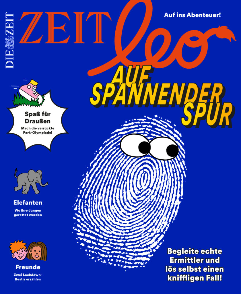
We've done something new here that I'm really pleased about. Previously, there was always a child on the cover, which has the advantage that you immediately realize it's a children's magazine. However, this made it difficult to convey topics. You often have a beautiful person on the cover, but then you have to make the topic clear, so you write it somewhere, which makes everything a bit half-baked.
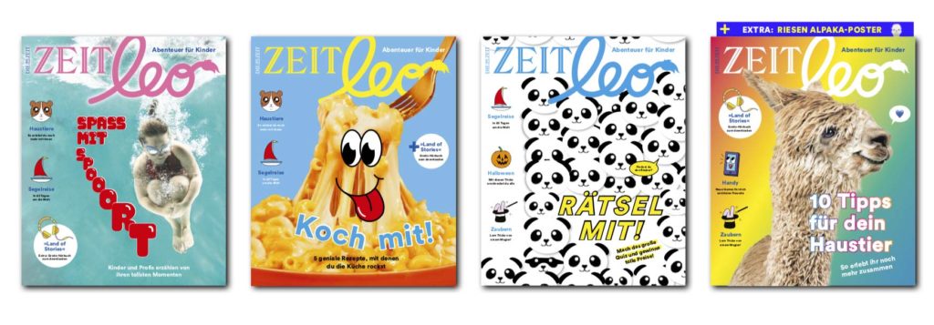
So we no longer have that. Now the cover design is much more conceptual, more illustrative and the range of possible motifs is more diverse. We have seen that the much more colorful, illustrative and pop imagery reaches the children in a completely different way and they are very excited and happy with it. The playfulness of the new covers appeals in a much more emotional way.
We tested this in qualitative conversations with parents and children and it was sometimes blatant how the children reacted to the new covers. They sometimes held them close or laughed and snatched them out of each other's hands.
How are children as a target group in general, very different from adults?
The special thing about working for a children's magazine is that it is not a special interest magazine. After all, the target group is only characterized by being young, otherwise children are interested in everything. For feelings, for dreams, for archaeology, for technology, the future, the environment and all sorts of other things. That's why you have to think broadly, which is also important for the magazine mix, and appeal to children with a wide range of interests. You have to be an expert in everything, children are a very demanding target group.

Once again about the design, the logo has remained the same, what about the typography?
No, we haven't changed the logo, that would have been too big a step at the moment, as there are other applications attached to the logo. The font is Circular, which has remained the same, but we have since developed additional weights that we have purchased. Now we also have Extra Thin to Extra Black and many other weights that allow us more variance, a bit more drama. (laughs)
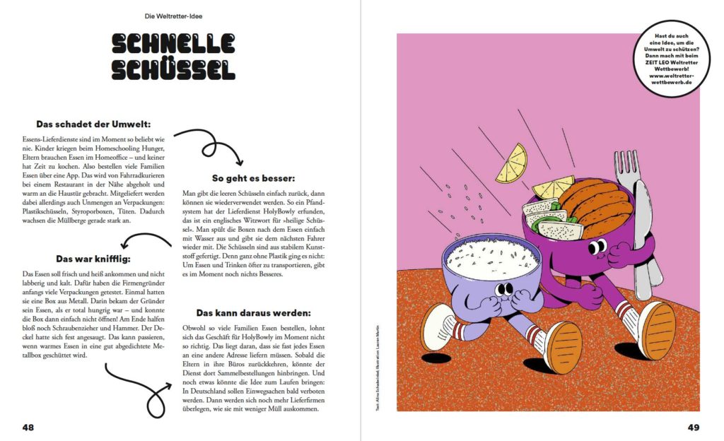
Apart from that, we have revised all the category pages and removed the colors. Now they are all black and white, but to introduce a certain childishness here too, we have added another font from Lineto, Biff, a bubbly, cute chewing gum font. Biff now determines the headlines and has a strong yet funny effect, it characterizes the pages and also the magazine, the look is now uniform, but still childlike.
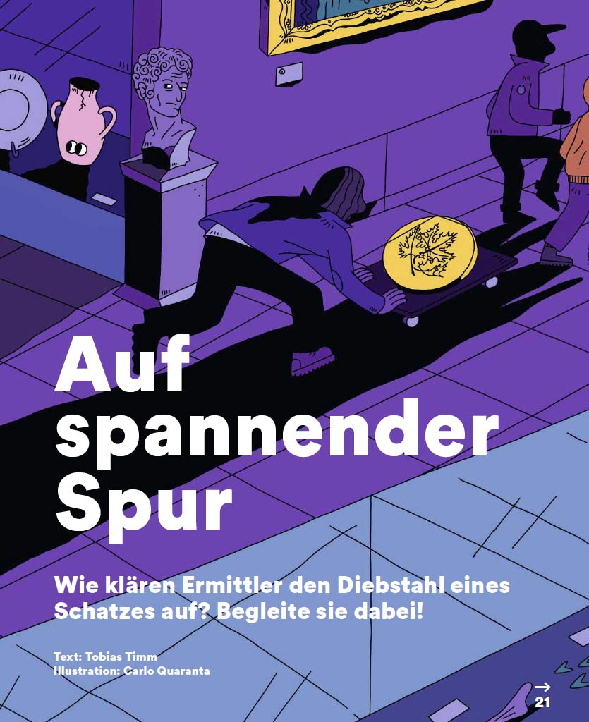
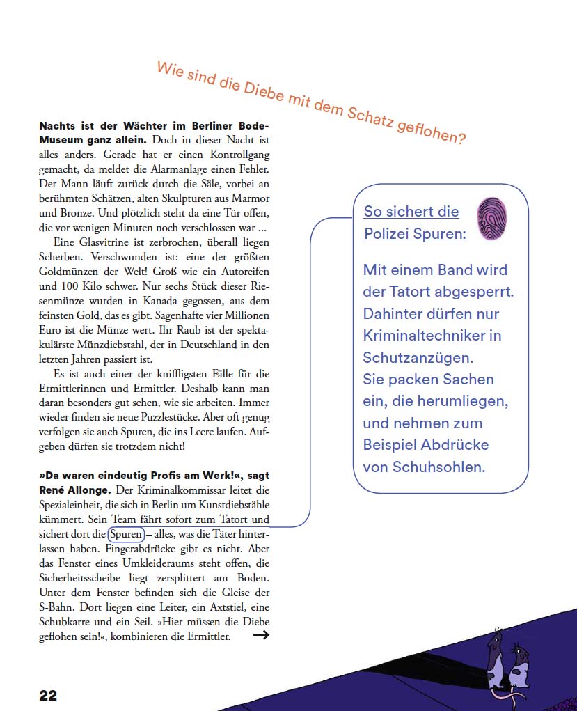
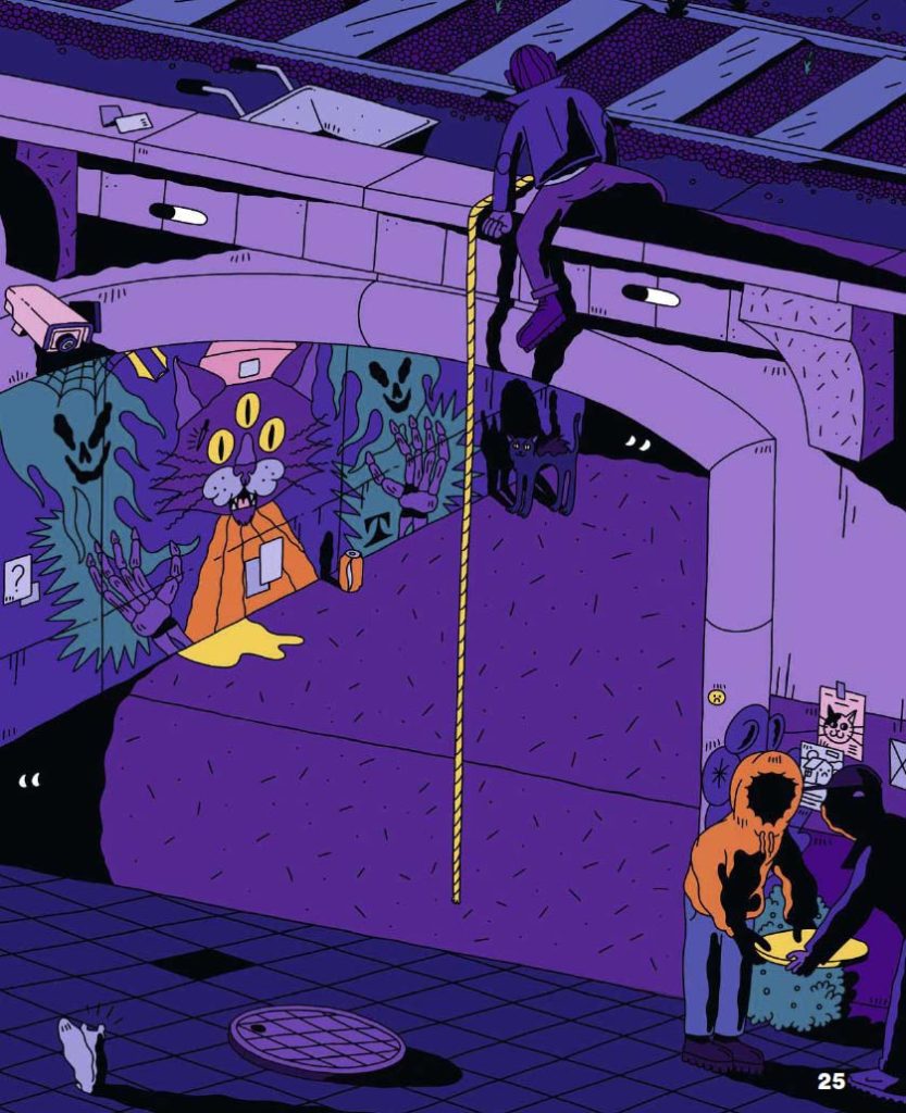
Zeit Leo also uses a lot of illustrations, how do you select the illustrators?
We always use the same illustrators for the section pages and work with them in every issue. But there are also 4-6 other places for illustrations in each issue and here we always ask new and different people. These can be small spots or world maps, but also the cover story over 5 double pages.
Once we've decided on our concept, we do some research. We find most of it on Instagram and design blogs, but sometimes we also find something in the portfolios that are sent to us. Illustrations are also more important at the moment, as it has become difficult to take photos in times of coronavirus. Our stories are always very close to the protagonists and that's difficult at the moment.
Now that you have been working on this relaunch for a whole year, what do you personally find particularly successful, what makes you proud?
I would perhaps like to talk about the content first and then the design, you can't think of one without the other. The whole thing was a process with ups and downs and a lot of what we wanted to do didn't work out. But what emerged in the course of this development was the idea of an adventure trip. At first we only needed a claim, but the idea of adventure then became a kind of beacon that guided the whole magazine. Previously there were chapters that were divided into understanding, experiencing and what to do. The whole thing was quite didactic. Now we have a kind of dramaturgy that tells an adventure in itself when you leaf through the magazine. What does adventure mean in the picture? A lot could be derived from this idea.
More about the Leo era at: leo.zeitverlag.de
The interview was conducted by: Christine Moosmann
