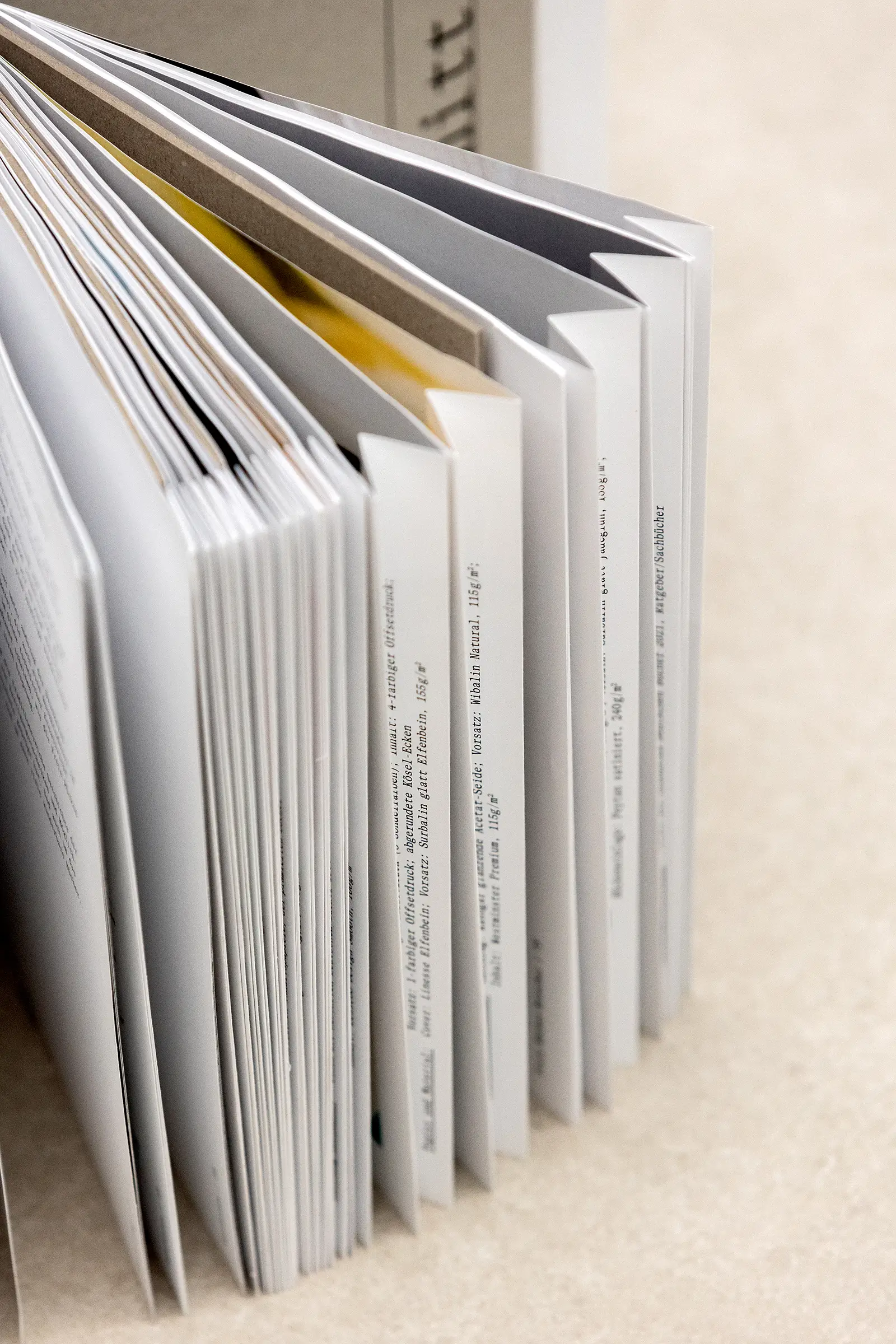
Anna Lena Gangluff found out about the insolvency of the Kösel printing company in the middle of her internship semester. She herself was not yet familiar with the name, but quickly felt the shock wave that went through the industry. So she set off in search of clues for her bachelor's thesis at Düsseldorf University of Applied Sciences and produced a documentary that is also impressive in terms of form.
For your work, you have studied Kösel's history intensively, but also its innovative developments. Which one impressed you the most?
Each technique is a special feature in itself. But I didn't know, for example, that the free-spine binding was a Kösel development. I also find the book-in-book technique a very nice solution for separating content.
So you quickly realized that this was a special print shop?
Yes, because no matter who I spoke to - employees at Verlag Hermann Schmidt or in other print shops - they all raved about Kösel and had a gleam in their eyes. That's probably why the closure affected so many people.
Did you know right from the start how you could capture this history in a book?
The concept was actually a little more complicated, because I wanted to capture the rich history but also offer added value. Interviews with formeremployees and companionswere therefore planned from the outset. During my further research, I learned about Kösel's patented production techniques - this became more and more the focus. It was also about raising awareness of the fact that print shops do more than just put ink on paper.

How did things formally continue?
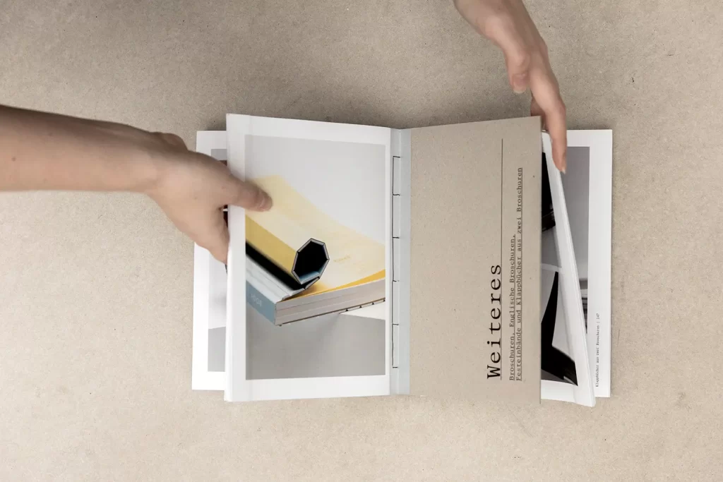
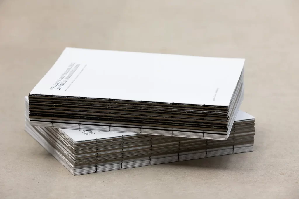
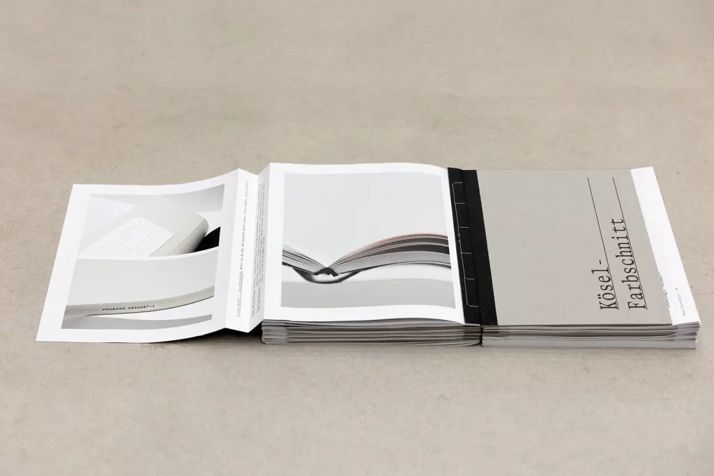
I wanted to bind the book myself and incorporated an interactive element in the form of fold-out photo pages in the production techniques section. The haptic separation was not planned from the outset, but was a necessity to make my folding and binding work.
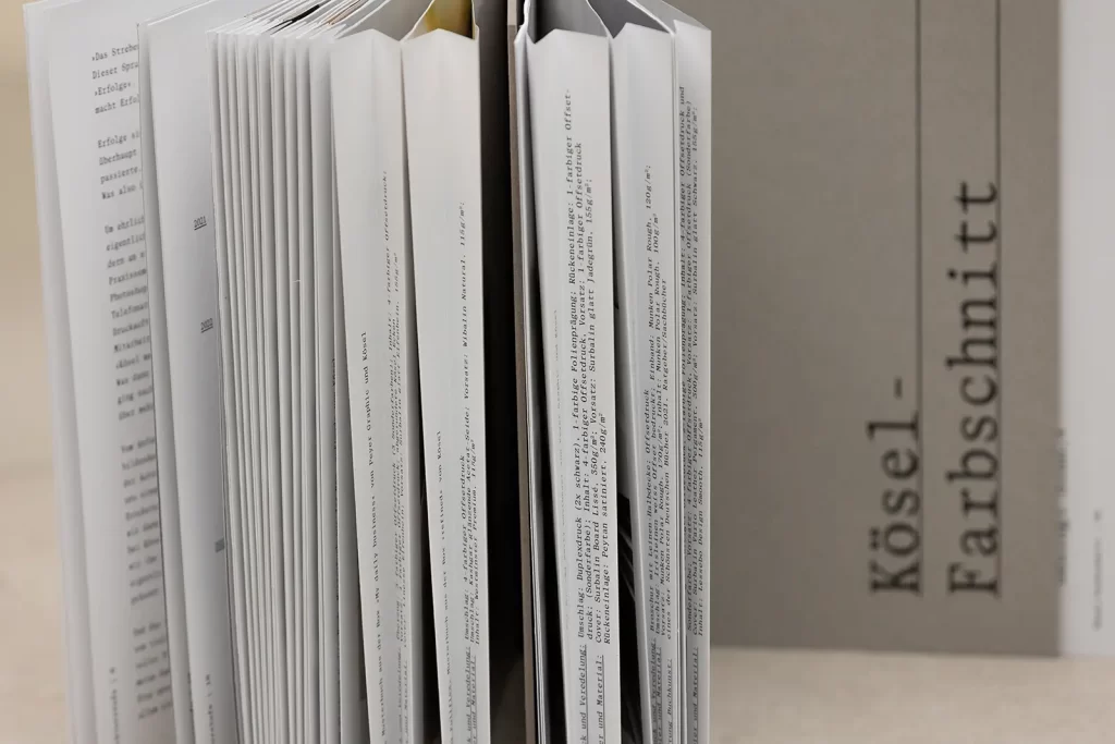
A special folding technique in the middle section created another reading level. How did you come up with this idea?
During my research, I stumbled across a wonderful catalog of the most beautiful books in the Netherlands, which had large colored pages that were simply folded in the middle. I wanted to build on that. For days, every receipt and piece of paper that fell into my hands was folded in a variety of ways. I quickly arrived at the fold that I ended up with. It's great to see how many different design layers can be created with three simple folds.
The biggest hurdle in the realization was the production of these pages. You can imagine how difficult it is to explain this fold over the phone (laughs). Many people also said that it wouldn't work - I would have liked to have had the Kösel print shop at my side again ...
Japanese thread stitching, an open spine, the incorporation of shortened gray boards as chapter dividers - what gave you the most headaches?
Clearly: the binding! That really was a bit of a struggle. I used two different bindings in the work, the Japanese thread stitching and a normal thread stitching. It was a huge challenge to create the connections between all the individual components. With each attempt, new problems arose and I was worried that it would look "tinkered", but after the final trimming everything looked clean and coherent.
Prof. Victor Malsy and Hilde Gahlen were the supervisors of this bachelor thesis.
Have a look at our "Mensa" section, where there are always new student projects.
Text: Bettina Schulz

