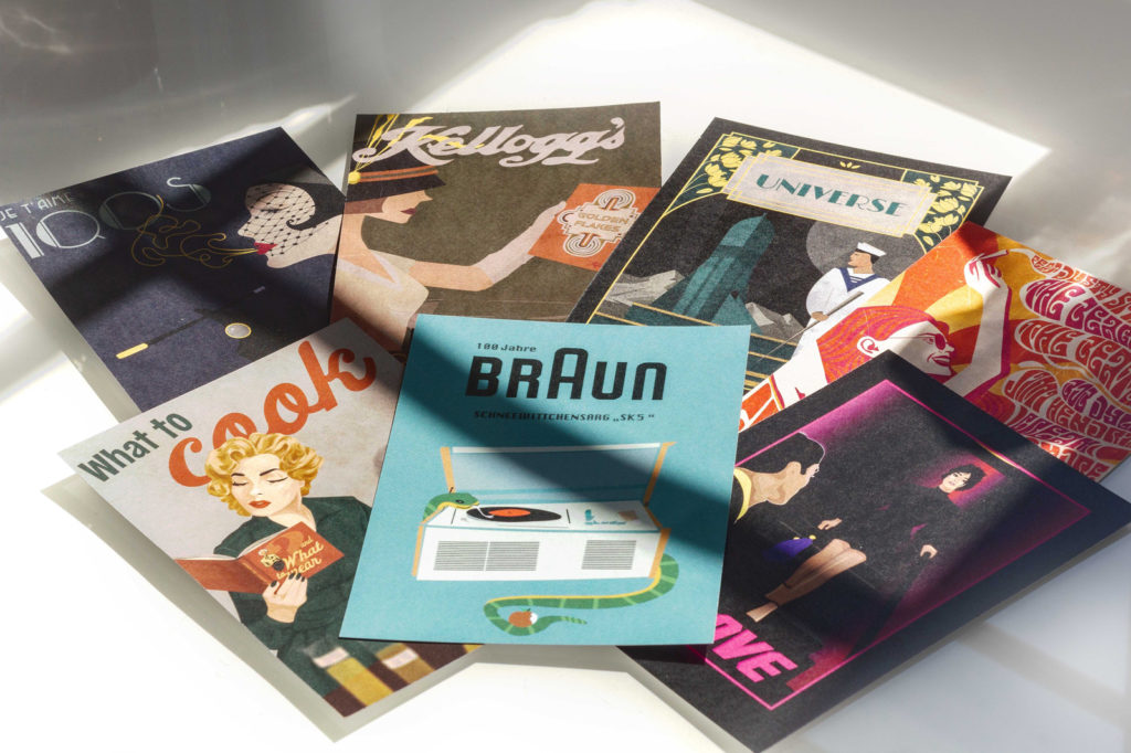
"Creative Tools, Analog & Digital" doesn't sound like a course that students would queue up for. But what sounds like dry basic knowledge turned out to be an absolute stroke of luck for fourteen second-year students at Macromedia University in Munich. Lecturer Denis Widmann invited the students to immerse themselves in different styles under the motto "TimeMachine" - the result is over thirty posters that are really something to behold.
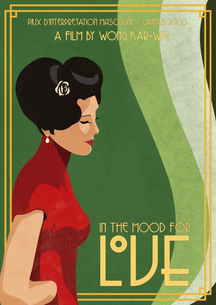
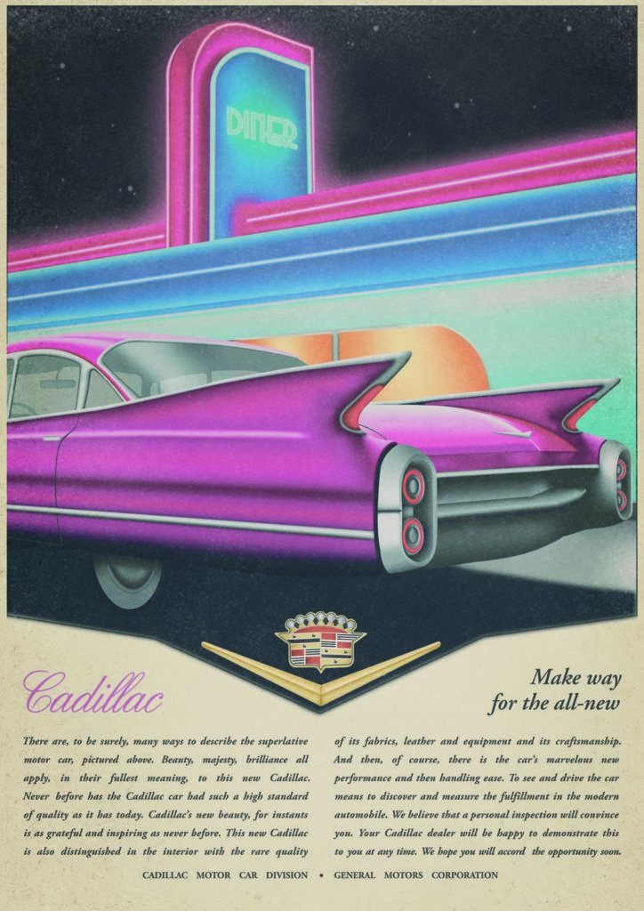
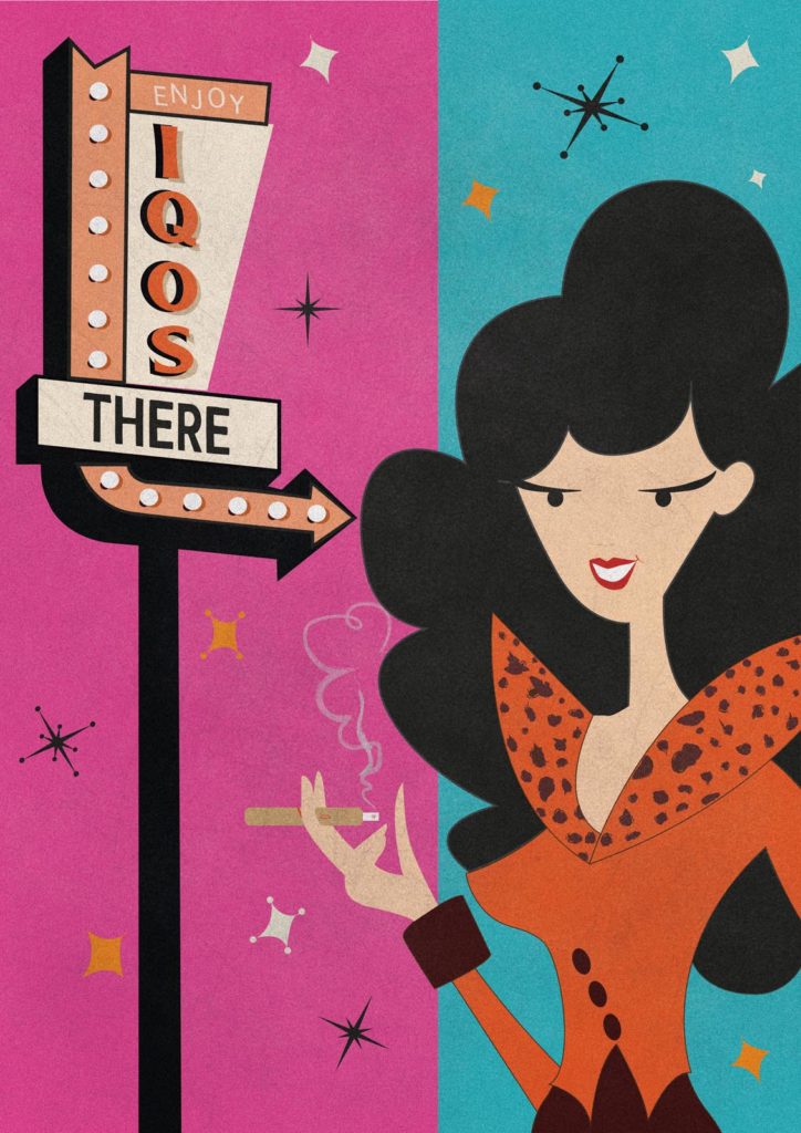
Of course, it is important to master the common programs, but if you want to become a good designer, you need many more tools. For example, it is important to develop a feel for styles and to know which colors, fonts and design tools can be used to create a certain look. For his course on creative tools, lecturer Denis Widmann therefore decided to take the students on a journey through time under the motto "TimeMachine" and have them design posters in three different styles.
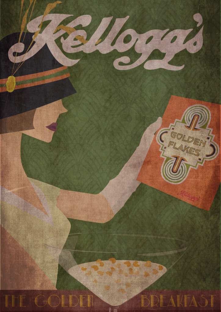

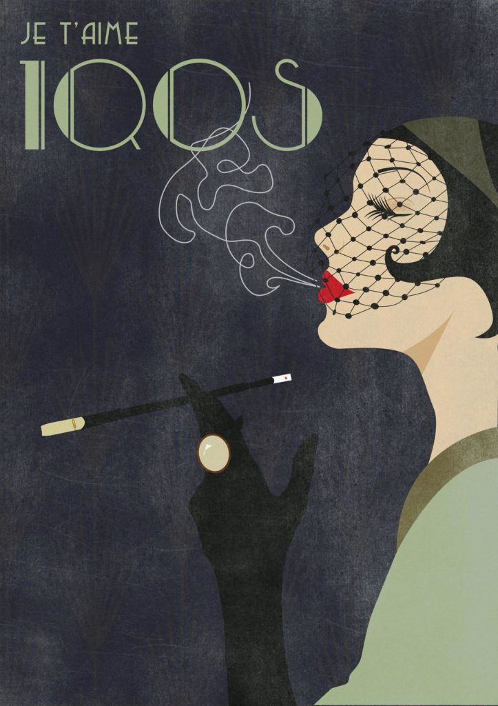
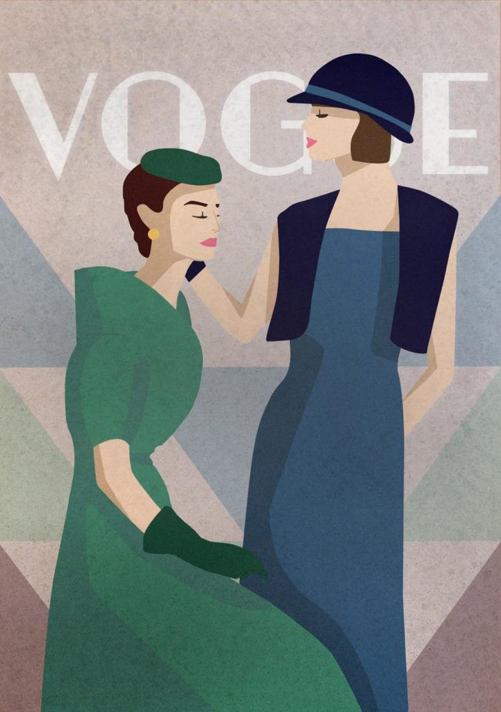
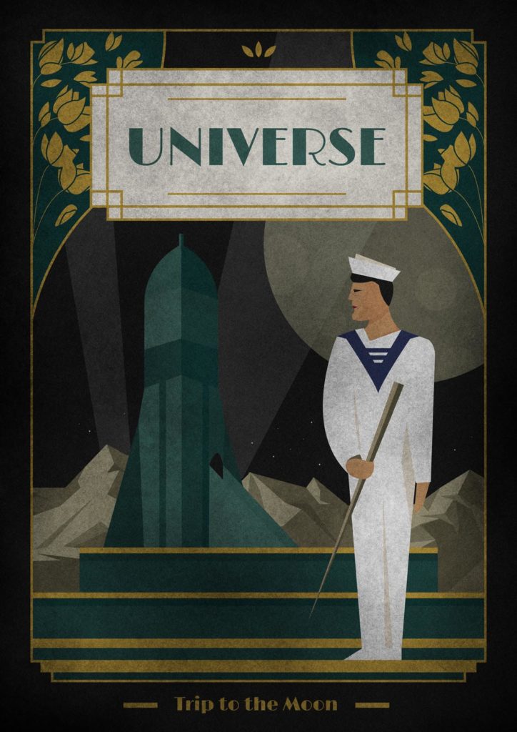
An introduction to the core programs of Adobe Creative Cloud was therefore followed by a short historical excursion so that the students could get to know the economic, political and social conditions of the time and thus better understand the framework conditions for the design. "We looked at poster design from the past 100 years and analyzed the individual design elements in great detail," reports Denis Widmann. "The students were then required to create three posters in the style of the 1920s, 1950s and either the 1960s or 1970s/80s based on a topic of their choice, for example a brand, a film or a political statement."

For the three micro-assignments, the students first had to research what visually characterized each style and create mood boards as well as analog and digital sketches. After a discussion, the designs were implemented in Illustrator, followed by texturing and ageing in Photoshop and, after the typographic typesetting, it was finally time to prepare for printing. "The students had to familiarize themselves with various styles and different briefings within a very short space of time and learn to develop and implement a coherent concept iteratively and transparently under time pressure," explains Widmann.
So what would a campaign for Iqos have looked like in the 1950s? How would a trip to the moon have been advertised in the 1970s or a television series in 1920? As in their professional lives, the students had to develop solutions quickly and accurately and learned to communicate their ideas clearly, even at the design stage.
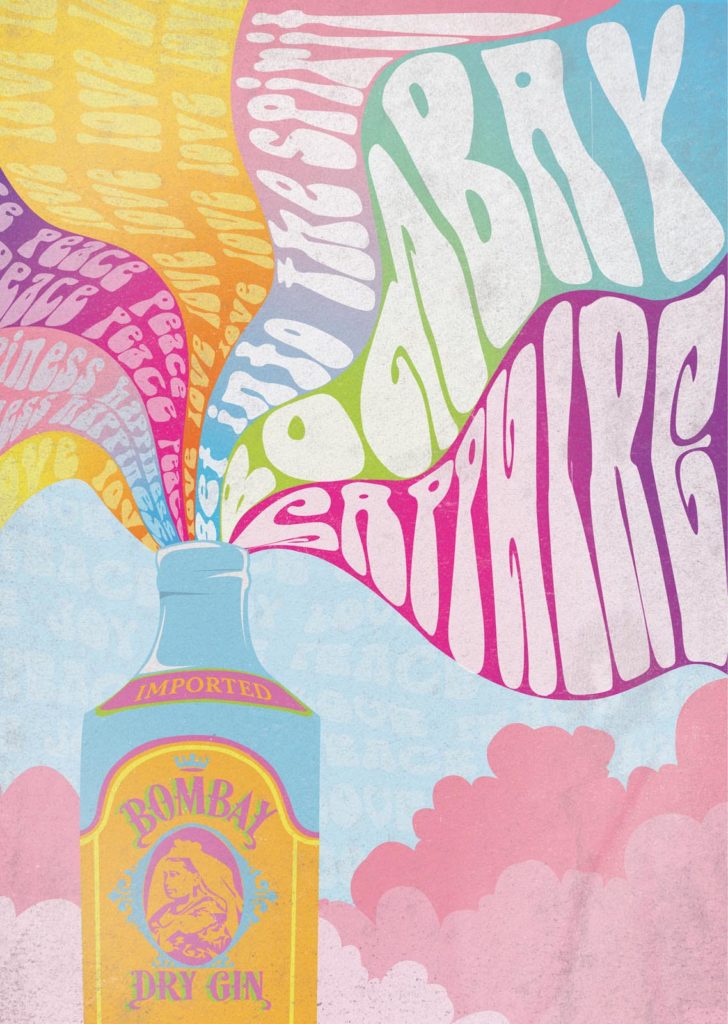
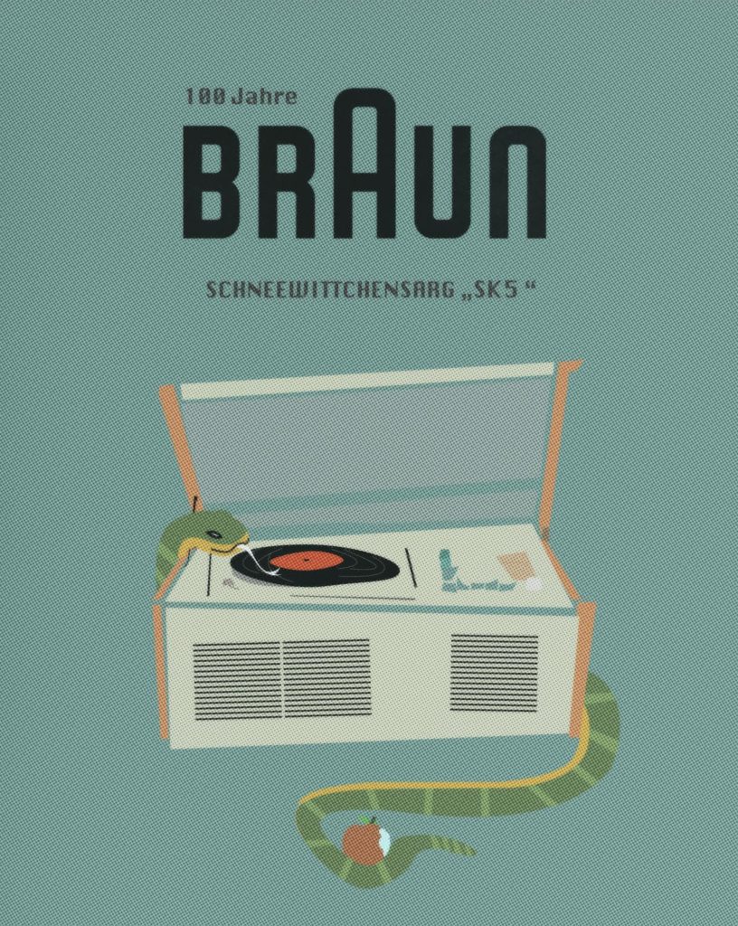
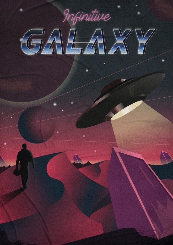
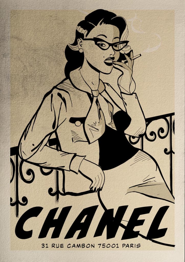
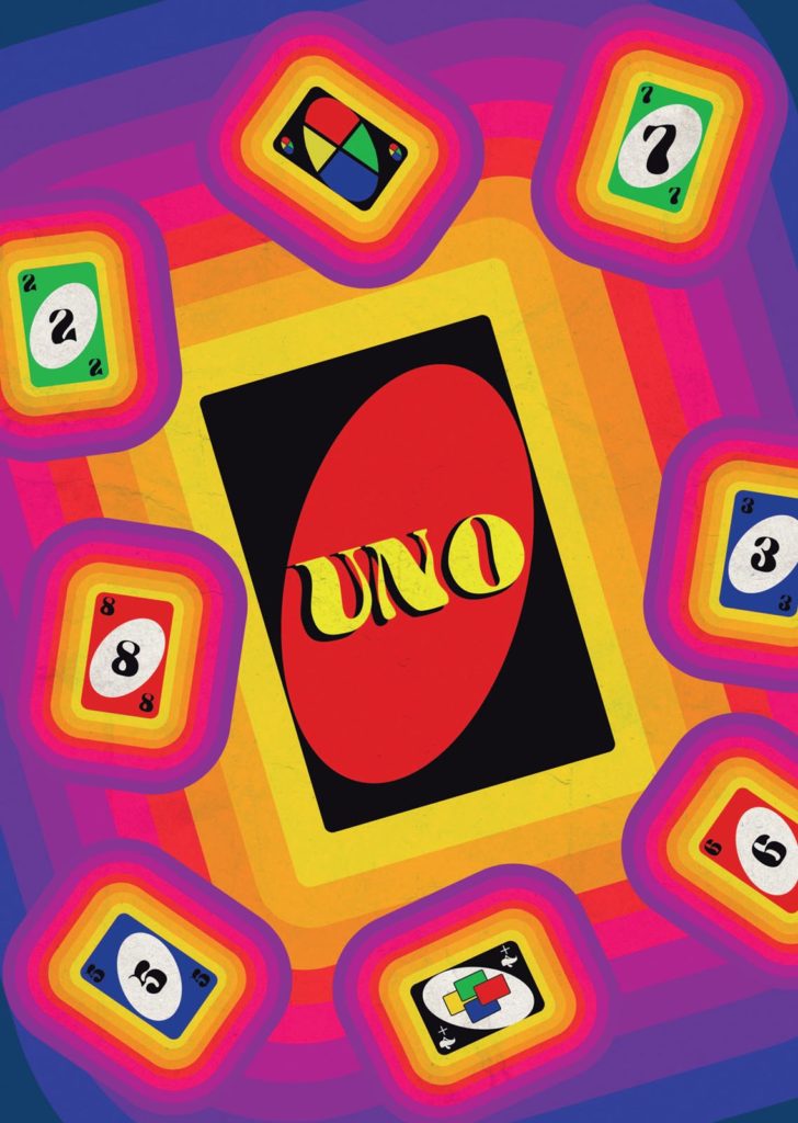
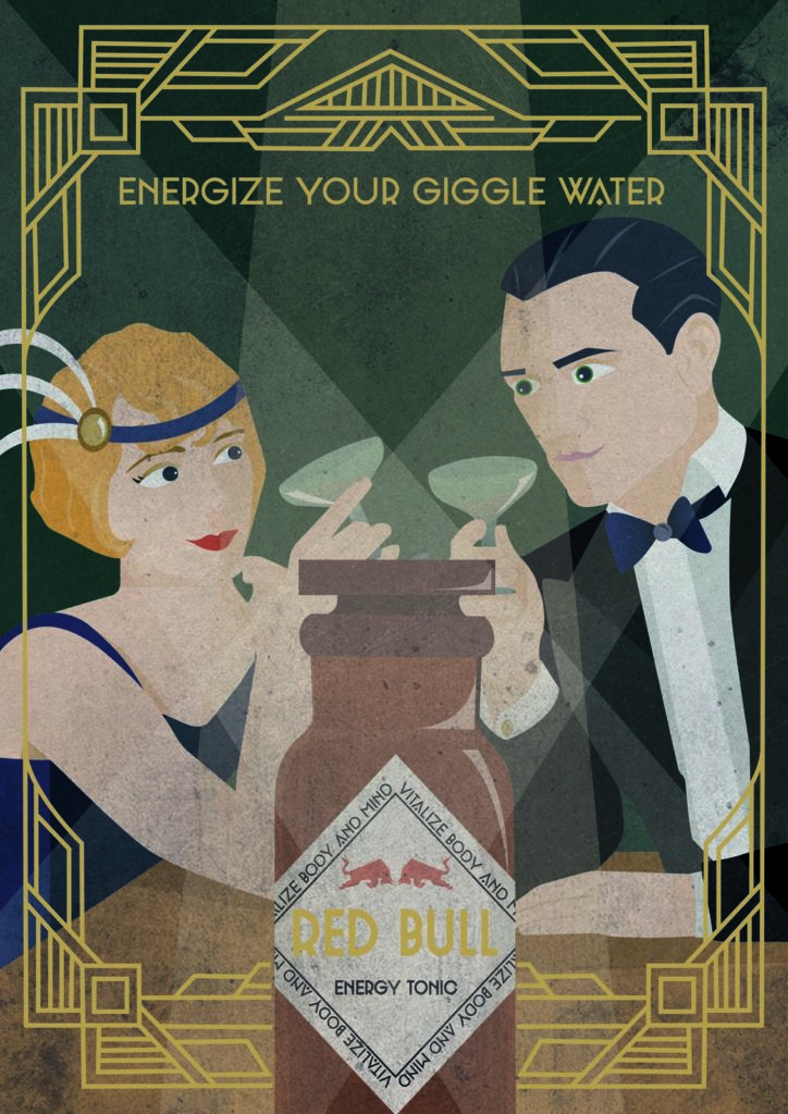
However, the course was also intended to teach analog creative tools, which was anything but easy in times of corona and distance learning. Thanks to the support of Gmund and Inapa, Widmann was able to let the students make samples using a wide variety of papers. Equipped with thread counters, they had to literally scrutinize the samples in order to get a feel for the feel, material, running direction, screen and the various printing and finishing techniques. An important process that will not only benefit the young designers in their professional lives, but was also important for the course itself, as the designs will ultimately be realized as art prints with the help of printing partner Xerox.

And because the students had done such a great job and the partners from the paper and printing industry were also supporting the project so generously, and because corona had already made everything so difficult, Widmann wanted to at least bring the course to a close with a bang. A jury finally judged the work and selected three winners for the TimeMachine Award, and there was also a big party on the Makromedia premises, including Campari on the roof terrace.
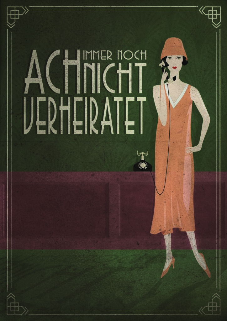

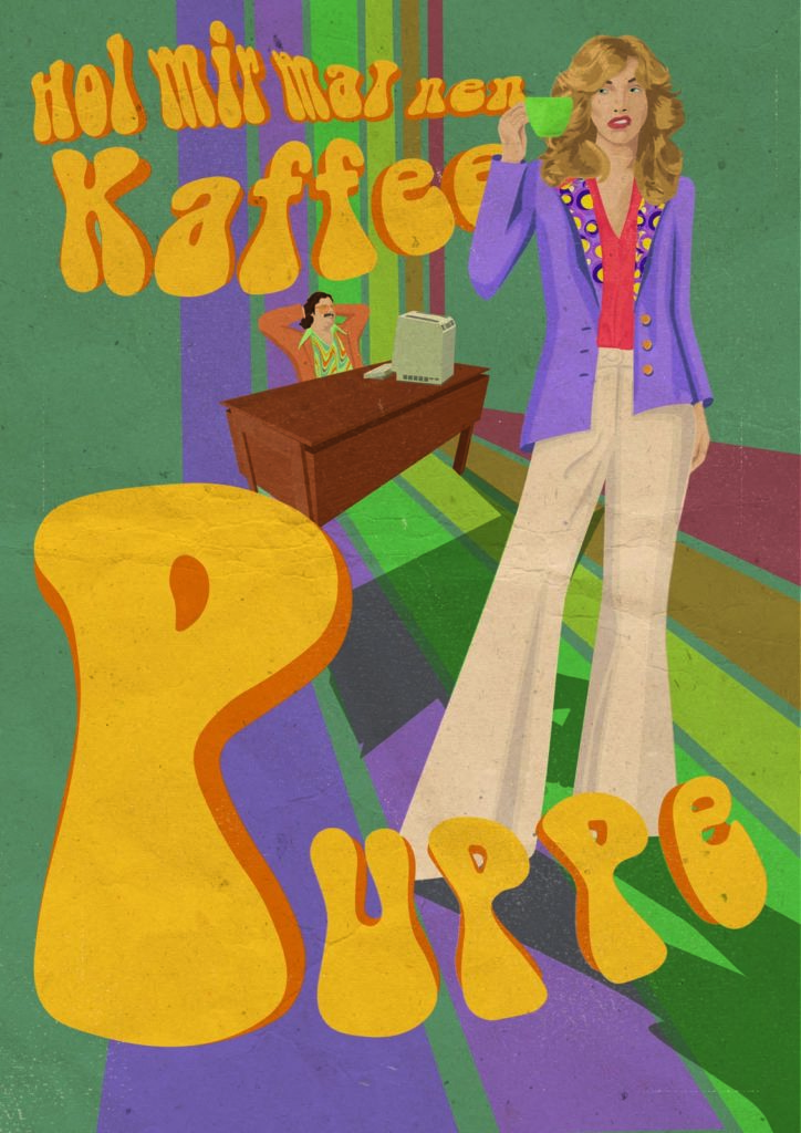
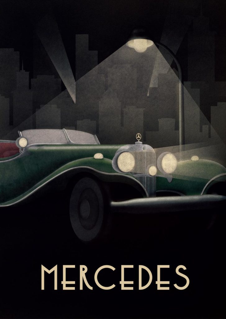

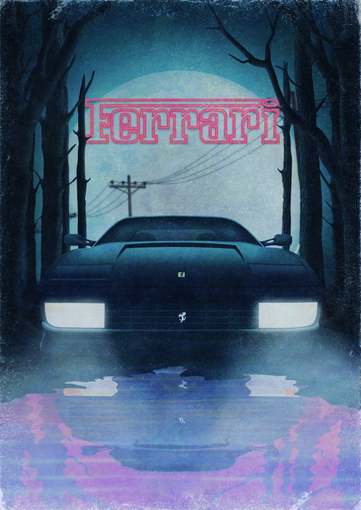
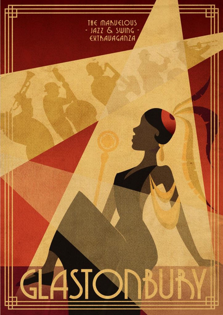

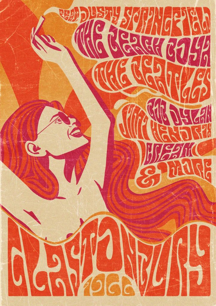
Paula Tornieporth had staged the working world of women and was awarded third place in the TimeMachine Awards. Tom Redlbacher showed the automobile through the ages and was awarded second place for his great work, while Amy Prosser won the award for her depiction of the Glastonbury Festival in different eras.
The award judged the consistently high-quality execution in all three styles and not all students were able to score equally well with each motif. Some of the students were over the top with one poster, others preferred the twenties to the seventies, but the overall quality of the work is impressive and all the students can be proud of themselves. After all, and this is easy to forget, despite all the staging, it was "only" a university course on analog and digital tools.
The TimeMachine example therefore also shows how much more teaching can be when people get involved and convey that design means passion - for history, for craftsmanship, for print and paper, for communication and for creativity.
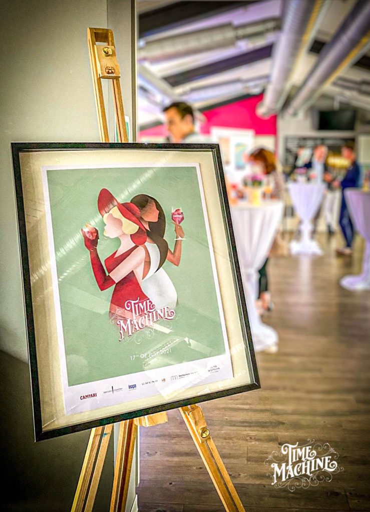

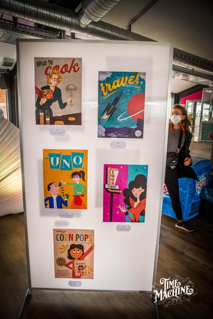

Incidentally, visitors to the closing event were also able to enjoy a nice give-away, as Denis Widmann also had postcards produced from the poster motifs. A nice replacement for business cards, as the students were able to present their work directly and one or two beautiful motifs may now adorn the desks and walls of guests.
Anyone thinking about having postcards printed should not miss out on this Onlineprinters promotion: Readers of Grafikmagazin receive a discount on their order, read how it's done here ...
