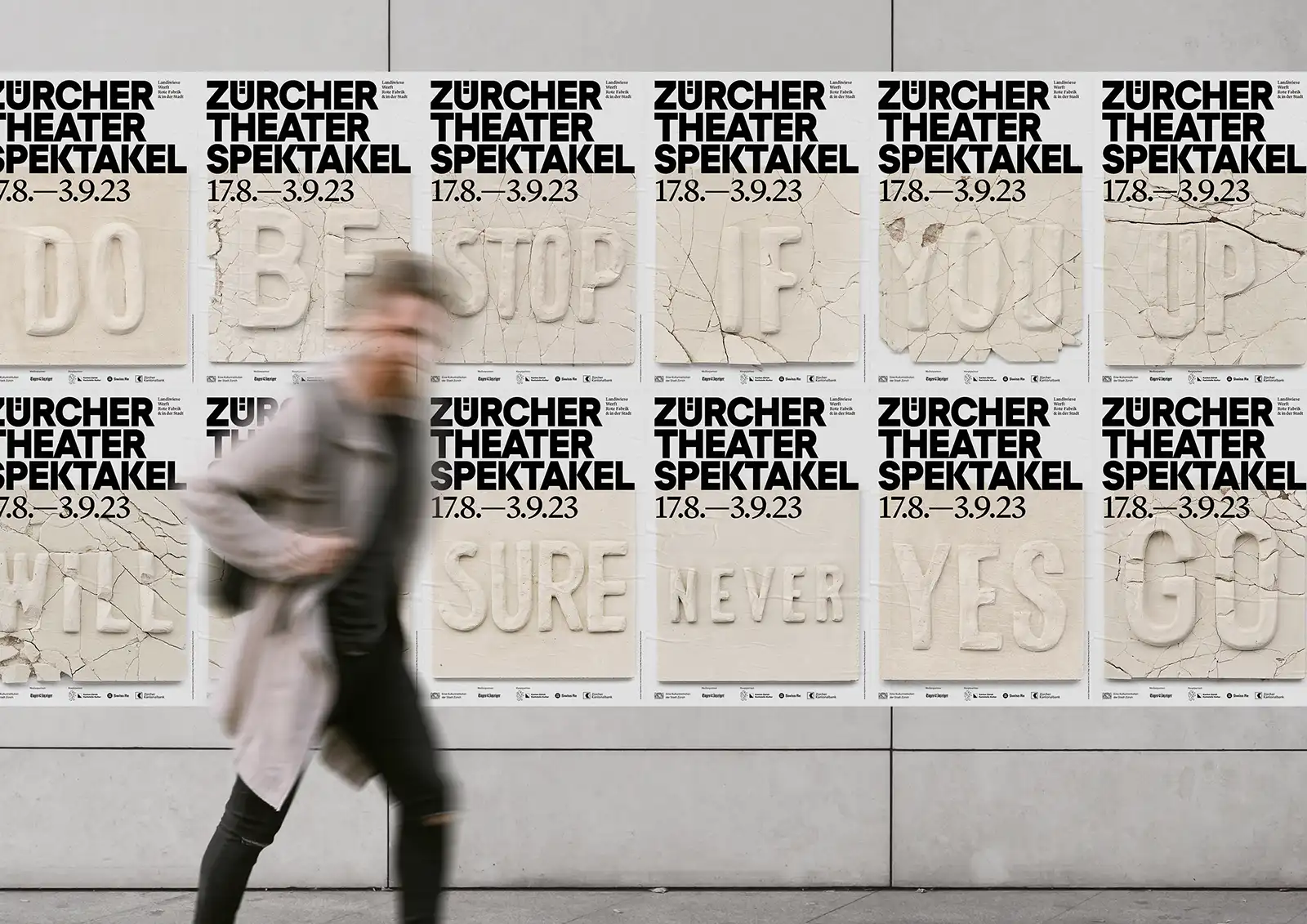
Sculptural typography in the form of plaster letters announces this year's Zürcher Theater Spektakel - one of the most important festivals for contemporary forms of performing arts in Europe. As in the previous five years, this year's campaign was conceived and designed by Studio Marcus Kraft. This time in collaboration with works by Miet Warlop.
Text: Paula Schneewind
What began in 1980 as an international meeting of independent theaters is now one of the most important European events for the performing arts in the field of theater and dance. The Zürcher Theater Spektakel is known for its varied program, unique atmosphere and curious and open-minded audience. No wonder it has been a desirable performance venue for recognized and up-and-coming artistic groups from all over the world for 44 years now. With over 100,000 visitors every year, this year's traditional event will take place from August 17 to September 3.
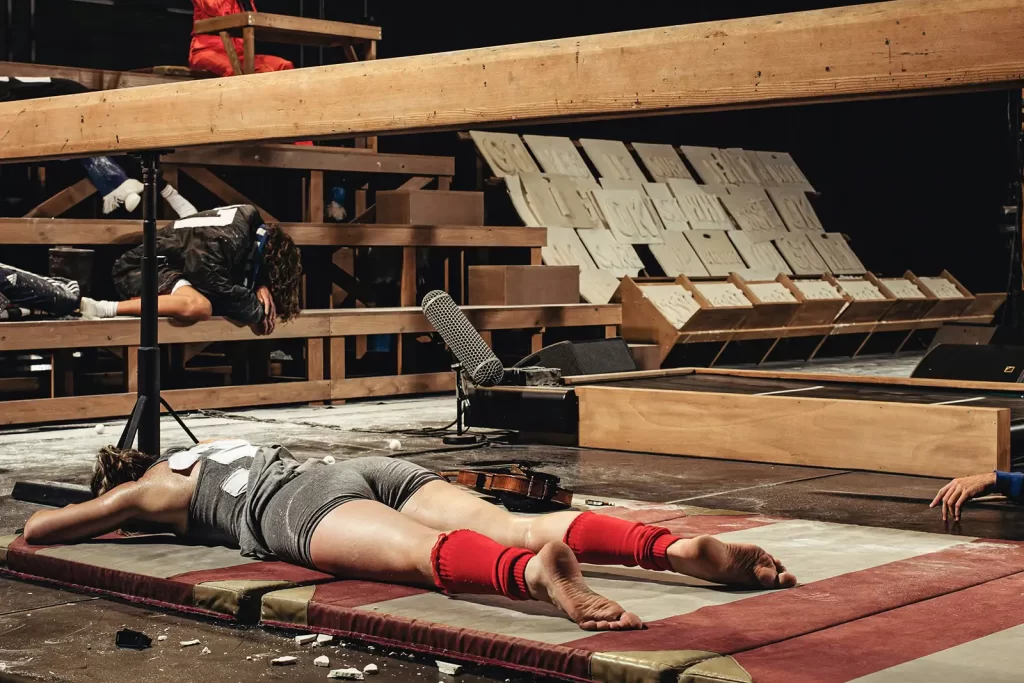
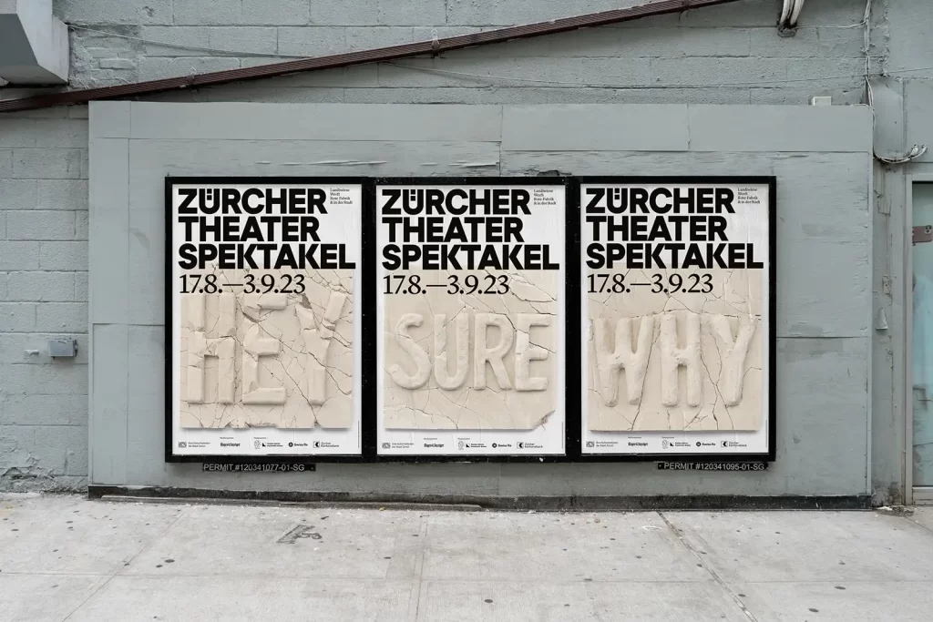
Since 2018, the multi-award-winning Swiss design studio Studio Marcus Kraft has been able to demonstrate its qualities in well thought-out design concepts with a high typographic standard. This year, the Belgian choreographer Miet Warlop was also invited to participate with plaster elements from her internationally acclaimed piece "One Piece". As a result, this year's visual communication was directly linked to the high-quality program of the event. The 15 hand-cast plaster words are individually combined in different ways on posters or in short moving image media, creating new and unexpected statements time and again. This is also a successful reference to Zurich as the birthplace of Dadaism.
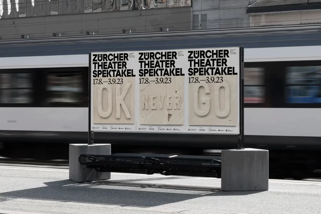
The reduced and quiet visual language of the campaign is intended to form a stylish contrast to the otherwise very loud world of advertising. The inclusion of handmade letters refers to the human and artisanal character of the Zürcher Theater Spektakel. The combination of static typography, photography of handmade, partly broken, plaster words and moving images stylishly unites the different levels and also represents the artistic variety within the program.
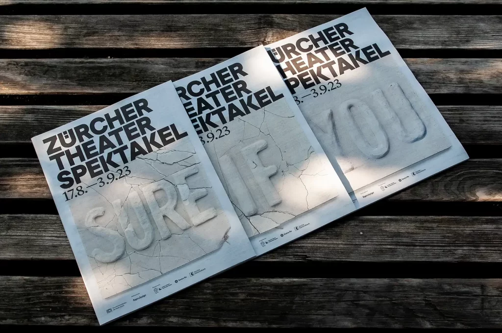
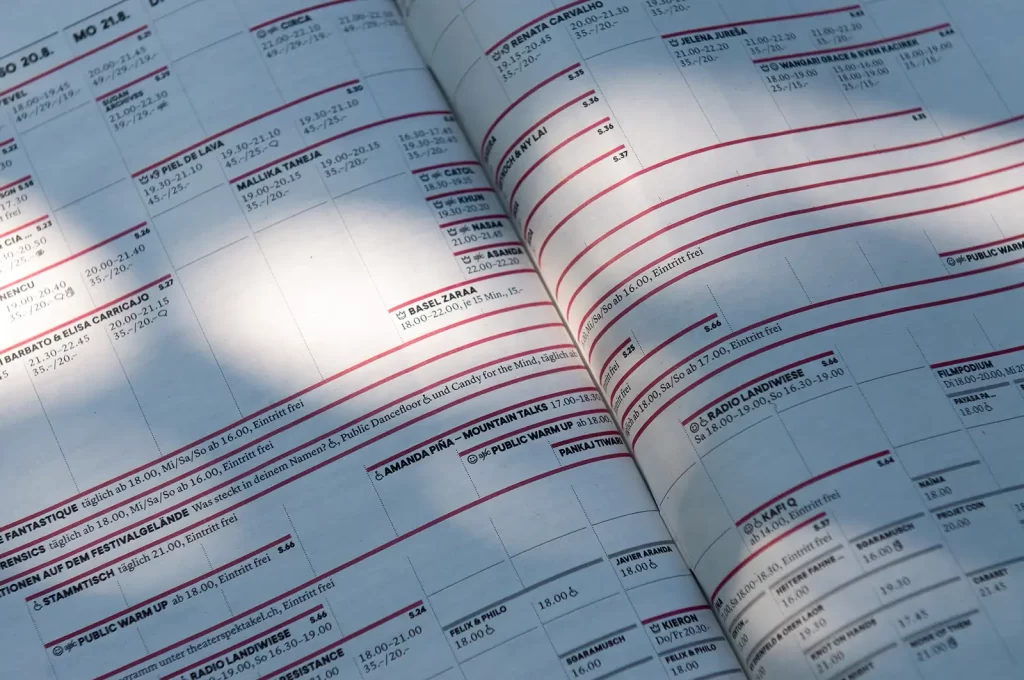
The trained typographic eye of the design studio is also clearly noticeable in the accompanying program booklet. The bilingual content has been skillfully, clearly and with attention to detail fitted into the format. This addition alone makes the event worth a visit.
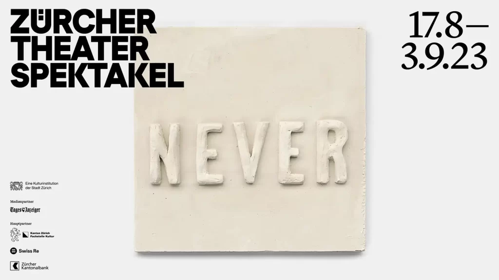
The original plaster objects used for the campaign will be on display at the main entrance for the entire duration of the festival, creating a very well-rounded overall appearance for the event.
If you liked this article, you may like to read another article on the subject of typography, e.g. about the Munken Creator: Raising Questions

