Appreciation, mindfulness, non-violent communication - these terms have been heard a lot recently, especially in the creative industry. Nevertheless, we often find it difficult to deal with criticism from within our own ranks, perhaps because we rarely discuss good design, let alone controversially face to face. So what makes a good poster? When is it worthy of an award and what tips can be given to young creatives?
A former and the current president of the 100 Best Posters Association, two great poster designers, discussed poster design with Christine Moosmann. Stephan Bundi and Fons Hickmann did not always agree, but this much is certain: the poster is a medium like no other.
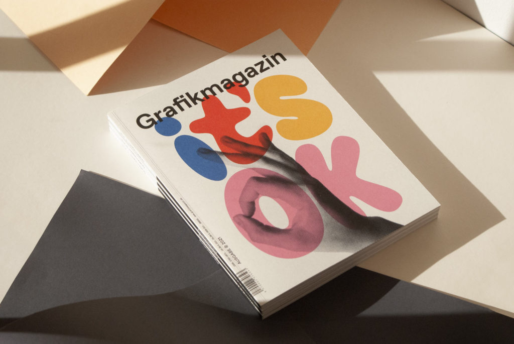
In the course of the 100 Best Posters, which we published in the Grafikmagazin 03.21, you, Stephan, as a former president, raised some critical points about competitions and poster design. I had the feeling that we should talk about this, preferably with you, Fons, the current president.
Stephan Bundi: I studied in Germany, among other places, and what always impressed me was the culture of debate. You can hold a different opinion in a good way and still reach an agreement.
Fons Hickmann: I think that's a good point. Discussion is important and so are different opinions in society. Sometimes I have the feeling that people are finding it increasingly difficult to tolerate different opinions, but we have to and we also have to treat different opinions with respect. Because if I understand how the other person thinks, it can enrich me. So we should also make an effort now to really disagree. (Laughter)
SB: We don't know each other very well personally, but we have certain parallels in terms of our areas of work. Fons, I didn't have to research your work and for me that's one of the best signs when you still remember your work years later because it has stuck with you. That's all a poster can do and that brings us to the competition. When I look through the 100 best, for me the best are the ones that I still remember the next day. But there aren't many of them and I still remember very few of them ten years later. That's an important aspect for me and means that someone has really dealt with the subject. And not just visual decoration, but visual communication.
In competitions I sometimes have the feeling that a certain sharpness of content is missing, a really good idea, which for me constitutes poster design. Am I wrong?
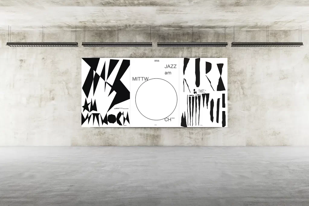
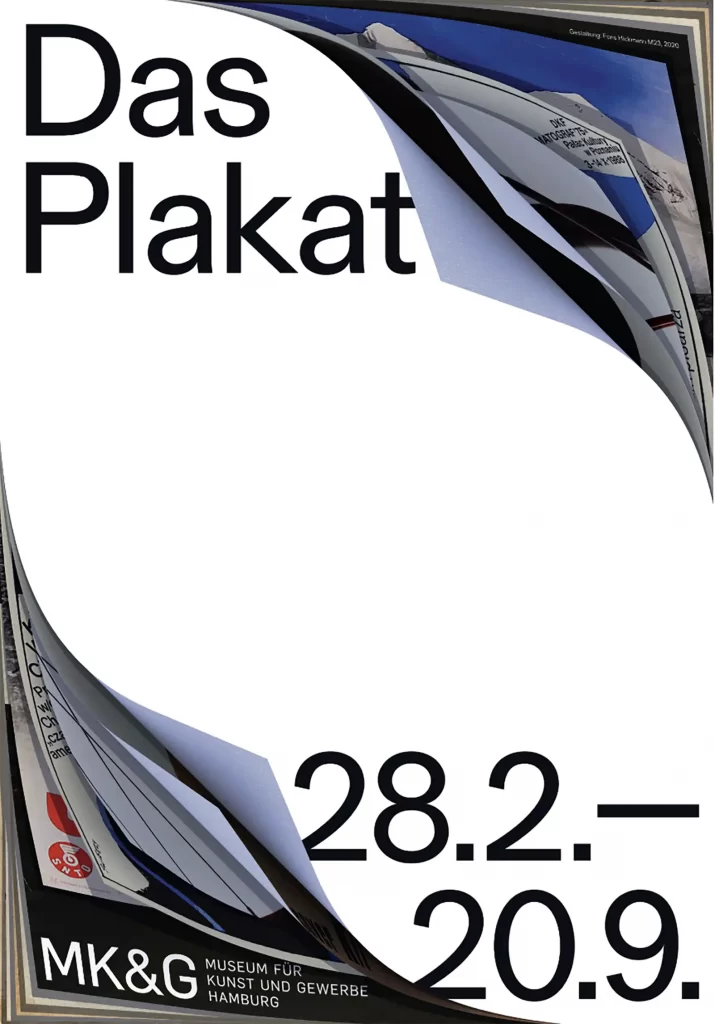
FH: No, I think that is precisely the profile of the 100 Best Posters and that this competition has an artistic approach. It is not comparable with posters from the commercial sector or with competitions such as the Art Directors Club or Type Directors Club or the Red Dot. The special thing about this format is that the artistic, intellectual and socio-political poster is preferred, also in the selection.
However, it must also be said that the jury is different every year. Incidentally, the five-member jury is made up of equal numbers of men and women, i.e. one year there are three men and two women, the next year it's the other way around. We also have equal representation in terms of age, i.e. younger and older creatives are represented on the jury, and at least one member comes from each of the three participating countries, plus a guest from abroad. So the composition of the jury is complicated.
But the jury is independent and does not follow any aesthetic or content-related guidelines from the association. Every jury is completely different and I find it amazing that over the years the level of quality has usually been very high, even in comparison with other competitions.

Do there always have to be a hundred awards?
FH: Yes, we do have a few rules. In the end, there are a hundred posters, whereby a series counts as one, which makes 140 posters, as in this year's exhibition.
SB: In Switzerland, there was the "Swiss Poster of the Year" competition, which was founded in 1943 and honored the most beautiful posters. And the great thing about the system was that the posters were then exhibited in all major cities throughout Switzerland. I can remember that we looked at them at school and then had to write an essay about them. That was very important for raising awareness of graphic design and posters in Switzerland.
That's perhaps a problem with the 100 best, but also with the ADC and other competitions, there are always bubbles in which we find ourselves. And as a Swiss, you think the name 100 Best Posters already seems very German. There are 100 best and the 101st is no longer worth anything. (general laughter)
Also, the 99th is just as good as the first. I think it would be better to choose the posters of the year. In Switzerland, for example, you couldn't enter for this award, you were simply selected. I experienced this in Bern, where all 3500 posters were hung on a washing line in a huge hall and it took hours to run through them all.
FH: You're right, you can't measure quality by numbers. You can't say that there are only 100 good posters every year, and some years are stronger than others. But this competition has a tradition and was launched 60 years ago in the GDR. In the beginning it was very regionally limited, then it awarded prizes throughout Germany and for the last 20 years works from Germany, Austria and Switzerland have been awarded prizes. The bracket has always been the "100 best", so the competition has been recognized as a brand and also has international appeal.
SB: Yes, you can no longer change that, but you could also question other things. For example, as president I introduced online entry, which didn't exist before and there was a lot of resistance from the 100 Best Posters Association: you have to feel a poster and see it properly. No, if a poster doesn't look good in the half-light and is badly printed, then it's no good. A poster is not an art print that only really comes into its own when illuminated in a museum. If you don't like a poster in screen size, then it's no better in its original size.
FH: Uwe Loesch once said that a poster must also function as a stamp.
SB: Yes, exactly, that has long been undisputed. But who makes the selection is also important. At the Swiss Poster Award, for example, the jury is made up of photographers, graphic designers, advertising people and marketing people. Then you don't have such a bubble. I know more or less what graphic designers think is good and I know how advertisers think, but there are good works that are simply good and are also considered good by the majority of people.


Are there really completely neutral criteria that make a good poster?
SB: Yes, that's innovation and poster justice ... and then, of course, self-initiated projects are not comparable to commissioned work. I have a client, for example, and it's a constant battle. They never really want what I do. I always go to the limit and say: then you'll just have to find another graphic designer.
FH: Competitions have quality criteria, but everyone also has their own personal criteria. For me, a poster is something that works in terms of form and content and where form and content belong together and fit together. A poster must also be relevant in terms of content and aesthetics. Aesthetically relevant naturally raises the question of what that is. This includes what we see again and again with the 100 best, that it is very contemporary.


But do contemporary and timeless go together? Good design is usually said to be timeless.
FH: They don't have to go together. Something contemporary always has a touch of fashion, as in music, fashion or art. An aesthetic that only works today and not tomorrow or yesterday. That is one aspect of contemporary or zeitgeisty. And then there are the classic parameters, i.e. certain fonts, shapes or colors that are considered timeless. A picture diagonal will always be a picture diagonal and if you build up an arc of tension within a poster, then it's very similar to how a picture is composed in art. There are mechanisms that simply work visually. That may be timeless, but it's not necessarily contemporary.
SB: I largely agree with you, although I think that a poster is a classic medium. It's always interesting when people say we need to rethink the poster. Wow, that's like someone saying we need to rethink chess. No, you don't have to!
The poster is a surface that sticks to the wall, the content must be legible and appeal to us. It is interesting that the poster is the only medium that can have a different effect at a distance than up close. I have often played with these optical phenomena myself and that is not possible with a book cover or an advertisement. This medium is so rich in possibilities and I'm always amazed at how many Hamlet posters there are or your Don Carlos poster, the jumbo in the forest - it makes me weak in the knees. (general laughter)
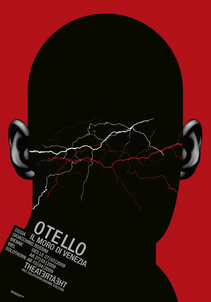
I've designed posters for Don Carlos twice myself, a great drama, love stories that don't work out, that lead to death, disappointment or betrayal. So a heart would always be right, but of course that doesn't work. But the drama starts in the Bois de Boulogne, the situation is hopeless and when you see your Jumbo in the forest, you think: Yes. That's exactly how it is! My approach was a lock with the key hanging in the shackle so that you can't open the lock. Nothing works anymore. These are ideas that I find impressive and I don't want to discuss them as a juror, they are simply top.
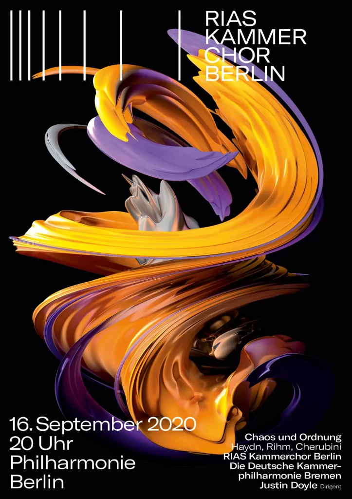
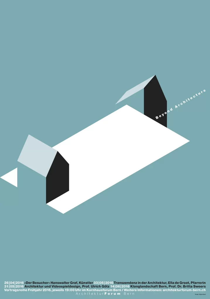
FH: You can add two more good parameters. For me, one is the close-up and long-distance effect that only this medium can really achieve. A poster has to have an effect from a long way away and convey a first impression, then you go up and, in the best case, you have another effect, namely the information. So you can convey two messages, on the one hand a signal, which can be a provocation or a strong idea. And when you approach it, a subtext may be decoded. That's exactly what excites me about posters, when I recognize an underlying message. At first glance, I perceive the signal and at second glance I think, oh wow, there's a reference, there's an analogy. And these are the outstanding works that make a lasting impression on us.

Can this be learned? I would also like to address the area of teaching and training.
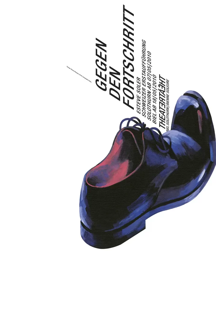
FH: Of course you can learn that. One of my teachers was Uwe Loesch and for him, analogies were always essential. A clue or a joke that I might not even recognize at first glance, but only when I study the subject. Theater posters, for example, are also judged by people who don't even know what theater is ...
SB: Yes, but they don't have to understand it either.
FH: They can't understand it either, but that's okay. I don't care about the recipient who doesn't bother with culture and education, because they can't understand it. But I can't go to that level to make it understandable either, because if you want to understand theater, you have to watch it. If you want to understand music, you have to listen to it.
SB: But that can also be problematic. If I make a Macbeth poster, most people immediately know what it's about. But if I make a poster about ephebiphobia, which is the fear of teenagers, then most people can't decipher the motif.
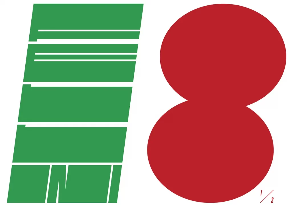
FH: But then the whole thing is a puzzle for me. I have a foreign word and a subject and I have to want to solve this puzzle. If I solve it, then the memory effect happens and I never forget the poster and the subject again. Ideally, we can trigger this mechanism through our work.
Is the poster still as important today as it used to be? After all, many other mediaare now used to communicate ...
FH: I understand the question, I must have heard it for the first time when I was still a student, now I've been around for quite a while, you, Stephan, even longer ...
You mean the question is an evergreen? (laughter)
FH: Yes, the question is an evergreen. And I can only say, why are we sitting here? The poster is the most communicative medium of all! It always has been and always will be, even if it is now moving more and more. Even when we talk about politics, we talk about posters. I think the question is answered quite quickly.
SB: I see it the same way. With theater commissions, I often hear: Shouldn't we do more on the website? No, the poster is a reference medium. I first have to know what's going on, because I don't just go to any website. Once I've become aware, I go online to find out about available seats, prices or book a ticket - websites are great for that, but I have to get that first hint first.

A poster always lives from its surroundings. How much do you think about this when designing?
FH: I actually don't think it's that important. A poster can also hang in a museum. It doesn't just have to work on the advertising pillar, it can also follow an aesthetic path, just like in art. That's not the masses, but I think it's important that designers also understand the medium as a form of artistic expression. A poster is not just advertising.
SB: To come back to your earlier question, can this be learned? Of course you can learn many things, such as basics. There are rules, but the opposite can also sometimes be true. We talk about poster art, not ad art or flyer art, and you have to master this art. I've already had students who said, look at my poster, I thought about this and then I did it like this and then like this. And after twenty minutes I said, listen, how is that supposed to work? Do you want to stand in front of your poster and spend minutes explaining to everyone what your brilliant intention was? If what I want to know doesn't come across immediately, then it won't work. I don't have to talk about the golden ratio for long. (laughs)
FH: I always try to say, don't tell the punch line until you've told the joke. And another important rule: take the viewer seriously! You have to meet them at eye level and not give everything away straight away. By doing so, we underchallenge the people for whom we are communicating. And intellectual underchallenge is actually an insult. In everything I see or read, in art, music, culture and literature, I want to be challenged. Communication that is not challenging is not sustainable.
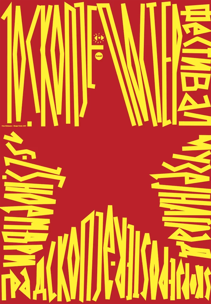
We would like to thank Stephan Bundi and Fons Hickmann for the entertaining and informative interview and the bag manufacturer Freitag, who kindly provided us with a meeting room in their Zurich office.
The current call for entries for the "100 Best Posters" competition runs until January 20, 2022.
If you would like to find out more about posters, we recommend our Grafikmagazin 05.21, which focuses on "Poster design".
