Women in architecture are committed, future-oriented and present. What they lack: visibility. The female students of the HAWK Holzminden, Hildesheim, Göttingen, together with Professor Dominika Hasse, addressed this problem in a project that pursues the same goal in terms of both design and content: To give women a space in architecture.

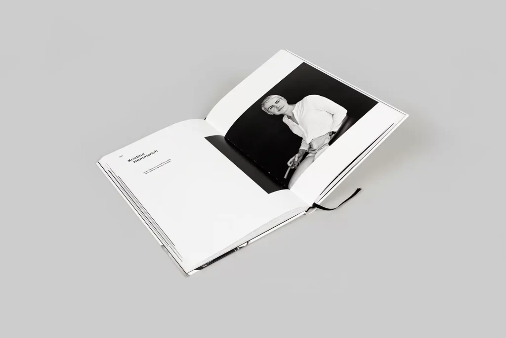
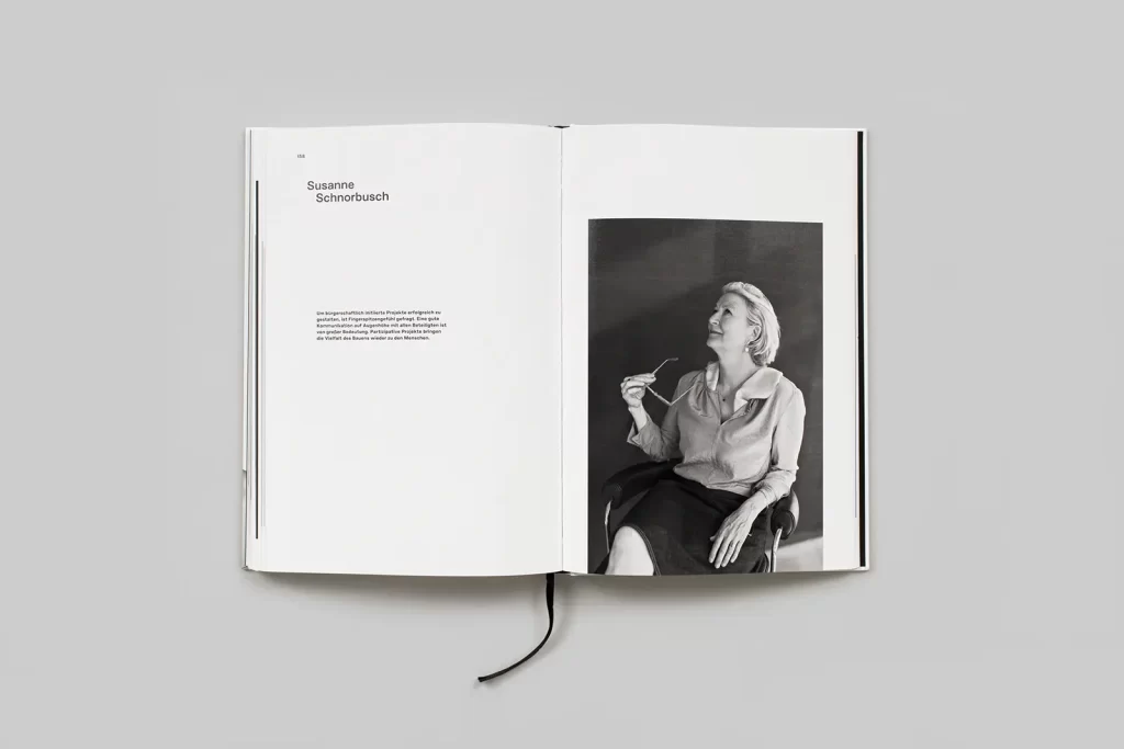
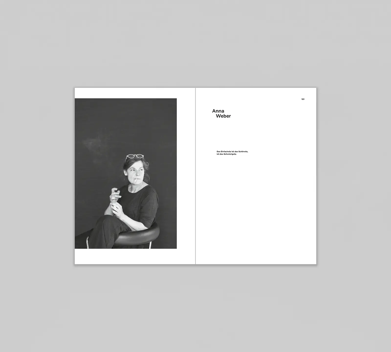
Photographer Anke Illing's photos form the basis for the photo book, the design of which was worked on throughout the semester. Inspired by iconic photographs, her pictures show women from all areas of architecture - from students to specialist journalists to architecture collectives - posing with selected accessories such as the Chaise Longue LC4 by Charlotte Perriand. What they all have in common is that they are committed to sustainable, environmentally friendly and future-oriented construction and thus take an important stand in architecture.
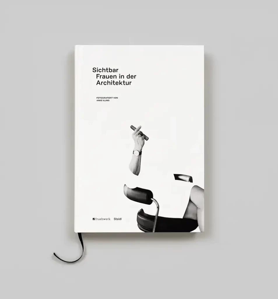
In separate design phases, the results of which were worked out through regular meetings with the group, each of the 13 students was able to work individually on the realization of the photo book, but also to develop designs together. From the pool of creative approaches, the course finally came up with a joint design solution, which has now been published by Fruehwerk and Steidl under the name "Visible - Women in Architecture". Despite the many different ideas that influenced the final result, the final elaboration is reduced and well thought out.

The typography is reminiscent of building structures through indents and staggered paragraphs in order to think the theme of architecture through to the smallest detail. At the same time, enough space is given to the protagonists of the design, the large black and white portraits. Last but not least, the students have once again highlighted the work of a woman through their choice of font, namely Charlotte Rohde's Marguerite Grotesk.
The seminar also opted for a minimalist but expressive visual language for the cover: a collage shows a seated figure with a cigar, but the body has been cut out and thus appears invisible. This motif thus ties in perfectly with the title.
The project was accompanied by publisher Gerhard Steidl, who not only provided the students with support and advice as a guest critic, but also made the high-quality Tritone print of the black and white photos and a hardcover publication possible. This gave the students a unique opportunity to participate and collaborate in the real implementation of a project with professional support. And it paid off: The publication not only received the Red Dot Award, but also the Creative Communication Award (C2A) from the USA, thus gaining international recognition.


Click here for the project. There are also regular new interesting projects to discover in our "Mensa" section! Please feel free to take a look.
Text: Johanna Schmees


