Atelier Dreibholz was founded in London in 2004 and even then the focus was on publication, book design and editorial design. The studio has been based in Vienna since 2014. We spoke to Paulus M. Dreibholz about his career and his love of editorial design.
Could you tell us something about your career?
As the son of an artist/architect and an architect, during my formative years I inevitably and against all pubescent patterns of interest learned a lot about art and cultural history, humanism and socially relevant developments, but my own professional path led first via an aborted law and Spanish degree, and only in the second instance via an artistic education. I undertook this at the London College of Printing and Distributive Trades - now the London College of Communication - and at Central Saint Martins College of Art and Design. After graduating with a Master of Art and the accompanying specialization in Typography and Language, I was naive and arrogant enough to set up my own studio. Atelier Dreibholz has been around since fall 2003 and spring 2004. In addition to my practical work, I have always been interested in teaching and publishing, as I perceived these as reflective and therefore important activities early on, and this worked out quite well until I started a family with the birth of my first child. Since 2012, publication activity has at least decreased. However, the focus of our work soon shifted to editorial design and book design, which was due to both my own interests and fortunate circumstances.
Finally, in December 2014, we left London as a family due to a number of obvious social developments and settled in Vienna. My employment at the time in the Ideas class at the University of Applied Arts Vienna and isolated clients from my time in London allowed me to slowly build a new professional base in Vienna.
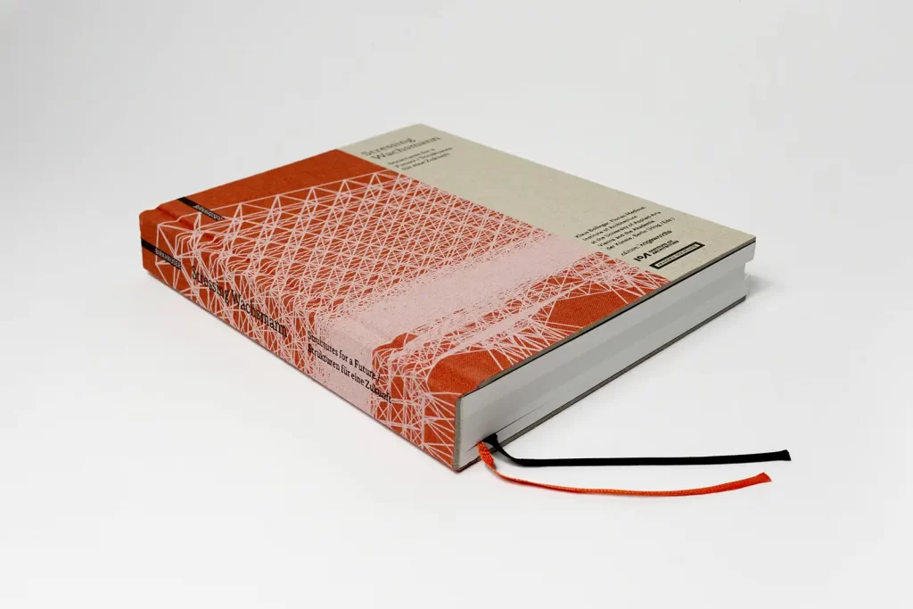
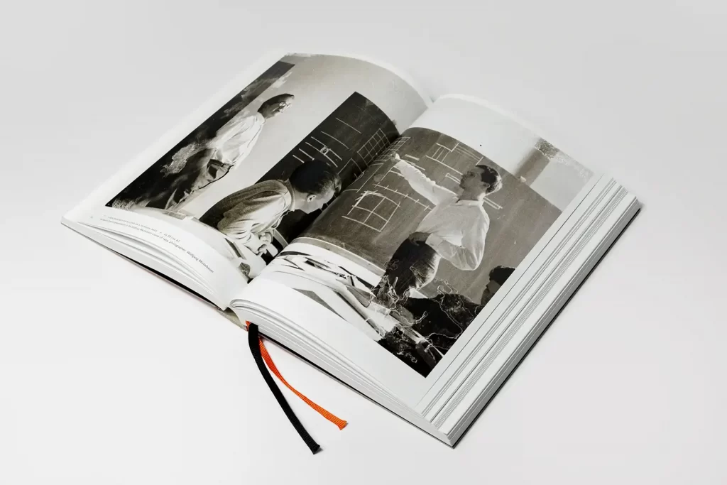
Can you think of a defining moment, a person or something that inspired you to go into [editorial] design?
I would like to mention Peter Willberg, Freda Sack, Roland Früh and Roland Stieger here - in chronological order. Peter Willberg gave me my first insights into the complexity of book design during my bachelor's degree, Freda Sack gave me my first insights into the subtleties of type design during my master's degree, Roland Früh motivated me by always managing to create a larger theoretical framework around the discipline with just a few remarks during our conversations, and Roland Stieger, by saying at a dinner after an exhibition at St Bride's Library in London that book design is the "supreme discipline" after all. The latter confirmed to me that my interest in books as a cultural object was not a reluctance to take on other tasks, such as art direction or advertising campaigns, but could be a real passion. This would prove to be the case later on.
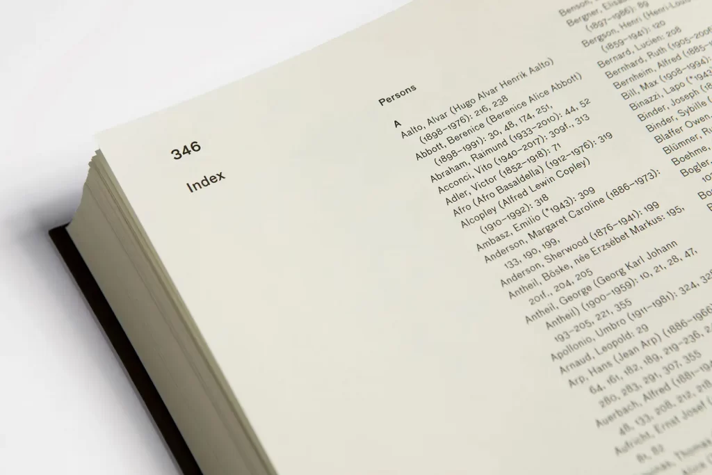
How would you describe your design work / aesthetics?
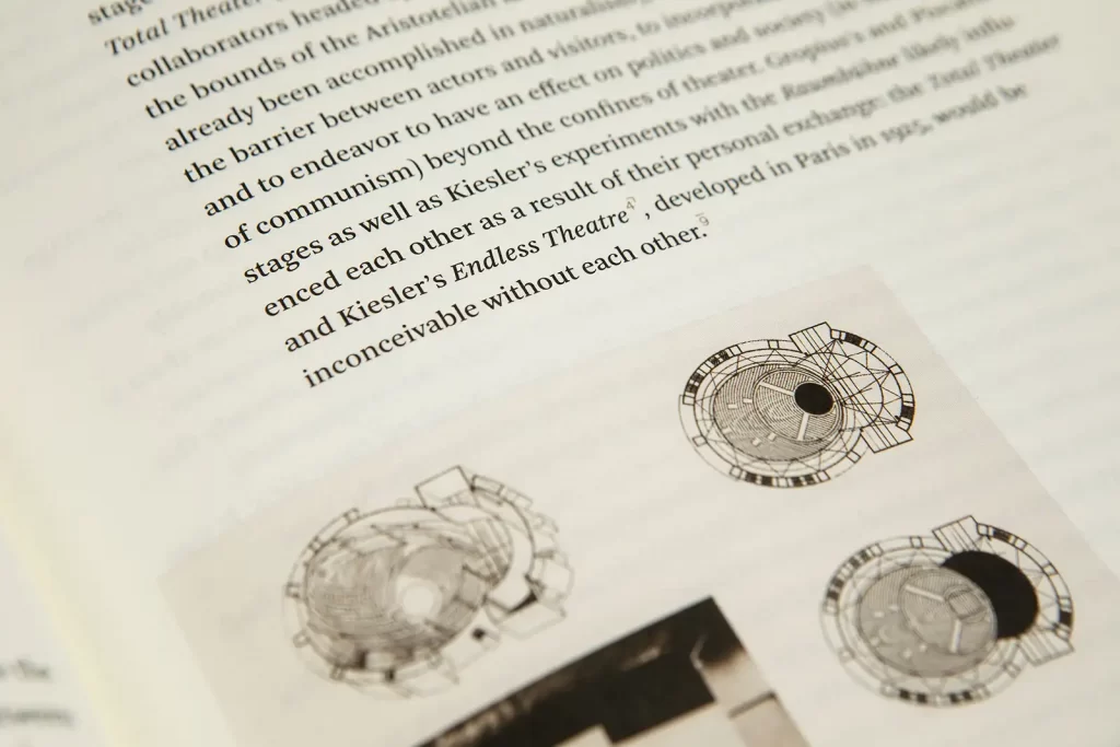
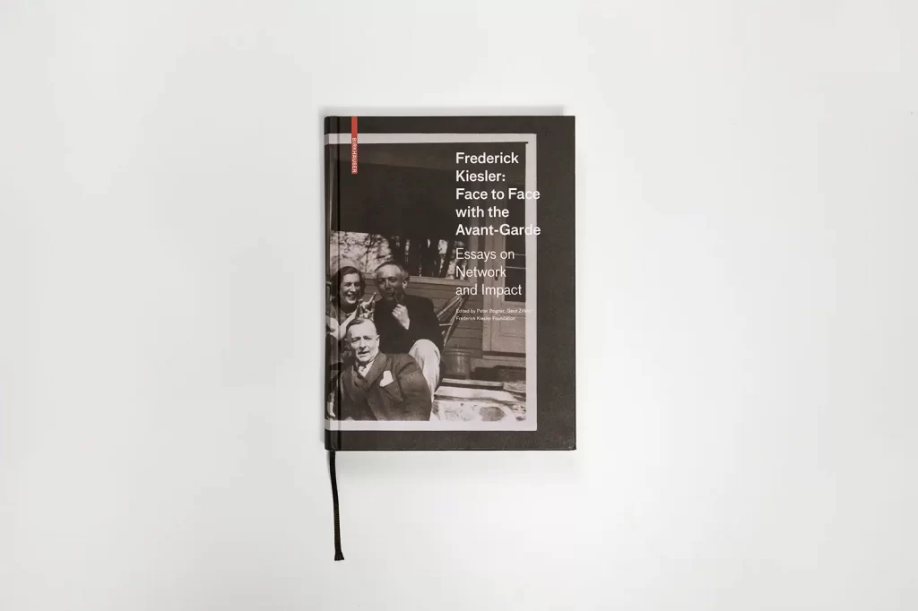
Of course, a certain aesthetic develops in a catalog of works that has been compiled over 20 years. However, I don't attribute this to any particular formal preference, but rather to the methods and approaches we use. Typography - like all areas of design - is dependent on these, and as designers we feel more comfortable with certain tools than with others. It is obvious that - for example - the book as a medium in general, or a certain book format in particular, is not always the right tool to answer a communicative question. But within certain parameters, established measures automatically emerge. These then result in a certain aesthetic. We are not immune to this, but we always try to unravel the package, i.e. our design decisions, so as not to fall into the trap of repeating ourselves out of convenience.
You focus primarily on editorial design, what do you like most about this form of communication?
The comprehensive complexity in the apparent simplicity of the medium of the book. The changes that this medium undergoes, both in its significance as a communication channel and in its symptomatology as a (cultural) object. For centuries, the codex as a book form was apparently subject to slow development. However, it is clear that with the emergence of new channels and the associated perception processes, the book is also creating or conquering new meanings, niches and markets. The process is not dissimilar to that of the newly emerging photography and the new challenges it poses for painting.
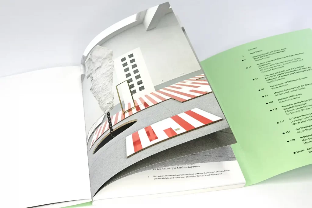
Is there a format in editorial design (book design, brochures, magazines, catalogs, etc.) that you enjoy working on the most?
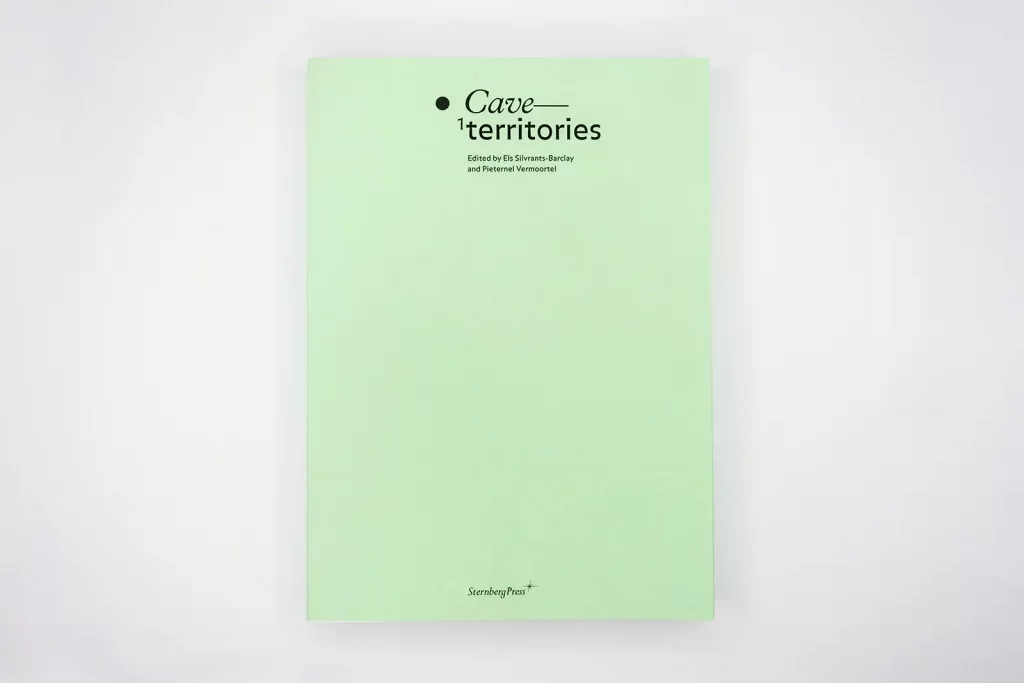
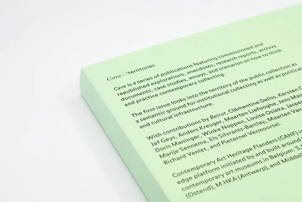
Without going into the countless exciting mixed forms, this would probably be any combination of text and image. As a result, the catalog is my preferred creative playground. However, I am also very happy to work on projects with a strong emphasis on text, and complex scientific publications are also extremely exciting challenges for me. According to my colleagues, my enthusiasm for all kinds of topics and design tasks is also my biggest enemy when it comes to developing a clear identity as a studio.
What is the difference between the design process for smaller and larger formats?
In my design process, it doesn't matter whether a format is larger or smaller. As soon as we start from more than one "recorded" page (as would be the case with a poster), the criteria and complexities of the temporal and spatial sequence and corresponding reading ergonomic variables come into play. Even if these cannot be controlled, they can still be influenced. They stand in contrast to simultaneity, where the reader is presented with all the information at once.
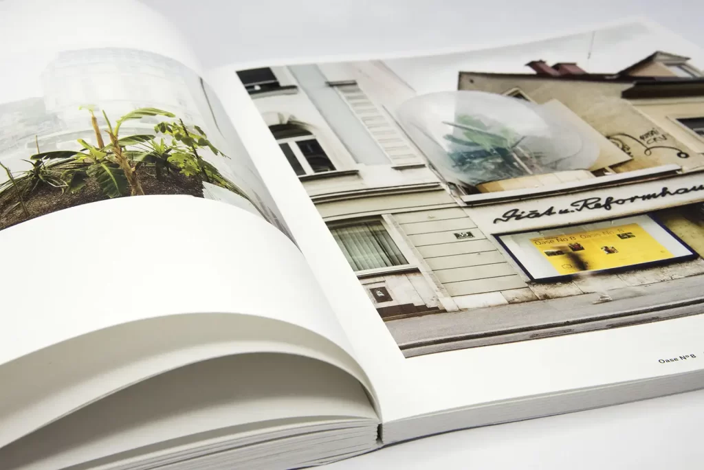
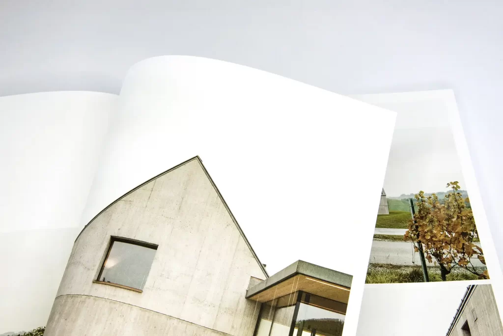
Are you optimistic about contemporary editorial design, or does a visit to the local newsagent depress you?
There are great timeless examples in the field of editorial design, both from the past and the present. Surprisingly, however, it is very often the same protagonists who manage to create holistically valuable work that challenges but does not overwhelm readers, clients and disciplines. A lot of contemporary work disappears quickly and that's a good thing.
You work a lot in the arts and culture sector, what do you particularly like about this industry?
The questions about established and new contexts are similar to those of design in the fields of art and culture. A certain courage to break new ground, i.e. to expose and process formulas of design and meaning as such, is common to these disciplines. Forming hypotheses in the sense of "What if?" or "Isn't it the case that ...?" is often a welcome method of approaching a project. "Uncertainty" is therefore not a threat, but an established method of critical design. This also reflects our approach very accurately. I hope to help shape society with the works that leave our studio, but not to alienate it.
To the website of Atelier Dreibholz

