Large campaigns and brandings usually get attention or work for "cool" clients such as art and cultural institutions or start-ups. But what does it look like when the budget is manageable, the client is rather conservative and the product is not fancy? Surprisingly well, we found out. In this issue, we focus on "Design for SMEs" and show remarkable work and why it is a good idea to specialize in this customer group.
In this issue, we have once again put together a diverse mix of interesting projects and useful information for you. In our books section, you will find several guides that provide valuable tips for your own work, such as the impact brands can develop, how to design for plain language or what it means to show attitude in design. The beautifully designed book "Emojization" is dedicated to the topic of emojis, and in our "Looking Back" section we also look at a classic book by the great designer Dieter Rams.
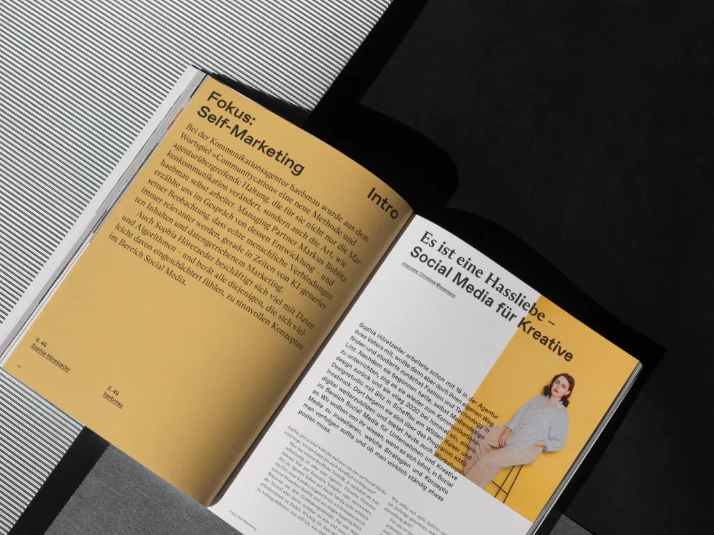
Our focus is on self-marketing, i.e. how you can position yourself well as a designer. For example, in the area of social media or when it comes to communication and communities. Our production specialist Sylvia Lerch explains which new papers are currently inspiring her and how to approach an order step by step in a cheat sheet over two meters long.
Graphics+ "Design for SMEs"
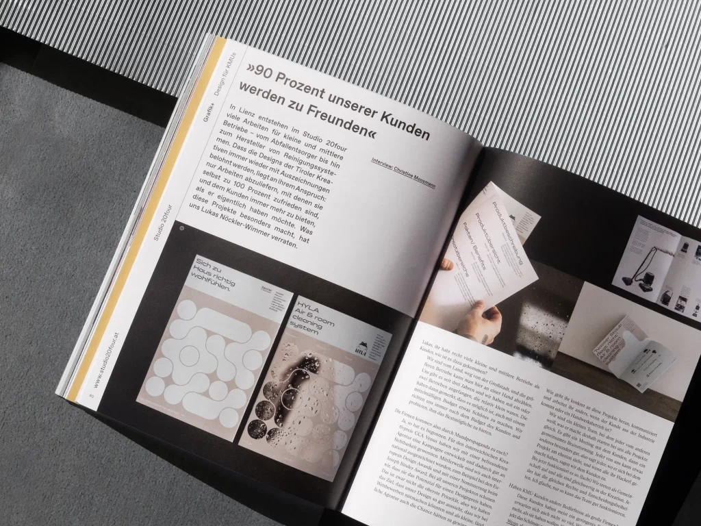
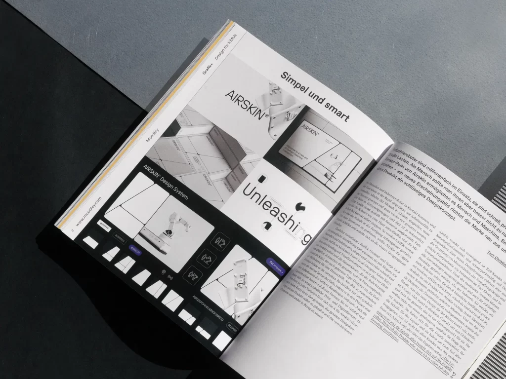
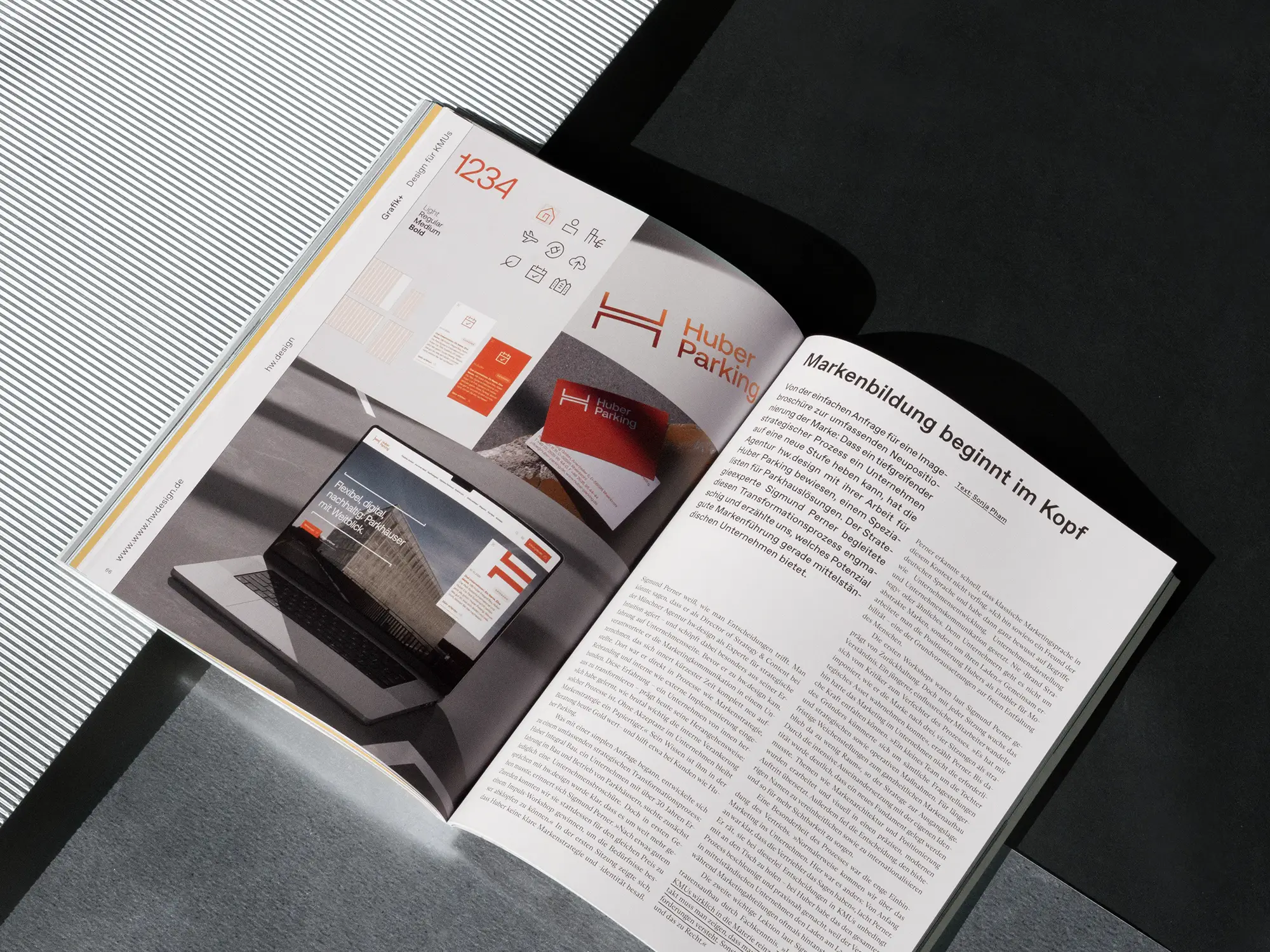
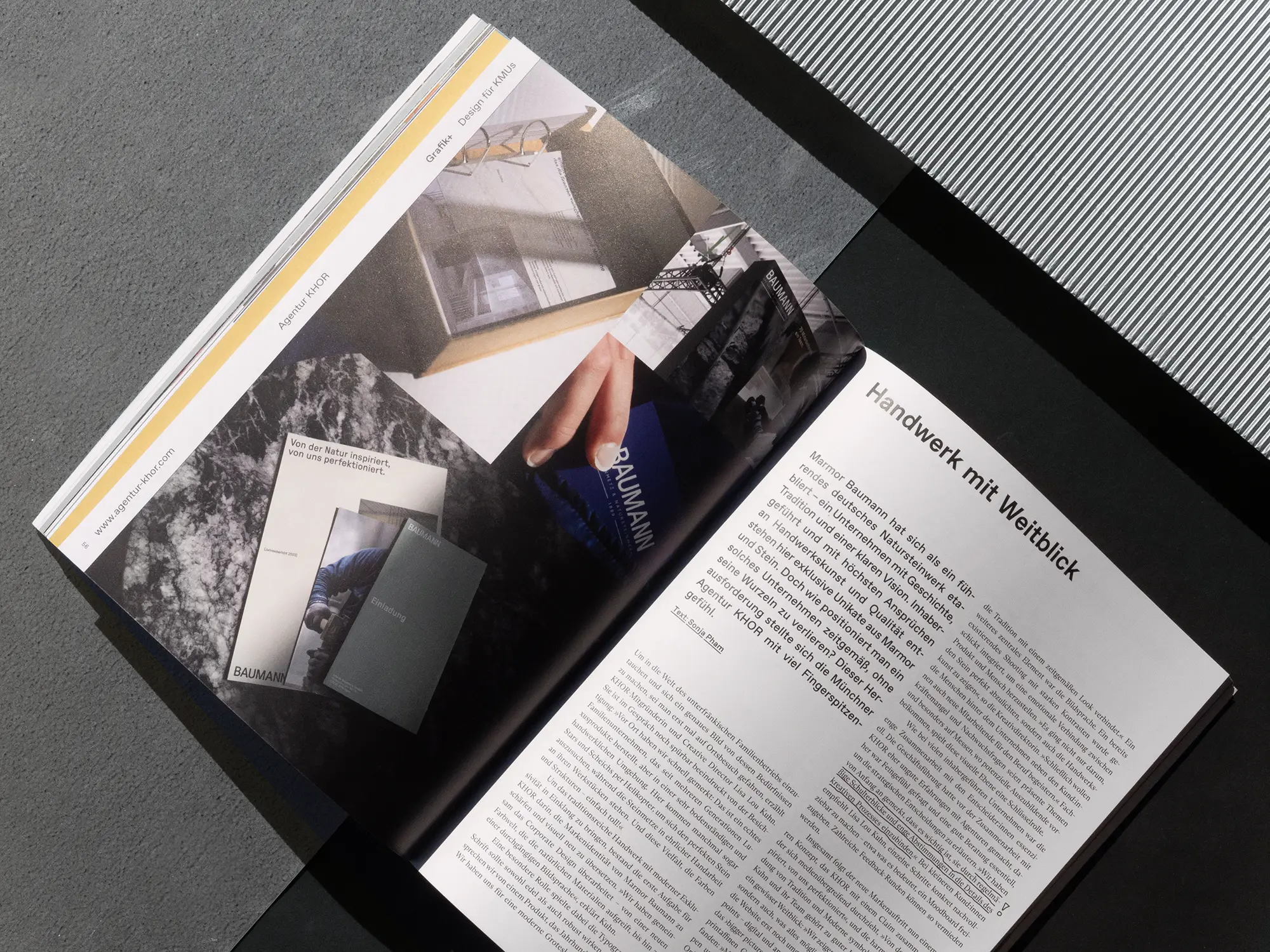
In this issue, we focus on so-called "hidden champions". These are usually the big brands that the industry celebrates, brandings for cool start-ups or unusual design solutions for art and cultural institutions. With a large budget or great artistic freedom, you can of course create a lot of magic, but what happens when money is tight, the client is rather conservative and the product is not exactly sexy? We looked into this question and found that projects are often created for small and medium-sized companies that are remarkably well designed. They are not lacking in quality, but in visibility. With our Grafik+ topic "Design for SMEs", we want to change that and present projects worth seeing as well as studios that specialize in precisely this customer group. Fun fact: everyone seems much happier or, as one agency put it, "90 percent of our clients become friends".
The cover
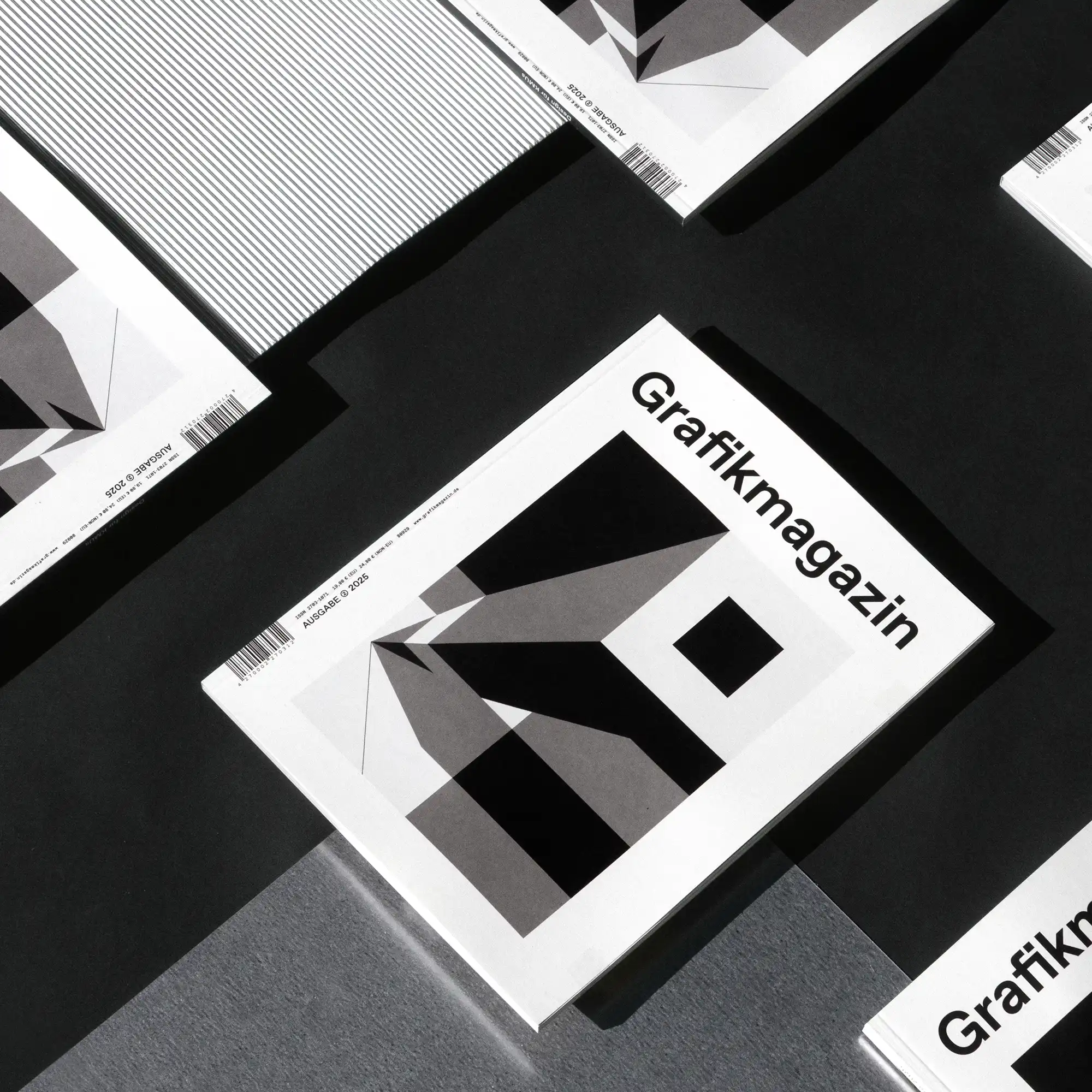
For the cover of this issue, we were able to win over the great illustrator Christoph Niemann. He is always inspiring us with his covers for the New York Times Magazine or The New Yorker and he has also come up with something very special for the Grafikmagazin . He describes his technique as a process of reinventing something three-dimensional in 2D and says: "With a lot of luck, this process even leads to a fresh look at the 'real' world that surrounds us."
We realized the monochrome motif on a natural paper from Peyer Cover. Peydur Recycled is a white paper and cardboard quality made from 100% recycled fibers. The lissé version has a light hammered texture and a pleasant feel. Printing was carried out by F&W Medien.
The showroom
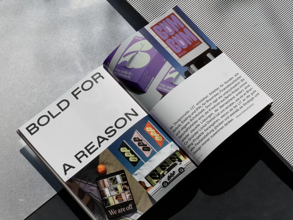
For the showroom, we take a look at Malaysia, where Lew Tau Fei incorporates diverse cultural influences into his designs. Illustrator Jill Senft loves quirky characters and rich colors and inspires fans from Berlin to Beijing. Behind the name LIT is a team of branding experts who think design and strategy together, and to mark the 100th anniversary of his birth, we show posters by Almir Mavignier that still inspire today.
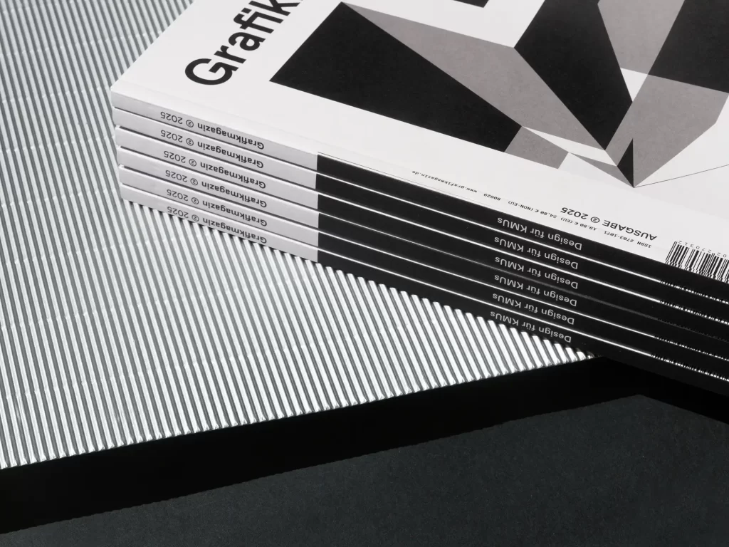
Order now!
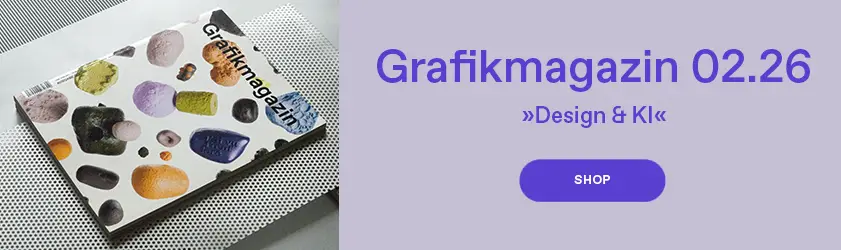
Grafikmagazin 02.25 shows that good design is not a question of budget and why it is often more worthwhile for designers to serve niches. This issue also offers many tangible tips for your work.
You can order Grafikmagazin 02.25 with a focus on "Design for SMEs" here, free of shipping costs (within the EU).
You can find out more about branding here ...