
The more digital our lives become, the more important real encounters are. Festivals and events bring people together and good communication design turns them into an experience that will be remembered for a long time. In our "Festivals & Design" section, we showcase outstanding design solutions - from children's art festivals to expos with an audience of millions.
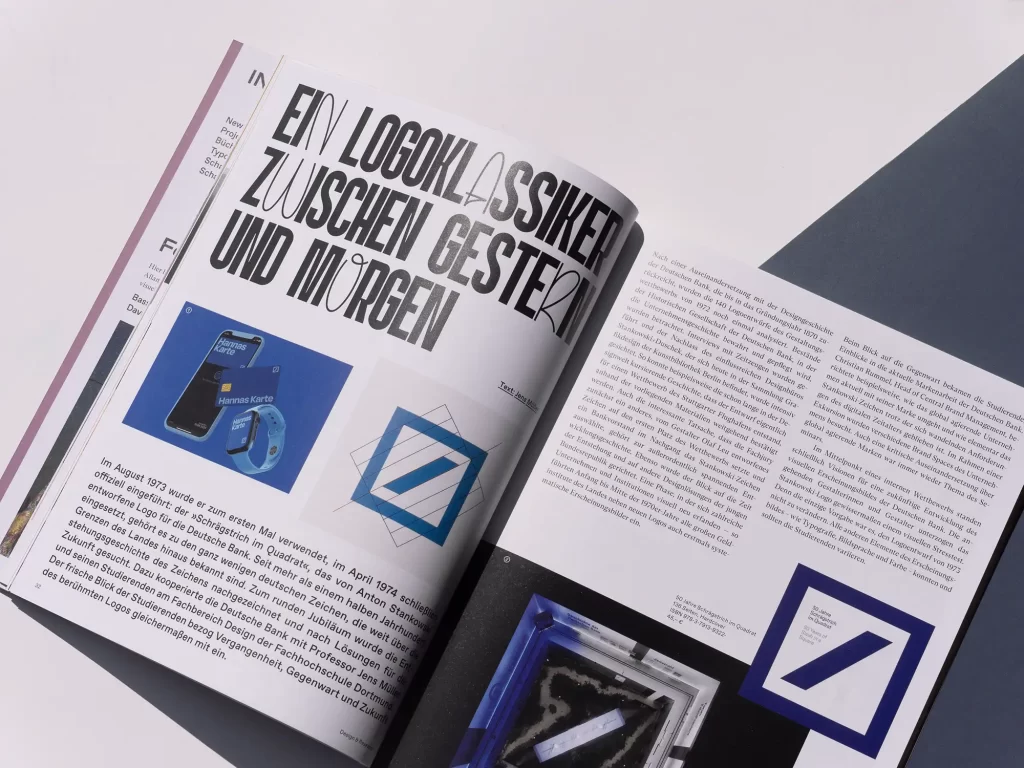
In this issue, we have once again put together a diverse mix of design projects and topics worth seeing for you. Vegan packaging design shows that luxury and sustainability harmonize wonderfully and fresh branding makes companies attractive to new employees - this also works for tax consulting firms. We look ahead to the future of typography. We look back at Deutsche Bank's classic logo and the legendary appearance of Berlin's public transport company.
In Grafikmagazin 03.25 we also begin a new focus series. This time, we are looking at the topic of "Public Value" and asking how design can be used to make citizen services and administration more efficient, for example. The CityLAB in Berlin shows what can be done specifically to improve dealings with public authorities and offices. Frankfurt, on the other hand, is gearing up to become World Design Capital next year. Here, plans are being made in advance to ensure that urban society will still benefit from the projects after the major event has ended.
Graphic+ "Festivals & Events"
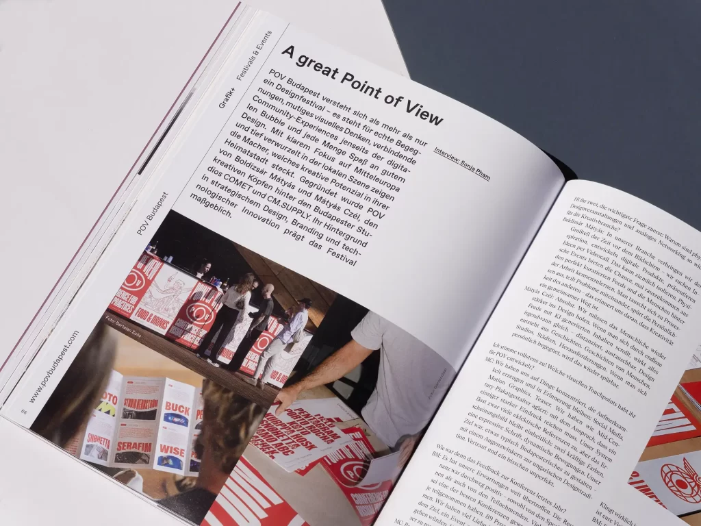
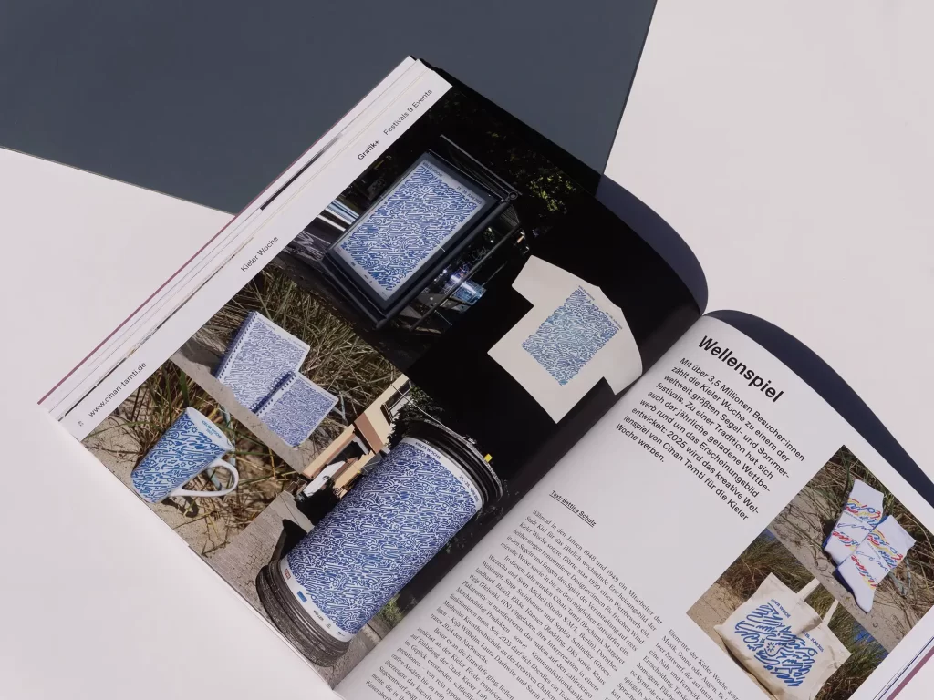
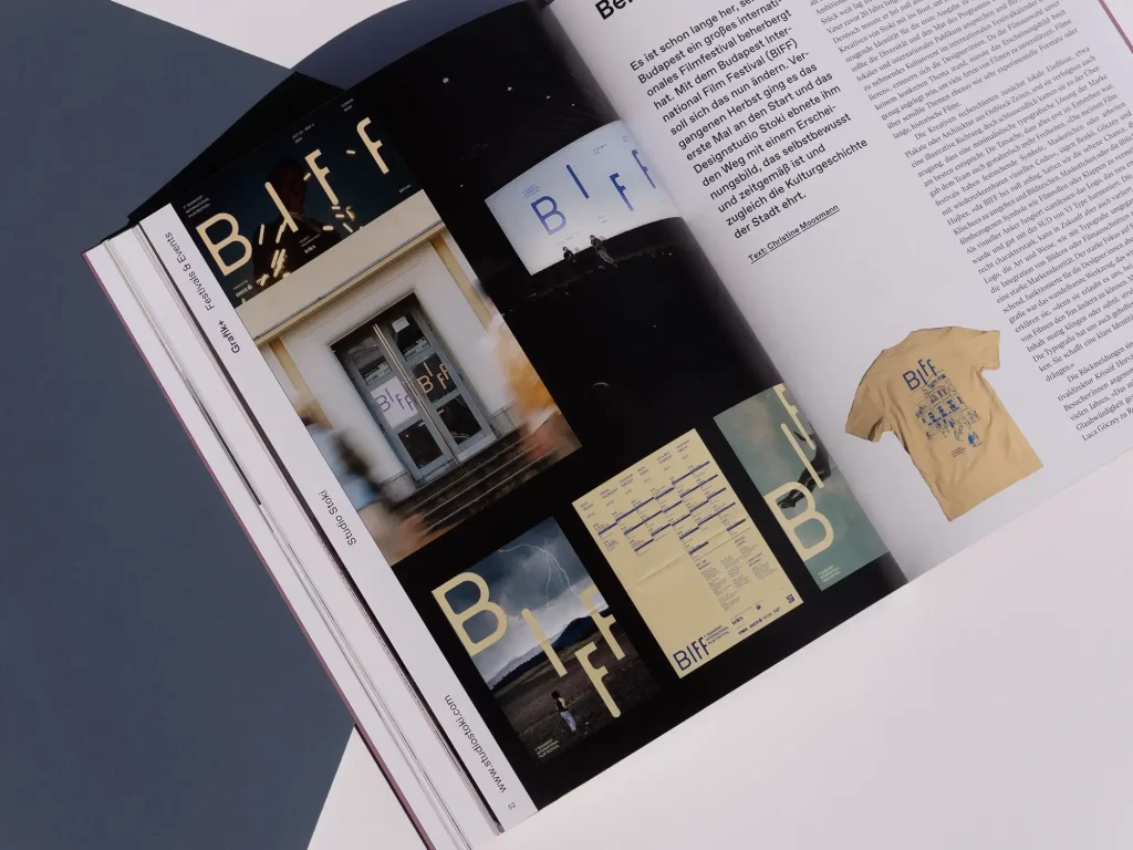
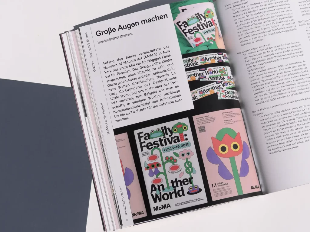
As with any brand, good communication design also sets the tone for festivals and events. In our Grafik+ we show many successful and very different examples. The Budapest International Film Festival, for example, was only launched last year, but thanks to its typographically sophisticated design, guests had the feeling of being at an event that has been around for a very long time. The House of Beautiful Business brings together business, art and humanity - a design that is as fresh as it is coherent creates a visual bracket. The Family Festival at New York's MoMA was intended to be equally attractive for children and adults, and HUG's aim was to create an atmosphere in which everyone feels comfortable, even with 1000 visitors. Well thought-out design solutions made both possible.
You can find these and many other exciting projects in this issue's Grafik+.
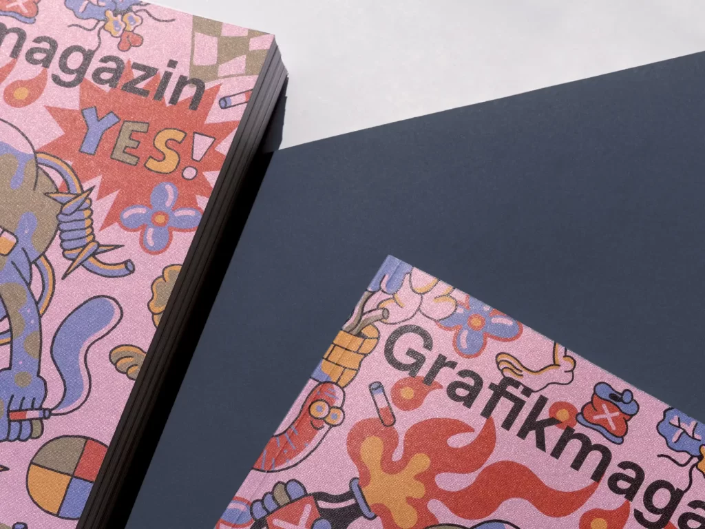
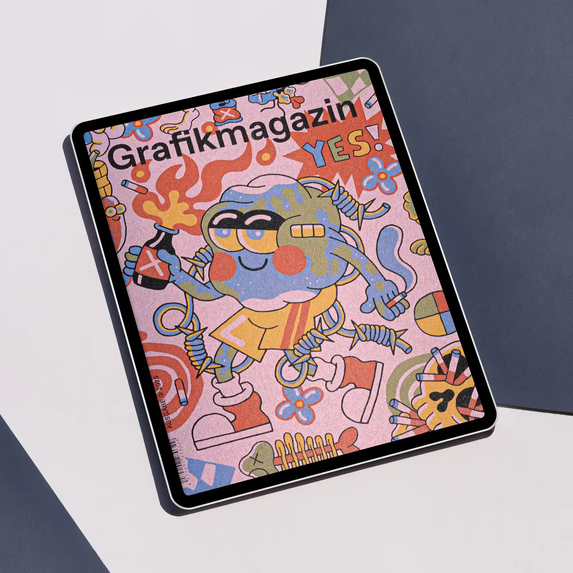
The cover
The cover motif captures the fun and chaos of a music festival. British illustrator Sam Taylor designed it for us and tried to capture the feeling of being in the middle of the hustle and bustle and having a really good time.
You can see Taylor's skater past in the colorful motif and the subculture charm forms an appealing contrast to the noble material of the cover. We used Sirio Illusion from Fedrigoni for this issue. The solid-colored uncoated paper has a one-sided, iridescent coating with micro-embossing and is available in five colors. We chose the color rosamalva, which shimmers golden in the light.
The illustration was printed digitally by f&w Medien.
The showroom
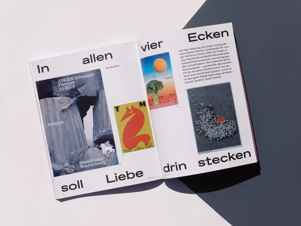
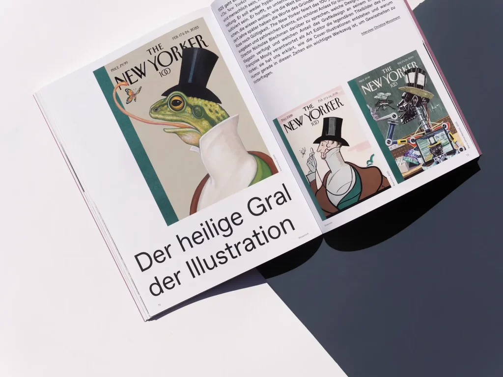
We also present the cover artist Sam Taylor in detail in the showroom, as well as the designers from Groenlandbasel, who are masters of their craft from exhibition design to poster design. We also show a selection of the 100 best and provide an overview of current poster art from Austria, Germany and Switzerland. Finally, it was with great pleasure and curiosity that we looked across the Atlantic and spoke to the creative director and art editor of the New Yorker. The magazine is currently celebrating its 100th anniversary and Nicholas Blechman and Françoise Mouly explained to us what makes the magazine still relevant today and how the legendary illustrated covers are created.
Order now!
Grafikmagazin 03.25 shows what successful design for festivals & events looks like. This issue also offers many practical tips for your work.
You can order Grafikmagazin 03.25 with a focus on "Festivals & Events" here, free of shipping costs (within the EU).
You can find out more about branding here ...

