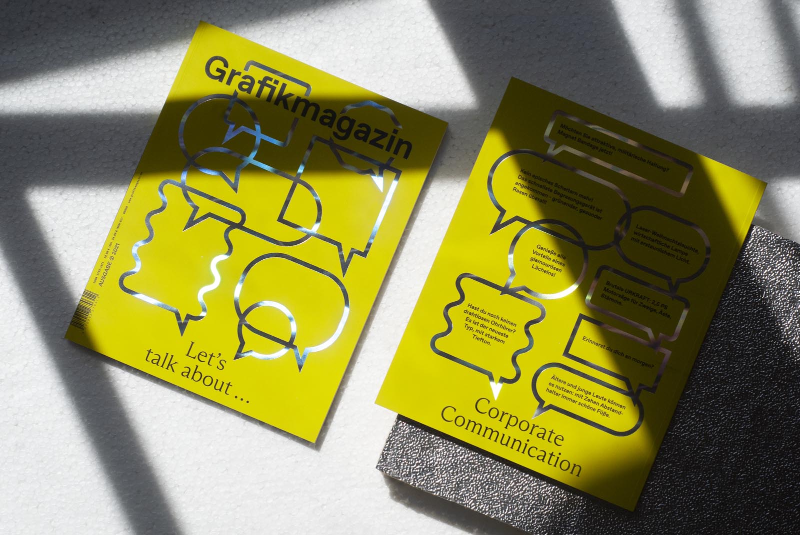
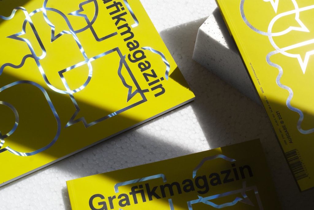
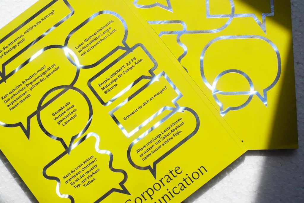
The new issue of Grafikmagazin is all about "Corporate Communication" and the cover shows that communication is particularly effective when it appeals to all the senses. A wonderfully soft paper, an almost poisonous color and embossed highlights that shimmer in all the colors of the rainbow - this is where the medium of print shows all its strengths.
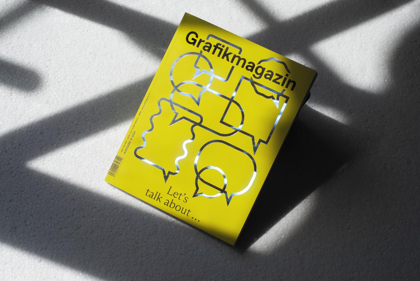
As social beings whose development depends heavily on sensory experiences, we attach great importance to touch. We humans find it difficult to do without them, as the past year has shown in many ways. And so the second issue comes with a cover that is particularly pleasant to the touch, including a focus topic that is also about our senses and the perception of identities: "Corporate Communication".
Once again, you can also expect an exciting potpourri of timeless and highly topical design aspects. True to our motto, we present outstanding works from the fields of typography, illustration, photography, science & research, paper and printing. To the store
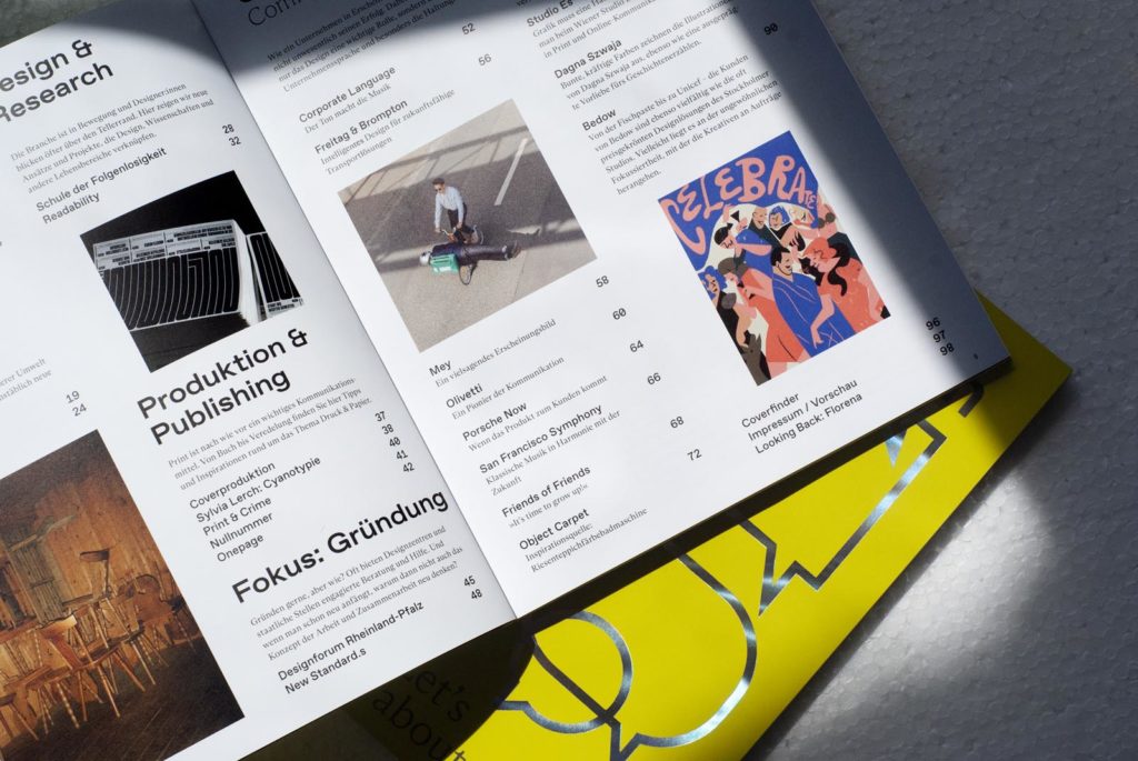
The content
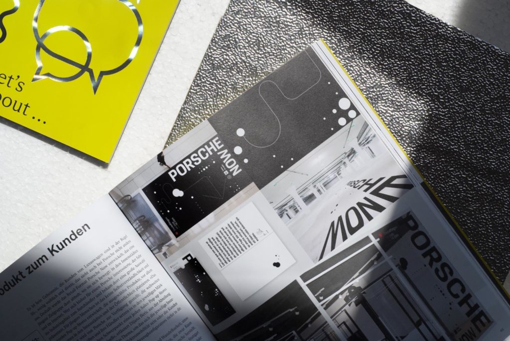
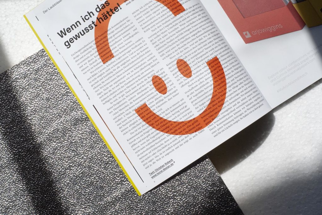
As always, we have put together a diverse and inspiring mix that highlights different aspects of design. What about design education, how can you promote legibility or what thoughts should you give to your own actions? How does the targeted use of language work, what can you learn from a traditional brand and how do you skillfully showcase underwear? And of course there are also countless wonderful design projects to discover ...

Grafik+ portrays brands in transition, such as the office technology manufacturer Olivetti, the traditional company Mey and the interview platform Friends of Friends. It is about meaningful collaborations between brands such as bag label Freitag and bike manufacturer Brompton, but also about the importance that should be attached to corporate language in an age that is heavily influenced by algorithms and keywords.
What is the "school of inconsequentiality", initiated by design theorist and lecturer Friedrich von Borries, all about? Why is legibility so complex and needs to be integrated into the design process? In the "Design & Research" section, we show which approaches and projects combine design, science and other areas of life in a pioneering way.
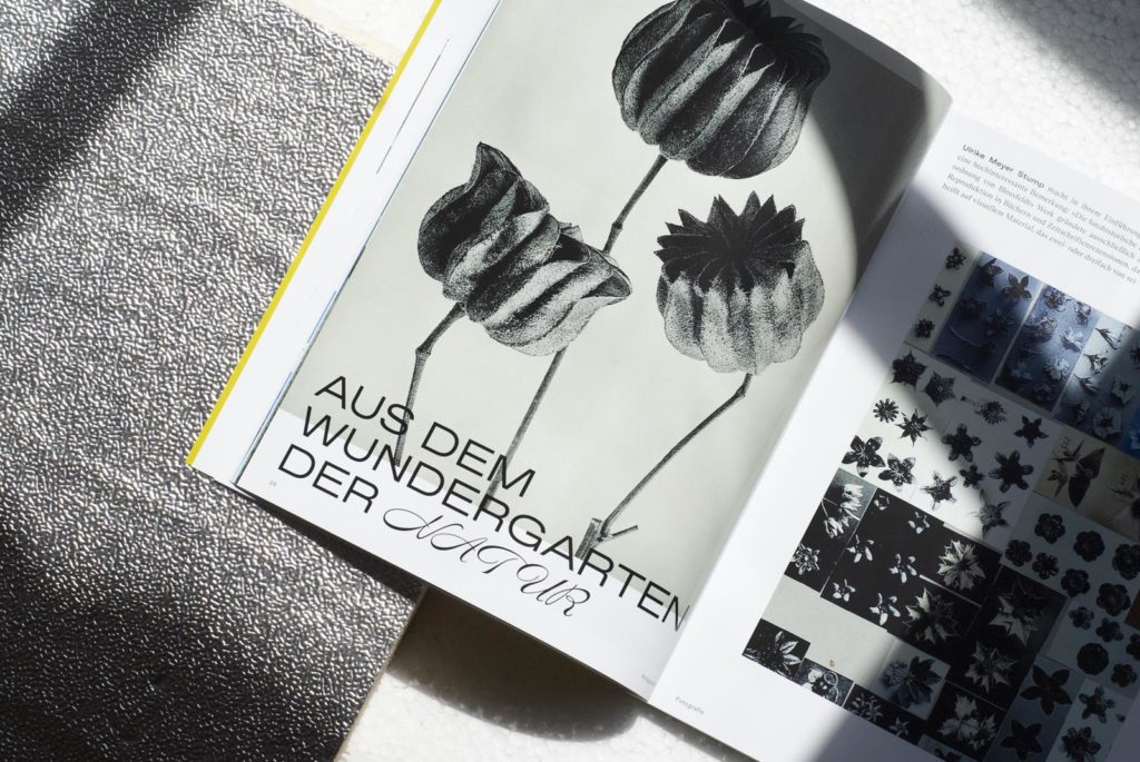
In the photography section, you will get to know Juergen Teller's student Jonas Höschl, who fascinates us with his wonderful portraits and his political stance, and we will also travel back in time to the works of Karl Blossfeldt, the botanical photographer and pioneer of New Objectivity.
In the second focus section, in which we devote a little more space to various current topics, the editorial team once again looks at aspects relating to "start-ups". To what extent can the federal states support young professionals? The Designforum Rheinland-Pfalz shows how state agencies can offer dedicated advice and help. In this issue, Berlin-based studio New Standard.s also talks about its positioning in the field of sustainability and consulting.
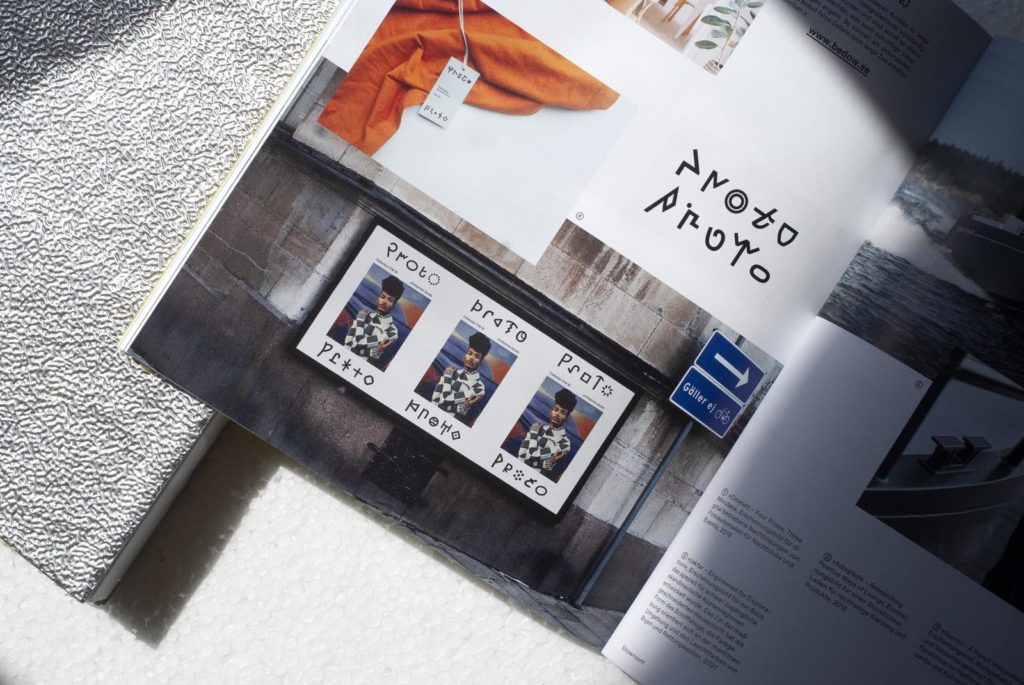
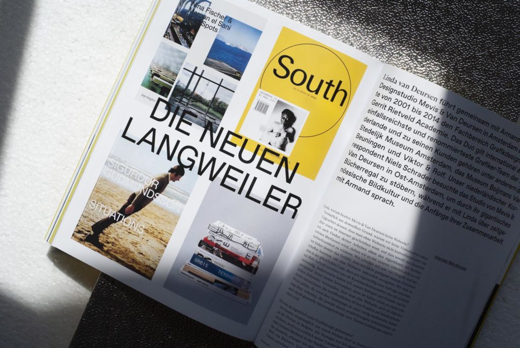
We introduce you to other studios in the "Showroom" section: the Viennese studio Es, the Bedow agency from Sweden, Linda van Deursen based in Amsterdam and the Polish illustrator Dagna Szwaja.
Cover, paper and production
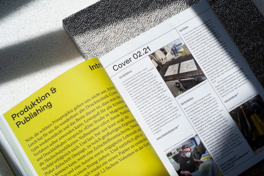
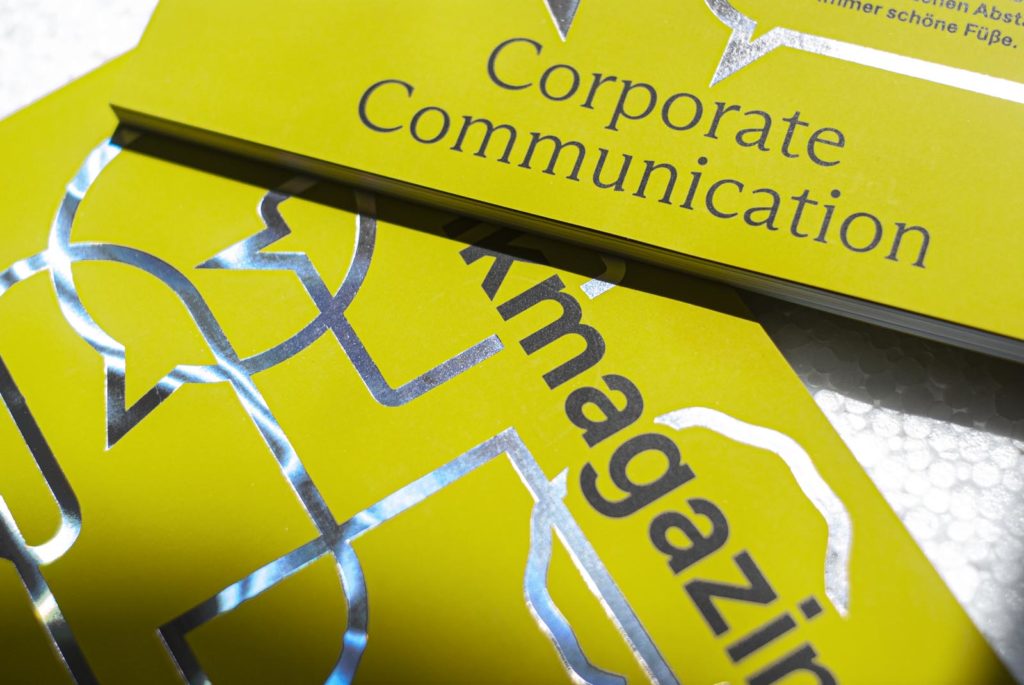
For the cover, which not only flatters the skin but almost feels the same, we used Curious Skin Anis in 270 gsm from Antalis. It is also available under the color name Absynthe - no wonder, as it glows in an almost poisonous tone. The colorful 16-piece Curious Skin series, available in grammages from 135 to 380 g/sqm, impresses in particular with its incredibly soft feel. Touching is expressly encouraged, as the papers have another surprise in store: The Skin series leaves no fingerprints and is therefore particularly suitable for brochures, packaging and folders as well as covers, invitations and business cards - in other words, printed materials that are frequently touched. The entire range is also FSC-certified.
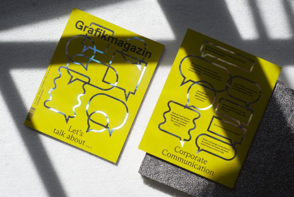
The black elements were first printed in offset by F&W Medien, followed by hot stamping to create highlights - thanks to the excellent work of Gräfe Druckveredelung. The SB Liquid Select AL decorative layer from Kurz creates a shimmering effect that accentuates the speech bubbles on the cover.
Speaking of speech bubbles: For the themed cover design, our art director Tobias Holzmann pulled out a special treasure: a collection of annoyingly funny spam emails that our editorial team received last year. This is also exemplary corporate communication - even if our team did not buy lawn sprinklers, solar lamps or magnifying glasses. So the advertising slogans remain charming everyday poetry.
Have we aroused your curiosity? Then go to the store quickly and look forward to receiving your own copy of Grafikmagazin 02.21 in a few days' time
And if you missed the first issue of Grafikmagazin, it's also worth taking a look here: Grafikmagazin 01.21

