It's just part and parcel of large construction projects - they always cost more than planned and are rarely completed on time. However, the airport in Berlin set new standards: one of the few things that was completed on time in spring 2006 was the guidance system (we reported), otherwise it was postponed, rescheduled and postponed again. But on October 31, 2020, Berlin Brandenburg Airport opened its doors after all, much larger and more complex than originally planned. The signage system also had to be adapted to the new requirements; the agency Moniteurs, which also created the visual identity, was responsible for this. Christine Moosmann spoke to Sibylle Schlaich and Heike Nehl about the challenging project.

What else has changed in the originally planned guidance system for BER up to the current opening?
In 2006, we designed the control system and by 2012 we had drawn up the implementation planning and implemented the control system. Berlin Brandenburg Airport was originally planned as a large terminal that was to be expanded via piers or satellites. However, passenger numbers rose steadily before corona and in order to be able to maintain the necessary capacities in the future, it was decided in 2015 to integrate Berlin-Schönefeld Airport (SXF), operated by Flughafen Berlin Brandenburg GmbH (FBB), into the new Berlin Brandenburg Willy Brandt Airport (BER). It was renamed Terminal 5 for the opening.
FBB also had Terminal 2 built on the BER campus. Passengers will be directed to Terminals 1, 2 and 5 for the opening on 31 October. If the airport had opened in 2012, we would only have shown the way within Terminal 1. Terminals 3 and 4 have not yet been used because the master plan provides for further terminals to be named as such. The challenge was that we had to make do with the existing hardware. We didn't plan any additional signs, but restructured and redesigned the content.
Schönefeld Airport has been renovated since 2016, both the four existing building sections A, B, C and D, as well as the entire outdoor area with the parking garage. The airport has also been extended by a new building D2.
One refurbishment measure was the introduction of the new guidance system at SXF. The entire airport was equipped building by building with the control system of the new Berlin Brandenburg Airport. Our task was to design the hardware to match the building ensemble, to be less complex in terms of quality and less expensive. The challenge was to ensure that the guidance system nevertheless remained a family with the high-quality system of the new BER and that it formed a design bracket for the entire BER campus. For us, this was a test that worked very well. These two topics are examples of extensive content-related extensions to the guidance system since 2012.
A less complex example is Easy Pass, a semi-automated border control system that has been successively introduced at airports in the European Union since 2014. We have integrated Easy Pass into the control system as a destination point, but also the identification of the transit control.
Now, shortly before the opening, we have updated all the plans. The overview plans in the building for passengers, but also the plans of the outside area for pedestrians and cyclists. We have also drawn in the additional terminal buildings here. Terminal 1 and Terminal 2 are connected to each other. Depending on whether passengers who want to change planes are traveling with hand luggage or with luggage that needs to be checked in, they take different routes. Bus stops have changed and with them, of course, the routing in the outdoor area.


Thousands of people are on the move at airports every day and as a passenger you quickly notice whether the guidance system is working or not. But how do you approach such a project as a designer, how do you find out how to guide people in a meaningful way?
It was ideal that we were able to develop the guidance system in 2006 at the same time as the passenger flow defined by the architecture and that it was included in the building planning. Of course, it is not only the constant exchange with the architects that is important, but above all the exchange with the people responsible at the airport. These are the experts who usually have years of experience with passenger behavior, who move around the airport themselves and give us feedback.
In a first step, we identified the decision points for certain user scenarios. We selected target information and positioning with suitable visual axes that can be seen and read from afar.
The Orat (Operational Readiness, Activation and Transition), which took place shortly before the opening, was also very important. The processes at the airport were tested by extras on trial operation days. Their feedback was evaluated by the airport. We worked with the airport to develop solutions to the specific questions or problems identified by the extras. We expanded a handful of positions based on the orate; fortunately, there were fewer than expected.
We ourselves have gained a lot of experience over the years with other airport projects, such as Munich, Hanover and Zurich. However, it is also important to always look around to see how other airports are tackling new issues. Processes are constantly evolving, especially due to digitalization. Airports interact with each other, so it helps to always keep your eyes open and make use of synergies.

You were involved in the design early on by the architects from Gerkan Marg and Partners. How did that change your work?
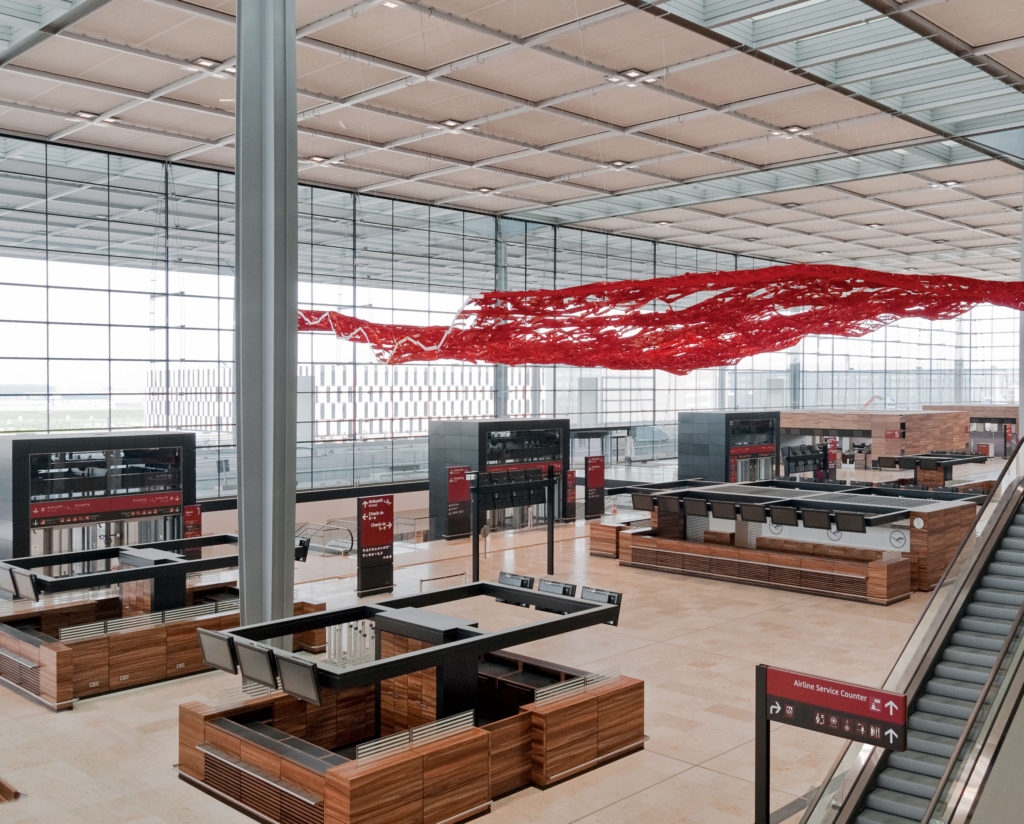
By working closely with the architects right from the start, we were able to integrate parts of the guidance system into the architecture. The architecture of BER is based on an architectural grid developed for Terminal 1. The design of the wayfinding system is reflected in this grid, in a system of distances, lengths, dimensions and areas. The sizes of the signage elements are derived from this architectural grid. Panels follow the wall grid and ceiling signs follow the ceiling grid. The elements are modular, developed with the architecture and not built on top of it or placed in front of it.
Structural elements of the guidance and orientation system are coated in the same color as the structural elements in the architecture: black-grey. The graphic surfaces contrast in signage red as luminous bodies. The material, color and structure of the guidance and orientation system thus speak a common language with the architecture.

You say that goals should not be sought, they should be found. What do you mean by this and how is this approach reflected in your design?
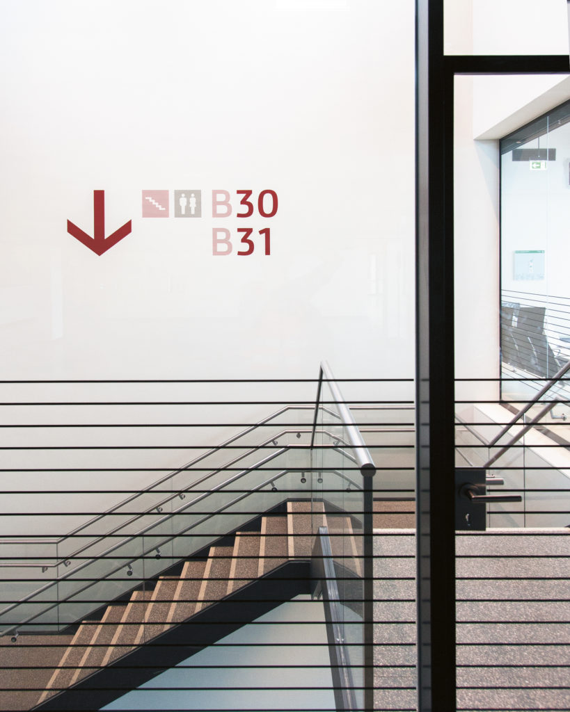
We want passengers to get to their gates as stress-free and intuitively as possible. Our approach is a reduced design, few colors and a calm, uniform design language in lettering and pictograms. The architectural grid also defines the hanging heights and horizons, which are adhered to across all areas and types. The elements of the guidance and orientation system can always be found quickly by passengers at the same height.
It is not only the design that is decisive, the content is very important, as is a seamless information chain and uniform naming. All destinations in the airport are named according to a logical, meaningful nomenclature. Defined terms are used consistently, not only in the building, but also on arrival and throughout the campus - this creates good orientation. A seamless, consistent information chain, with uniformly applied terms, enables passengers to find their destinations step by step and easily

Other airports often rely on bright colors to ensure distinctiveness and attention. At BER, everything looks very stylish and calm, how do you manage to create the necessary signal effect despite the tone-on-tone design?
As soon as you enter the BER campus, you are immersed in the world of Berlin Brandenburg Airport. The red, the pictograms, the lettering and the product design make the identity of Berlin Brandenburg Airport visible in all terminal buildings and in the outdoor area.
With its echoes of the regional building tradition, Berlin Brandenburg Airport is clearly located in the German capital region. The color red is the color of Berlin and Brandenburg. It is quickly recognized, even from a great distance, and has a signal character. The flight information is displayed on this warm, representative signage red, the secondary information on the dark signage gray, which is also used in the architecture.
The guiding idea for the information design of the guidance and orientation system is to translate the clear geometric structures of the architecture into lines. With their straight trunks, the typical pine forests in Berlin and Brandenburg form a linear structure that can be found in Berlin's architectural history, for example in Karl-Friedrich Schinkel's columned hall in the Altes Museum or in the strict architectural grid of Mies van der Rohe's Nationalgalerie. They were an inspiration for the architects of the airport and can be found, for example, on the driveway with its canopy supported by columns. By using lines and a mixture of red, gray and white, different tonal values can be created in the signage system, allowing information to be displayed in a differentiated way.
The information elements are all backlit. The signage red, printed in several layers, glows pleasantly without glaring. The white information elements shine brightly and are very easy to read with optimum contrast. The signage system combines identity and function. It forms the design and content bracket for the entire BER campus.

Legibility is of course a key issue, what is the specially developed BER Signage font all about?
During the initial planning for the signage and orientation system, it became clear that Berlin Brandenburg Airport should have its own corporate typeface. Readability and quick comprehensibility were a high priority, but recognizability and design references to the architecture and the city of Berlin were also incorporated into the typeface design. To illustrate this, we worked for some time with a test font, which was the template for the font used today, BER Signage. This was developed exclusively for Berlin Brandenburg Airport by type designers Alexander Branczyk and Georg Seiffert. A typeface is often based on corporate communication. BER Signage is based on the signage system, designed for optimum legibility on signs and further developed for the corporate design and displays. It is visible from a great distance and is highly assertive against other fonts in the environment.

What was the hardest nut to crack as a designer and what makes you most proud now that the project has been completed?
There were several tough nuts to crack. One is the integration of two additional terminals into the routing without additional signs or larger sign areas, as described above. We were very happy with the reduced design and now we had to redesign it before the airport opened. Today we are again very happy with the solution of the terminal coding on white circles. These are easy to recognize, stand out clearly from the rest of the design and have brought new momentum.
And the second topic answered in the first question also made us proud that the guidance system could be transferred so well to the completely different buildings at Schönefeld Airport. Not only that, the guidance system has enhanced these buildings!


