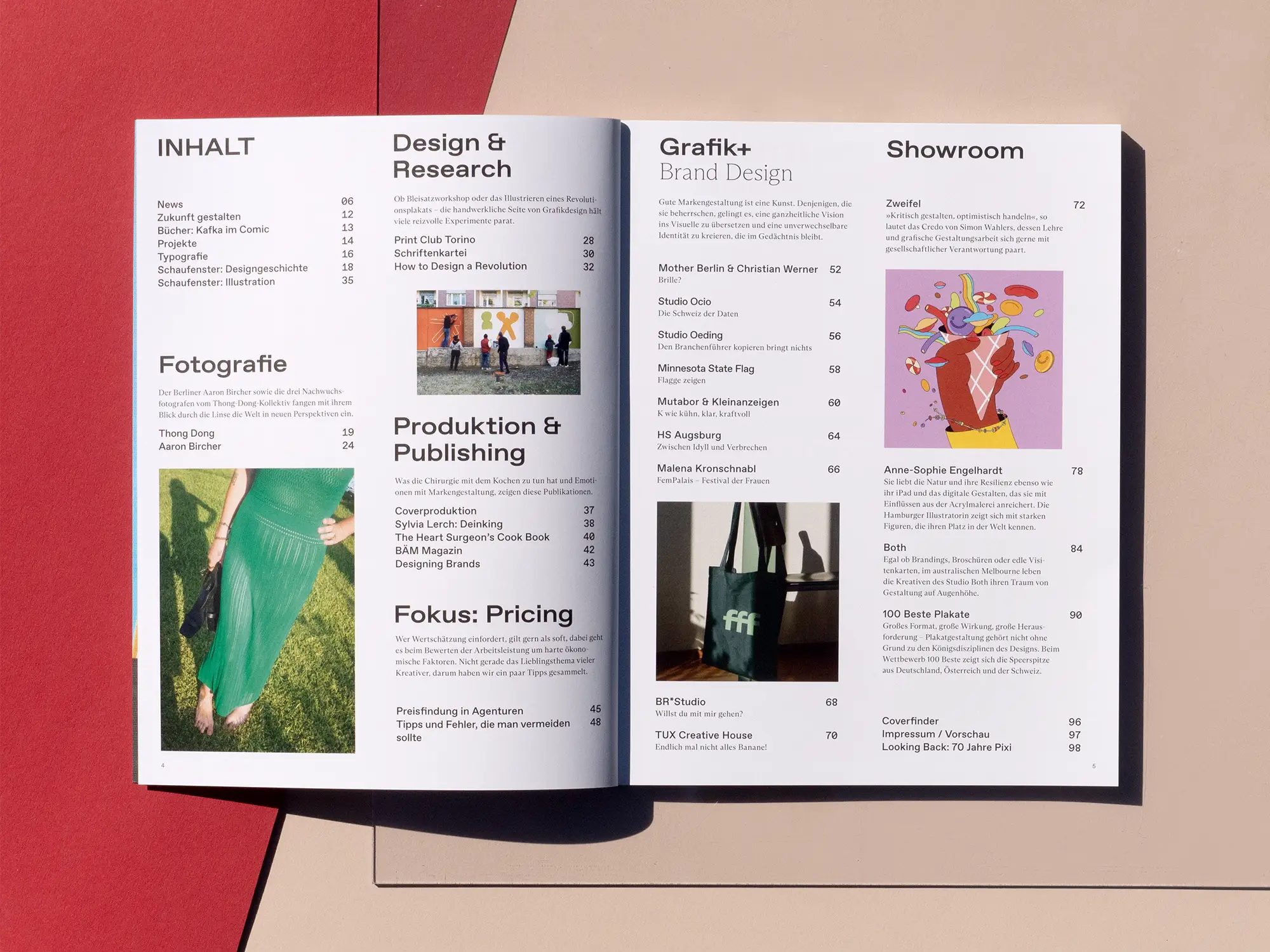
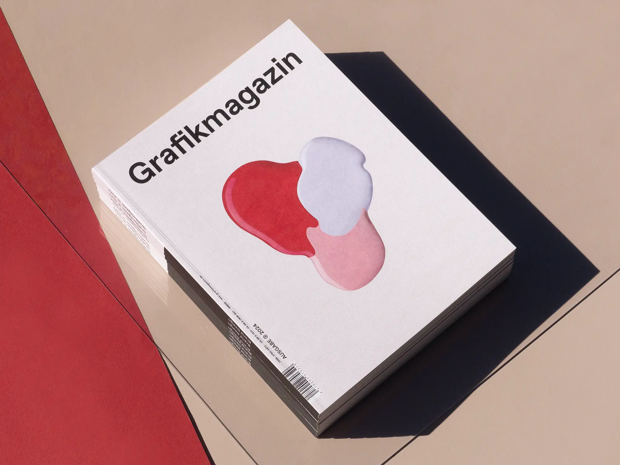
What do fair trade bananas and Fielmann have in common? Both show what good brand design looks like, how you can give visions a visual form and create identities that are unique and memorable. In Grafikmagazin 03.24 we look at "Brand Design" and take a look behind the scenes of the most exciting branding projects of recent times.
In Grafikmagazin 03.24, we start with a new focus and deal with the topic of "Pricing" over the course of two issues. It's not just newcomers to the profession who find it difficult to correctly assess the value of their own work. But how do I ensure that my work is paid well and appropriately and that the customer goes along with it? Markus Hartmann, the author of "Preisfindung in Agenturen" (Pricing in Agencies), has lots of advice and tricks up his sleeve and we asked various creative professionals to share their practical tips with us. You can find out more about "Pricing" on seven pages in this issue.
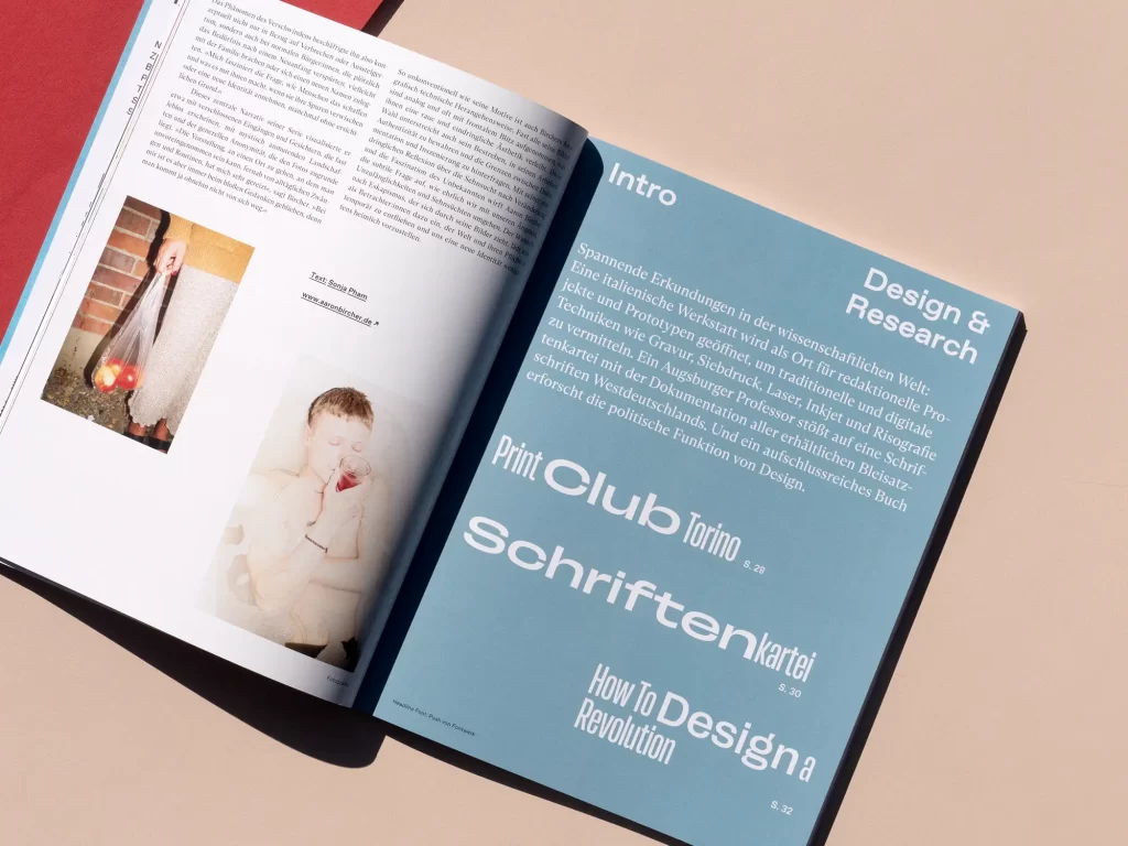
Of course, inspiration should not be neglected either. We report on an unusual typographic treasure, take a look at how the revolution in Chile has inspired design and travel through Vietnam with a photography collective. Sylvia Lerch explains what deinking is all about and what impact it has on the sustainability of papers and printing processes. In our Illustration showcase, Jill Senft shows what happens to the animal blood that drives around 120 tankers through Germany every day and the "Heart Surgeon's Cook Book" brings together what belongs together: heart surgery and Michelin-starred cuisine.
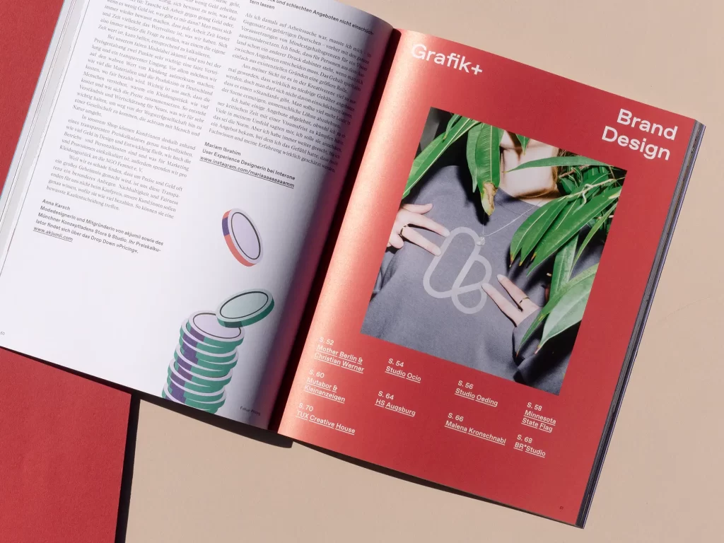
Grafik+ »Brand Design«
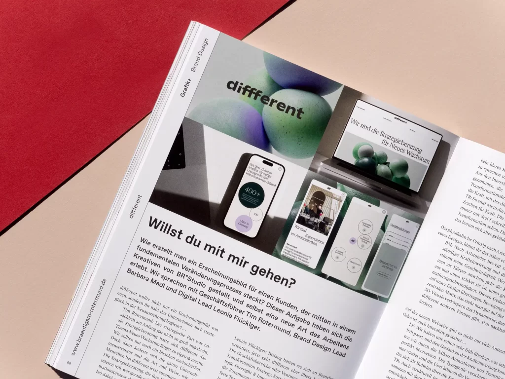
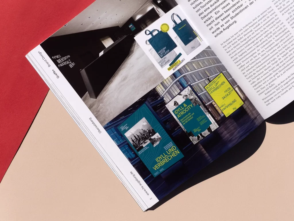
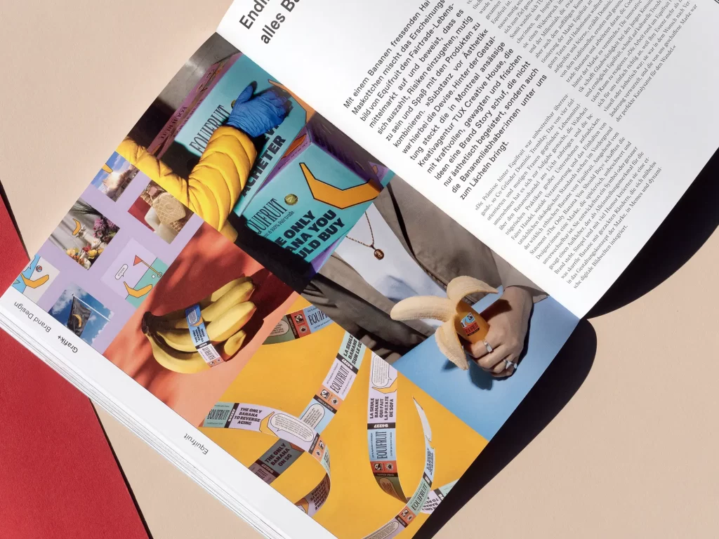
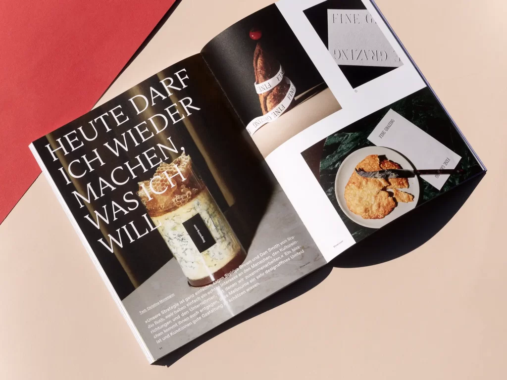
Good brand design is an art. Giving complex content or services a visual form is just as challenging as giving consumer brands something unique. For this issue of Grafik+, we took a look behind the scenes at some exciting projects, such as the branding for Fielmann, where she not only changed the customer approach, but where photography also plays a decisive role. We spoke to customers and creatives about the complex process behind the separation from Ebay and the new look of classified ads. Students at Augsburg University of Applied Sciences took on a major task and responsibility and developed a new look for the Obersalzberg Documentation Center, while TUX Creative House gave fair trade bananas a look that is simply cheeky and cool.
You can discover this and much more in this issue's Grafik+ ...
The cover
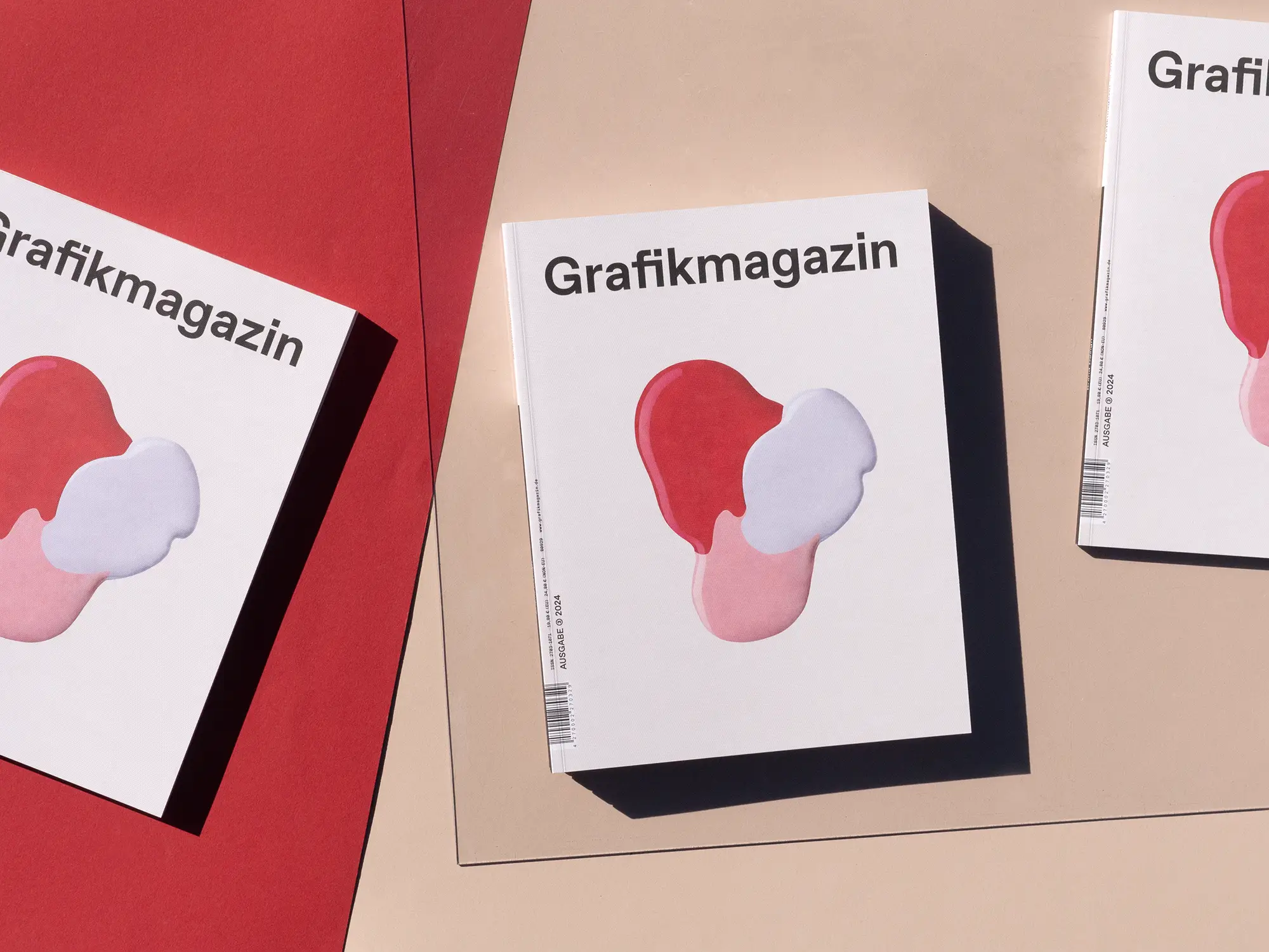
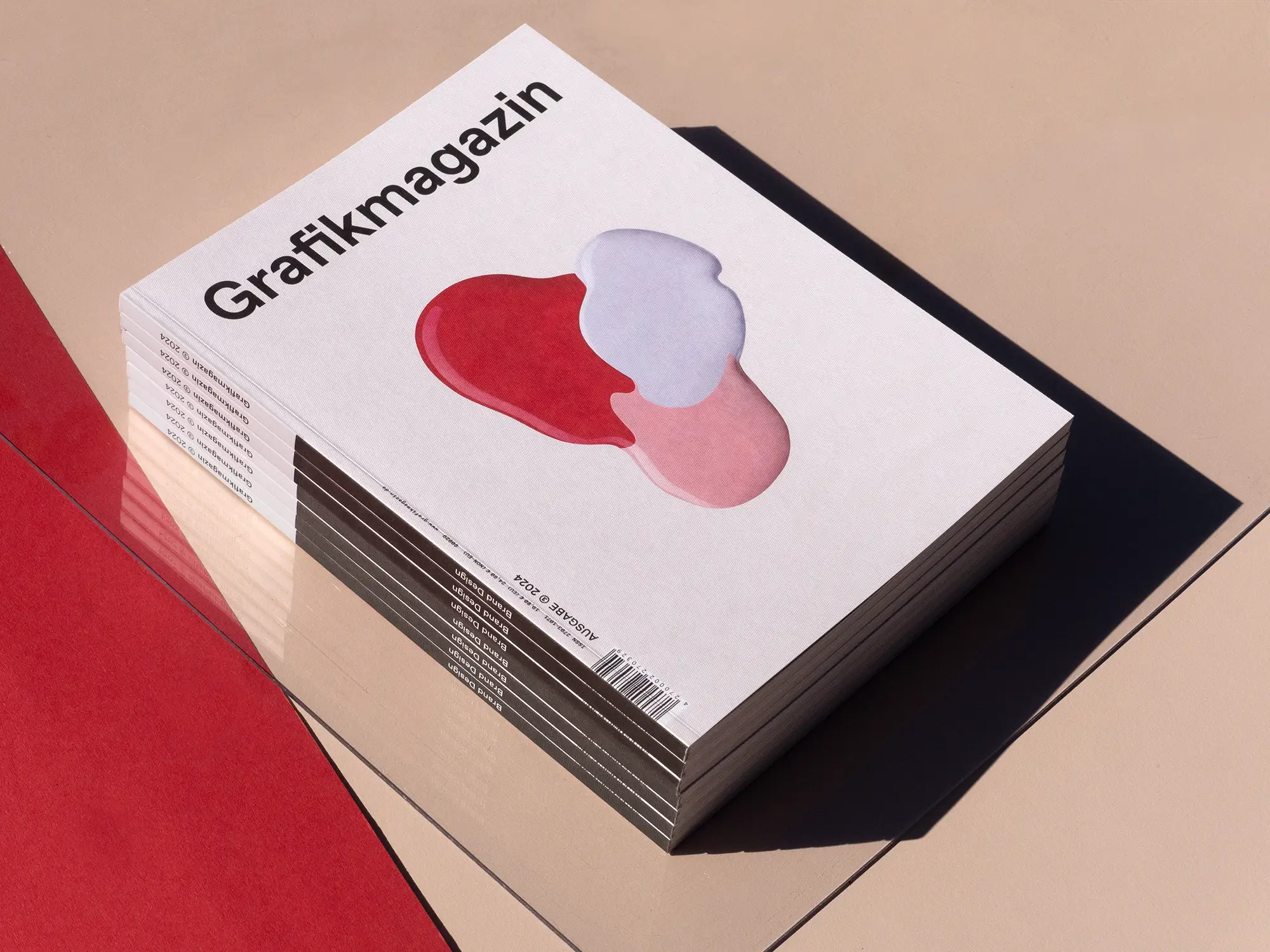
The motif of this cover is a color pattern for nail polish. With the brand design for Neonail, Studio Oeding wanted to show that this brand is cool, unconventional and different and did not stop at the color samples, which normally have the shape of fingernails. The cover was printed in offset on the fine-mesh embossed creative paper Rives Design white in 350 gsm from Antalis.
The showroom
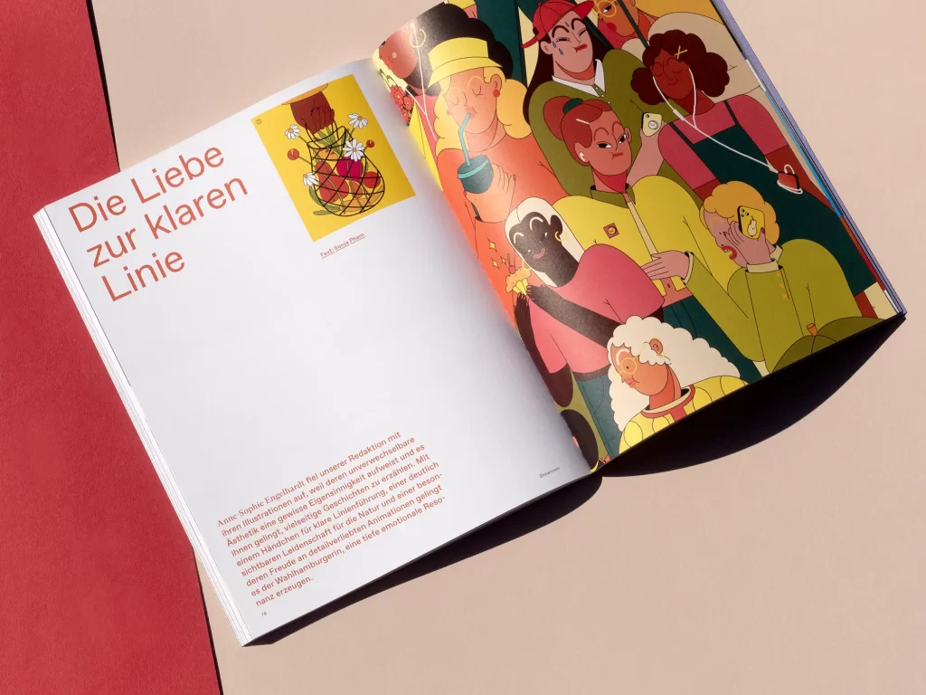
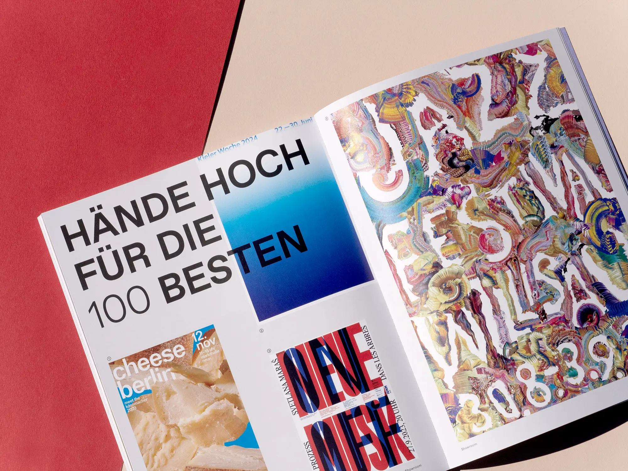
Zweifel is a rather unusual name for a design studio, but definitely a fitting one, as Simon Wahler's credo is: "Design critically, act optimistically". Anne-Sophie Engelhardt 's illustrations are characterized by strong, courageous figures and Studio Both in Melbourne, Australia, places great emphasis on print. As every year, the "100 Best Posters" competition promises great cinema, with poster designers from Germany, Austria and Switzerland showing what they can do.
Order now!
You can order the Grafikmagazin 03.24 with the focus on »Brand Design« here.
If you are interested in the topic of branding, you should also take a look at our issue focusing on »Corporate Communication«.