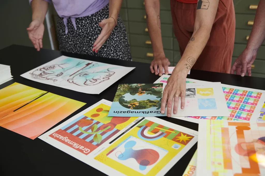
In a very unusual and labor-intensive collaboration project, the Grafikmagazin has teamed up with six studios and designers in Germany and the USA to create six different cover motifs. Each design has its own unique charm and, above all, technical finesse. Find out more about the six cover motifs and the creative minds behind them here.
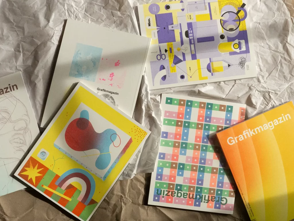
Risography is not only a very environmentally friendly, but also an enormously versatile printing process. However, it is generally not used for magazine covers - too long print runs, too much ink application, too much abrasion, surfaces that are far too sensitive. All this is true, but as the saying goes: if there is no way, you have to make one.
Risography studios are usually small and large print runs are often a problem. So the Grafikmagazin spread the load over several shoulders and invited six designers and risography studios to develop and print their individual motif. In the summer, despite the vacation season, the designs started to trickle in and each new motif caused a stir in the Grafikmagazin-editorial team. No two designs were alike and there was also a great deal of sophistication in the motifs in terms of printing technology.
The preparation and coordination took months and without the commitment and a good dose of self-exploitation and madness on the part of the Riso crews, this great project would not have been possible. So curtain up for our leading actors ...
Martin Krusche
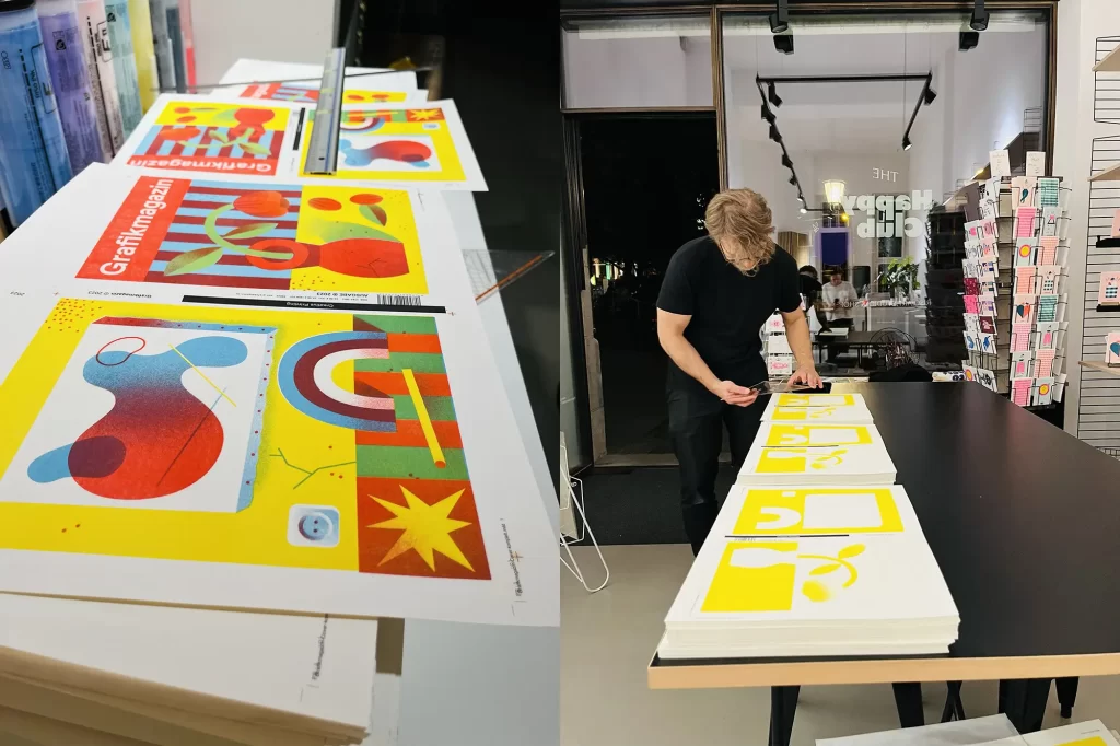
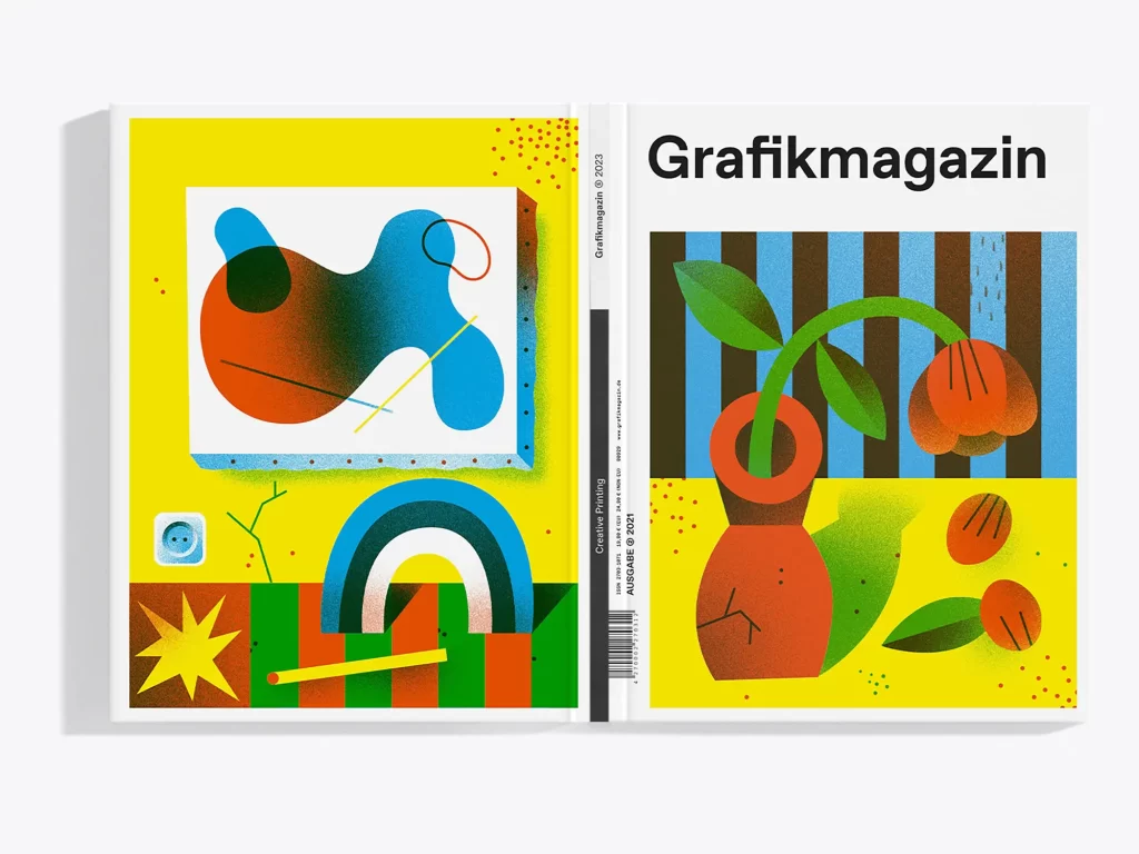
Martin Krusche has been a freelance illustrator in Berlin since 2008 and his profession is both a vocation and a passion for him. "As I became intensively involved with screen printing very early on, it is still one of my favorite production and printing techniques," he says. "Working with screen printing (and then also with risography) with reduced colors and in layers has thus also burned itself into my design style and also into my way of thinking."
"I created the motif itself from a sketch in Illustrator and
then made the three print colors "riso-capable" in Photoshop with gradients and shadows and by "splitting" them in
. With riso printing, I like to play with the strong printing colors as well as the beautiful print image and I like overprinting to create completely new color spaces. I also really like the Risograph's screening, which creates very unique and special gradients
and halftones."
Rosidruckt
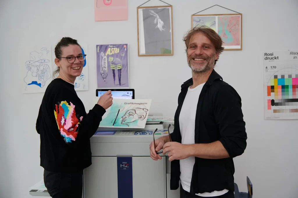
Rosidruckt, that's Sabine Bretschneider and Andreas Ullrich. She is a trained graphic designer and studied sculpture at the Academy of Fine Arts in Munich. He also attended the AdBK, but in the free class for graphics and painting and completed the master school for fashion in Munich. Both are as rooted in graphics and design as they are in art, and initially it was screen printing that enabled them to combine the two fields, but now their passion is risography.
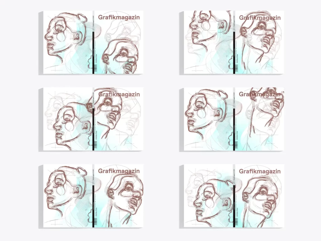
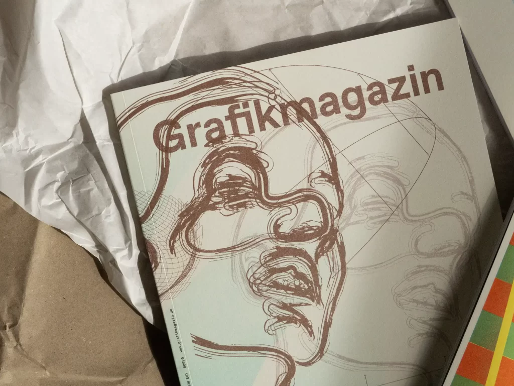
The cover shows two portraits that were created on the original glass of the Riso machine. Brettschneider and Ullrich subsequently altered the scans on the computer using brushstrokes, among other things. "As we at Rosidruckt mainly specialize in art prints and editions, our aim was to increase the degree of individualization of the cover edition through the design and technical adjustments. The cover was produced using two colors and three printing processes on the MZ 770 two-color press. We used six different templates (master templates), which we repeatedly cut up and moved around," explain the creative team.
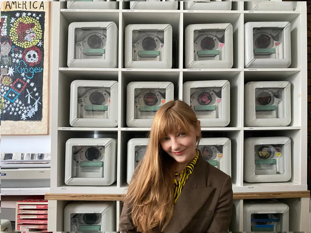
The Happy Club
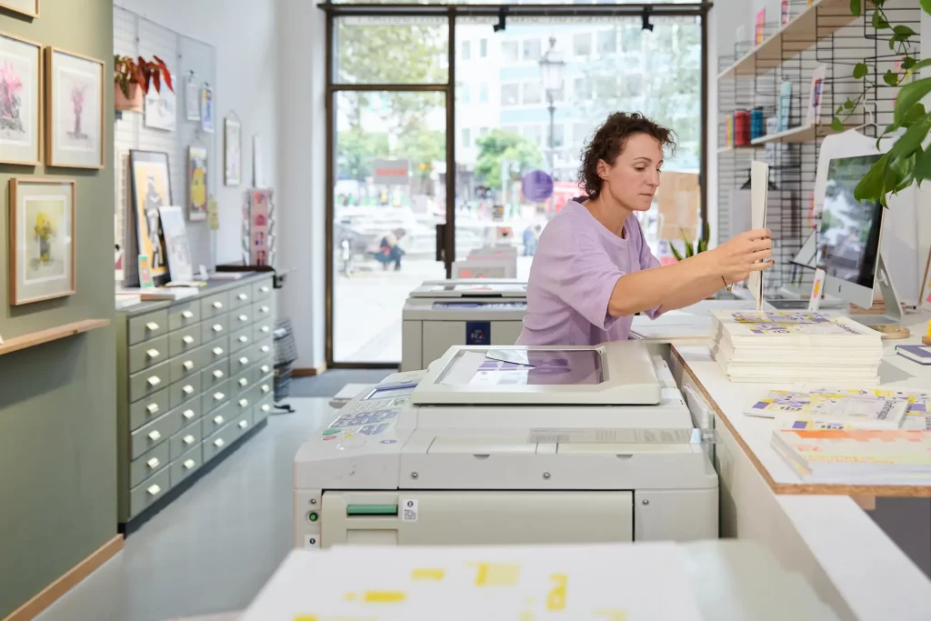
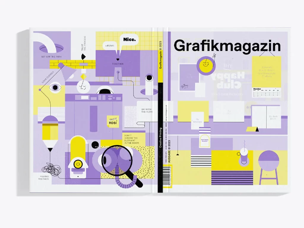
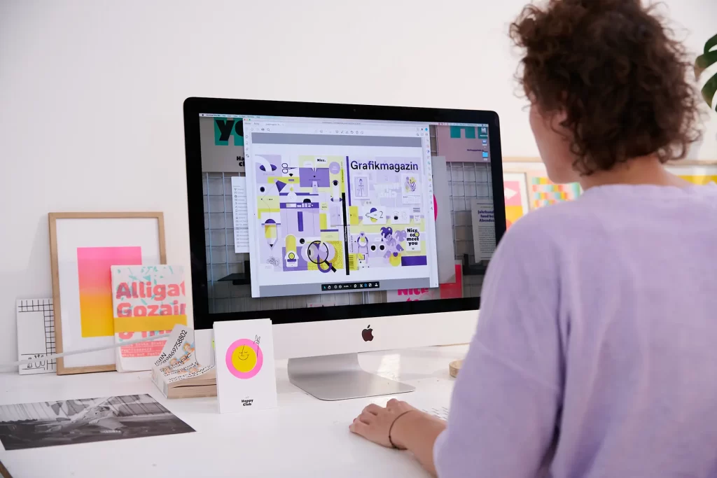
Initiated by designer and illustrator Michaela Huml, the Happy Club opened its doors for the first time in 2022: an open risography studio and store. Whether alone, in a team, as a workshop, young, old, with or without a creative background, the Happy Club brings everyone together. Permanent beta and permanent camp or simply a club without bouncers - the Happy Club is all about discovering, experimenting, sharing, surprising and getting involved in a little dance with the riso.
"Risography builds a bridge between the analog and digital worlds. It lures us out of our comfort zone, pushes us to collaborate and creates a priceless value of creative exchange," says Michaela Huml. It is precisely this special place of exchange and inspiration that she has captured in her cover motif. You can see the Happy Club, but also many works by other artists that were created there. If you would like to try out the Riso printer for yourself, you can get creative in the new store in Munich's Au district during workshops.

Mr. & Mrs. Rio
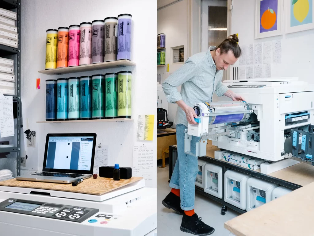
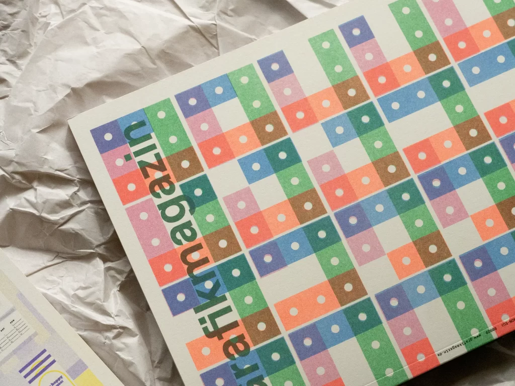
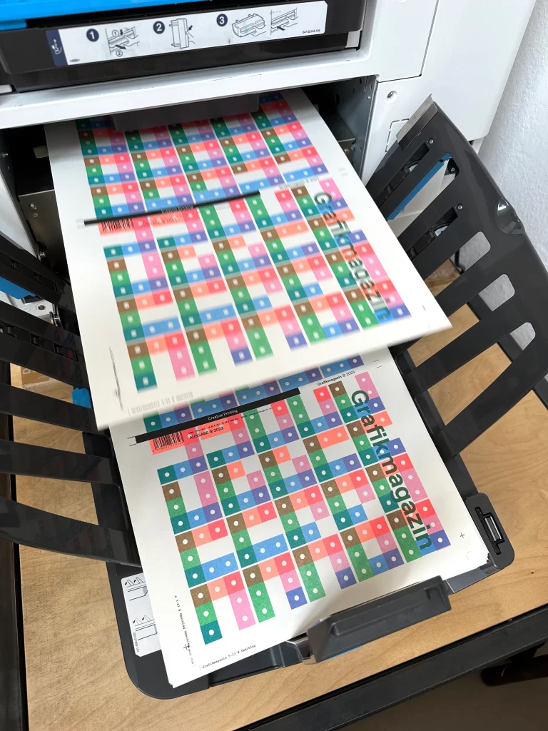
Laura Sirch and Sascha Wellm met while studying design and realized after graduating that it wasn't quite right for them. So they switched sides and founded Mr. & Mrs. Rio in 2015. They started out with an old Riso in their shared flat, today Risography is the focus of their work and they offer printing services ranging from simple postcards to complex projects such as hardcover books. The two also design and produce their own products such as weekly planners and notebooks and offer workshops.
"For our four-color cover design, we focused on technical finesse," the two explain. "For example, it was important to us to have a design with a sloping edge, even though the cover format is longer than the maximum print format of the risograph. To achieve this, we used a simple trick and printed the sheets from two different directions: the paper was fed in from the front edge to print the first two colors and from the back edge for the second print run. In order to avoid visible seams between the motif parts, we used gradient edges in the design, so the individual color separations run smoothly into each other.
Our use of screening is somewhat more visible than the format tricks. For the design, we opted for a mixture of different AM and FM screens, and in some cases also printed individual color separations in two different screens. As the Risograph's RIP doesn't actually allow this, individual areas of the motif were screened in advance using different software.
The result is a striking cover that catches the eye from a distance with its bright colors and reveals many details on closer inspection."
Kelli Anderson
Kelli Anderson has been an independent designer for over 15 years and says: "My work is very unique and combines experimental approaches from graphic design, art, technology, education, research, architecture and publishing. I believe that humble materials - like a piece of paper - have tremendous magic. When they don't behave the way you expect them to, it shakes our sense of reality. This is exactly the emotional impact I try to achieve with my work when I transform risography into animation."
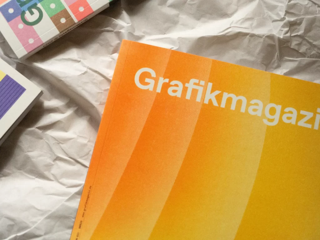
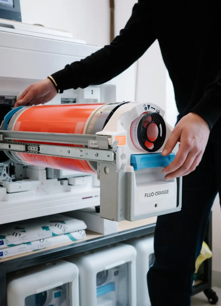
Kelli Anderson uses risographed templates to create animations with the special look and feel of Riso printing. "The animation that is the basis for the cover motif is a color study. Its effect depends on the colors that were specially selected for this study." Bubble, Fluo Orange, Kelli Green, Cornflower and Black were used.
"I think to develop new techniques and find new possibilities that are hidden, you have to abuse your tools," says the designer. "In my opinion, RISO inherently invites abuse because it was invented as an office copier, but no one uses it that way. Since animation relies on precise alignment to create the illusion of movement, and since register accuracy is a big challenge in risography, I was sure that experimenting with animation on the RISO would lead to something unexpected, uncontrollable and cool."
Supercolor
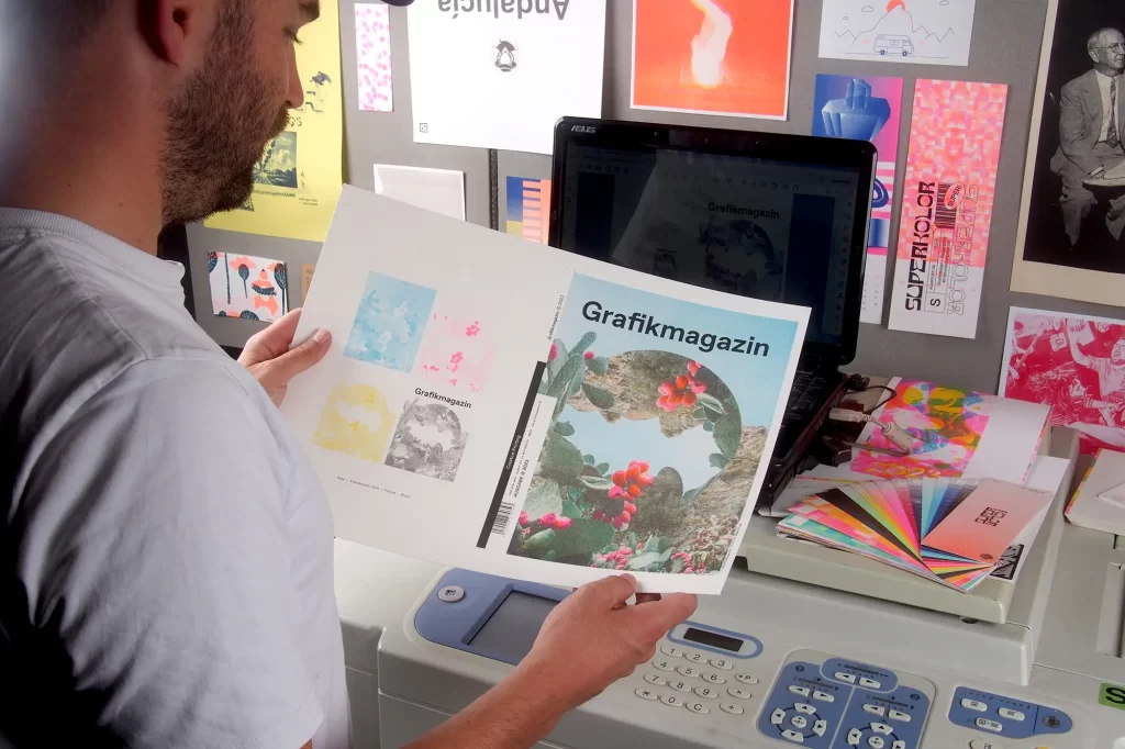
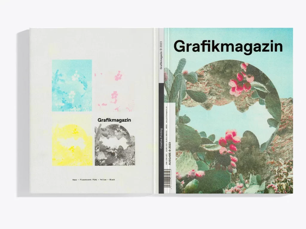
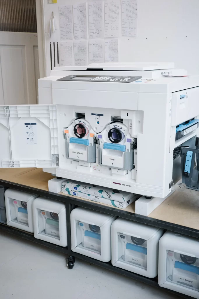
Studio Superkolor are Julian and Hendrik Klein - brothers and graphic designers from Münster. Since 2019, their studio has been located on an old farm outside Münster, where they offer classic design services, from branding to poster campaigns, with a focus on sustainability. A good ten years ago, they became aware of risography through a classified ad (photocopier to give away). Their graduation projects were the first things they realized on the Riso printer; today they teach design basics at the Risograph at Dortmund University of Applied Sciences and Arts and are fascinated by the limitations and experimental approaches of this printing technique.
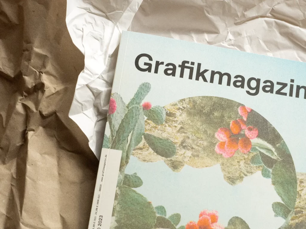
With her motif for the Grafikmagazin-cover, Julian and Hendrik Klein show that photographs can also have a great effect when printed in Rios. They use the back of the cover to show how the motif was printed. The basically very simple division into CMYK - or in this case aqua, fluorescent pink, yellow and black - is also familiar from offset printing. However, the illustration of Superkolor makes it clear once again that different degrees of saturation are also used in risography and that this printing process combines many things that are already familiar, but also has very special characteristics that occasionally require strong nerves. "Despair? After several years with various risographs, troubleshooting in forums from the 90s and night shifts in test mode, we try to deal with the printer's quirks as calmly as possible," say the creatives from Münster. "This also applies well to our own way of working: accept and embrace imperfection."
The paper
For the cover of this issue, we used the uncoated fine paper Munken Pure Rough in 300 gsm, which is particularly suitable for risograph printing.
With up to 1.4 times the volume, four shades of white and two surfaces as well as matching envelopes and mailing bags, the Munken design range is an excellent choice for a wide variety of applications. The papers are also "Cradle to Cradle Certified Silver" certified.
We used the arto gloss paper in 150 gsm for the photo series in the 05.23 graphics magazine. The FSC and PEFC-certified picture printing paper with its glossy surface makes colors shine and is particularly suitable for the presentation of photographs. The "Production & Publishing" section was printed on the coated uncoated Amber Graphic paper in 150 gsm. On the other pages, you will encounter PrimaSet, a coated paper with a high volume that ensures perfect legibility and high-quality image reproduction with high image contrast thanks to its matt, low-reflection surface.
All paper comes from Inapa

Have we aroused your curiosity? In Grafikmagazin 05.23, we also present many other exciting print projects that are well worth discovering in the "Creative Printing" section. Order our special issue now or the six risograph motifs as original prints as a set (simply by email) - so beautiful, you'll want to hang them all on your wall.


